
12/01/2018
DAVID ROBERT JONES
(DAVID BOWIE)
IN MEMORY OF AN ENGLISH SINGER,
SONGWRITER, RECORD PRODUCER,
PAINTER AND ACTOR
Published by
CoIR CARDS
Ref: 2016.CR.192
This postcard was released two years ago upon the death of David Bowie on the 10th January 2016. I am a couple of days out on the anniversary of the death of this music idol, but this postcard is a nice reminder of what was lost that day.
12/01/2018
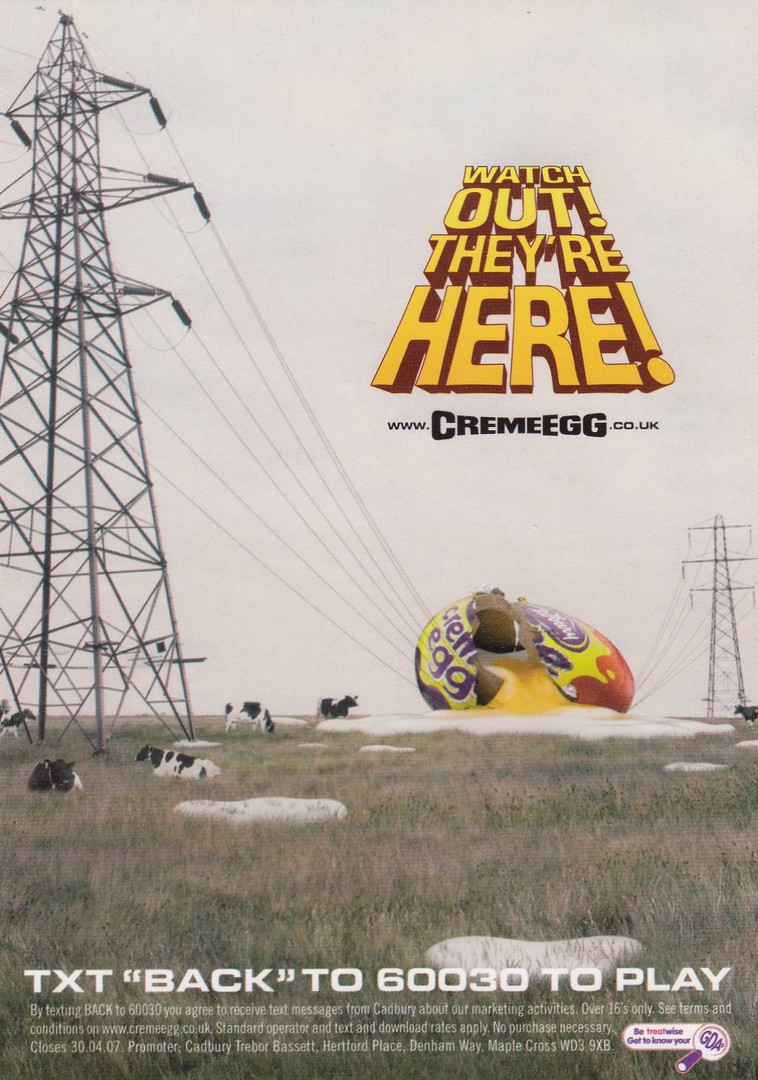
WATCH OUT!
THEY’RE HERE!
(CADBURY’S) CRÈME EGG
Published by
BOOMERANG
Aren’t they just! This is an older advert for the release of these Easter themed treats (although this year they were in the shops by the 1st January!! – hardly Easter!). I love these, but can’t really eat them any more as I am diabetic (I cheat occasionally but have not had a crème egg for a while). This card has details of a competition which was held that year. This year it seems they have introduced some white chocolate eggs into the mix and these, if you find one, are worth £2000 (or something like this – so don’t eat it if you come across one). I wonder if any postcards have been issued around this year’s unusual hunt? I have not seen one yet, but it is early days.
11/01/2018
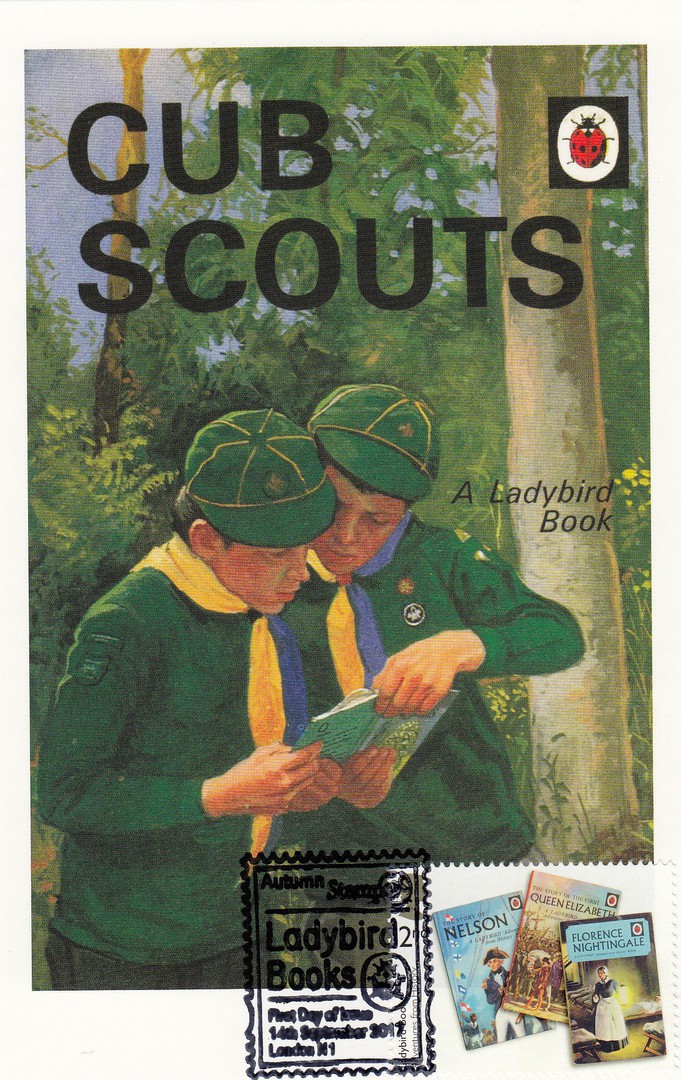
LADYBIRD BOOK COVER POSTCARDS
From the boxed set of 100 Ladybird Book Covers
Used on the front with a Royal Mail ‘Ladybird Books’ Stamp 2017
Cancelled with a special AUTUMN STAMPEX 2017 special hand stamp.
Tonight was the first Cub Scout meeting of 2018 for my cub pack (where I an assistant Cub Scout Leader) – I post this card to celebrate this fact (and because it is a cracking card)

11/01/2018
SWEET AS A ROSE!
Published by
THE POSTCARD FACTORY
Ref: PC46-PR-GEN009V
Not wishing to announce to loudly that I know my Disney Princesses, but this is the Sleeping Beauty princess, otherwise known as Princess Aurora. Another card from the gift shops outside of the official parks in Florida. I have to say that the quality of the cards published by The Postcard Factory are extremely good.
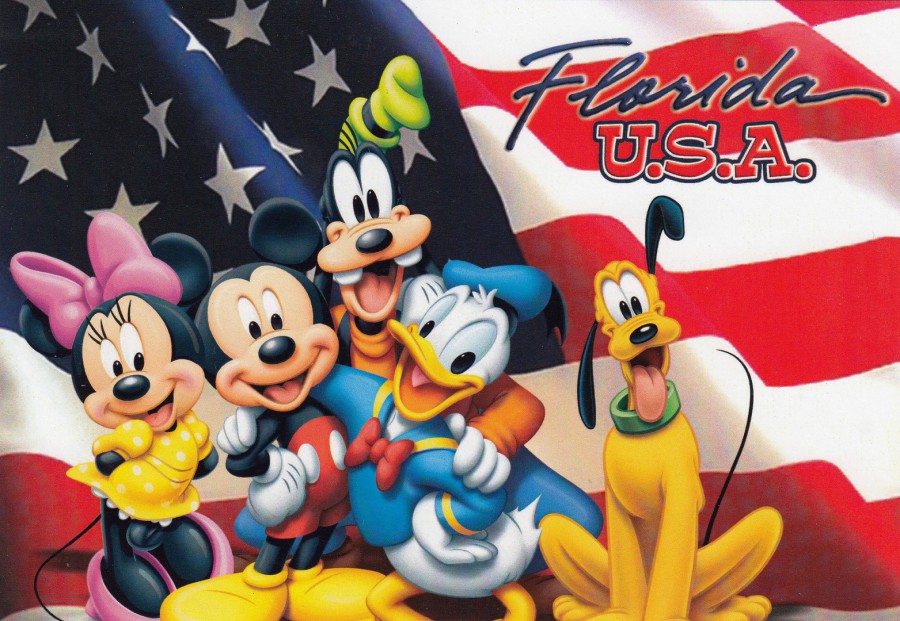
11/01/2018
FLORIDA
U.S.A
Published by
THE POSTCARD FACTORY
Ref: PC57-WD-FLG 10
Minnie Mouse – Mickey Mouse – Goofy – Donald Duck – Pluto
Mickey and the gang set against the backdrop of the stars and stripes US flag. It is a lovely card, but a typical card for the gift shops set up in areas outside of the official theme parks. They are also, I am pleased to say, considerably cheaper than the official theme park cards as well (although I do buy both, as you will know from previous postings).
REVERSE SIDE OF ABOVE POSTCARD
Again, a nice little reverse side image
11/01/2018
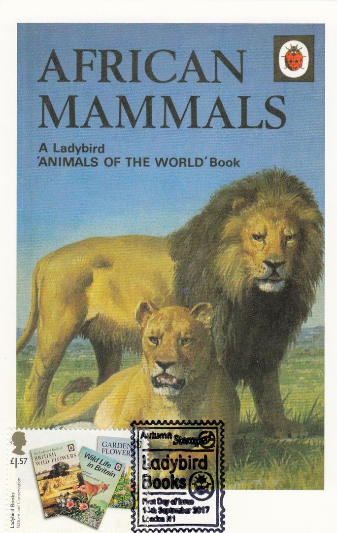
LADYBIRD BOOK COVER POSTCARDS
From the boxed set of 100 Ladybird Book Covers
Used on the front with a Royal Mail ‘Ladybird Books’ Stamp 2017
Cancelled with a special AUTUMN STAMPEX 2017 special hand stamp.
‘ANIMALS OF THE WORLD’
AFRICAN MAMMALS
This was the only cover from the ‘Animals of the World’ series of Ladybird books that appeared in the postcard collection. For me this was a shame as this is the series of books that I collect, although I think I now have an example of them all. I certainly have this African Mammals one. I loved these books as a kid and they bring back superb memories of my childhood interest in animals. This was another one which I knew in advance I would want to have used in this way.
11/01/2018
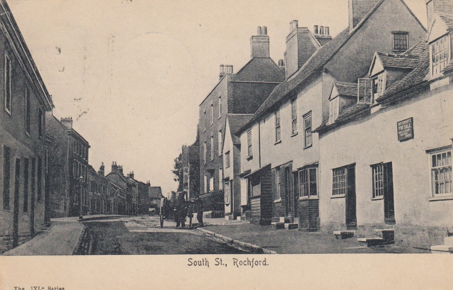
SOUTH STREET, ROCHFORD
Anonymous Publisher
The IXL Series
This location is very well known to me as Rochford Police Station was located here in this very street, in fact it was located on the right side of the street, as seen here, but the photographer would have had to have stepped back about sixty feet then he would have been standing outside the front of the Police Station. So, every time I left the station and turned right I was driving along the street you see here. This image is an early one as the postcard was posted in 1904.
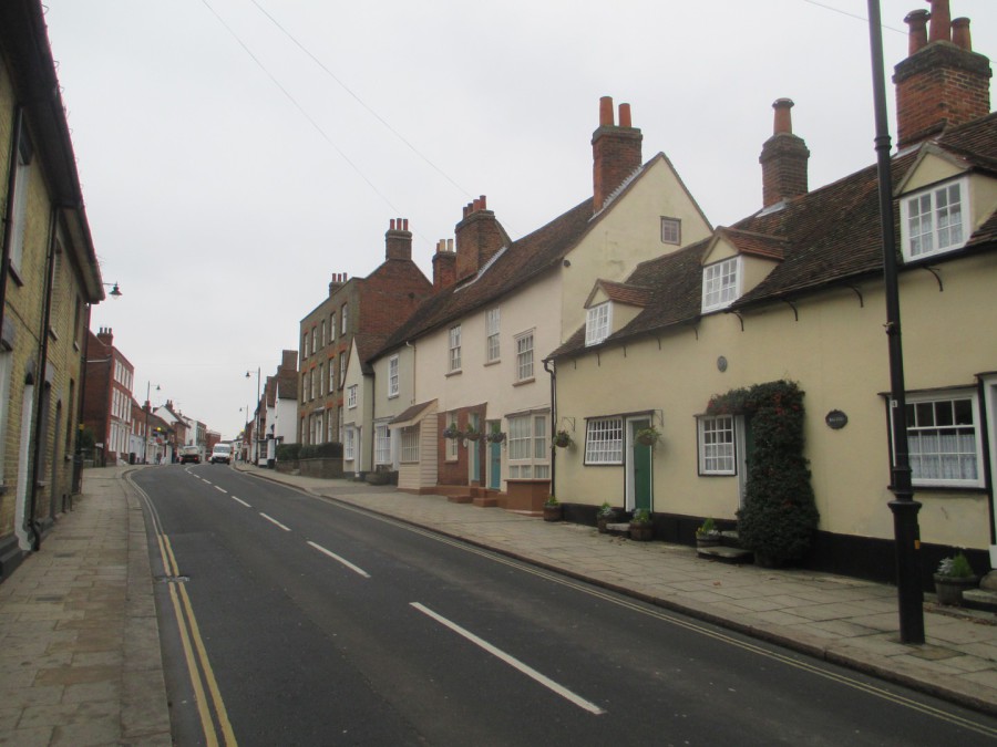
PHOTOGRAPH
Taken on 09/01/2018
As you can see the basic buildings remain much the same. The main difference is the road modernisation.
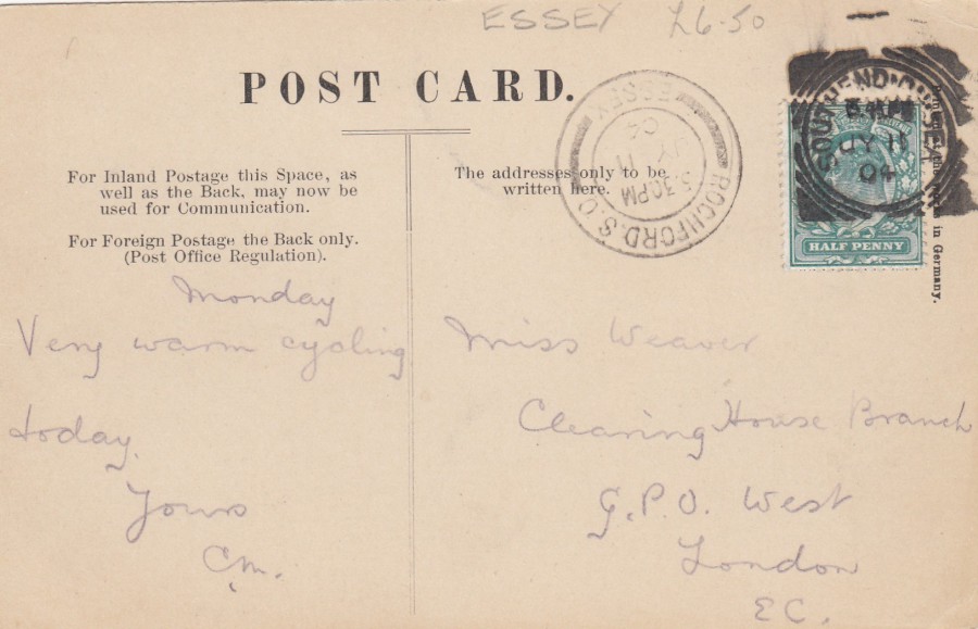
REVERS SIDE OF ABOVE POSTCARD
Here you can see an isolated ‘ROCHFORD S. O., ESSEX’ double ring local cancellation dated 11 July 1904, timed as 5.30pm. The Edward VII Half Penny (green) stamp has then been cancelled with a Type II (two arcs) Squared Circle ‘SOUTHEND-ON-SEA’ postmark also dated for 11th July 1904 but timed for, I think, either 5.45pm or 6.45pm (I am not sure 15mins was enough time for this card to be taken from Rochford to Southend so 6.45pm seems more likely). For a local philatelic postal history collector this is a great combination of postmarks on one card, and they are both nice clear strikes as well. I paid £6.50 for this card and I think it was worth every penny.
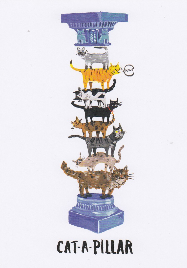
10/01/2018
CAT – A – PILLAR
Published by
JELLY ARMCHAIR
Design by
CATHERINE FAULKNER (2016)
Ref: PO18
And the cat cards keep coming. This was a recent buy and it is the second design by Catherine Faulkner that has appeared on the webpage. There was something appealing about this design and despite it being another ‘CAT’ design I still had to have it (no, I am only joking, I do like cats really. I even had a pet cat as a kid, and we had a family pet cat when my own kids were younger, it hated me, and would attack me on the stairs when I came in after night shifts. It would leap onto my head from the first floor up as I was climbing the stairs – everyone else said it was because it liked me – but I knew better).
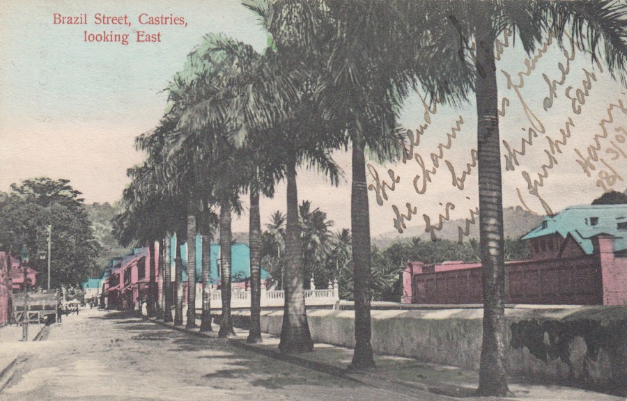
09/10/2018
BRAZIL STREET
CASTRIES
LOOKING EAST
Published by
P. & C St. Lucia
Ref: No. 5
This postcard depicts Brazil Street, Castries which is a town on the island of St Lucia. This is fine example of how badly some postcards were coloured in the past, especially from out of the way smaller locations. But, it was not the front of this postcard that made me buy this one.
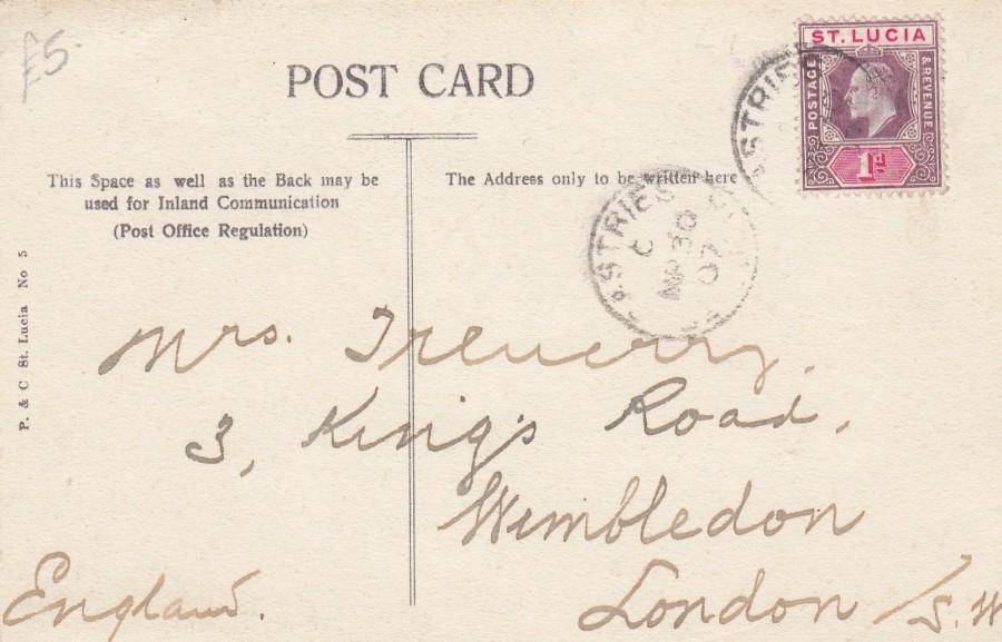
REVERSE SIDE OF ABOVE POSTCARD
This card has been posted using a 1902 issued 1d purple and red St Lucia postage stamp (SG 66a) which has been cancelled with a single ring CASTRIES date stamp dated 30th March 1907. The card was addressed to Wimbledon, London. It was the stamp and the cards usage, i.e. posted to the UK, that led to me buying this one.
09/10/2018
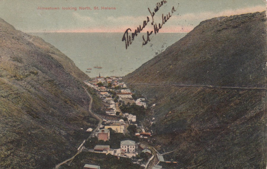
JAMESTOWN LOOKING NORTH
ST. HELENA
Published by
T. JACKSON, St Helena
St. Helena is an island which is part of the British Overseas Territory. It is a remote volcanic island in the South Atlantic Ocean. St. Helena is historically best remembered as the final place that the British exiled Napoleon Bonaparte to after his loss at the Battle of Waterloo. It is also where Napoleon passed away. The island is only 10 by 5 miles and has a population of about four and half thousand people. Jamestown, as depicted here, is the capital of the island.
Others were also exiled or imprisoned here including Dinuzulu kaCetshwayo (he was imprisoned for leading a Zulu army against the British rulers) and more than 5,000 (some reports say over 6,000) Boers taken prisoner during the Second Boer War, some after their defeat at the Battle of Paaedeberg. These prisoners were kept on the island between 1901 and 1902. The final batch of prisoners departed the island on 23rd October 1902. But, some of them remained and married local girls. It is almost certain that this postcard was posted by one of the remaining Boers as it was sent from the island to South Africa, in 1909.

REVERSE SIDE OF ABOVE POSTCARD
This postcard was posted using a 1903 issued 1d black and red postage stamp depicting ‘The Wharf’ (SG 56). This has been cancelled with a very feint ST HELENA small circle date stamp dated 19th April 1909. The card was addressed to PIETERMARITEBURG, NATAL, SOUTH AFRICA and has a ‘PIETERMARITEBURG, NATAL’ double circle thick single arc receiving date stamp dated 30th April 1909.
The card has no message and no details of the sender but the islands only real connection with this part of the world was through the Prisoners of War from the Boer conflict. This means that this card was either sent by a remaining POW who stayed on the island or sent to a POW by someone they befriended on the island, although I believe the first option is more likely. It is the usage of this card which adds the value to it rather than any catalogue value for the stamp
09/10/2018
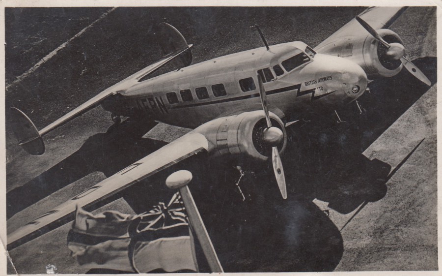
BRITISH AIRWAYS LOCKHEED ELECTRA
THE VIKING ROYAL MAIL EXPRESS
Published by
RAPHAEL TUCK & SONS
“REAL PHOTOGRAPH”
Ref: Real Photograph Postcard No. 300
This nice aviation themed postcard was posted from Ireland in 1938. Although not fully described on the postcard this is a Lockheed Model 14 Super Electra:
First Flight – 29th July 1937 (introduction October 1937)
Number built - 354
Maximum Speed – 250mph (402 km/h)
Range – 2,125 miles (3,4320 km)
Service Ceiling – 24,500 ft. (7,649 m)
This depicted plane is a British Airways airplane but, they were also used by Northwest Airlines in the US, Aer Lingus in Ireland and KLM of the Netherlands.
Although not the plane depicted here, it was a model 14 Super Electra that flew British Prime Minister Neville Chamberlain back from Munich after the signing of the Munich Agreement in 1938, and it can be seen in the background behind the Prime Minister when he is shown waving the document whilst saying that famous ‘Peace in our Time’ speech (the plane there was G-AFGN).
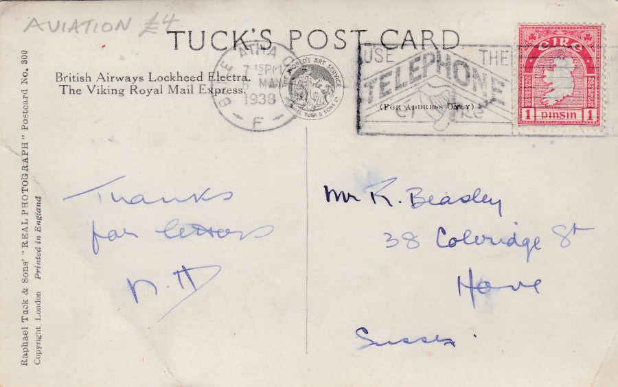
REVERSE SIDE OF ABOVE POSTCARD
The Irish 1d postage stamp (SG 112) is from the 1922 definitive issue, the first stamp series issued by the country (which had previously had overprinted UK stamps). The stamp has been cancelled with a ‘BAILE ATHA CLIATH’ (Dublin) slogan cancel ‘USE THE TELEPHONE – EIRE’ dated 6th May 1938. This has a nice clear slogan cancel which has been nicely applied. This would be of interest to philatelic collectors who specialise is ‘Telephone’ related items.
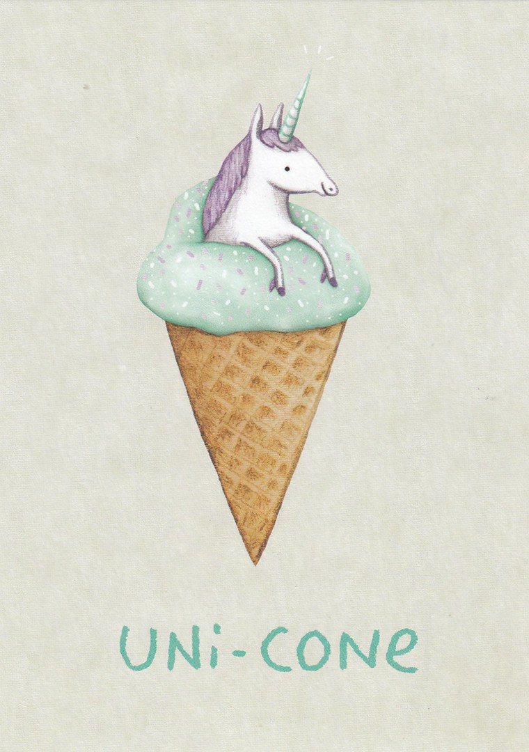
08/01/2018
UNI-CONE
Published by
OHH DEER
Ref: SG-PO-005
Design by
SOPHIE CORRIGAN
Another recent cartoon postcard by this company, who I discovered only last year. I think their designs are nice and simple and designed to quickly catch the eye, especially of, I suspect, all those young princesses out there (and the older ones for that matter). Unicorns have become popular again (possibly partially due to the fluffy unicorn toy in the film ‘Despicable Me’, and its sequels). This is another design which features a pictorial pun on words, or a single word, as in this case.
08/01/2018
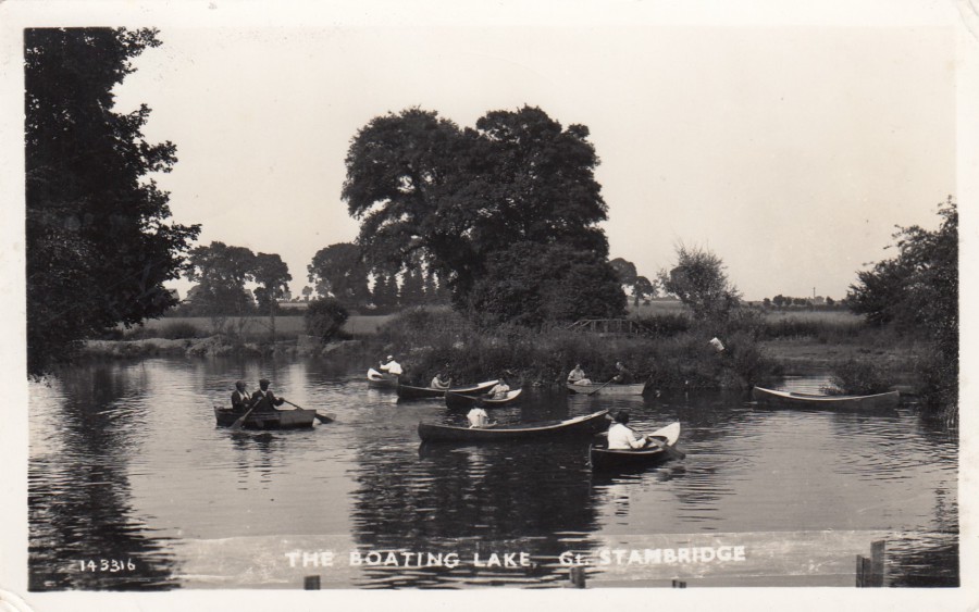
THE BOATING LAKE, GREAT STAMBRIDGE
Published by
BELL’S PHOTO CO. LTD., WESTCLIFF-ON-SEA
Ref: 143316
Although at first look this looks like a quite basic and simple photograph it is one which I am very fond of. It shows a ‘number’ of people enjoying (at least I assume they are) rowing around a lake in little two-person row boats and what look like large kayak type styled boats. I know this lake really-well as during the late 1990’s and early 2000’s I often had to search this area as this lake is located in the small village of Great Stambridge, which is just outside Rochford, where I used to work, and where there used to be a Police Station (which has now been closed due to the cut-backs and has been sold (when I drove past it today the old station is all boarded up and surrounded by workman’s plaquing). As long, as I have known, this lake has been used by fishermen. I suspect the boating aspect was closed-down because of health and safety many years ago. When I first started work in Gt. Stambridge, back in 1996 there were no boats here. This postcard shown here was posted in 1956, a period when postcard production was not at its peak. Finding local real-photograph postcards like this from the 1950’s era can be quite hard (accepting that the fact this was posted in 1956 means it could have some years before that the card was issued – although I don’t think so with this one). Postcards from this period have been rising in value since the 1990’s and more and more topographical collectors have been seeking them out.
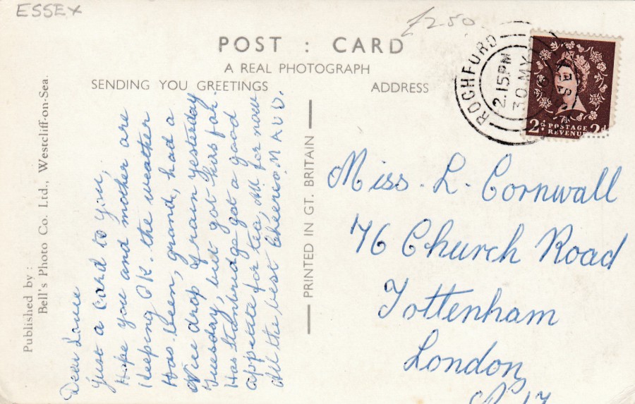
REVERSE SIDE OF ABOVE POSTCARD
This postcard was posted from the local area with the stamp being cancelled with a ‘ROCHFORD – ESSEX’ double ring cancel dated 30th May 1956. This postcard was published by the same company as the Rayleigh Dutch Cottage postcard depicted on the webpage yesterday.

07/01/2018
10 Centimes + 10 Centimos
Red pre-printed postage stamp and Coat of arms on lilac card
Higgins & Gage, World Postal Stationery Catalog
Section 19
Venezuela - Page 1 (& possibly 2 as well)
Reference No: 11 - although it is a bit confusing here with the catalogue entries as this appears to have a Ref. No. 11 image, but with a Ref No. 13 overprint – so this is either non-recorded Ref. 11 type (i.e. with FEBRERO DE 1900 boarder print instead of the listed JUNIO DE 1899 one, which is the earlier issue and only type listed in the catalogue under Ref. No. 11) or a Ref. No. 13 with the previously released Ref. No 11 type artwork heading.
Issued 1900
This card design was first issued in 1899 but without the black printed ‘1900’ over the pre-printed stamp design, which came in the year 1900. The design can be found with two different blocks of text along the bottom boarder area, depending on its date of issue – this one is the type printed ‘EMISION DE FEBRERO DE 1900’, which was the later printed version. The pre-printed red stamp features the head of Simon Bolivar. The card stock used is described as ‘LILAC’ in colour. The Higgins & Gage catalogue makes a note that the described ‘Lilac’ stock is often found looking like a perfect pink colour (which appears to be the case with my copy here). At the time of the catalogue (1977) it was not known if this was a condition caused by the tropical climate or if they were actually-printed on a pink stock. I like this one because it does not fit exactly into the Higgins & Gage Catalogue listings.
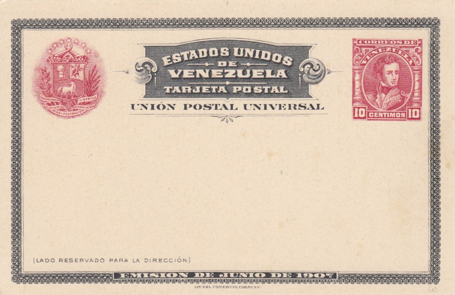
VENEZUELA
10 Centimos
Carmine pre-printed postage stamp and Coat of arms on white card
Higgins & Gage, World Postal Stationery Catalog
Section 19
Venezuela - Page 2
Reference No. 14
Issued 1907
This issue was printed twice with the first issue having ‘EMISION DE JUNO DE 1907’ in the lower boarder area, as with this card depicted here (the second printing was with ‘OCTUBRE DE 1908’ in the lower boarder area – this one is Ref. No. 14a in the catalogue). So, this copy here is the first type for this issue. The carmine pre-printed stamp features the head of General Jose de Sucre. The similarity between this design and the above posted Reply Card design is obvious.
07/01/2018
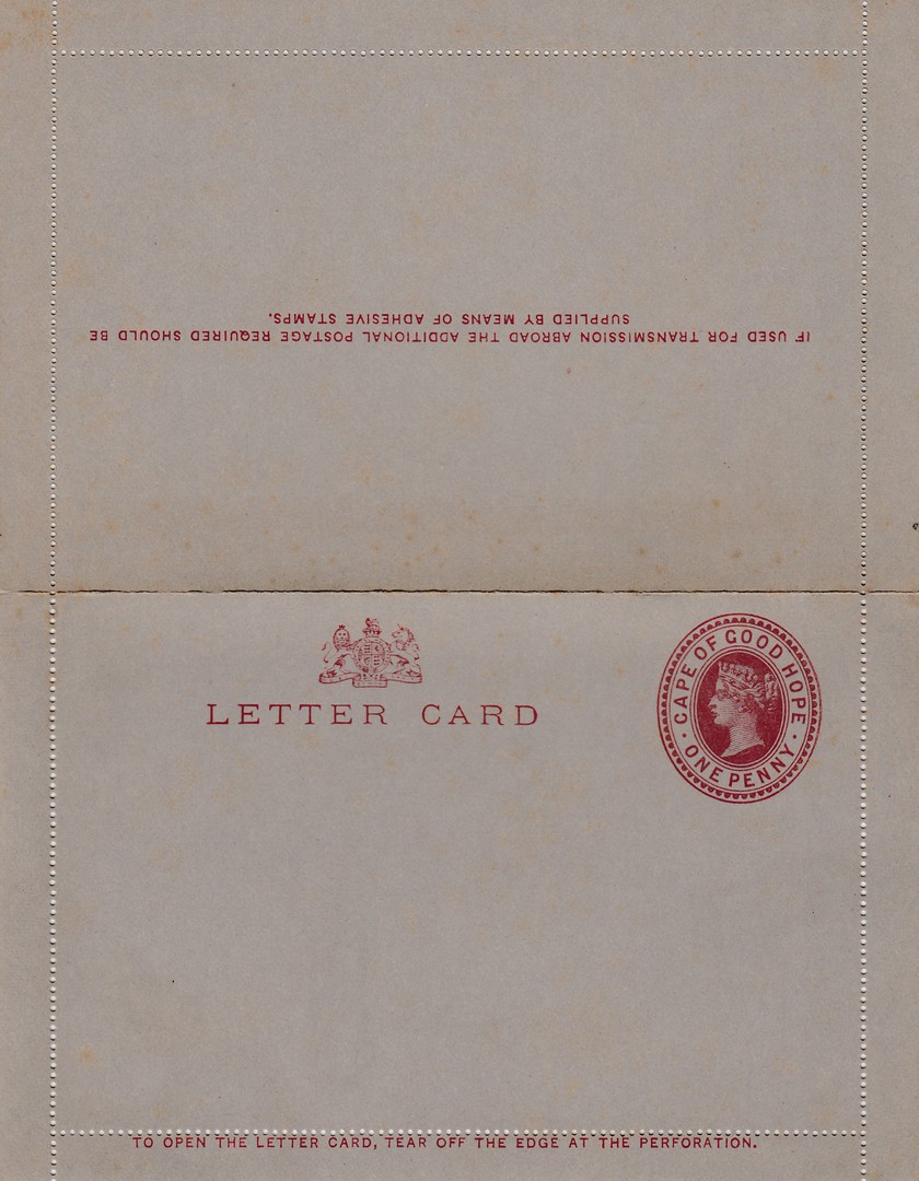
ONE PENNY LETTERCARD
Brown Carmine pre-printed stamp on Grey card
Higgins & Gage, World Postal Stationery Catalog
Section 3
Cape of Good Hope - Page 3
Reference No: 1
Issued 1895
This was the only Queen Victoria lettercard issued for the Cape of Good Hope. But, as it was around for a few years it is not an uncommon item and is valued quite low (my 1977 catalogue prices a mint copy at just 50p – although it might make a little more these days - not much though). I still like these, regardless of their value.
07/01/2018
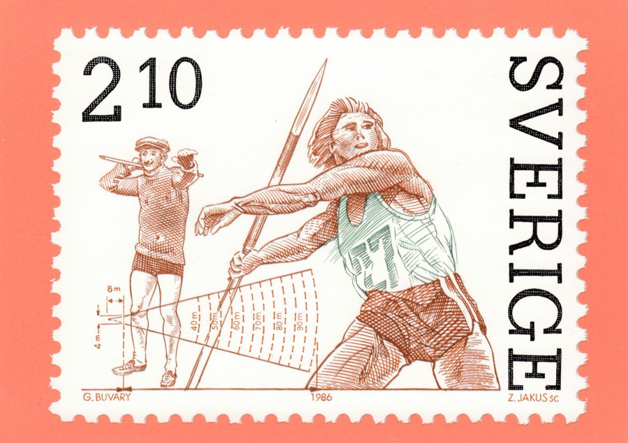
SWEDEN
The Javelin-Throwing stamp was issued on October 18, 1986
Designer: Gyula Buvary
Engraver: Zlatko Jakus
Official Swedish Post Postcard
(POSTENS TRYCKERI 1986)
The Swedish Post Office have a history of issuing postcards which depict some of their stamp issues. This is not done for every issue, in-fact not by a long way, as only occasional issues are produced in this way. These are common cards and are rarely expensive although they mainly appear at philatelic shows and not so often at pure postcard fairs.
07/01/2018
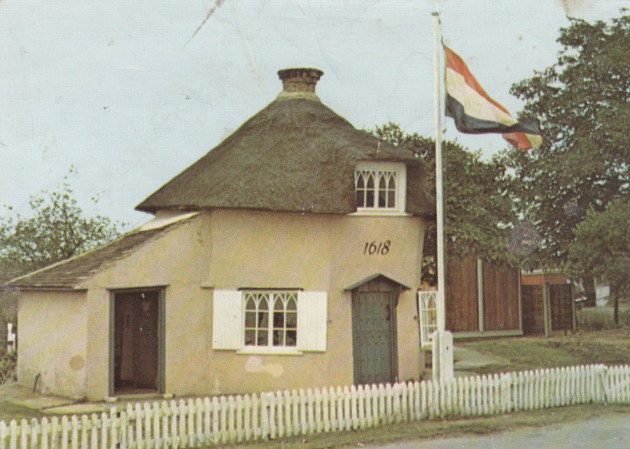
THE DUTCH COTTAGE MUSEUM 1618
CANVEY ISLAND
ADMINISTERED BY THE BENFLEET AND DISTRICT HISTORICAL SOCIETY
Printed on behalf of the Society by
BERIC TEMPEST & CO., LTD
(BERIC TEMPEST COLOURCARD)
I have shown a few postcards, mainly old ones, showing another Dutch Cottage on Canvey Island where I have mentioned that there is a Dutch Cottage Museum located in a second Dutch Cottage. This is a postcard which depicts this second Dutch Cottage. I was unaware that I had this card as it was in one of my boxes of older modern cards which I had not been through for some time. I found it and immediately knew I needed to put it on the webpage to show you this preserved museum cottage.
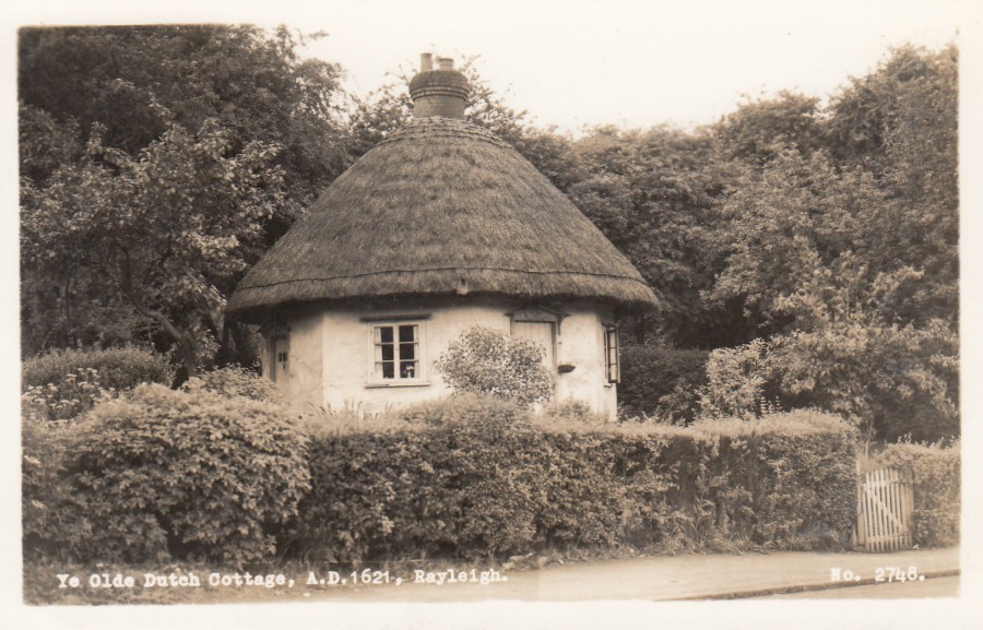
YE OLDE DUTCH COTTAGE
A.D.1621
RAYLEIGH
Published by
BELL’S PHOTO CO. LTD. WESTCLIFF-ON-SEA
Ref: No. 2748
There is one other Dutch Cottage in my local area of Essex. This one is not on Canvey Island but is located on the mainland in the town of Rayleigh, which is not that far away. This cottage is now on a main road which leads down to the railway station at Rayleigh and it is a very busy road indeed. The cottage is set much further back from the road than shown in this old postcard depicting it. I think this is the only postcard I have which depicts this ‘particular’ Dutch Cottage.
Local historians are very interested in the three Dutch Cottages which can be found locally but I do wonder if they can be found in other areas of the UK.
REVERSE SIDE OF ABOVE POSTCARD
07/01/2018
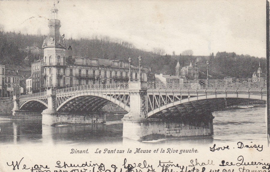
DINANT. LE PONT SUR LA MEUSE ET LA RIVE GAUCHE
Dinant. The Bridge over the Meuse and the left bank
Anonymous Publisher
Posted 1905
I have just finished reading a book called ‘The Splintered Kingdom’ by James Aitcheson (the book is sub-titled as part of a series called ‘1066: The Bloody Aftermath’). It is the second book in a series (I have not read the first – I saw this second book in a sale and because my family history involves the 1066 Battle of Hastings very highly I thought it worth a go). The book is based around a single fictional character called ‘Tancred a Dinant’, a knight originally from Dinant. Whilst I was reading the book I came across this postcard whilst going through one of my boxes of cards. It depicts Dinant, which is a city in Belgium on the banks of the river Meuse, as depicted on this postcard. It seemed more than just a coincidence that I found a postcard depicting the location that the character from my book originated from. But, it does show how a large collection like mine can bring up little surprises like this.
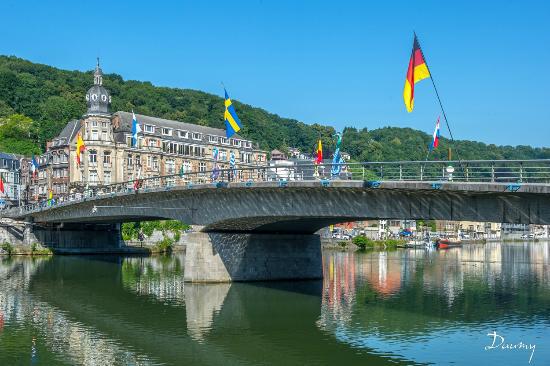
PHOTOGRAPH
DINANT
This seems to be the area depicted on the above postcard as it looks today. Clearly the bridge has been modernised, and the main building shown has been raised by a floor. But, at least the countryside still appears to be there in the background and has not been built up on.
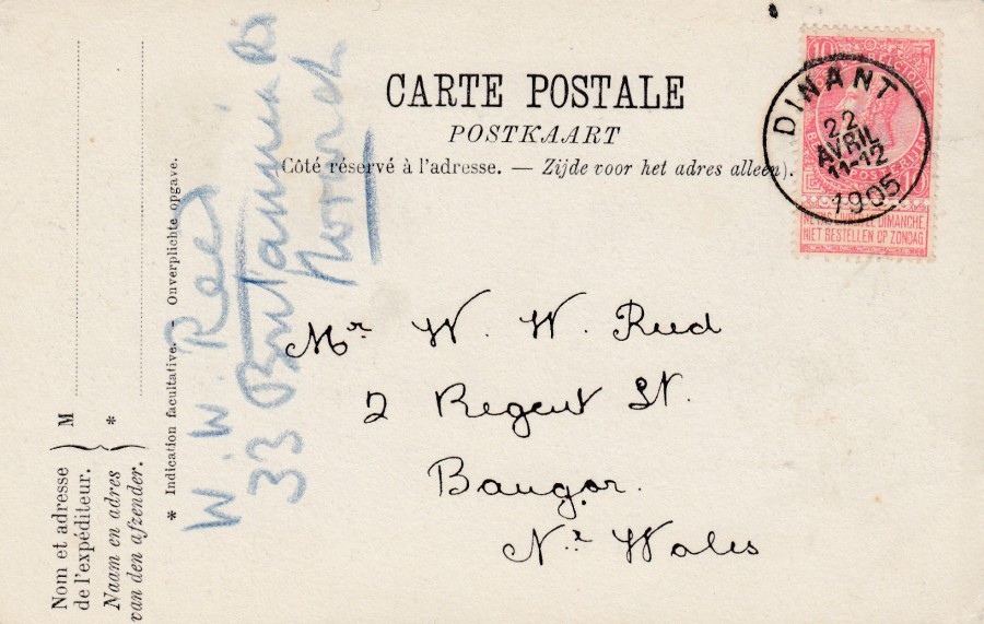
REVERSE SIDE OF ABOVE POSTCARD
I bought this postcard from a stamp dealer for the stamp that has been used on it, and the very nice small single ring DINANT cancel dated 22nd April 1905. The stamp used is an 1893 issued Leopold II side portrait stamp with the attached tablet at the bottom, the tablet being a small perforated rectangular attachment to the bottom of the stamp. These stamps are worth more with this attachment in place, not that this one has any great vale (my 2004 issue of Gibbons Stamps of the World only catalogues a used example at 25p). The attached tablet has the following text in it:
NE PAS LIVRER LE DIMANCHE
NIET BESTELLEN OP ZONDAG
The top line is in French whilst the bottom line is in Dutch. They both mean:
DO NOT DELIVER ON SUNDAY
The postcard was posted to a W.W. Reed in North Wales, but, clearly in the meantime either W.W. Reed had moved away or was staying away in Britannia Road, Norwich, the other side of the country. The card was redirected by someone, using a blue pencil, and I assume was delivered to W.W. Reed at their new location. For a card that travelled around as much as this one did I thought it was in remarkably good condition.
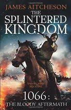
This is the cover of the book that lead to this posting

06/01/2018
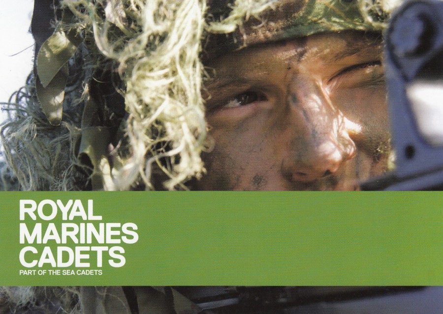
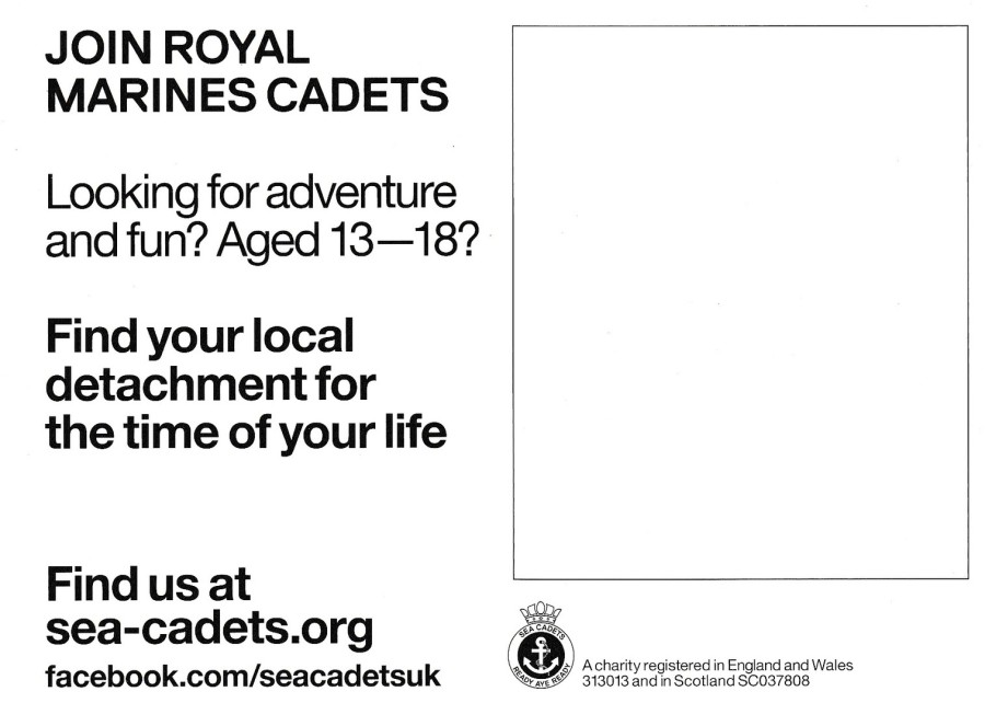
ROYAL MARINES CADETS
Part of the Sea Cadets
‘JOIN ROYAL MARINES CADETS’
Looking for Adventure and fun?
Aged 13 – 18?
Find your local detachment for the time of your life
Official Promotional Postcard
One of a couple of postcards which advertise the benefits of joining the Royal Marines Cadets. I had not realised that the Sea Cadets were a registered charity (313013 in England and SC037808 in Scotland), the details of which are contained on the reverse side of this postcard. This is a free card which I expect is given out from promotional stalls at events up and down the country
ROYAL MARINES CADETS
Part of the Sea Cadets
‘JOIN ROYAL MARINES CADETS’
Official Promotional Postcard
This is the second card produced for the Royal Marines Cadets. It is a partner card to the one shown above. It has the same reverse layout as the above card. They make for a nice pair. I think this image would certainly appeal to kids of a certain age. I suspect that is why it appears here
REVERSE SIDE OF ABOVE TWO POSTCARDS
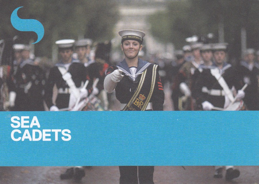
SEA CADETS
10 – 18? JOIN US!
14,000 Sea Cadets
Official Promotional Postcard
This promotional postcard would have come from the same source as the two Royal Marines Cadets cards. The Sea Cadets though start three years earlier, at the age of ten. The image used here shows a Sea Cadet marching band.
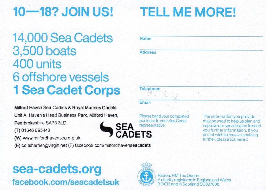
REVERSE SIDE OF ABOBE POSTCARD
I am calling this a postcard but truly its an information card, the two Royal Marines Cadets cards called be called postcards as there is a block where a stamp and an address could be applied, which is not the case here. This card has a black contact details cachet applied for the area of Milford Haven in Pembrokeshire. This is no surprise as the cards depicted here were sent to me by my postcard friend David Rye, who resides in this part of the country (thanks David).

SEA CADETS
10 – 18? MAKE MORE OF YOUR FREE TIME
JOIN SEA CADETS!
Official Promotional Postcard
On this card, which has more of a postcard design on the back, the black contact details cachet, which appears on the reverse side of the above postcard, has been applied on the front and almost, there is a very slight tilt to it, looks like a printed part of the card design.
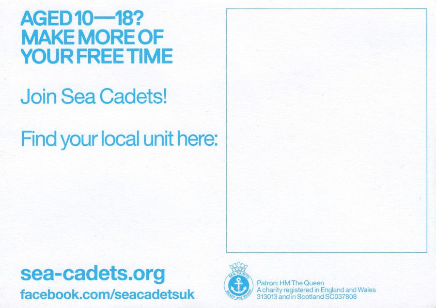
REVERSE SIDE OF ABOVE POSTCARD
I do like the fact that they have used blue printing for the two Sea Cadet cards, whilst using black for the Royal Marines Cadets cards. The use of blue is very appropriate considering the organisation being promoted here.
The four postcards, or at least, cards, do go nicely together and, also fit well into my military themed collection.

06/01/2018
BOO BEES
By
Catherine Faulkner (2016)
Published by
JELLY ARMCHAIR
Ref: PO17
I have mentioned before a friend of mine who collects ‘Ghosts’ on postcards. I wonder if this one would be considered as suitable for his collection? (I will have to ask him). Besides being a very simple design, it is also a comic one. The joke here is probably obvious and a pictorial pun on a well-known female anatomically descriptive word, mostly used by the male segment of the population (especially those aged 13yrs or who have not matured beyond it). But I do like the way that this has been turned into this funny little sight gag.

05/01/2017
WESTCLIFF-ON-SEA
Published for
W. LOCKHART (SOUTHEND) LTD
By
PHOTOCHROM. CO. LTD (TUNBRIDGE WELLS)
Westcliff is an area of Southend just to the west of central Southend. It is an area I know well and, despite the images all displayed on this postcard, is an area which has more in it than the seafront areas. The Bandstand has long been moved due to the collapse and subsidence of the cliff area beside the seaside where it was originally placed. The Rock Gardens displayed are also immediately opposite the seafront. It is therefore clear that this postcard was designed to be sold around the area of the seafront, probably to the tourists who were coming here on their day trips or holidays. With the Westcliff area it tended to be more those coming to here for longer than day trips.
The central image is of a cat and I often wonder who decided that the most common creature to appear on postcards in this position was to be cats and kittens. You do also find dogs and puppies, and at seaside locations you get donkey’s and, less often, seagulls. But, by far and away the most popular centrally depicted animal is the cat. Why? Logically I would have thought man’s best friend – the dog – would have been more popular in the UK, but, no… it is ‘definitely’ the cat that wins out.

05/01/2017
POSTCARD ENVELOPE
WESTCLIFF-ON-SEA
W. LOCKHART (SOUTHEND) LTD
This is the envelope the above postcard, along with others, came in. The central cut out circle would allow you to see the cat in the centre of the above postcard. One assumes that seeing the cat would make you want to buy this postcard set more! This envelope is probably harder to find than the postcard. Most people who bought these wanted the cards and disposed of this envelope thus making them far less common than the cards which it contained.
05/01/2017
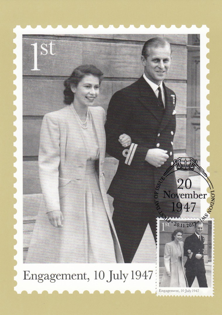
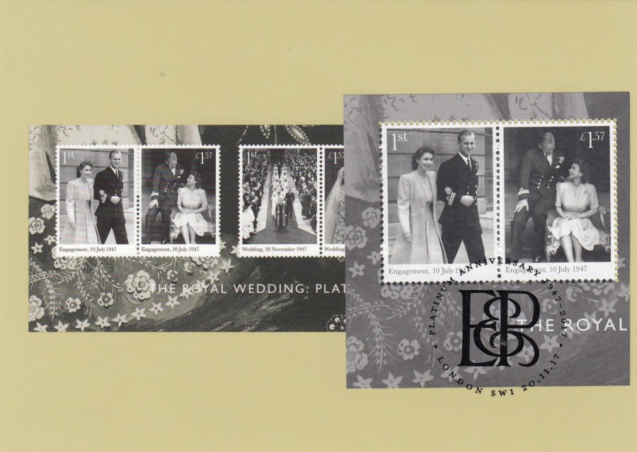
THE ROYAL WEDDING: PLATINUM ANNIVERSARY
ROYA MAIL PHQ/STAMP CARD SET
Stamps Issued – 20th November 2017
I still find it strange that the last PHQ/Stamp set of 2017 was not the Christmas set. Somehow this seems wrong but, I can see why this set here was required, or at least considered so by royal mail. It is though, obviously, another ‘Royalty’ themed release and these are quite a common theme and as a result they can seem to be a bit repetitive in their approach, i.e. black and white photographs. This is again the approach taken here. One thing which is not in doubt though, is the fact that stamp collectors do love this type of issue and, the photographs used here are at least uncommon ones. I also liked the approach of having two engagement photographs, two wedding photographs and lastly two honeymoon photographs. At least the stamp designs therefore follow a story:
THE ROYAL WEDDING: PLATINUM ANNIVERSARY
(ENGAGEMENT)
ROYA MAIL PHQ/STAMP CARD
Ref: PHQ 437 (1) 11.17
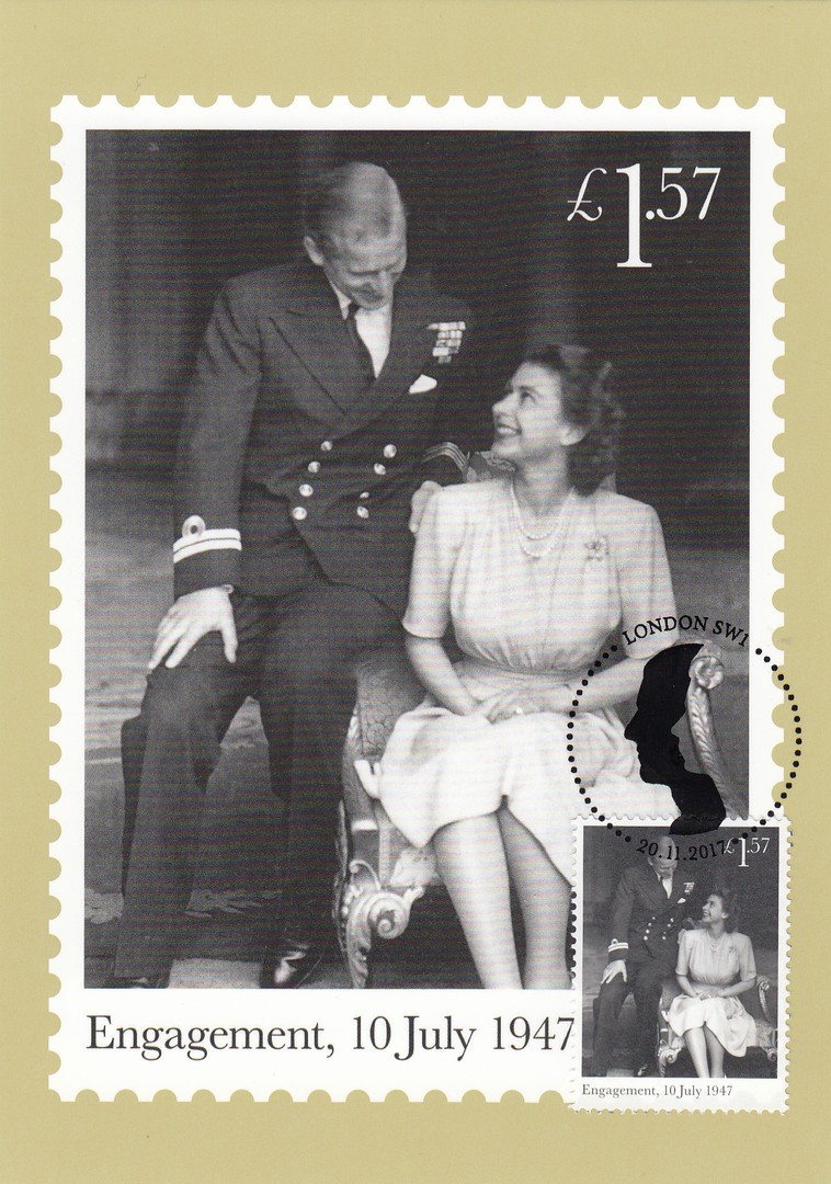
THE ROYAL WEDDING: PLATINUM ANNIVERSARY
(ENGAGEMENT)
ROYA MAIL PHQ/STAMP CARD
Ref: PHQ 437 (2) 11.17

THE ROYAL WEDDING: PLATINUM ANNIVERSARY
(WEDDING)
ROYA MAIL PHQ/STAMP CARD
Ref: PHQ 437 (3) 11.17
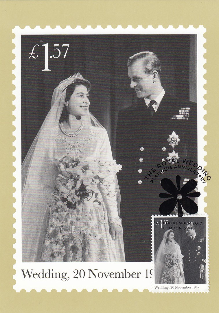
THE ROYAL WEDDING: PLATINUM ANNIVERSARY
(WEDDING)
ROYA MAIL PHQ/STAMP CARD
Ref: PHQ 437 (4) 11.17
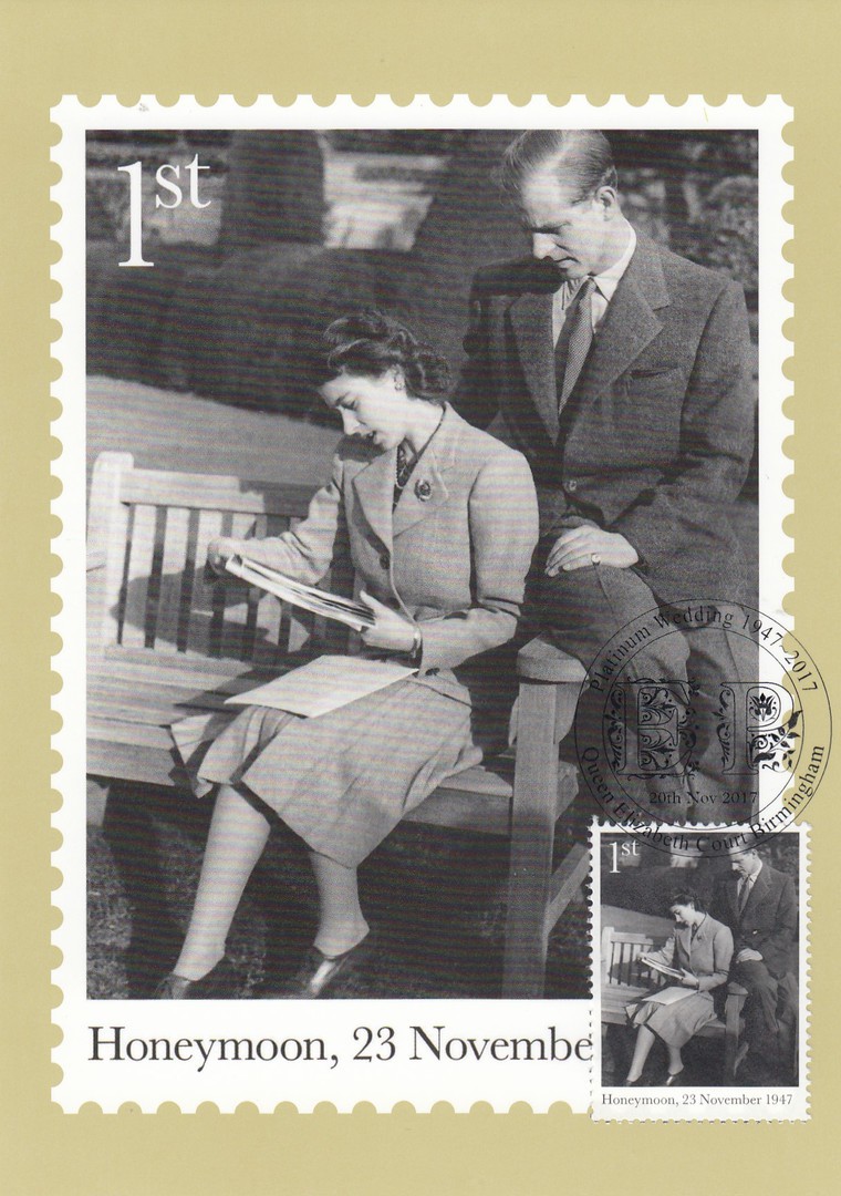
THE ROYAL WEDDING: PLATINUM ANNIVERSARY
(HONEYMOON)
ROYA MAIL PHQ/STAMP CARD
Ref: PHQ 437 (5) 11.17
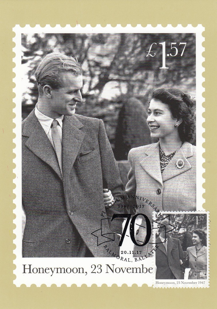
THE ROYAL WEDDING: PLATINUM ANNIVERSARY
(HONEYMOON)
ROYA MAIL PHQ/STAMP CARD
Ref: PHQ 437 (6) 11.17
THE ROYAL WEDDING: PLATINUM ANNIVERSARY
(MINIATURE SHEET)
ROYA MAIL PHQ/STAMP CARD
Ref: PHQ 437 (7) 11.17
The stamps were issued in a stamp sheet which was quite long and therefore a whole sheet could not be applied to the card which depicts it. This therefore means that two of these cards are required to have a whole sheet applied and cancelled first day of issue. The stamp sheet is cut into two segments and each applied to a separate card. Regular readers of my webpage will know this is not an unusual situation as this happens often and I have had to depict two such sheet cards on a ‘number’ of occasions over the two years that the webpage has been running.
Here you have the left-hand side of the sheet with the two ‘Engagement’ photograph stamps.
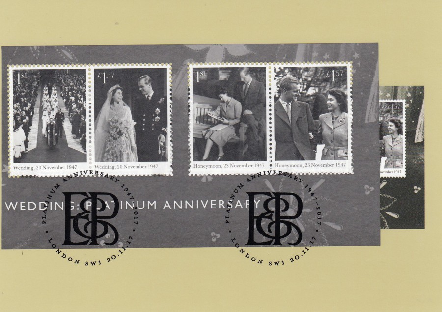
THE ROYAL WEDDING: PLATINUM ANNIVERSARY
(MINIATURE SHEET)
ROYA MAIL PHQ/STAMP CARD
Ref: PHQ 437 (7) 11.17
This card has the right-hand side of the stamp sheet applied, with the two ‘Wedding’ stamps and the two ‘Honeymoon’ stamps.
As always, and understandably, cards used first day of issue with the representative stamps will cost a lot more than a mint card set. For the past ten years or so I have only collected these used with the stamps applied and cancelled F.D.I. With the older issues, especially the very first PHQ Stamp cards, I also collected them mint.

04/01/2018
Last year, in October, I visited Florida and Walt Disney World. Whilst there I visited the resort hotel called ‘Wilderness Lodge’. In the resorts gift shop, I found a range of ‘Non-Disney’ postcards which were nature, landscape poster design cards published by Lantern Press Artwork. I thought these were lovely and bought all those that were available on my visit – I display them all here:
NATURE’S REFUGE
NATIONAL PARK WPA SENTIMENT – NATURES’S REFUGE
Published by
LANTERN PRESS (ARTWORK)
Ref: Image # 52976
This one is a nice sunset, or sunrise, lakeside poster design which nicely captures the remoteness which can sometimes be found at such locations’
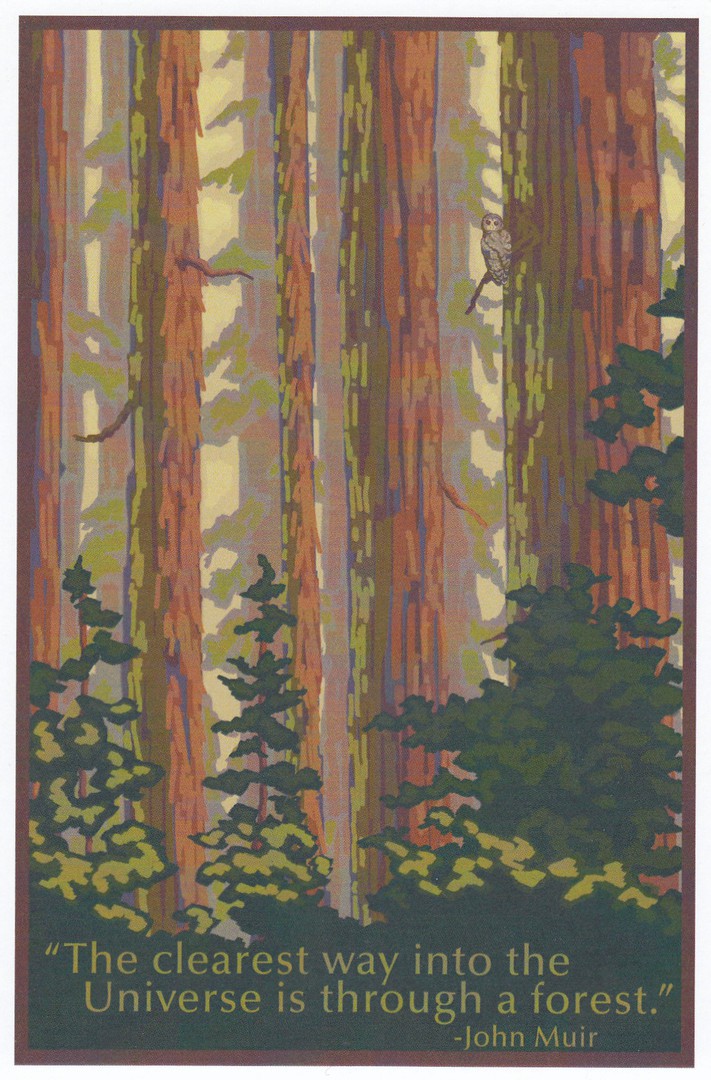
THE CLEAREST WAY INTO THE UNIVERSE IS THROUGH A FOREST – ‘John Muir’
NATIONAL PARK WPA SENTIMENT – THE CLEAREST WAY
Published by
LANTERN PRESS (ARTWORK)
Ref: Image # 52755
My favourite of these poster designs are the ones with wildlife in them. Some are obvious and stand out within the design, but this is not always the case as can be seen with this poster design. It was not until I came to write these up for placing on the webpage that I noticed that there is a large owl shown in the image. When I saw it, this image became even better for me.

WILDERNESS CALLING
NATIONAL PARK WPA SENTIMENT – WILDERNESS CALLING
Published by
LANTERN PRESS (ARTWORK)
Ref: Image # 52759
On this design the wildlife is immediately more obvious. Depicted here in this mountainous terrain is a Bighorn Sheep, a species native to Northern America. The artist involved in these designs is not named, which is a shame as their work here is superb.

WILD AMERICA
NATIONAL PARK WPA SENTIMENT – WILD AMERICA
Published by
LANTERN PRESS (ARTWORK)
Ref: Image # 52771
Possibly my favourite poster design in this collection, mainly, of course, because of the depiction of the black bear and its cubs. Again, the artwork here is superb and, across all the poster designs there is an American poster art style which seems, to me at least, to be ‘SO’ American. I really do like these cards.
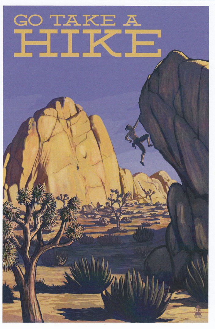
GO TAKE A HIKE
NATIONAL PARK WPA SENTIMENT – TAKE A HIKE
Published by
LANTERN PRESS (ARTWORK)
Ref: Image # 52752
This poster depicts someone doing a bit of free-climbing in a desert environment. I used to be a climber, I was also a climbing instructor and used to run sessions on an artificial climbing wall (there are no climbing places in Essex, so any local sessions had to be done on artificial wall. Fortunately, there were at least four in my local area at the time I was doing this). As a result, I do pick up any postcards which depict climbing in any way.
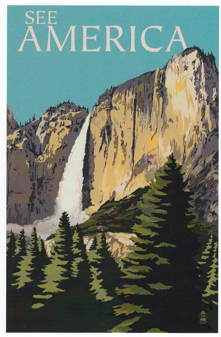
SEE AMERICA
NATIONAL PARK WPA SENTIMENT – SEE AMERICA
Published by
LANTERN PRESS (ARTWORK)
Ref: Image # 52758
This one has a certain ’Yellowstone Park’ feel to it in my mind. I have never visited this part of America (have always wanted too) but this type of waterfall and rock face, not to mention the conifer styled trees, always brings this sort of natural park to mind. This is a simple design but no less effective than the others.

WORLD’S BIGGEST TREE
NATIONAL PARK WPA SENTIMENT – WORLD’S BIGGEST TREE
Published by
LANTERN PRESS (ARTWORK)
Ref: Image # 52754
As this makes mention of the world’s biggest tree I can only assume that this poster depicts a giant sequoia tree. The type of tree it not named on this postcard but the species ‘Giant Sequoia’ are known to be the biggest trees in the world.
If I remember correctly, these were not cheap postcards (little rarely is at Disney), but I think they were worth the money ($2 each I seem to remember).
04/01/2018
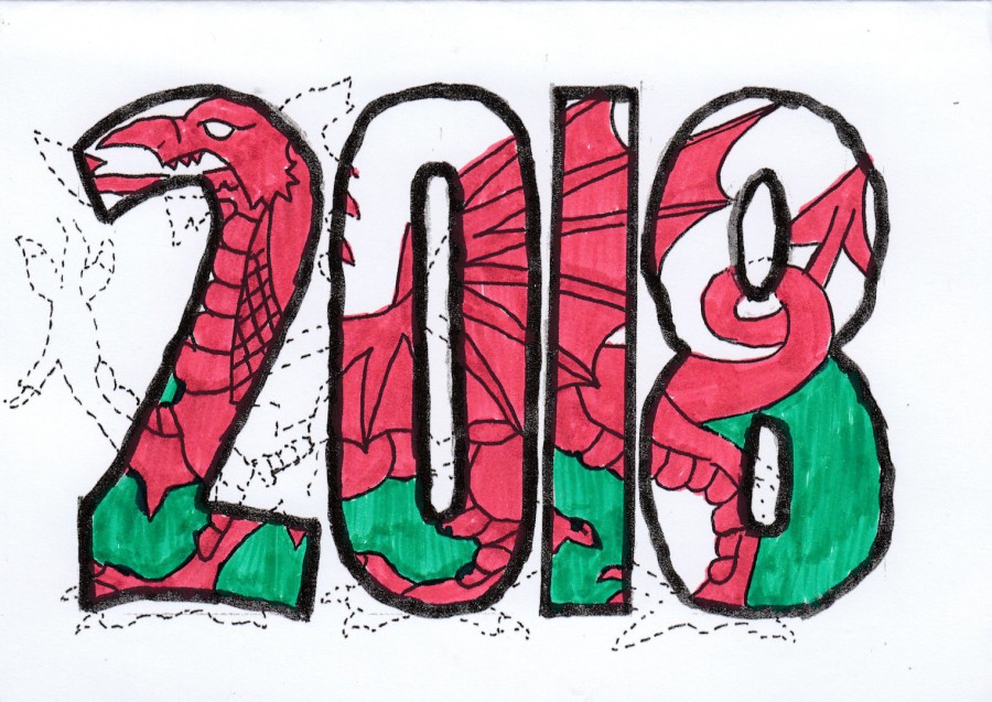
2018
POSTCARD – NEW YEAR 2018
Home Made Year Date Postcard
Welsh Dragon Design
Made by
David & Pat Rye
Dated cancel – 2nd Jan
I always enjoy receiving these hand-made postcards from David and his wife Pat. This one is another great design, and a very nice looking and clever one as well. I do have a thing for dragons, which as a theme were harder to seek out before the days of Harry Potter, and the Welsh Dragon always was a good source of related postcards for my collection.
This superb card here, arrived through the post this morning.
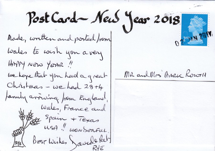
REVERSE SIDE OF ABOVE POSTCARD
You have got to love the Royal Mail. The 2nd Class blue Machin head postage stamp has been cancelled with a bulk mail usage single line cancel – which appears to me to be dated ’02 JAN 2017’ – Yep, 2017 – looks like Royal Mail have been so busy they have not yet realised it’s a new year! It made me laugh and adds a nice little bit of curiosity to the card as well, of course it could be an ‘8’ at the end of the year, but the smudged application ‘definitely’ makes it look like a ‘7’, oh dear, never mind, usually my mail quite often arrives with the stamps cancelled through with either a felt tip pen or a biro line through them. So, I think I should be happy that it received a proper cancel of some sort.