
12/05/2018
THE WISE KITTY
“LE CHAT SAVANT”
By
SAINT COME
Published by
GALERIE NAIFS ET PRINITIFS
Ref: SC 4
This is an older modern ‘cat’ themed postcard. I am still finding new ones (some will appear on the webpage), but I wanted to show an older artist drawn one, one from the era where there were new cat postcards every month! Those were the days.
12/05/2018
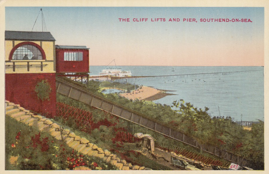
THE CLIFF LIFTS AND PIER,
SOUTHEND-ON-SEA
Anonymous Publisher
Ref: 423
Despite what it says here, using the plural ‘Lifts’, there has only ever been the one car, depicted here at the top of the cliffs (really a slope rather than a cliff, but all of this type of vehicles are known as ‘Cliff Lifts’, regardless of the slope they travel up and down). The one here in Southend has been in operation since 1912, with a pause between 2003, when the line was closed-down due to technical issues and refurbishments were required, and 2010 when it re-opened, delayed due to changes in the regulations which required further modifications. I have travelled in this lift many times and it is a well-known landmark here on our seafront.

REVERSE SIDE OF ABOVE POSTCARD
12/05/2018
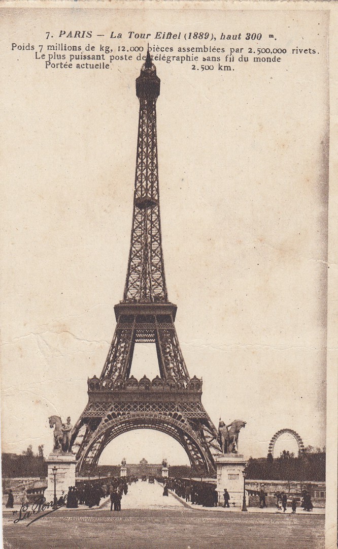
PARIS
LA TOUR EIFFEL (1889)
Published by
PHOTOTYPIE PARIS BAUDINIESE
Ref: No. 7
I have collected Eiffel Tower postcards for many years and there can be no doubt that no other French structure, natural or man-made, appears on ore postcard issues than this. For any collector of Eiffel Tower postcards there is two bonus’s, firstly the aforementioned fact that there are so many out there, and secondly, because of their commonality, they are also extremely cheap, in most cases (the real exception on value is where they have Cinderella labels attached where they have been posted from the top of the tower, but even these are not very expensive, even the really early ones – I have a collection of these cachets and will post images of some of these on the webpage in the future).
This one is from the early 1900’s, but post 1902 definitely because of the style of the reverse side which is a divided reverse layout.
12/05/2018
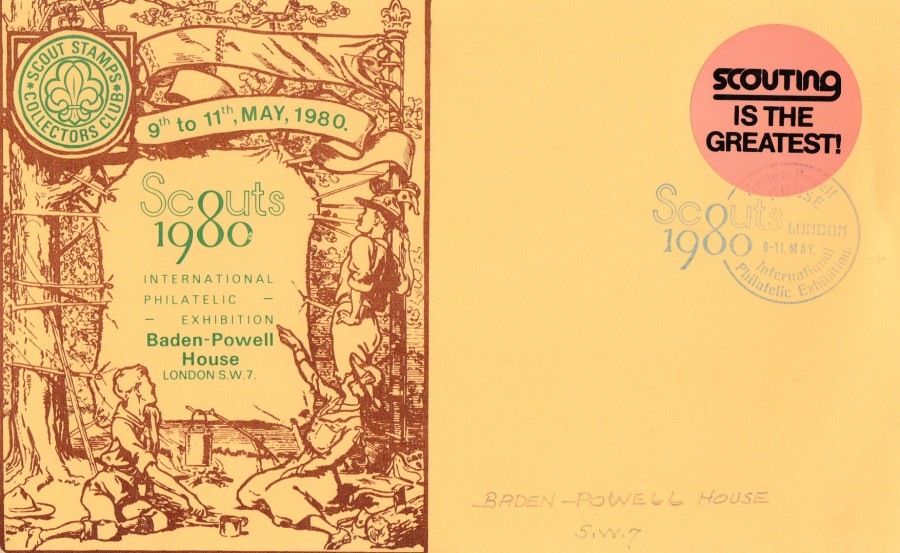
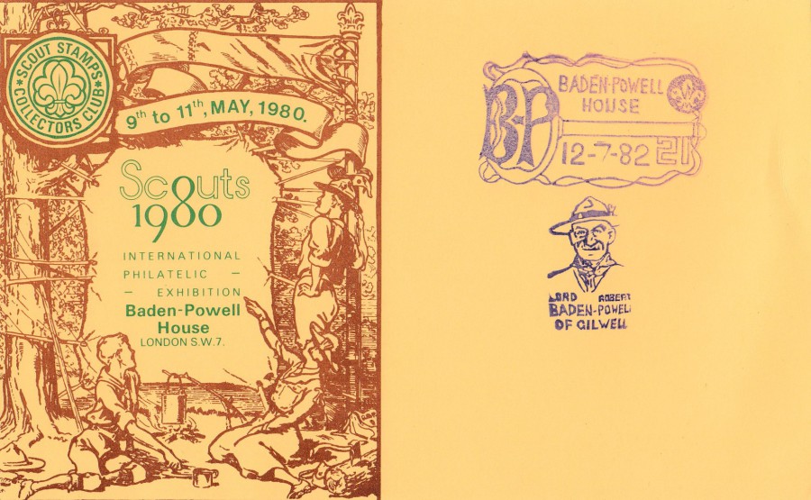
SCOUTS 1980
INTERNATIONAL PHILATELIC EXHIBITION
BADEN POWELL HOUSE, LONDON S.W.7
9TH – 11TH MAY 1980
Published by
SCOUT STAMPS COLLECTORS CLUB
This a very large plain baked card, as is so often the case with scout themed philatelic cards (I have mentioned this before, I know). Someone has applied a ‘SCOUTING IS THE GREATEST!’ sticker top right which has been struck with the events cancel/cachet; ‘BADEN POWELL HOUSE / LONDON / SCOUTS 1980 / INTERNATIONAL PHILATELIC EXHIBITION / 9 – 11, MAY, which has been struck in blue ink.
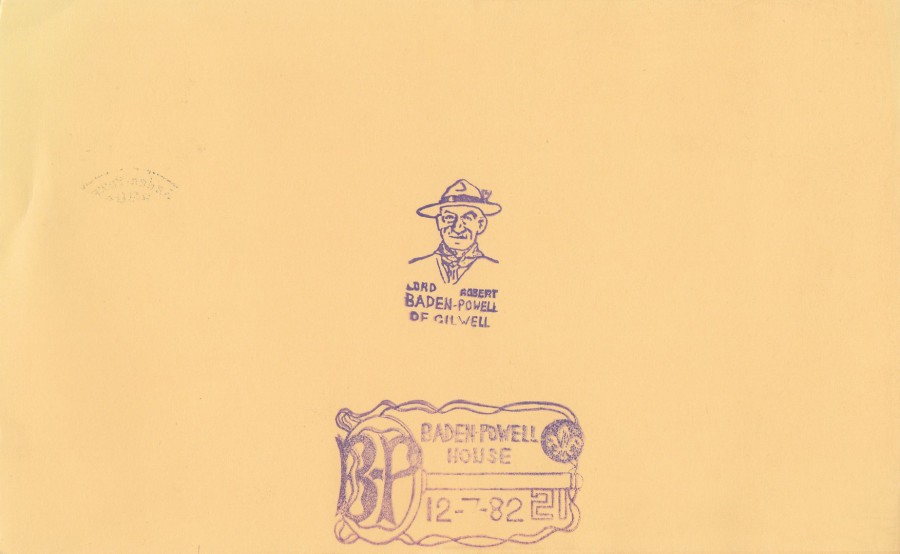
REVERSE SIDE OF ABOVE LARGE POSTCARD
This side has received two scouting themed cachets. The first is one depicting the head of Lord Baden Powell himself; ‘LORD ROBERT BADEN-POWELL OF GILWELL’, which has been struck in purple. The second cachet is also in purple and this one is a dated cachet; BADEN-POWELL HOUSE / BP 21 / 12 – 7 – 82, this is clearly a date beyond that of the reason for the cards issue, the exhibition in 1980, so must have been applied a couple of years later.
SCOUTS 1980
INTERNATIONAL PHILATELIC EXHIBITION
BADEN POWELL HOUSE, LONDON S.W.7
9TH – 11TH MAY 1980
Published by
SCOUT STAMPS COLLECTORS CLUB
A second copy of this large postcard but this time used with the two purple cachets applied to the reverse side of the above postcard placed on the front. This one has not received any cachet or hand stamp applied which relates to the 1980 exhibition.
10/05/2018
On Friday (tomorrow) I shall be attending the Woking Postcard Fair – I will hopefully be posting some images from the fair on the facebook page. Depending on what time I get home there may or may not be a posting tomorrow, but hopefully I will pick up some nice new postcards to show you over the following weeks, fingers crossed.
10/05/2018
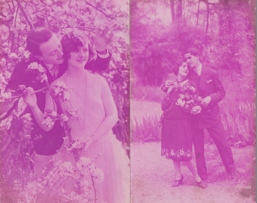
UNTITLED
LILAC TINTED
FRENCH PHOTOGRAPHIC POSTCARDS
FAR LEFT
Published by
P – C PARIS
Ref: 2351
NEAR LEFT
Published by
LEO PARIS
Ref: 1193
For some reason this trend of toning the entire image lilac was popular during the late 1920’s. Other colours were also used, like blue, but this shade of lilac appears to have been the most popular. The images used were nearly always romantic themed photographs either showing couples, like these two examples, or sometimes a single female, often looking wistfully off into a corner of the card. The postcards are more unusual these days than valuable, and copies can often be picked up for just pennies, although I think they have their place in the history of the postcard.
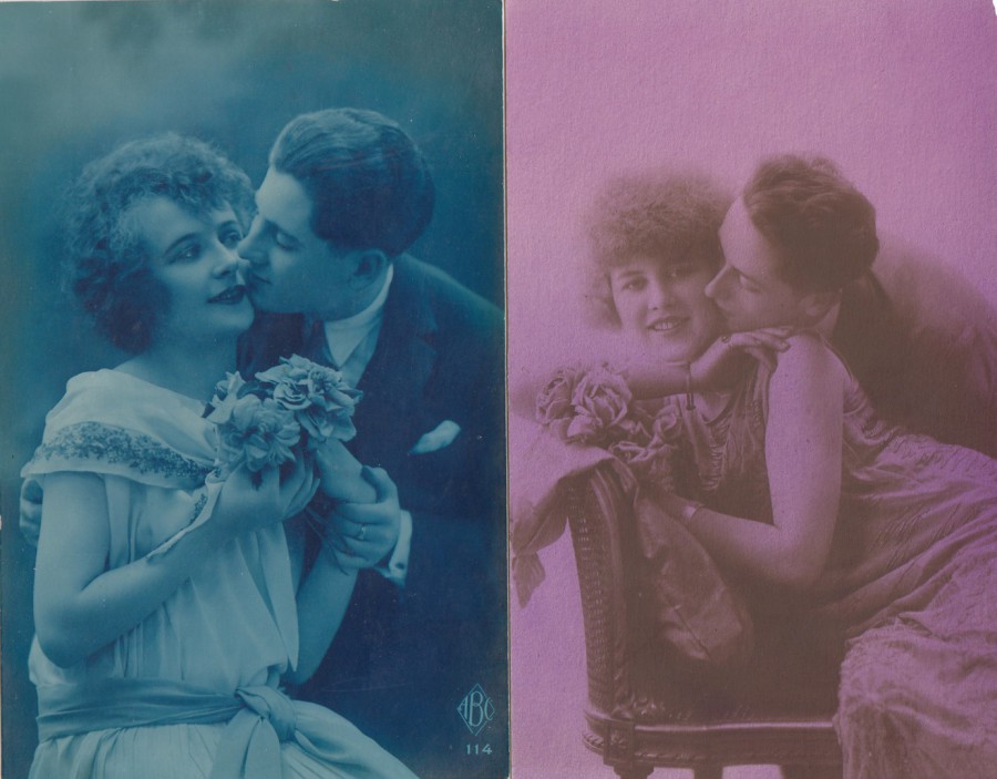
UNTITLED
TINTED
FRENCH
PHOTOGRAPHIC POSTCARDS
FAR LEFT
Published by
ABC
Ref: 114
An example of a Blue Tinted Photograph
NEAR LEFT
Published by
DOUNO
Ref: 410
Two more couples including a couple on a blue tinted version as mentioned in the above block of text. Beside this is another of the more popular, apparently, lilac tinted photograph. The 1920’s appear to have been a popular era for the romantic postcard, especially the ones like these depicting an adoring couple.
10/05/2018
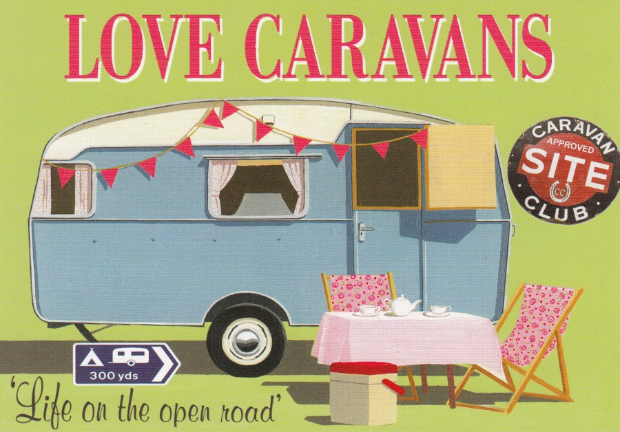
LOVE CARAVANS
“LIFE ON THE OPEN ROAD”
‘RETRO DAYS’
From an original design by
MARTIN WISCOMBE
Published by
J. SALMON LTD
Ref: 09/80/05/25
This is from a series of slightly larger than normal sized postcards with a holiday / caravan / camping theme. This one clearly in the ‘Caravan’ section of this series. I have had a couple of caravan holidays, but that was some years ago now, but I did enjoy them. This card is currently on sale in my home town.
09/05/2018
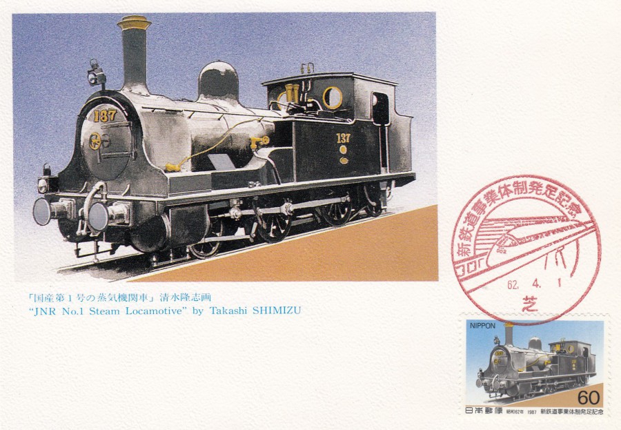
JNR No. 1. STEAM LOCAMOTIVE
By
TAKASHI SHIMIZU
Published by
JAPAN STAMP PUBLICITY ASSOCIATION
Ref: NO. 575-B
“Two 60 Yen postage stamps will be issued on April 1, 1987 to commemorate the inauguration of New Railway Sytem”
This is an official stamp postcard issued by the Japanese stamp authority and which depicts the artwork of the train that is used on the stamp which has been applied bottom right and cancelled, probably first day of issue, but not confirmed, with a red bullitt train like special cancel. A second stamp was also issued at this time and there may be a companion card to this one for that second stamp.

09/05/2018
Some new additions have been added to the Books listing – click on the BOOK LISTING tab and then the BOOKS 2 tab to view new images
09/05/2018
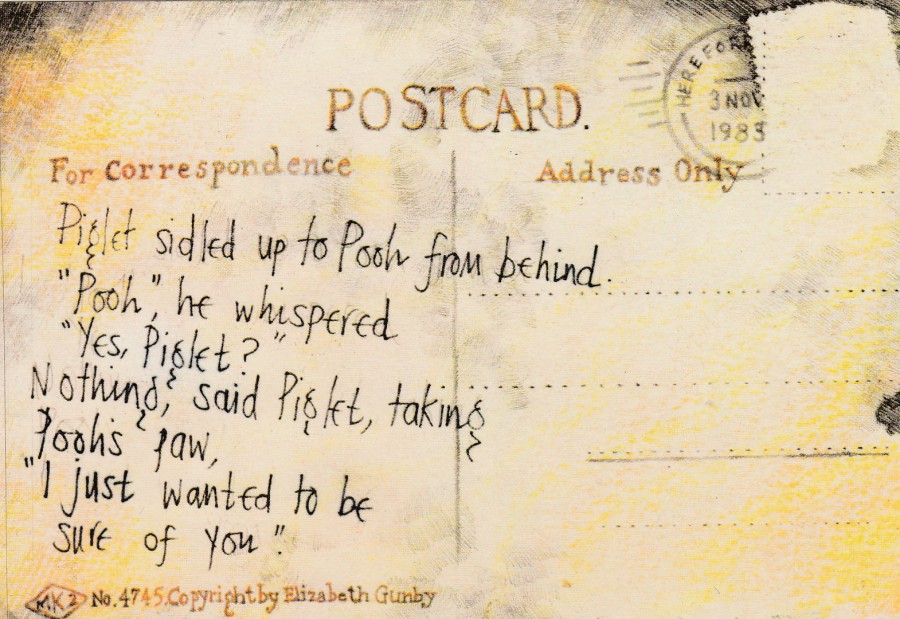
“I JUST WANTED TO BE SURE OF YOU”
By
ELIZABETH GUNBY
Published by
ARTIST’S CARDS
Ref: No. 140
When I first saw this postcard, and the one depicted below, I thought they were fantastic. These paintings, both of which are Winnie the Pooh themed, with quotes from the book, are clever designs using the postcard format as the main design of the image. I love these postcards, which were issued in the late 1980’s if I remember correctly, but I rarely see them on dealer’s stalls these days. I really like the idea of the artwork of a reverse side of a postcard becoming the front of a proper postcard release!

“PROMISE YOU WON’T FORGET”
By
ELIZABETH GUNBY
Published by
ARTIST’S CARDS
Ref: No. 75
If you have either of these cards it is a must to also have the other as the two cards fit together so well and should ‘definitely’ be considered as a pair. My congratulations go out to Elizabeth Gunby for coming up with such an original concept.
09/05/2018
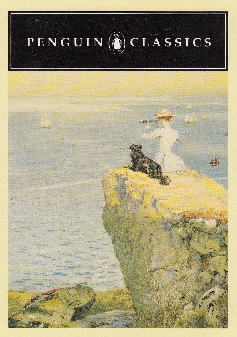
PENGUIN CLASSICS
THOMAS HARDY IN PENGUIN
“A PAIR OF BLUE EYES”
Postcard shows a detail from ‘A CLOSE WATCH’ by E. F. BREWTNALL
This was originally a free advertising postcard given out in bookshops to promote the Thomas Hardy books published under the Penguin Classics heading. It is a lovely postcard and it is a good example of how one postcard can cross over so many collecting themes, such as: Books, Advertising, Ships, Dogs and of course Art. I have had this card in my collection for many years, I think it originated sometime in the 1990’s.

REVERSE SIDE OF ABOVE POSTCARD
09/05/2018
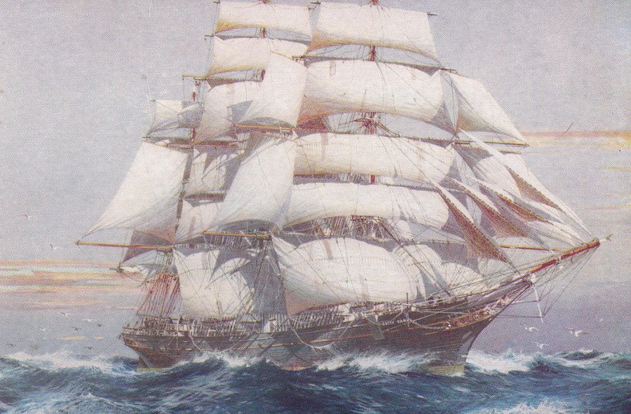
CUTTY SARK
By
JACK SPURLING
Published by
CALENDAR’S OF DISTINCTION LTD., LONDON
This is a lovely painting of what is a famous tall ship, and one which has had a tragic recent history after it caught fire whilst on permanent display at Greenwich, London. The 2007 fire near gutted this historic ship, but it was extensively rebuilt and eventually re-opened again as a tourist attraction. I visited it as a child and got to walk around the original structure, long before the fire, and have a postcard somewhere which I bought on that trip. This card here was a recent buy, but to be honest I bought it for something on the reverse side.
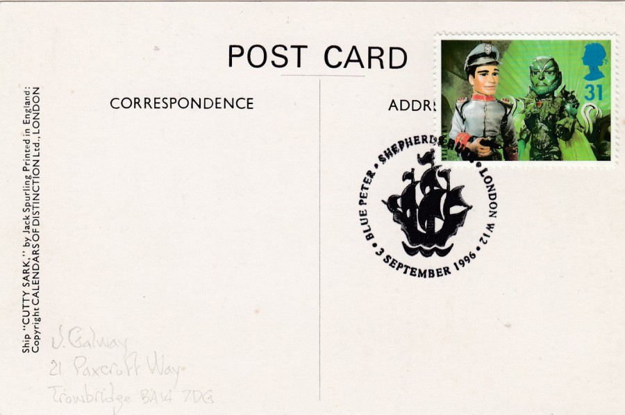
REVERSE SIDE OF ABOVE POSTCARD
Someone has applied the 31p stamp from the ‘50th Anniversary of Children’s Television’ 1996 stamp set and had this cancelled first day of issue with the ‘BLUE PETER / SHEPHERDS BUSH / LONDON W12 / 3 SEPTEMBER 1996’ special hand stamp which features the tall ship logo from the Blue Peter children’s programme (one of the best-known children’s television programmes here in the UK). The 31p stamp features characters from the Gerry Anderson puppet series ‘Stingray’ (Troy Tempest and Titan – Stingray was the first UK series ever to be entirely filmed in colour – this was so that it could be sold and shown in the US markets where colour was far more common and a major selling and distribution bonus. A bit of TV history there for you!). This card I bought for my television collection rather than my transport collection.

09/05/2018
MOOMIN CHATACTERS [CHARACTERS]
(MOOMINMAMMA)
Published by
KARTO
Ref: 47-60507
(Original retail price 1.30 euro)
The handbag beside the bed tells you that this is Moominmamma, one of the well-known characters from the Moomin stories by Tove Jansson. These famous story book characters originated in Finland in books written and published in Swedish. Over there they are still extremely popular and as a result many postcards are issued which depict the drawings which illustrate the original books, and many more which show the updated modern versions. This image is one of the original drawings by Tove Jansson. I have a reasonable collection of Moomin related postcards and one thing I can say about them is that they are never cheap!
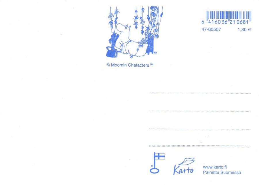
REVERSE SIDE OF ABOVE POSTCARD
I do like it when the reverse side of cards also catch the eye. Here they have again reproduced the front drawing at the top in the centre and have used blue ink printing which again is different enough to make the cards appealing.

09/05/2018
BRINGING THEM HOME
HEAL OUR PAST – BUILD OUR FUTURE
Artist
RIKI SALAM
Published by
AVANTCARD AUSTRALIA
Ref: #20651
Issued 2017
“Commemorate the 20th Anniversary of the Bringing Them Home report which extensively documented the experiences of our Stolen Generations.
Stop, remember, and understand. Take positive action for Stolen Generations members and families.”
(Text from reverse side of Postcard)
The ‘Bringing them Home’ report came out in 1997 and it was a report of the National Inquiry into the Separation of Aboriginal and Torres Strait Islander Children from their families’. I have recently read about this terrible forced removal of children from their parents, all done in some belief that the children would receive a better life away from their parent’s situation, in Bill Bryson’s book ‘Down Under’. This report, into the removal of the children, concluded that the indigenous families and communities in question endured gross violations of their human rights. It went on so far as to say that they were an act of genocide, aimed at wiping out indigenous families, communities, and cultures, vital to the precious and inalienable heritage of Australia.
The artwork used here on this card is very Aboriginal in its style and composition and is by the well-known Australian indigenous artist Riki Salam. I loved this artwork and have always loved the Aboriginal style of painting and design, the historical old rock paintings through to the modern interpretations and paintings being done today.
07/05/2018
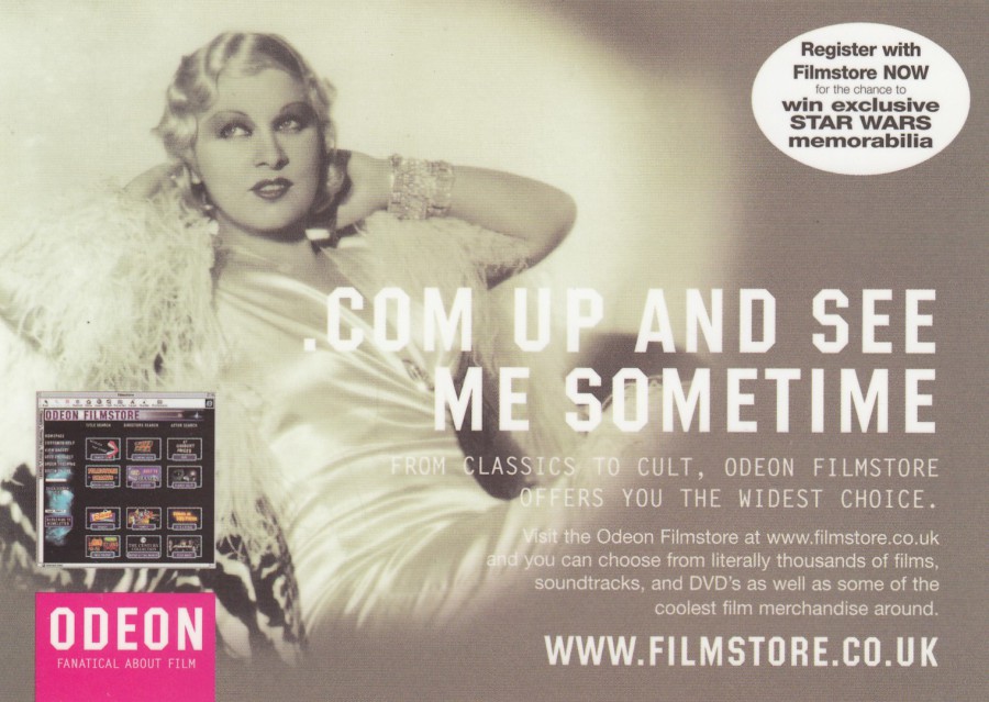
.COM UP AND SEE ME SOMETIME
ODEON – FANATICAL ABOUT FILM
Published by
The Odeon Cinema Company
A nice free postcard image of Mae West and one which uses a pun on her most famous film quote “Come up and see me sometime”. As a collector of film related postcards, I was pleased to find such a modern card featuring such an iconic film actress from an earlier age, remember she started out in 1907, although her real film career did not start until she was offered a motion picture deal by Paramount Pictures in 1932, when she was close to 40. Her last film was in 1978, although this was long past her prime feature film years.
07/05/2018
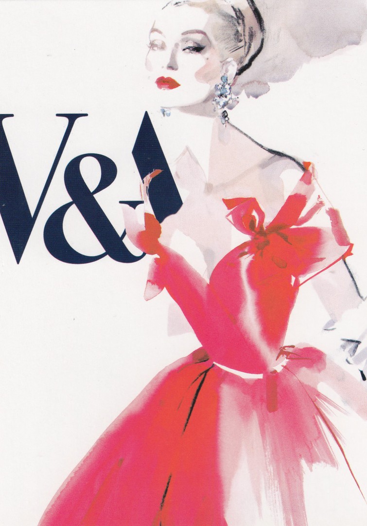
THE GOLDEN AGE OF
COUTURE
PARIS AND LONDON
1947 – 1957
Published by
BOOMERANG MEDIA
This is an advert card for a V&A Museum (Victoria and Albert) exhibition which ran between 22nd September 2007 and the 6th January 2008. It was described on the reverse side of this postcard as “a stunning exhibition looking at the secret world of couture, illustrated with fabulous period gowns by designers such as Dior, Balenciaga and Givenchy”. I think this exhibition poster design, designed by David Downton, is a great piece of advertising poster artwork. This was of course originally free in the Boomerang racks, but I found my copy in a 20p box at a postcard fair and was happy to pay this for what is a modern specific piece of museum exhibition poster artwork.

07/05/2018
TRAVELLING IN MY WORLD
By
Tehanne Weyman
Published by
CORRESPONDANCES
(Printed in France)
Ref: TV 148
LARGE POSTCARD
There are still some lovely artist designed postcards being produced, and sold in France. Many are issued just because the designs are appealing and for no other reason, and this is a good thing. It just needs people to continue to buy these so that the companies making them continue to do so.
When I saw this postcard on sale in the French town of Saintes I was initially surprised to see a traditional (and now of course historic) red UK telephone box, and as the text is in English I must assume that the artist is also, probably, from the UK – so it is a good thing that a French company has the foresight to publish this postcard and distribute it for sale in France.

07/05/2018
WHITE TIGER BODY
3D LENTICULAR POSTCARD
Published by
DELUXEBASE LTD (UK)
Ref: 3767 LIVELIFE POSTCARD
Some of these 3D postcards can be truly spectacular, and as you will know by now I can not resist tiger themed postcards, and this one is a real cracker. White tigers are a little less common than the better-known varieties with the orange and black banded coats, but there is something about the white coated tigers, something ‘more-ghostly’ in the way they move and how they still blend into the landscape. I will accept any new Tiger postcard into my collection, but really good ones are always a bonus.

07/05/2018
SUPER SLOTH
“I WIL RESCUE YOU AT MY OWN PACE”
By
Katie Abey
Published by
WHALE & BIRD
Ref: KAPC027
This was a recent acquisition, and from a company I don’t think I have heard of before. It is also yet another new card appearing in the ‘paperchase’ stationery shops. I find pleasing that simple comic designs like this are still being released.
07/05/2018
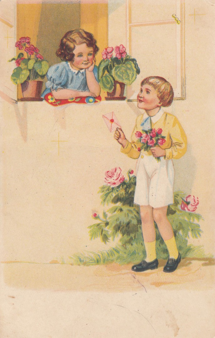
UNTITLED
‘CHILDREN, FLOWERS & LOVE LETTER?’
Anonymous Publisher
(Printed and distributed in France)
Ref: 180
There is very little printed information on this early French postcard, although there is the written date on the message of 12th June 1940. This is just a month after the German invasion of France during WWII, and if I have got that date correct this was just one day before the Germans occupied Paris. So, this message was written at a very important time in the early days of the French/German WWII story. As I am writing this Jo is translating the message (so this should appear below). History is often contained in the simple messages we exchange. Historians who study the ancient history of our world often only have the writings of the time to use to obtain their information. With more modern history, as in the past 120 years, historians of any part of this era have the hoards of saved postcards to use to gain the understanding of those who were corresponding with family and friends during these times. Much of these postcards though go unrecorded so I am looking forward to seeing what this one says.

REVERSE SIDE OF ABOVE POSTCARD
Translation (a rough one)
“LA REIVERE [this we believe is a location somewhere just north of the Bordeaux region of France and would have been from where this card was sent] 12TH June 1940.
Hello my little father and best friend. We come from receiving a letter of yours of the 10th. We are at the school eight hours a day, but we do not have the school this evening as it is the school of refuges [probably from Paris as this we believe was on the route from Paris to Bordeaux where the Paris government moved to just before Paris was over run].
At the school on Thursday Sanfare [possibly someone’s name] was at the hunt yesterday and didn’t come back [ was the hunt the German advance down from Paris?].
I had not received my Meick [? Not sure what this relates to – possibly someone’s name?] by today. I hope to receive him this afternoon.
There are refugees from Paris at Chez Bouffard [this appear to be in Bessac on the road from Paris just north of Bordeaux - this would make sense as this was the destination of the French Government]. Monsieur Ci Messand (?) has come here yesterday. It does not have the biggest chase, [we think this refers to this card being chased down in the post by the German army heading in the same direction] and hoping you to read it this afternoon.
Receive my best wishes”
(Not sure on the signature here - Jo thinks its a girl called Tsertiand, whilst I think it could be a male and named Berteand)
There is a lot of interest here, especially the references to the refugees, and specifically refugees from Paris. To me this is a piece of WWII history and not just a very interesting pictorial postcard.

07/05/2018
1776
AMERICA’S AWARD WINNING
MUSICAL
BEST MUSICAL: N. Y. DRAMA CRITICS AWARD
BEST MUSICAL: TONY AWARD
46TH STREET THEATRE
“Bids fair to become one of Broadway’s all time hits – Readers Digest”
Official Postcard – Anonymously printed/published
Posted 1970
1776 was a musical based around the signing of the Declaration of Independence. The musical premiered on Broadway in 1969 and had an amazing 1,217 performances. In 1972 it was turned into a feature film and the musical itself was revived in 1997.
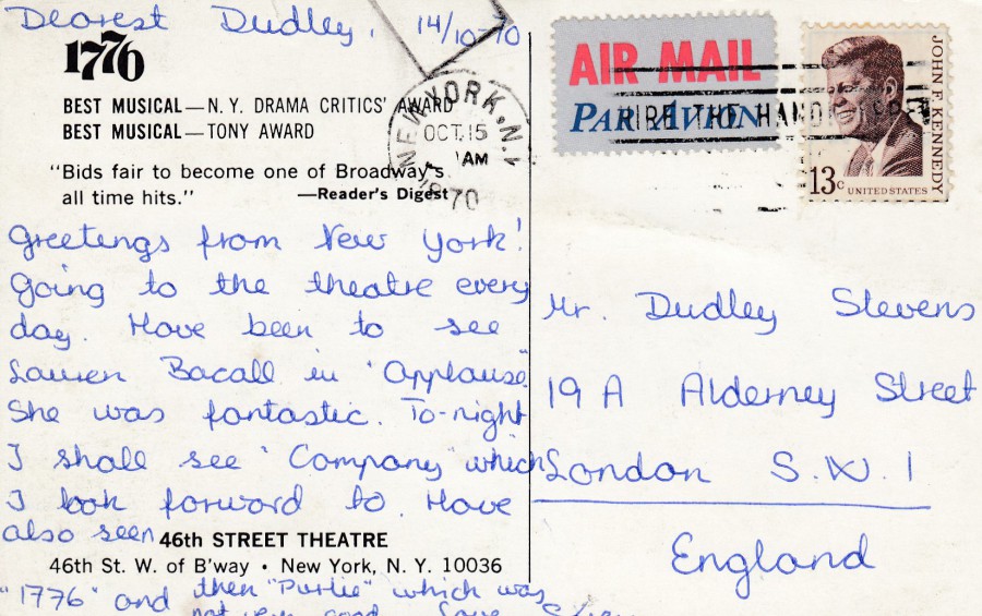
REVERSE SIDE OF ABOVE POSTCARD
Used with a 13c John F. Kennedy postage stamp
15th Oct 1970
06/05/2018
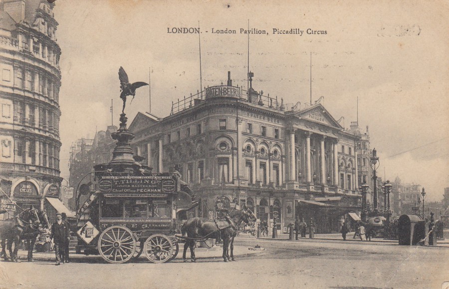
LONDON
LONDON PAVILION
PICCADILLY CIRCUS
Anonymous Publisher
Although this postcard was posted in 1910 the photograph that appears on this postcard looks older to me. It is a lovely photograph of the area with a smashing horse drawn carriage. There is a lot of early history contained here, and that is what I really like about these early photographic image postcards.
REVERSE SIDE OF ABOVE POSTCARD
This card was posted to Paris from London with the ½ d postage stamp being cancelled with a LONDON 39 cancel dated 19th September 1910. This was not enough postage to cover postage to France and therefore a French postage due stamp was applied to cover the value of 10 centimes (SG D298 – first issued 24/12/1893). I am fond of postcards which have received ‘Postage Due’ stamps, it is a form of postal history I find fascinating, but not that common. This one is a superb example.

06/05/2018
NOTRE-DAME DE PARIS
Anonymous Publisher
This is an old undivided back postcard release from France, from around the 1900 – 1904 period, possibly a year or two earlier but I think this card is from after 1900. Although this is definitely an early postcard it is not a valuable one, at least money wise. This is because it depicts a building which has appeared on hundreds of thousands of postcards down through the entire history of the picture postcard, and it still appears on many every year. So, as with many well-known buildings around the world, especially ones which have existed throughout the years that postcards have been issued, they do not raise much money, because there are so many postcards of them. The Notre Dame Cathedral is certainly one of these structures.
REVERSE SIDE OF ABOVE POSTCARD
06/05/2018
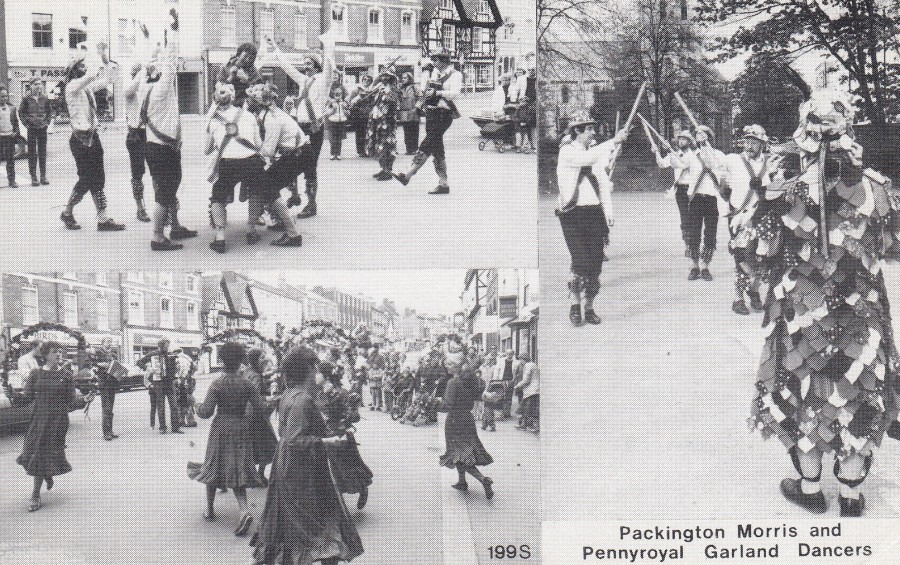
PACKINGTON MORRIS
AND
PENNYROYAL GARLAND DANCERS
Published by
J/V POSTCARDS
(VILLAGE SERIES)
Ref: 199S
Is there anything more British than Morris Dancers? No, I think not, although I had not herd of the Pennyroyal Garland Dancers before obtaining this postcard depicting them. Although not as generally collectible as their disaster, miners strike and other more topical postcard issues the ones in their ‘Village Series’ are often much harder to source, and I suspect were issued in quite small print runs and only sold locally within the depicted villages on the individual postcards.
05/05/2018
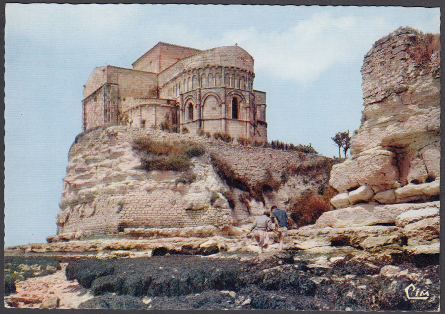
L’EGLISE DE TALMONT
(17. CHAR.- MAR)
The Talmont Church
(17. Charante Maritime [French region])
Published by
COMBIER IMPRIMEUR MACON
Ref: E. CI. 899
Talmont church is a lovely structure located right on the very edge of land immediately beside the sea (it is seaweed which can be seen across the rocks in the foreground looking so dark). I have visited this church a couple of times now and really like it here. Talmont is about 45 mins drive from where my in-laws house is located, in France (which I have often mentioned here). This postcard here was a recent buy but not from Talmont as it is at least five years, probably a few more, since I have visited here. This card was bought at an antique’s shop elsewhere in France. I bought it because of my love of this small tourist location and this superb church.
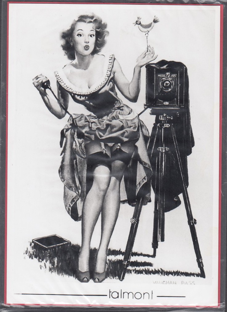
TALMONT
Published by
EDITION LA PHOTOGRAPHIE PIM
COZES – TALMONT
When I last visited Talmont, which as mentioned above was many years ago know, Jo thinks it must have been at least seven years, there was a small specialist photographic shop which sold exclusive postcards which were black and white photographs attached to a red piece of card which had a full reverse side postcard printing. These cards were all contained within a cellophane bag, as you can see here in this image my card is still in this bag. I wanted one of these for my collection, although if I remember correctly they were a little more expensive than normal postcards, but so unusual in their design, and clearly unique items to this single shop, that any postcard collector would want an example. Although many were old views of the surrounding area there were also a few more unusual drawn images like this one, which I am certain was chosen because it was a photograph themed image. So, this is the example I ended up with.
I hope very much to return to Talmont early this summer. I will check and see if this specialist little shop has survived. If it still there I will buy at least one more example and place it here on the webpage.
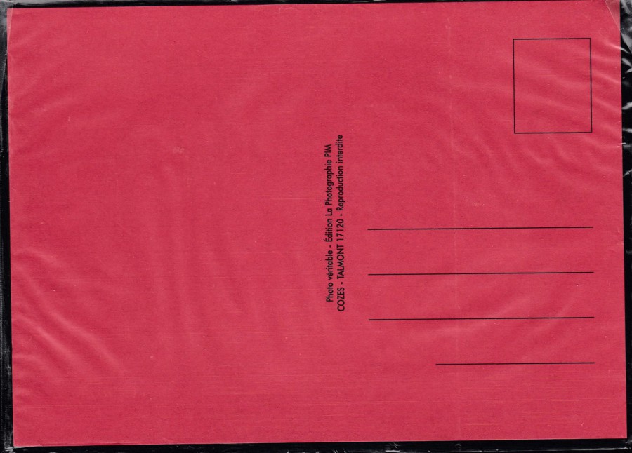
REVERSE SIDE OF ABOVE POSTCARD
Still in its cellophane sales bag
05/05/2018
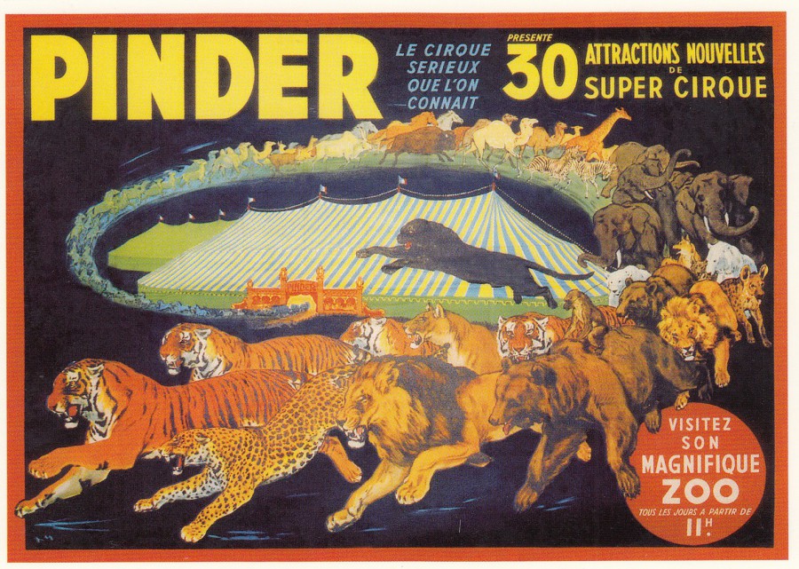
CIRQUE PINDER
Pinder Circus poster
Published by
CENTENAIRE EDITIONS
13, rue Rabelais – 1700 SAINTE – FRANCE
Ref: 01 (Pinder Circus series)
(This is the series of postcards which I discovered in the town of Sainte, which is located close to where my In-Laws house is located, in Venerand, France. The cards depict old adverts from all periods, but I particularly like the ones from the 1950’s, 1960’s and 1970’s, and those depicting farm equipment & vehicles, Cards, Vans, Motorcycles and other forms of transport – many of which I have not seen on postcard before. I also like the fact that these postcards were locally published in Saintes. I like this series a lot and I have previously posted some examples)
This is a cracking circus poster design. Now days I fully understand and support the ‘ongoing-protests’ against live animal circus acts, as I clearly believe and can see that the animals involved are often not kept in the best conditions and are harmed in some of the training involved, but despite these current views I am still a child of the 1970’s who visited many a circus and saw many animal circus acts. As a child I was unaware of the controversial side of these acts, so I enjoyed them and as a result I love circus poster art, especially the earlier ones and those which depict the animals involved. This one is a superb poster, and it also fits nicely into my Tiger themed collection as well as four are included amongst this extensive menagerie.
05/05/2018
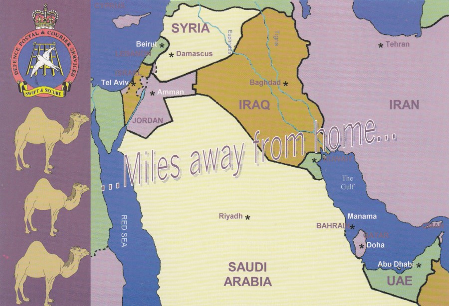
BRITISH FORCES
“…MILES AWAY FROM HOME…”
Official British Forces Iraq Field Post Card
Published by
DEFENCE POSTAL & COURIER SERVICES
This great map postcard, with its camels was issued to British forces soldiers serving in Iraq during the deployment there in the early 2000’s. It was an official postcard only available to serving soldiers with the one exception of a small number cancelled especially for sale at the Stampex Exhibition in what I believe was 2004. The cards were stamped and cancelled on the reverse side with a ‘FORCES POST OFFICE 133 – 22/APR/2004’ on a 1st class Queens head Machin definitive postage stamp, if I remember correctly the cancel 133 was the one allocated and used at Baghdad.
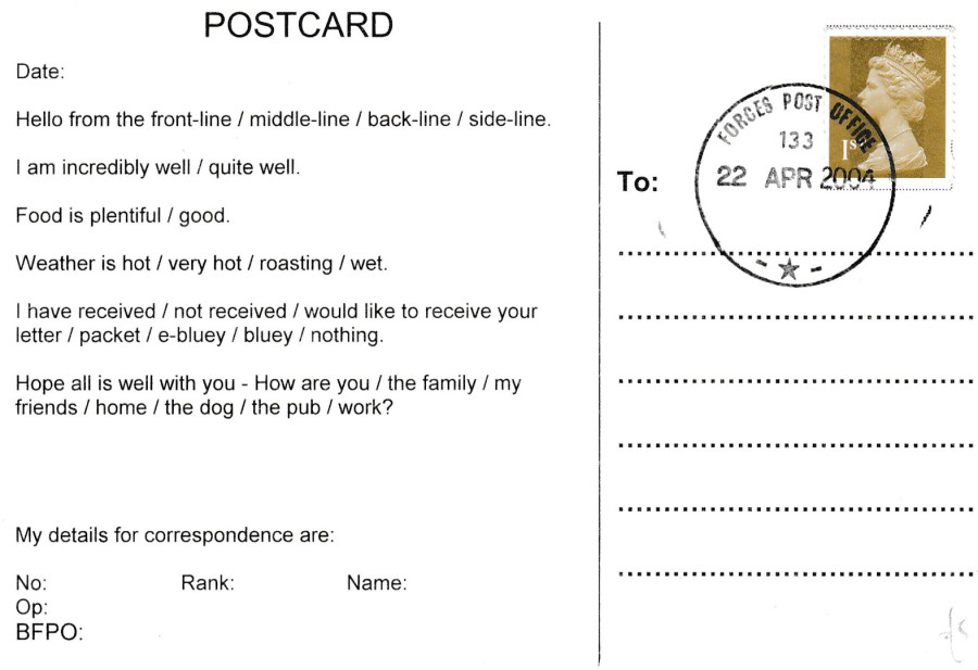
REVERSE SIDE OF ABOVE POSTCARD
Used with Forces Post Office cancel – 22 APR 2004

05/05/2018
THE QUEEN’S VISIT TO LEICESTERSHIRE
FRIDAY, 17TH NOVEMBER 1989
Published by
J/V POSTCARDS
Ref: 1123S
“H.M. The Queen followed by Lady-in-Waiting Lady Elton, arrives at the East Midlands International Airport, to be met by the Lord Lieutenant of the county, Timothy Brooks.”
(Text from reverse side of postcard)
One of the many black and white topical event based photographic postcards issued by this superb little company (based in the Nottingham area) during the 1980’s. Although they ceased trading many years ago, after the sad death of one of the two founding members, their postcards, especially the mid 1980’s Miners Strike examples, and their airplane and train crash photographic news ones are very collectible. Their style of publishing photographic images of recent (then) news events was very reminiscent of the old ‘Golden Age’ publishers back at the turn of the last century.

REVERSE SIDES OF TWO COPIES OF THE ABOVE POSTCARD
Because this card featured the Queen, and that I had some doubles with which to play, I decided to have each of these two initially used with a different 24p ‘40th ANNIVERSARY OF THE ACCESSION’ 1992 issued postage stamps, both cancelled with different first day of issue hand stamps:
TOP POSTCARD: ‘QUEEN ELIZABETH II / 40 YEARS / TV TIMES / HAPPY AND GLORIOUS / 06-02-1992 / LONDON SW1’, the TV Times was a national TV listings magazine (so a nice television touch here for my television themed collection).
BOTTOM POSTCARD: ‘FORTIETH ANNIVERSARY OF THE ACCESSION / LONG LIVE THE QUEEN / 6TH FEBRUARY 1992 / BUCKINGHAM PALACE / LONDON SW1’ which was a nice related first day of issue hand stamp, especially with the Buckingham Palace connection.
Then, four years later, I realised that there was to be some 70th Birthday special hand stamps related to the Queens then birthday in 1996. So, I applied the most recent issued royal mail 25p (then the 1st class value) stamp to each card, the 25p stamp from the ‘100 YEARS OF GOING TO THE PICTURES’ issue. I then had each stamp cancelled with a special 70TH Birthday special hand stamp:
TOP POSTCARD: ‘HAPPY 70TH BIRTHDAY / SANDRINGHAM / 21-04-96’ special hand stamp which has a crown incorporated in the shaped hand stamp
BOTTOM POSTCARD: ‘70TH BIRTHDAY EIIR / 21-4-96 / WINDSOR, BERKS’. I liked this oval heraldic design special hand stamp.
So, I ended up with two nice unique postcards for my collection. These are good examples of what you can do with a mixture of postcard, stamps and hand stamps. There is a lot of work involved with creating this type of philatelic collectible, but there is also a lot of entertainment in sorting it all out and what you end up with as an end-result. I hope you also like these.
05/05/2018
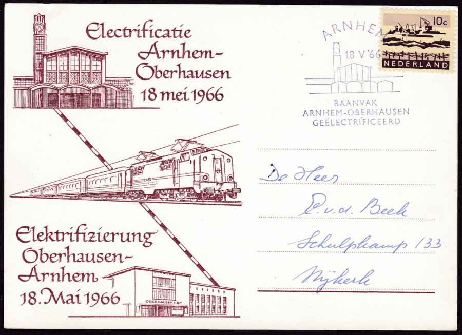
ELECTRIFICATIE ARNHEM – OBERHAUSEN
18 MEI 1966
Plain backed card
Electrification Arnhem – Oberhausen
18th May 1966
This interesting railway themed card celebrates the electrification of the railway line between Arnhem station in the Netherlands and the Oberhausen station in Germany, with the text on the front of the card being in both Dutch and German. The applied 10c Nederland postage stamp has been cancelled with a special related pictorial hand stamp:
‘ARNHEM / 18 V ’66 / BAANVAK – ARNHEM – OBERHAUSEN / GEELECTRIFICEERD’
The picture incorporated into the special hand stamp is the outline of the Arnhem railway station. This item would class as a philatelic card and would be collected by both postal history collectors and postcard collectors.
05/05/2018
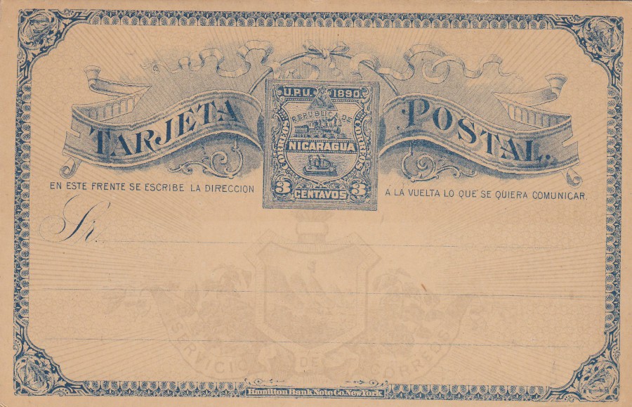
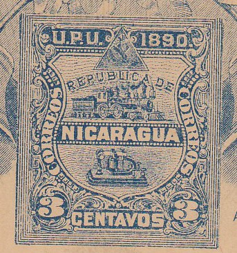
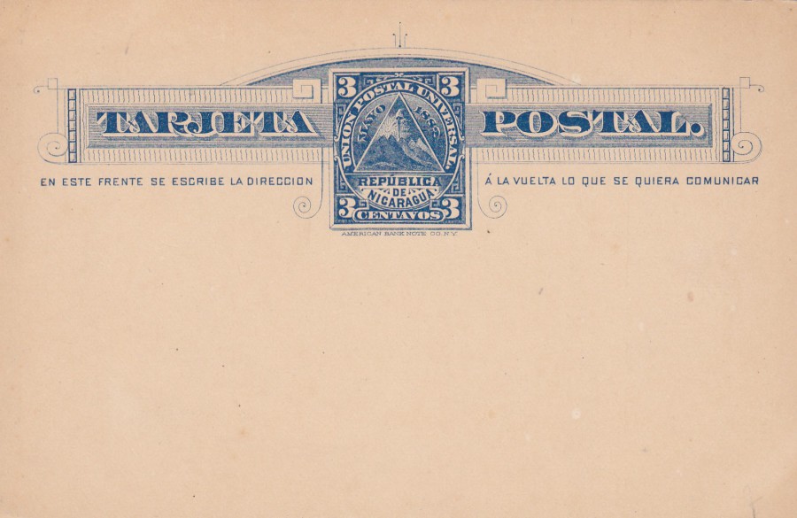
NICARAGUA
3 cent Blue on Buff card with grayish brown background
Coat of arms background over entire card (faded light background print)
Higgins & Gage, World Postal Stationery Catalog
Section 13
Nicaragua - Page 1
Reference No: 9
Issued 1890
I have a small collection of Nicaragua postal stationery post cards so thought I would show you some in this little section. On this card it is worth noting the background image of the coat of arms and the HAMILTON BANK NOTE C. NEW YORK printed across the centre bottom. As with many South American postal stationery cards these were printed and produced in North America. Also, if you look at the pre-printed stamp, placed in the centre top, you will see a small steam train which I always liked.
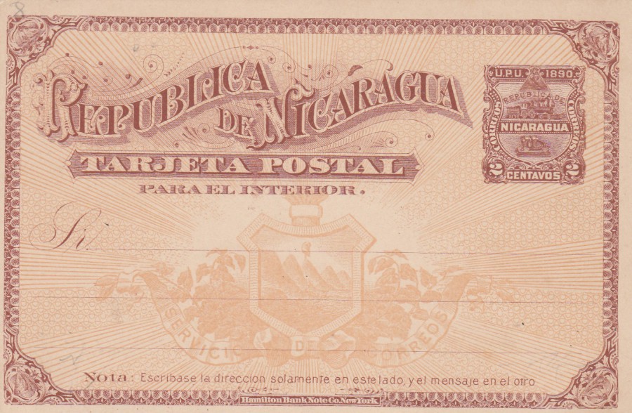
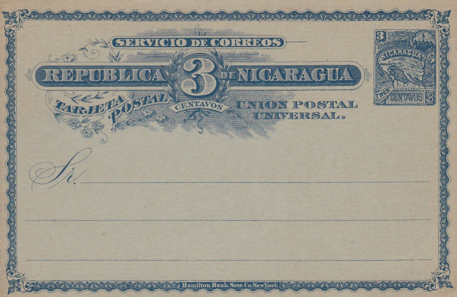
NICARAGUA
2 cent reddish brown on Buff card
Yellow brown background
Coat of arms background over entire card (faded light background print)
Higgins & Gage, World Postal Stationery Catalog
Section 13
Nicaragua - Page 1
Reference No: 8
Issued 1890
Issued at the same time as the above postal stationery post card this one here has a much clearer background outline of the coat of arms. On this issue the pre-printed stamp (again with the small steam train) has been placed in the top right corner in the more traditional location for the postage indicator/stamp.
NICARAGUA
3 cent blue on Cream card
Higgins & Gage, World Postal Stationery Catalog
Section 13
Nicaragua - Page 1
Reference No: 7
Issued 1889
This was the only value of card issued in this specific format
NICARAGUA
3 cent dark blue on light blue card
Higgins & Gage, World Postal Stationery Catalog
Section 13
Nicaragua - Page 2
Reference No: 33a (Type 2)
Issued 1896
The ‘Type 2’ version of this card is recorded as having complete shading in the central number ‘3’ and darker coloured areas in the corners of the main cross bar, as can be seen here.

NICARAGUA
2 cent dark blue on pink card
Higgins & Gage, World Postal Stationery Catalog
Section 13
Nicaragua - Page 2
Reference No: 32a (Type 2)
Issued 1896
Companion card to above
Again, this is a ‘Type 2’ printing
(distinguished by a lighter, smaller area of shading to the right side of the number ‘2’ (on the left side of card)
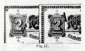
HIGGINS & GAGE PAGE SECTION
from the catalogue
Here the difference between the two ‘Types’ on the 2cents is depicted
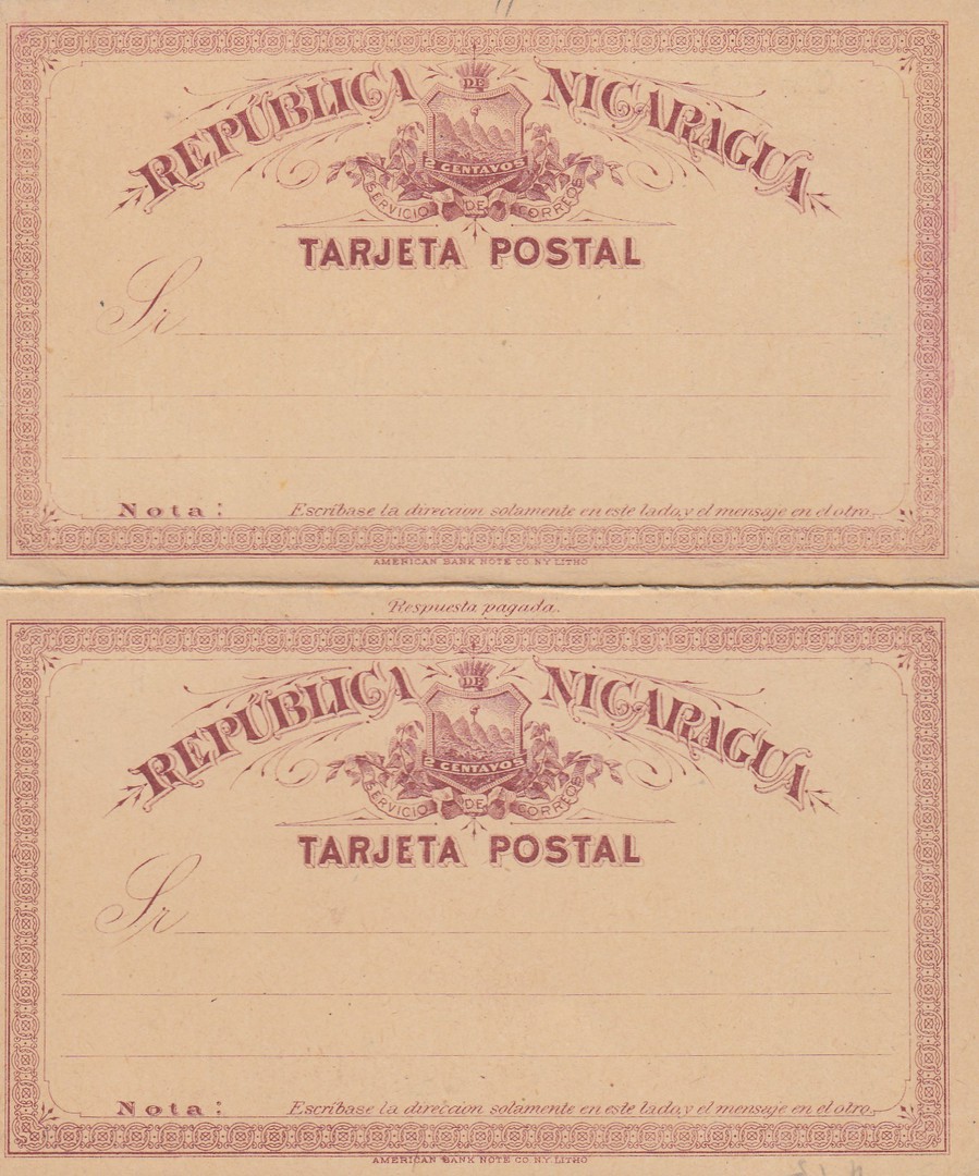
NICARAGUA
2 + 2 cent (Reply Card) red brown on buff card
TARJETA POSTAL
Higgins & Gage, World Postal Stationery Catalog
Section 13
Nicaragua - Page 1
Reference No: 4
Issued 1885
This is a two card ‘Reply Card’ postal stationery item and can be recognised by the ‘AMERICAN BANK NOTE CO. N.Y. LITHO’ text across the bottom of both card half’s. Also, the bottom card has ‘RESPUESTA PAGADA’ in small text across the top.

NICARAGUA
2 + 2 cent (Reply Card) red brown on cream card
TARJETA POSTAL PARA el INTERIOR
Higgins & Gage, World Postal Stationery Catalog
Section 13
Nicaragua - Page 1
Reference No: 6
Issued 1888/89
The main difference here, to the above version, is that this card has the main text reading as:
TARJETA POSTAL PARA el INTERIOR
NICARAGUA
2 cent red brown on buff card
Higgins & Gage, World Postal Stationery Catalog
Section 13
Nicaragua - Page 1
Reference No: 1
Issued 1878
This was the very first postal stationery post card issued by Nicaragua. The same design was later used for the reply card (see above) and the differences between this single card and the top half of the reply card version is that this earlier single card DOES NOT have the print across the bottom referencing the ‘American Bank Note Co, N.Y. Litho’, which does appear on the reply card version.
That’s my selection for this country, which is not a bad little selection. Some attractive cards, and they are all cheap ones only costing a pound or two at most.
05/05/2018
HAITI
3c Light Green on Cream card
Higgins & Gage, World Postal Stationery Catalog
Section 8
Haiti - Page 3
Reference No: 3
Issued 1898
The pre-printed stamp image features the head of the then President T. Augustin Simon Sam, and as with many of the South American postal stationery post cards of this period these were printed by the American Bank Note Company. This is the first Haiti card I have posted, and it may even be te only one of have (I must check).