
06/08/2016
SKY AT NIGHT
MAGAZINE
AUGUST 2016 - # (Issue) 135 (£4.99)
8 Free Postcards
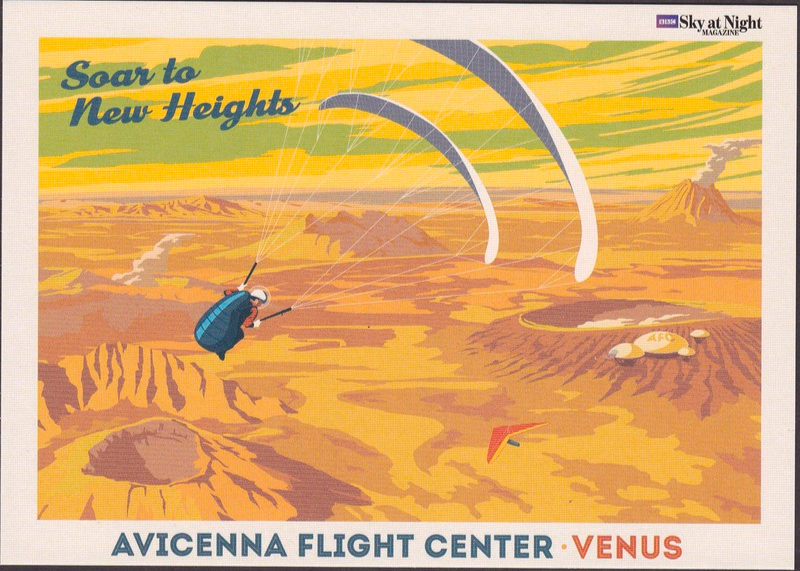
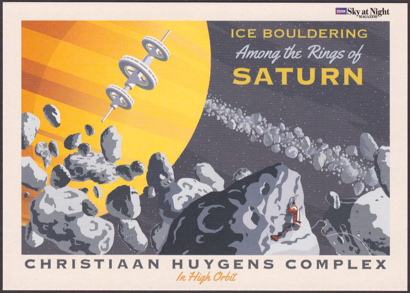
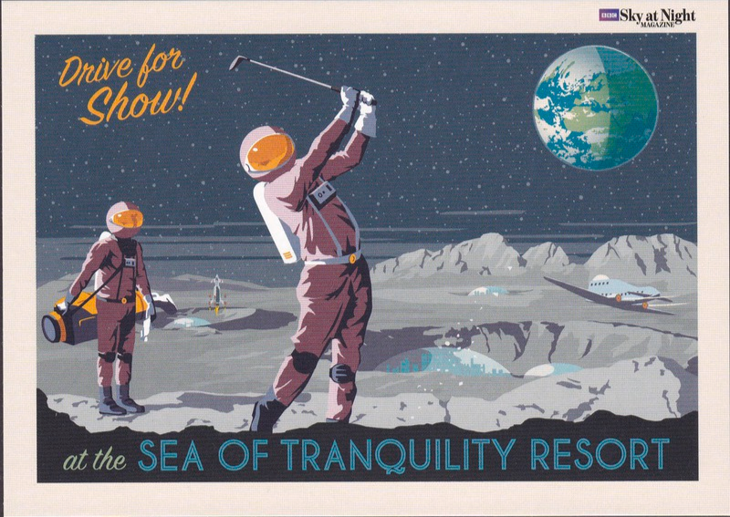
Last weekend on the website’s ‘facebook’ page I showed an image of the latest issue of the ‘SKY AT NIGHT’ magazine – August 2016 – which comes with 8 free postcards. Each postcards depicts an imaginary poster which show activities, either sport or tourist like, which could take place on other planets and moons.
The eight posters are depicted inside the magazine as part of an article titled “TRAVEL THE SOLAR SYSTEM” which looks to the future with an eye towards Solar System tourism. The images used are, I think, fantastic and I am delighted that someone decided that they are so good that they deserve to be shown in another format, namely postcards. So, if you like these then I suggest nipping out and picking up a copy before the next issue comes out (if of course you reside in the UK).
All the artwork used is by
STEVE THOMAS
And the series is titled:
TRAVEL THE SOLAR SYSTEM
(The cards are not individually numbered)
TRITON: CRYOVOLCANO TOURS
“EXPLORE CRYOVOLCANOES ON TRITON
NEPTUNE’S ‘ICE GIANT’ MOON”

All the artwork used is by
STEVE THOMAS
And the series is titled:
TRAVEL THE SOLAR SYSTEM
(The cards are not individually numbered)
URANUS: LUXURY LONG-HAUL CRUISES
“FLAMSTEED CRUISELINES
WITH REGULAR DEPARTURES TO URANUS”

All the artwork used is by
STEVE THOMAS
And the series is titled:
TRAVEL THE SOLAR SYSTEM
(The cards are not individually numbered)
MERCURY: DOWNHILL SPORTS
“MERCURY’S GASSENDI RESORT
HOME OF THE LOW GRAVITY, AERIAL ACROBATIC, CHAMPIONSHIP”

All the artwork used is by
STEVE THOMAS
And the series is titled:
TRAVEL THE SOLAR SYSTEM
(The cards are not individually numbered)
MARS: MOUNTAINEERING
“CONQUER! OLYMPUS MONS
ASCEND FROM MARS BASECAMP LOWELL
All the artwork used is by
STEVE THOMAS
And the series is titled:
TRAVEL THE SOLAR SYSTEM
(The cards are not individually numbered)
VENUS: AIR SPORTS
“SOAR TO NEW HEIGHTS
AVICENNA FLIGHT CENTER VENUS”
All the artwork used is by
STEVE THOMAS
And the series is titled:
TRAVEL THE SOLAR SYSTEM
(The cards are not individually numbered)
SATURN: ICE BOULDERING
“ICE BOULDERING AMONG THE RINGS OF SATURN
CHRISTIAAN HUYGENS COMPLEX
IN HIGH ORBIT”
All the artwork used is by
STEVE THOMAS
And the series is titled:
TRAVEL THE SOLAR SYSTEM
(The cards are not individually numbered)
MOON: LOW-GRAVITY GOLF
“DRIVE FOR SHOW!
AT THE SEA OF TRANQUILITY RESORT”

All the artwork used is by
STEVE THOMAS
And the series is titled:
TRAVEL THE SOLAR SYSTEM
(The cards are not individually numbered)
JUPITER: CLOUD SAFARIS
“JUPITER - TAKE A CLOUD SAFARI ABOARD THE ARYABHATA”
06/08/2016
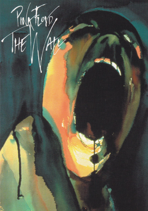
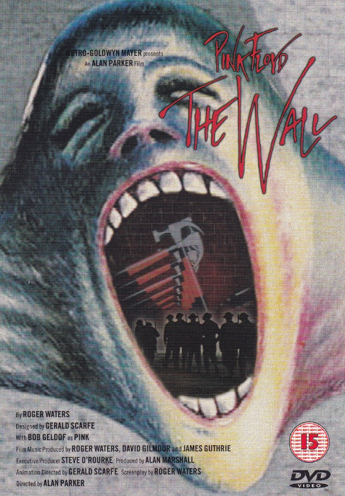
PINK FLOYD
THE WALL
On 23rd July I posted the Royal Mail’s ‘Pink Floyd’ stamp set which included six album covers. At the time I stated that although I understood why the album ‘The Wall’ was not included, it being a bit simple in design, I thought it was still a shame. The matter was somewhat abated by the inclusion of an image on a stamp of the ‘The Wall’ tour.
The album of course went on to be the feature of a full film production, one starring Bob Geldof (as the character ‘Pink’), which used the, to be honest, scary images of Gerald Scarfe.
PINK FLOYD: FACE
Published by
GB POSTERS
Ref: PC0358
This features one of Gerald Scarfe’s most famous images from the film
PINK FLOYD - THE WALL
Published by
BOOMERANG CINEMA CARDS
This was a free ‘rack-card’ which was used to promote the release of the film on DVD. Here they depict one of the film posters used when the film was released. This is a cracker as this poster was one I was unaware of and thus one that does not often appear (this was the first time that I had seen this one on postcard – I suddenly wonder if this was not possibly a design used for the DVD cover?)
06/08/2016
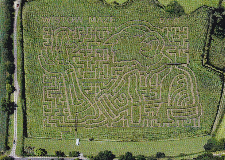
WISTOW MAZE – ROALD DAHL’s “BFG”
WISTOW, LEICESTERSHIRE
My thanks to Bob Borthwick who sent me this postcard of a local maize maze which is in his area. The maze is an annual thing with a different design each year, with most being of an appropriate theme for that period. This one here is of the BFG, which is topical as this character, from a Roald Dahl story, is the subject of a feature film recently released which was directed by Steven Spielberg.
The maze people have apparently issued 13 different postcards so it could be interesting to look out for the others (thinking about it I might have one which has the maze as a lobster).
This is a smashing postcard showing what looks to be a brilliant maze – if you live in the area it has got to be worth a look.

06/08/2016
ALL THE ARMS WE NEED!
BAN NUCLEAR WEAPONS
“August 6 and 9, 2015, mark 70 years since the US atomic bombings of Hiroshima and Nagasaki, which claimed more than 200,000 lives. Please support our work to outlaw and eliminate the 15,000 nuclear weapons that remain in the world today”
(Text from reverse side of Postcard)
Published by
AVANTCARD AUSTRALIA
Ref: #19038
Issued 2015
Artwork by
Tom Civil
This is such a simple, but very clever design which immediately passes over its theme in what I think is an amazing way. I immediately was drawn to this postcard and could not wait to post it here.
06/08/2016
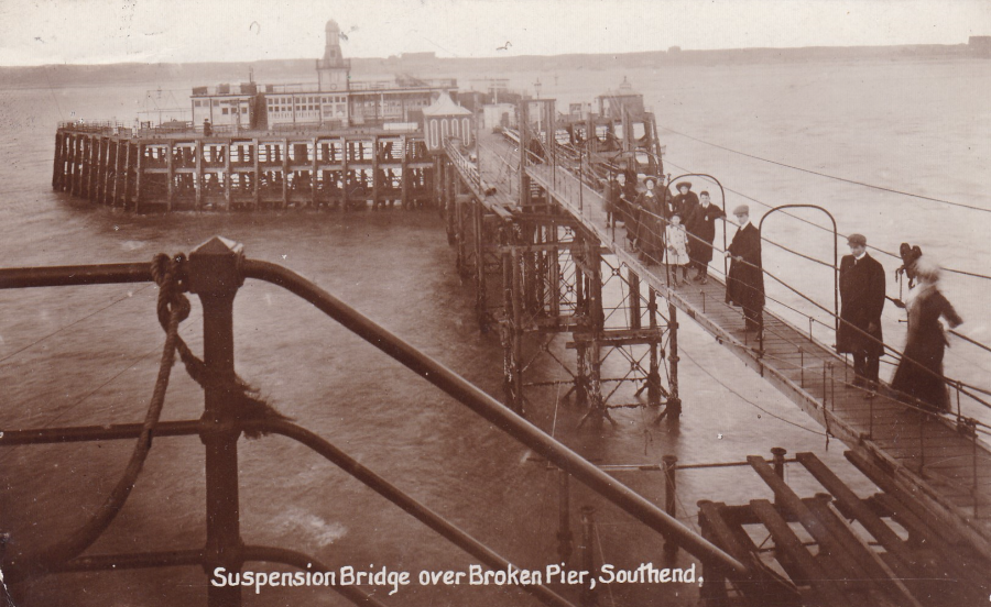
SUSPENSION BRIDGE OVER BROKEN PIER, SOUTHEND
Locally produced postcard
On the 23rd November 1908 a boat called the Marlborough crashed into the pier and removed a whole section of it. This damage isolated what had been a fairly recent extension to the pier. To combat this issue a temporary suspension bridge was placed between the two sides of the now separated walkway. This postcard shows that suspension bridge.
For any collector of Southend related postcards this is a must have, although they are expensive. Fortunately, despite being expensive, they are not that scarce and do crop up.
With this image you can see how these old postcards can be so important to local historians. They depict aspects of history which are so important to us now, over a hundred years later, when we try and gather information about the areas where we live. This postcard image here actually appears in a local book called ‘SOUTHEND PIER’ by Martin Easdown (Published by ‘The History Press’ in 2010 – the postcard appears at the top of page 33)
06/08/2016
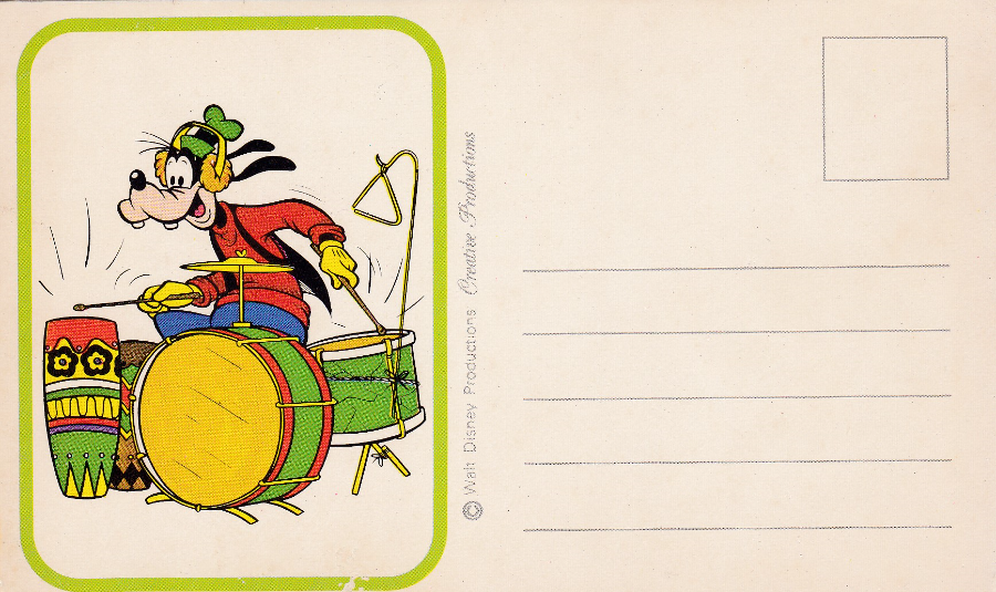
GOOFY
WALT DISNEY PRODUCTIONS – CREATIVE PRODUCTIONS
I recently received this postcard in a selection of postcards from Australia. The other side of this postcard is completely blank, so all of the printing is on this one side. You have Goofy playing the drums in a boxed image beside the area where the address and stamp would be applied.
From the information contained on the card itself it is difficult to ascertain its source. Fortunately, there is one little bit of evidence, a thin piece of adhesive still attached to the top edge of the card, which indicates strongly that this postcard has been removed from a postcard book. I just do not know which book it came from. Any held here would be appreciated.
05/08/2016
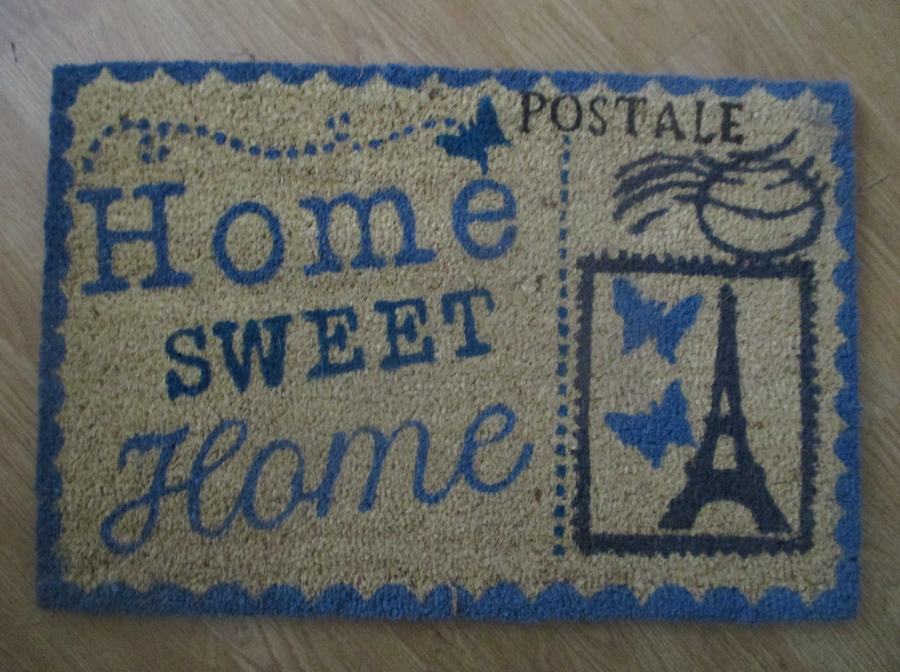
PHOTOGRAPH
This is the new front door mat that Jo has bought – you can tell we have a postcard collector in the house, and now anyone coming in can also see that!

05/08/2016
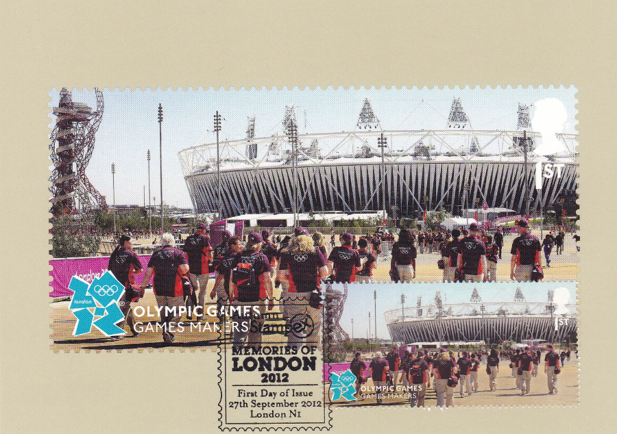
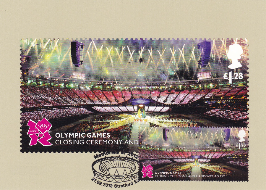
OLYMPIC GAMES
MEMORIES OF LONDON 2012
ROYAL MAIL STAMP CARDS (PHQ)
Good Luck to Rio who are hosting the 2016 Olympic Games
Their Opening Ceremony is tonight
PHQ 369 (1) 9.12
PARALYMPIC GAMES
OPENING CEREMONY
£1.28 stamp from miniature sheet
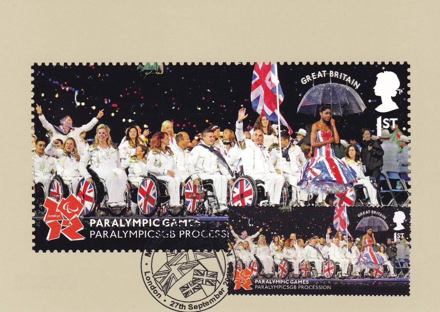
PHQ 369 (2) 9.12
PARALYMPIC GAMES
PARALYMPICS GB PROCESSION
1ST Class stamp
PHQ 369 (3) 9.12
OLYMPIC GAMES
GAMES MAKERS
1ST Class stamp
PHQ 369 (4) 9.12
OLYMPIC GAMES
CLOSING CEREMONY AND HANDOVER TO RIO
£1.28 stamp

PHQ 369 (5) 9.12
OLYMPIC GAMES & PARALYMPIC GAMES
MEMORIES OF LONDON 2012
MINIATURE SHEET
(Here with left side of stamp sheet with attached)
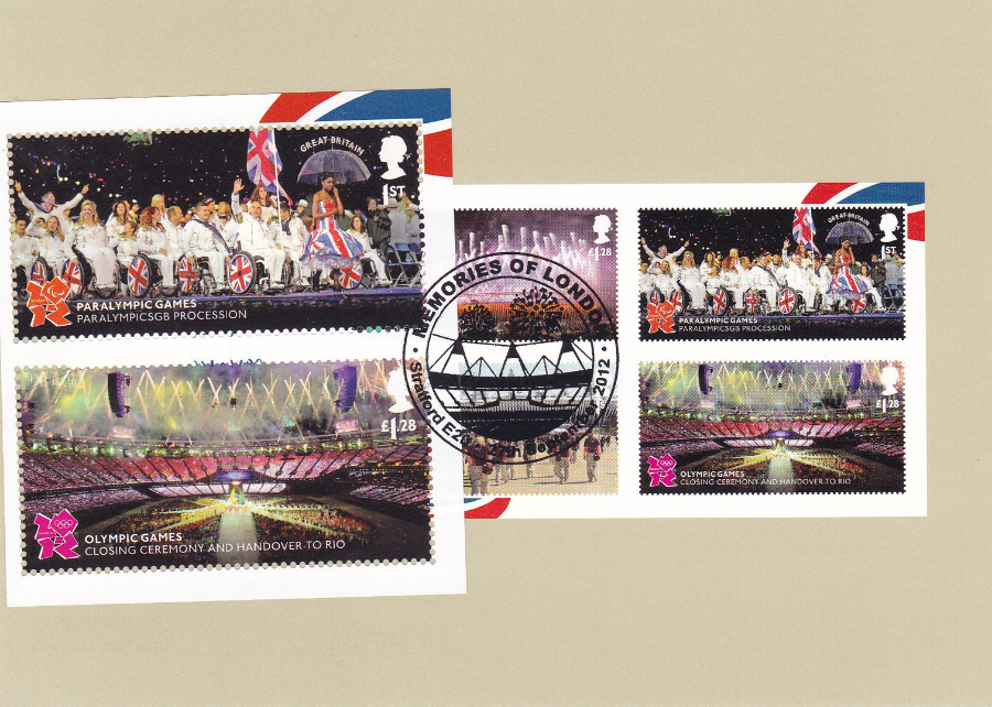
PHQ 369 (5) 9.12
OLYMPIC GAMES & PARALYMPIC GAMES
MEMORIES OF LONDON 2012
MINIATURE SHEET
(Here with right side of stamp sheet with attached)
I hope that Rio manage to present a successful opening ceremony and that the games themselves progress smoothly
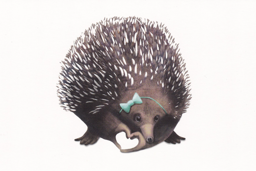
05/08/2016
SPIKY LOVE ECHIDNA 2014
Digital Illustration
Melissa Jane Hockley
Published by
AVANTCARD AUSTRALIA
Ref: #19419
Issued 2016
I think this is a smashing little picture – cute, even.
Another ‘Avantcard’ free postcard
05/08/2016
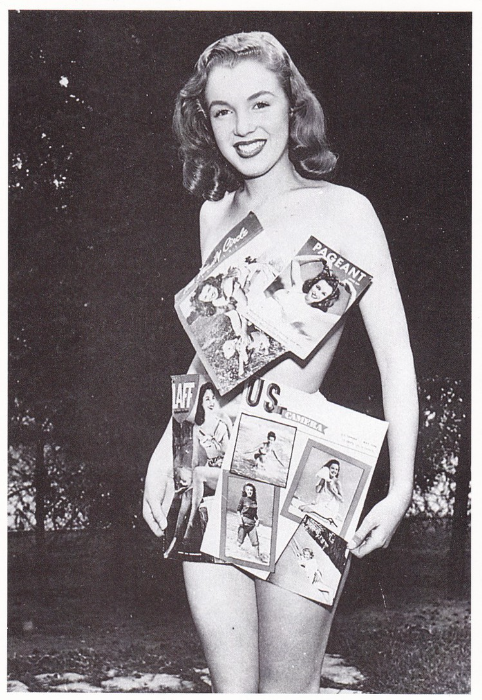
MARILYN MONROE
Published by
EDITIONS GENDRE
Ref: No 45
This is a French postcard which depicts a very early black and white photograph of a young Marilyn Monroe on one of her early photo-shots. It is these more unusual images of Marilyn Monroe which collectors seek out. I expect by now just about every known image ever taken of Marilyn has appeared on postcard somewhere. Monroe is also perhaps the most collected film actor on postcards, and many dealers have a separate ‘Monroe’ section in their stock. The prices for Monroe cards always seem to be a little higher than for any other actress – this one here would probably cost you at least £1.50.
05/08/2016
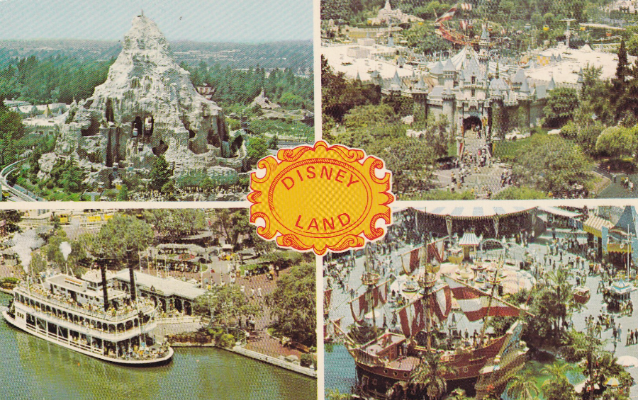
DISNEYLAND
Published by
KOLOR VIEW – LOS ANGELES. CA
Ref: KV2851 K2
DISNEYLAND U.S.A.
Anaheim, California
“A wonderland of happiness for children of all ages”
This is one of the best unofficial Disneyland postcards I have seen. I have no idea what the little central emblem is meant to represent, but it does look official, so perhaps that is what it is supposed to look like. The images are all aerial views and it is possible they were taken without authority and thus are not official Disney images (although this is guess work and not confirmed of course). I like this one, it is worth looking out for.
04/08/2016
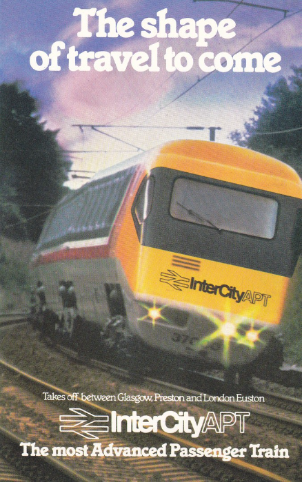
THE SHAPE OF TRAVEL TO COME
IntercityAPT
The most advanced passenger train
Takes off between Glasgow, Preston and London Euston
Published by
British Rail (LM and Sc Regions)
Printed in England by Lonsdale & Bartholomew Ltd, Nottingham
The APT (Advanced Passenger Train) was a new train developed by British Rail which had the unusual built in trait that it tilted at high speed as it turned. The train was developed throughout the 1970’s and 1980’s with the intention of being used on the West Coast Main Line. As this particular line had a number of curves it was thought the tilting train would mean that there would be no loss of speed and the train could take these curves better.
The experimental APT-E was very fast, and actually reached a new British railway speed record of 152.3 miles per hour (on 10th August 1975). But a later prototype, the APT-P, bettered this, reaching a speed of 162.2 mph (this was in December 1979 and that record stood for twenty-three years).
The development went on for years but things came to a head when the then Prime Minister hinted at funding cuts. This caused British Rail to put the prototypes into service, to prevent cancellation of the project.
The first runs took place between London and Glasgow in early December 1981 (see below image). But, things did not go well and all sorts of issues, some small, some not so, became news and appeared all over the newspapers. The trains were withdrawn by the end of the month as a result (the press loved this!).
It seems that Journalists on the train complained that the tilting effect caused motion sickness (they christened the trains as the ‘Queasy Rider’ – those in charge alleged the journalists were already ‘The worse for wear, having drunk copious amounts of free alcohol the night before’!). This and technical problems, including mechanical problems amid snowy conditions on subsequent runs stopped the trains being run.
These issues were solved and the trains were quietly returned to use in 1984, but a competing High Speed Train powered by diesel engines, but without the tilt, had progressed forward at a rapid rate and was already in place. The APT’s lost all support and the three APT-P’s stopped running over the winter of 1985-1986.
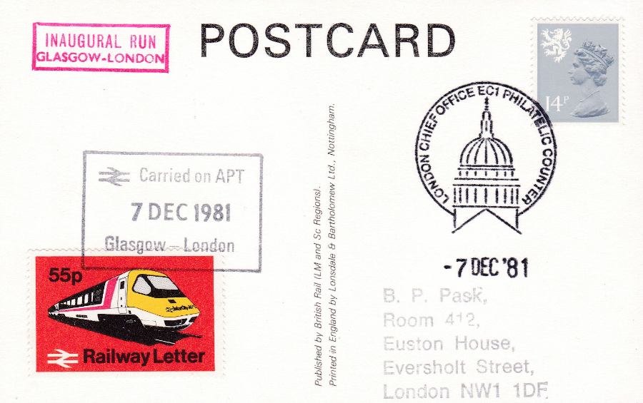
REVERSE SIDE OF ABOVE POSTCARD
Versions of this APT postcard can be found which were actually carried onboard the inaugural run of the first APT train between Glasgow and London on 7th December 1981.
These postcards will have the red boxed cachet “INAUGURAL RUN – GLASGOW-LONDON” and a special 55p Railway Letter Stamp, which features an image of the APT train, which will be cancelled with a black boxed cancel: “Carried on APT – 7 DEC 1981 – Glasgow – London”. As with all railway carried mail the item requires a royal mail stamp to be applied for onwards transmission in the normal postal system. The stamp used here has been cancelled with a ‘LONDON CHIEF OFFICE EC1 PHILATELIC COUNTER – 7 DEC’ 81’ philatelic counter hand-stamp.
Because of the short life span of the APT trains, and the few that were built, these postcards can be quite expensive. A mint copy could cost you anywhere up to £5 (if you are lucky you can find these at £2.50 to £3). Used copies, like this one here, have always been expensive and were £10 within very little time of the original release, and sale. I would not be surprised to find that these are around the £20 mark now. But then they are a fantastic souvenir of a short lived rail oddity (and one that did actually lead into the creation of tilting trains abroad, despite its failure in the UK).
04/08/2016
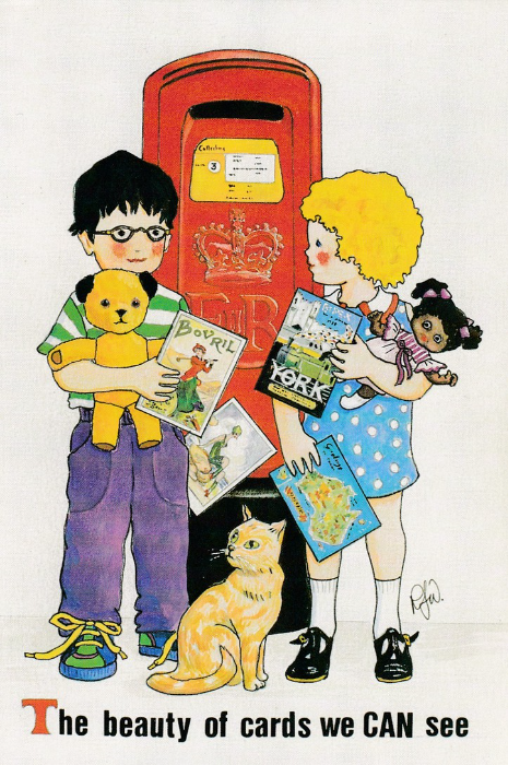
THE BEAUTY OF CARDS WE CAN SEE
Designed (and drawn) by
ROSALIND WICKS
Printed by
Thought Factory
“All profits from the sale of this card will be donated to charities working on behalf of blind and partially sighted people throughout Britain”
Any modern UK postcard collector who was collecting during the 1980’s and 1990’s will know of the work of Rosalind Wicks as she had a distinctive and very attractive artistic style (which I loved). Rosalind also produced a large number of postcards, for her own then ongoing series, and for other postcard people/companies. Many of her designs incorporate her favourite things, children, Post Boxes and toys. So, this design here is a good, and typical example of her work. Interestingly, and always the case with her designs where they are depicted within the design itself, the postcards which the children are holding are drawn images of actual postcards (I actually have copies of three of those shown here in their hands).
For me this card had additional thematic interest because the boy is holding a ‘Sooty’ teddy bear, from the long running children’s TV series. This was a clever, and deliberate inclusion, because Sooty was actually used in the promotion of Blind Awareness so was directly connected to the theme of this postcard.
Rosalind no longer issues postcards having retired some years ago, but I did have the pleasure of meeting her on a number of occasions and I will dig out and post some photographs I have of her taken in 1994 at the ‘Picture Postcard Centenary Show’ held in London.
04/08/2016
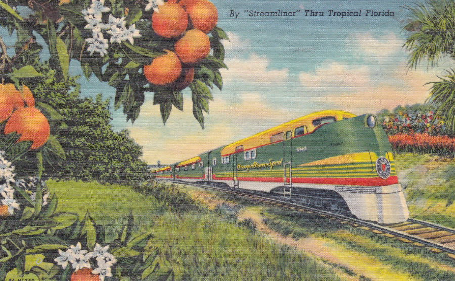
FLORIDA
STREAMLINER TRAINS
By “Streamliner” Thru Tropical Florida
Printed by
GENUINE CURTEICH – CHICARGO “C.T. ART-COLORTONE” POST CARD (REG. U.S. PAT. OFF)
Ref: 61 F – TROPICAL FLORIDA SERIES
(The design also has the reference – 9A-H1340 – on the front)
This postcard, along with the one shown below, was actually bought in Florida at an antiques fair, and as such, these are souvenirs of my holiday that year. This postcard here appealed to me because of the bright colours used on the train, I thought these captured the brightness of Florida. I also liked the oranges which are included in the design as Florida is the sunshine state and an area where I visit there is called ‘Orange County’. The train depicted here is the ‘Orange Blossom Special’.

REVERSE SIDE OF ABOVE POSTCARD
This particular postcard was posted from JACKSONVILLE, FLORIDA on the 13th August 1940 with the stamp cancelled with a machine wavy line cancel. The stamp used here is a 1938 issued 1c green featuring George Washington (SG 800)
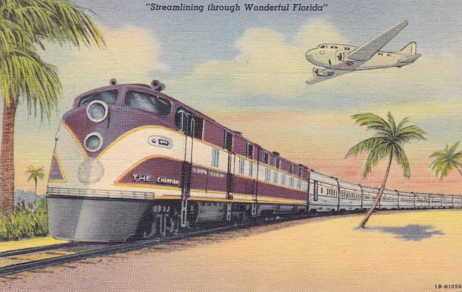
“Streamlining through Wonderful Florida”
Printed by
GENUINE CURTEICH – CHICARGO “C.T. ART-COLORTONE” POST CARD (REG. U.S. PAT. OFF)
Ref: 269 F – TROPICAL FLORIDA SERIES
(The design also has the reference – 1B-H1056 – on the front)
This postcard is from the same publisher and printer as the one above. The brown coloured train depicted here was called ‘The Champion’. On this postcard image you also get the added bonus of an early aeroplane, just to enhance the picture. Having bought the above postcard from the dealer’s box, when I came across this one I knew I had to also have this one, to go with it.
REVERSE SIDE OF ABOVE POSTCARD
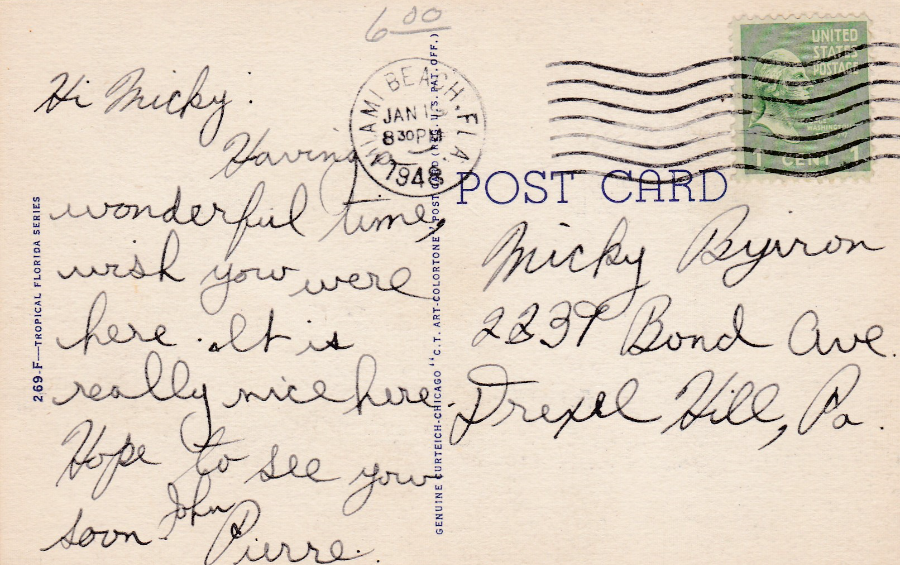
This particular postcard was posted from MIAMI BEACH, FLORIDA in January 1948 (the actual day section of the cancel is unclear – you can make out a ‘1’ but not the next number, although it is possibly a ‘9’). The cancellation used is again a wavy line machine cancellation. As with the postcard above the stamp used is the 1938 1c green (SG 800).
03/08/2016
THUNDERBIRDS
VITA NOVA POSTCARDS
PRINTED IN HOLLAND
(Copyright 1965)
‘VITA NOVA’ was a Dutch company that produced a number of postcards (there are also postcards for that other well-known Gerry Anderson series ‘Captain Scarlet’) some of which are now very collectible. The 1960’s British television series ‘Thunderbirds’ is now considered iconic and as a result there is a large community of collectors who buy anything related to the series. As a result, these Vita Nova postcards can be quite expensive at £4 - £10 each, depending on condition and the image on the front.
VITA NOVA
Ref: 14
This series is quite large, and I have a number of different postcards from it (I will post others over the coming weeks). But, there is an issue with trying to complete a collection of these Thunderbirds postcards. This is the fact that the cards individual reference number is located in the stamp box on the reverse side, a not uncommon position for postcards from Holland around the 1960’s to the 1970s.
This is not a problem if the card is mint, as this one here is, but, if the postcard has been posted the stamp covers the reference number, and if a used copy is the only copy (or copies) you have then you do not know the reference number.
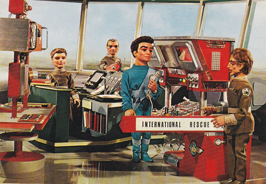
This postcard here depicts Scott Tracy in a command tower, and it is my favourite postcard from the series, so far (I am missing a few). The image is not described and no information is supplied on the postcard but, from my sad knowledge, I know this is a scene from the very first ever Thunderbirds episode titled ‘Trapped in the Sky’.
VITA NOVA
Ref: ?
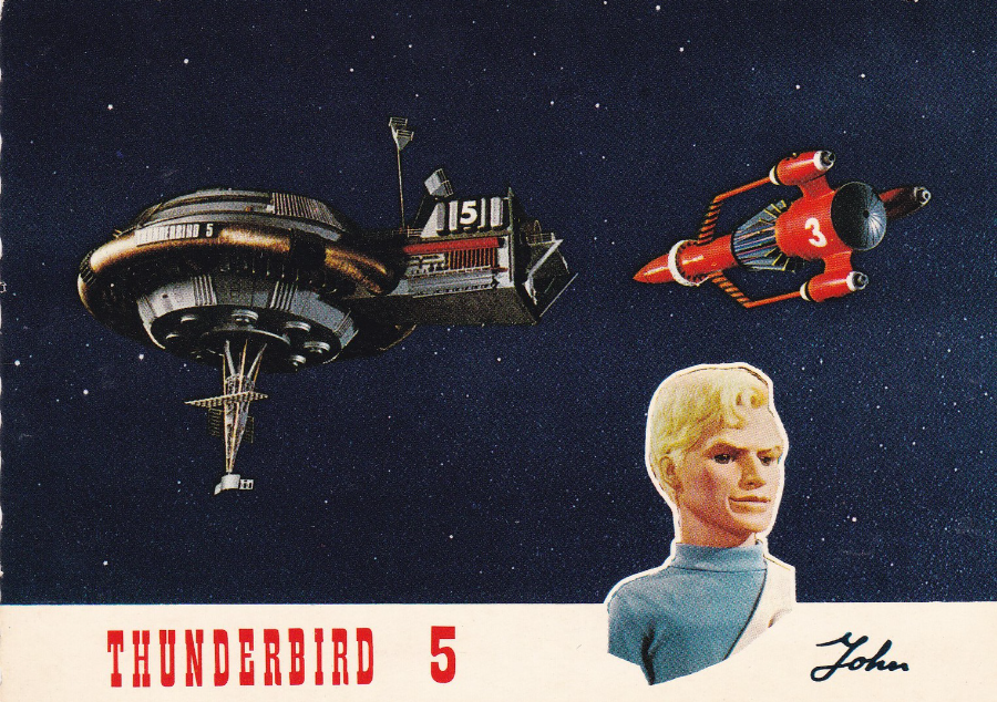
This postcard depicts John Tracy and Thunderbird 5, and Thunderbird 3 is also included in the image. This copy does have a stamp applied for posting so the reference number is covered. But it is a cracking postcard and a very sought after one.

VITA NOVA
Ref: ?
Another postcard where I only have a used copy so do not know the reference number. In fact, my copy of this postcard is quite battered and creased, but it is the only copy I have been able to obtain (and a battered used copy is better than no copy – until a better one comes along). This particular card was posted in 1967.
This features Lady Penelope and her butler Parker, and it looks like they have been out for a night at the casino (does anyone know what episode story this image is taken from?). The pink coloured FAB1 Rolls Royce is also depicted. This is a lovely postcard and I will continue to hunt down a better quality copy.
02/08/2016
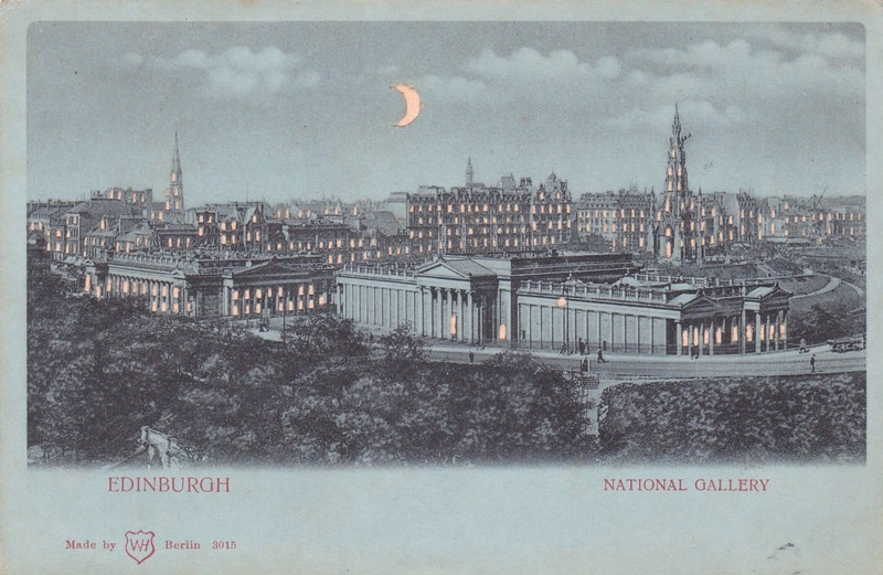
EDINBURGH
NATIONAL GALLERY
Made by
WH Berlin
Ref: 3015
Although not immediately obvious to the untrained (i.e. a Non-Postcard Collector) eye, this is actually a Novelty Postcard. It is a type of postcard called a ‘Hold To Light’. The card is actually made up from two pieces of thin card. The top one is blue in colour, and is intended to represent night, underneath this is a white (or with age, now cream coloured) sheet of card. If you look closely at the top blue sheet, here depicting a photograph of the city of Edinburgh, you will see that all the windows, and some doors, are cream in colour. Infact what you are looking at is holes cut into the blue sheet, so, what you are actually seeing is the cream coloured bottom card showing through the holes. Perhaps the most obvious cut out section is the curved depiction of the moon, look closely at its edges and you can see it is cut out.
The idea was that you held the card up to a bright light, probably a candle or very early electric lamp (the card is from the turn of the century) and you would light up the windows through the thin cream card thus making it look like all the lights have been switched on, thus the name, ‘Hold to Light’.
These are lovely items and quite unusual and worth seeking out as they make a very strange addition to any collection of a specific area, here obviously, it would be an Edinburgh collection.
REVERSE SIDE OF ABOVE POSTCARD
very simple and basic in design
02/08/2016
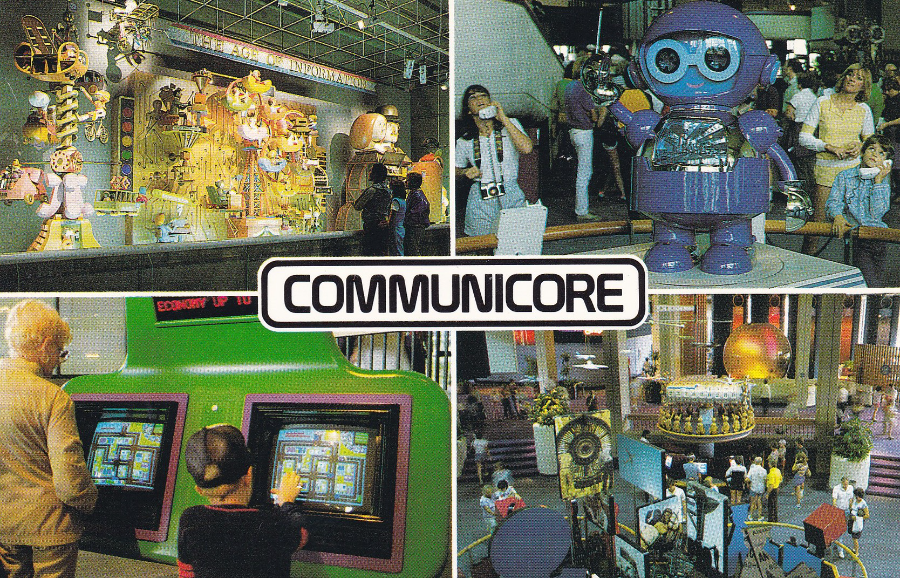
WALT DISNEY WORLD
EPCOT CENTER
Here is a selection of multi-view postcards from attractions within the Epcot theme park. They all have the same very basic central text box style and were clearly from the same era. These can be very interesting as they often depict some aspects of the attractions that have either changed or attractions totally removed.
COMMUNICORE
Ref: 0100-50056
Copyright 1983
“Technology and Innovation – The latest information systems provide “hands-on” displays in CommuniCore, the hub of Future World. Advances for today and tomorrow allow better understanding of our changing world”
(Text from reverse side of Postcard)
CommuniCore was actually two semi-circular buildings behind Spaceship Earth (the huge globe just inside the entrance). They were called CommuniCore East, and naturally enough, CommuniCore West. Both buildings contained an array of new technologies, which changed with the times (the computer screens bottom left are an early computer game).
CommuniCore was closed down in 1994 and re-opened as ‘Innovations’, which was far more of a corporate-driven technology showcase, with sponsored areas showing companies latest ‘innovations’. There was also restaurant space allocated. This is a postcard that shows something no longer in place, and these are the postcards that are most collectible.
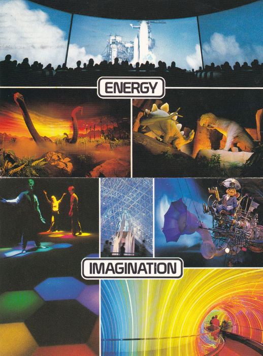
ENERGY
(The reference Number appears in the stamp box on these cards and this copy here is used, so the stamp covers the number – the card was posted in 1986)
“Bridge to the Future – The creation of fossil fuels is part of the Universe of Energy in Future World. The story of the search for new energy sources even extends into the reaches of outer space”
(Text from reverse side of Postcard)
This ride is of course still here, but it is now called ‘Ellen’s Energy Adventure’ and the film segments now star Ellen DeGeneres (and Bill Nye – the science guy). The Ellen film stuff was added in 1996 but the ride still retains what is probably it’s most famous segment, a ride through the age of the dinosaurs. Two images of the animatronic dinosaurs appear across the bottom of this card.
Sadly, or possibly not depending on your opinion, there is a rumour that this ride is to be closed down and the building re-opened (or possibly knocked down and totally rebuilt) as a ‘Guardians of the Galaxy’ attraction (after the film) – I shall watch out for any news.
IMAGINATION
Ref: 0100-50054
Copyright 1982
“One little spark in Journey Into Imagination, Dreamfinder and Figment introduce the Dream Machine,
3-D Magic Journeys and the Image Works, where light and sound spur creativity. Presented by Kodak”
(Text from reverse side)
‘Journey into Imagination’ was the original ride located in the Imagination Pavilion in Epcot. It ran between 1983 and 1998 (I rode this in 1993). This postcard here is from this ride and depicts aspects of the trip including the multi-coloured walkway. Top right you have the Dreamfinder riding his Dream Machine (apparently called the Dream Mobile or Dream Catcher by fans – but I have not heard this myself). For those in the know, if you check out the back of the machine you can just about see ‘Figment’, the small purple dragon.
The attraction changed its name to ‘Journey into YOUR Imagination’ in 1999, and was thus called until 2001. The attraction and ride is now called ‘Journey into Imagination with Figment, and Figment is the only survivor from the original attraction (the Dreamfinder has long gone).
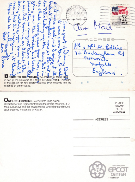
REVERSE SIDES OF THE ABOVE TWO POSTCARDS
These two reverse layouts show the two different versions which I believe are available for all four of the postcards depicted in this section. The other two postcards are in the same format as the lower version where the EPCOT CENTER logo appears bottom right. The top one has the logo top centre and has the descriptive text bottom left (the others have it top left).
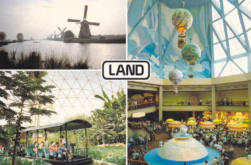
LAND
Ref: 0100-50055
Copyright 1982
“Listen To The Land in the country-fair setting of The Land, review age-old agricultural techniques. Then sail through the environments of the world and glimpse Tomorrow’s Harvest. Presented by Kraft”
(Text from reverse side of Postcard)
Undoubtable this postcard depicts the area least changed from its current appearance (although I have never really known where that Windmill photograph comes from – possibly the film at the end of the ride?). But it is still a relevant addition to this little series.
01/08/2016
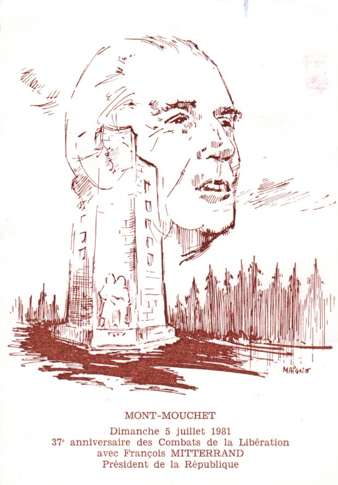
MONUMENT TO MONT-MOUCHET
MONT-MOUCHET
Dimanche 5 Juillet 1981
37e anniversaire des Combats de la Liberation
avec Francois MITTERRAND
President de la Republique
Translates as:
MONT – MOUCHET
Sunday, July 5, 1981
37th anniversary of the battles of the Liberation
with Francois MITTERRAND
President of the Republic
Text on the reverse side of this special postcard has been a bit harder to translate, but if I am right, this special postcard was issued for a special event held at the Monument on 05-07-1981, attended by the then French President Francois Mitterrand. I think it was sold to raise monies for the up-keep of the monument depicted
The Maquis du Mont Mouchet were a group of French Resistance fighters during WWII based, naturally enough, at Mont (Mount) Mouchet. Their aim was to delay the convergence of German forces in the South of France with those based around Normandy and the D-Day beaches.
In May 1944 the Germans made a number of attacks on the Maquis group, which they repulsed with fierce fighting.
To celebrate the struggle that occurred here a monument was constructed, which was inaugurated on June 9th 1946. The monument, depicted here on the front of this postcard, is 12 metres high and is the work of sculptor Raymond Coulon.

REVERSE SIDE OF ABOVE POSTCARD
This particular copy of the postcard has been posted and was almost certainly obtained at the monument (I assume it has a gift shop or information centre with attached shop or sales area – this cachet idea is common in France and you can pick up such like items from other locations – I have seen one for Verdun) as it has the blue circular ‘LE MONT-MOUCHET – MONUMENT NATIONAL – RESISTANCE’ cachet, which depicts the monument itself at its centre, and which would have been only available at the site.
I also like the fact that the sender used the 1969 ‘25th Anniversary of “Resistance and Liberation”’ 45c stamp which depicts the Mont Mouchet Memorial monument and resistance fighters (Ref SG 1836). The stamps used have been cancelled with a ‘PINOLS – HAUTE LOIRE – 43’ circular cancel dated 13th July 1981.
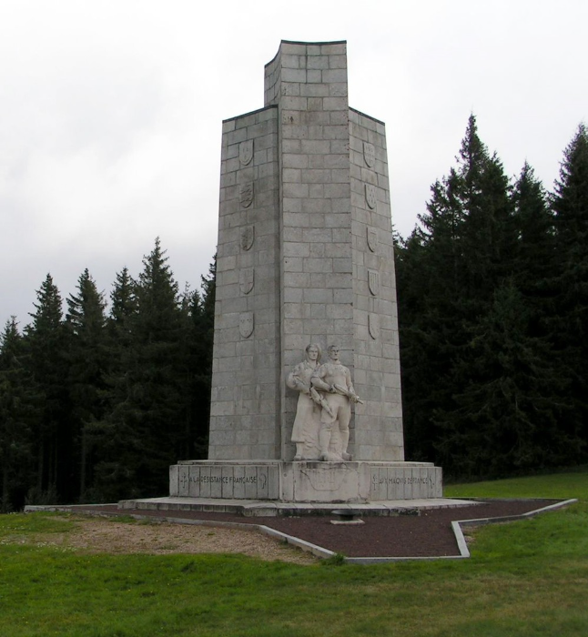
PHOTOGRAPH
Image of the Monument
01/08/2016
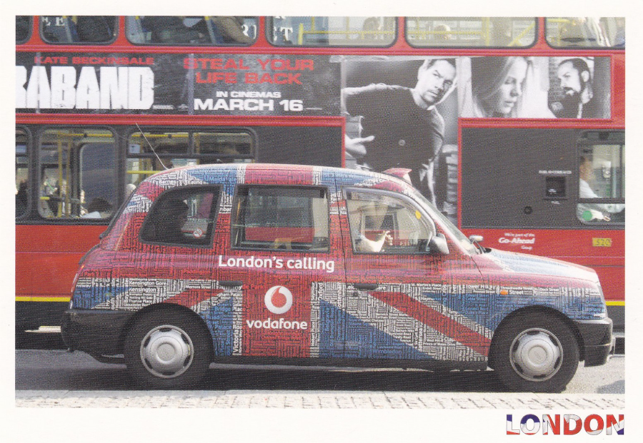
LONDON TAXI
Published by
FISA (London)
Ref: L314
Photograph by: Mark Rodriguez
A nice photograph of a London Taxi, but not in the normal, and traditional, black livery, but decked out as a Union Jack in an advert for the Vodafone company and ‘London Calling’.
This cheap postcard is currently on sale in London and can be picked up for around 12p, but this cheap price does not reduce the interest this card can produce. Those who collect transport, or cars as a theme would like this one. But, then also would ‘Film’ collectors as the advert on the side of the bus behind the taxi carries a film advert. This is for the 2012 feature film ‘Contraband’ starring Mark Wahlberg (depicted on the side of the bus) and Kate Beckinsale (also depicted but her name can also be seen above the segment of film title). This film advert nicely dates the photograph, and therefore to some extent, also the postcard, to 2012.
It would be a shame to ignore these cheap modern postcards as they may well become the collector’s items of the future (I suspect most are posted by tourists and read, and discarded, at the other end).

01/08/2016
UNTITLED ARTWORK
Published by
BOOMERANG MEDIA
Artwork suspected to be by
Marina Caruso
www. marinacaruso. com
The image here does not fit easily into any well-known collected theme, and the Boomerang cards are not often collected by publisher alone. So this is a postcard which has hardly any monetary value. But, I like it, and it sits in my collection.

01/08/2016
WHEN WILL THEY EVER LEARN?
Published by
ATHENA
(ATHENA INTERNATIONAL)
Ref: 9386
Design by
David Holmes
The 1980’s were full of the fear of Atomic Bombs (or, more correctly, Nuclear Bombs) falling on the UK, and of course at other locations around the world. This fear (sometimes hard for others to understand, but a real fear, as I remember only too well) caused a number of related poster designs and artwork to be made, and this one here is one of many which used the mushroom cloud as its main iconic, destructive and fearful main image. ATHENA issued a number of such designs, and others using the CND logo. All of these ‘Atomic/Nuclear War’ postcards are now collectible.
01/08/2016
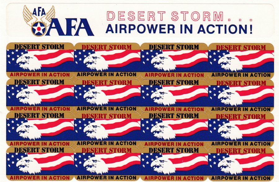
DESERT STORM
AIRPOWER IN ACTION!
AIR FORCE ASSOCIATION
Smashing, and quite unusual, and scarce, postcard which has 16 little stickers which were designed to be removed and placed on mail in support of the DESERT STORM campaign part of the first Gulf War. This was of course back in 1991 and this postcard here is from America and is typical of the postcards which celebrated the American operation to relieve Kuwait.
As these are collectible postcards, and were so at the time, I wonder how many were actually used as designed. For every card that had its stickers removed that was one less for collectors like me.
It is also of course a novelty postcard because of its ‘Sticker’ theme and is worth seeking out.
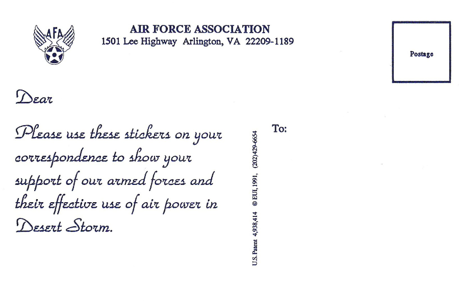
REVERSE SIDE OF ABOVE POSTCARD
With instructions on how to use the stickers