13/03/2018
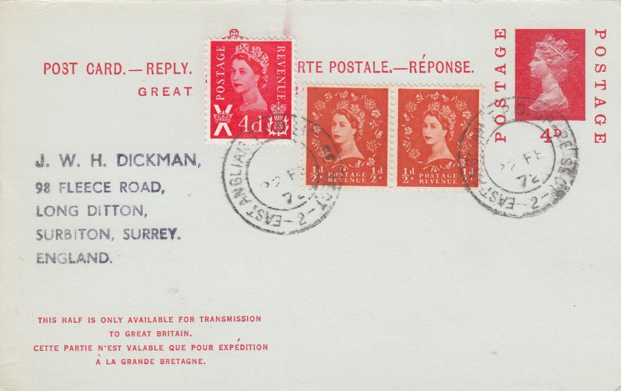
GREAT BRITAIN QUEEN ELIZABETH
POSATL STATIONERY POST CARD
UP RATED (extra stamps applied) REPLY SECTION
The Stamps have been cancelled with a
‘EAST ANGLIA T.P.O. UP’
No 2 Cancellation dated
22 February 1972
The T.P.O. part of this cancellation means ‘TRAVELLING POST OFFICE’, and this refers to a sorting office located on a train. Mail used to be sorted in special carriages on moving trains. Mail here was cancelled with T.P.O. cancels and they would be either ‘UP’ cancels or ‘DOWN’ cancels depending on which direction the train was travelling. T.P.O. cancels are no longer used, but when they were they were very collectible and there were, and still are, specialised collectors of these T.P.O. strikes. It is a very specialised area of philately, but not always an expensive one.
13/03/2018
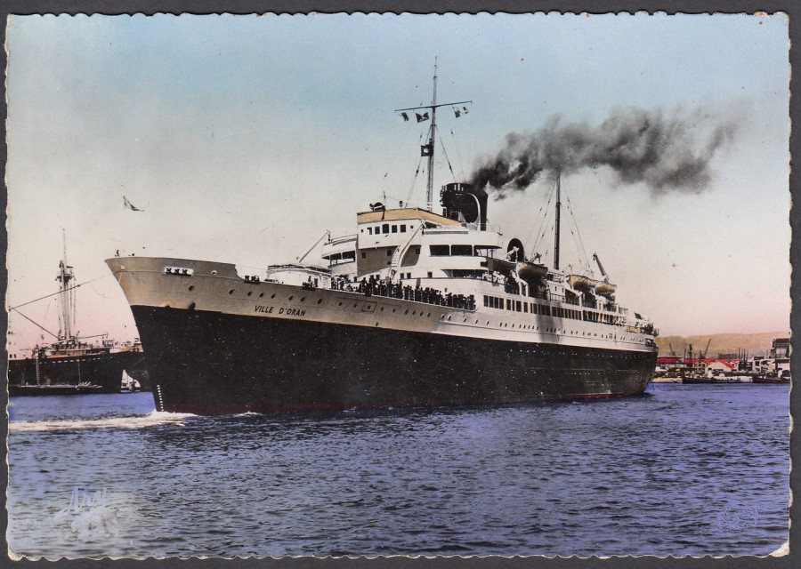
VILLE D’ORAN
(Campagnie Generale Transatlantique)
Collection Libairie Portuaire
Published by
EDITION TARDY
MARSEILLE
I have mentioned before that aeroplanes have a dedicated collector circle, the same could be said for trains as well, but shipping seems to be a bit different. There are shipping collectors, but I suspect less than for the other forms of transport mentioned, and it seems more often that people collect either a specific ship, or a specific type of ship. This one is a French vessel, which as the card was printed in Marseille I assume sailed from there. Judging from the style of card, deckle edging, and the use of a coloured negative for printing I think this would be a late 1940’s, 1950’s issued postcard.
13/03/2018
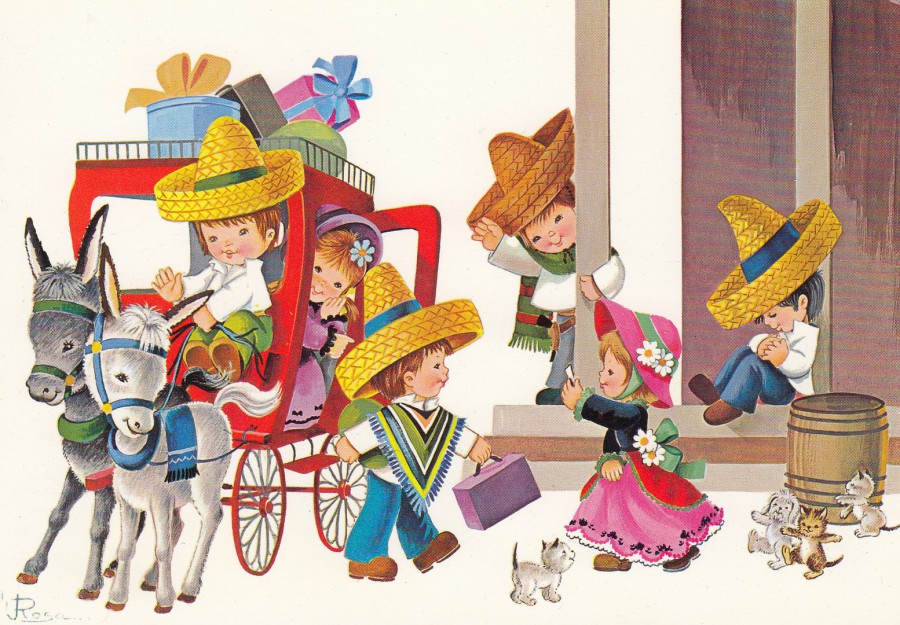
UNTITLED
(CHILDREN CARTOON)
Published by
NOVITAS PARIS
Ref: 7062
Printed in Spain
(Barcelona Espana)
This is one of those postcard images which people will either really like, or probably hate, in equal measures I suspect. I am in the ‘really Like’ category and to me it is an appealing picture, and one which is a classic postcard image style.

12/03/2018
UNTITLED
(UNICORN)
No Artist Named
Published by
PAPERCHASE
Ref: FSC C014059
I picked this one up about three weeks ago in London, and it goes to show that I am right about the current popularity of unicorns.
12/03/2018
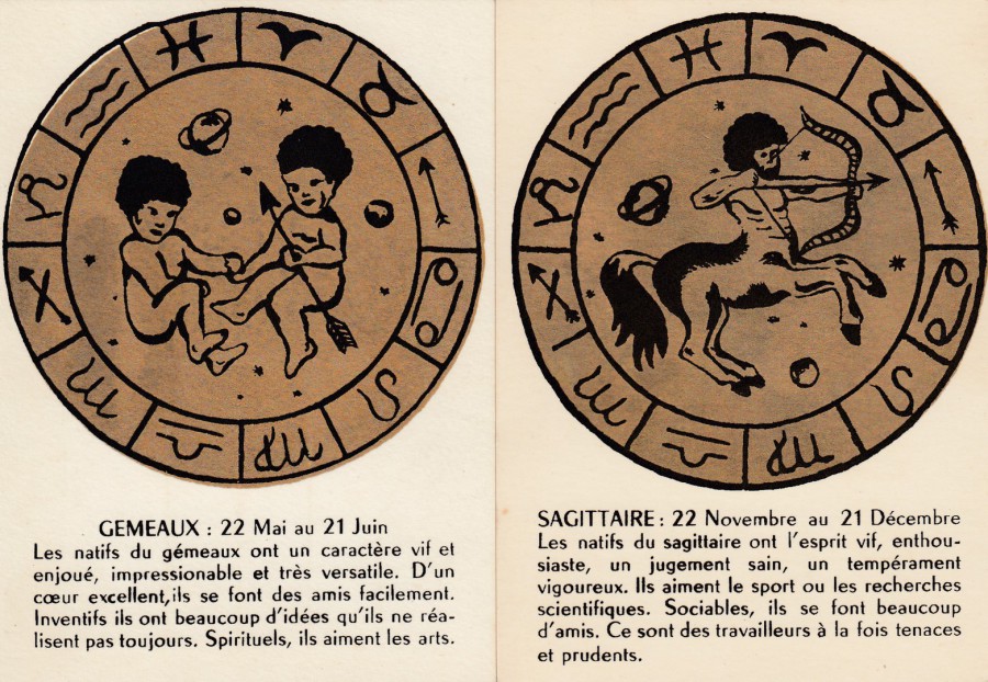
SIGNES DU ZODIAQUE
(SIGNS OF THE ZODIAC)
Published by
CARTES D’ART GAUTIER FRERES
GEMEAUX
(GEMINI)
SAGITTAIRE
(SAGITTARIUS)
I have always liked ‘Zodiac’ sets, and where I can I try and buy the complete sets, but these two cards are the only ones I found from this set. They were in an antiques market on a stall which I visited back in 2006 in France. When I saw them, I bought them straight away, and since then I have been looking out for others from the set, but so far, no luck. Still, I have these two.
12/03/2018
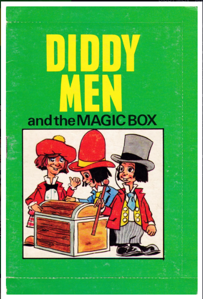
KEN DODD ….. RIP
Sir Kenneth Arthur Dodd
8th November 1927 – 11th March 2018
Comedian, singer and actor, forever to be linked to his “tickling stick” and as being creator of the Diddy Men.
DIDDY MEN post-book.
I have put this on the webpage before (check out the April 2016 webpage). But I put it here again in commemoration of the comedian Ken Dodd, who created these little characters.

This is th post (reverse) side of the book

PHOTOGRAPH
Ken Dodd
(with drawings of his Diddy Men)
11/03/2018
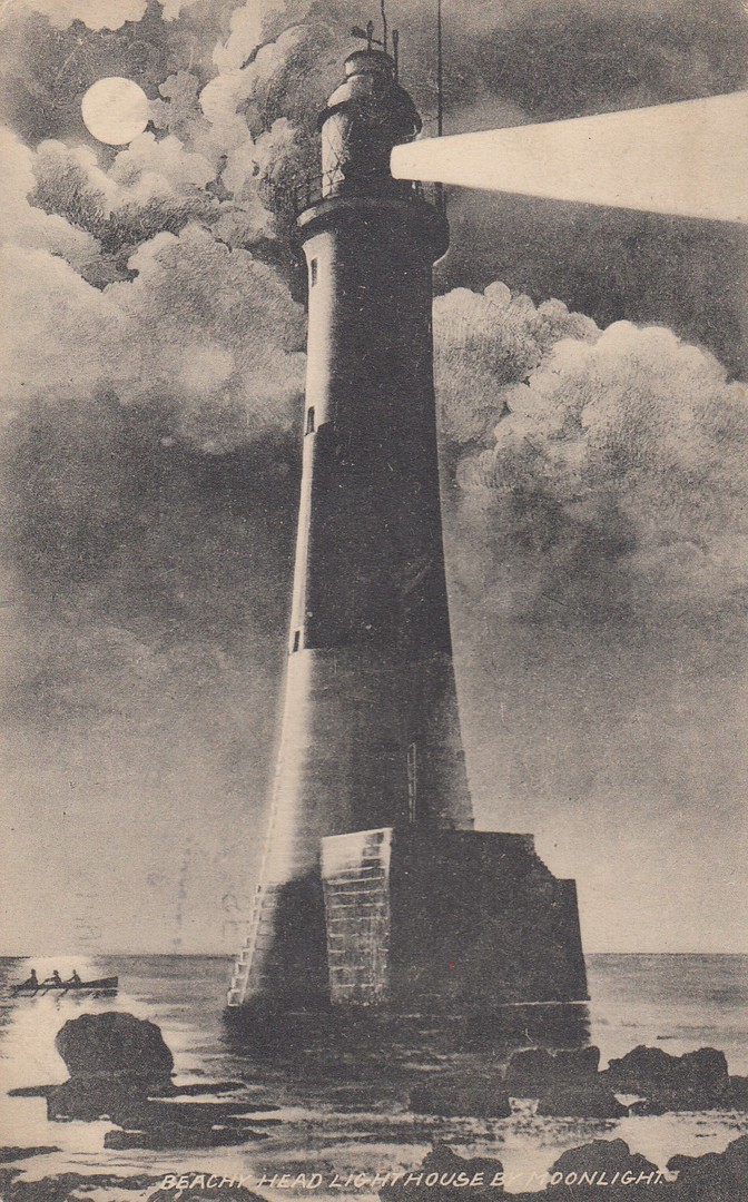
BEACHY HEAD LIGHTHOUSE
BY MOONLIGHT
Published by
ANONYMOUS PUBLISHER
This is probably a locally issued, and possibly printed postcard which was posted from Eastbourne in 1913. The ½ d green stamp has been cancelled with a roller machine canceller dated 8th September 1913.
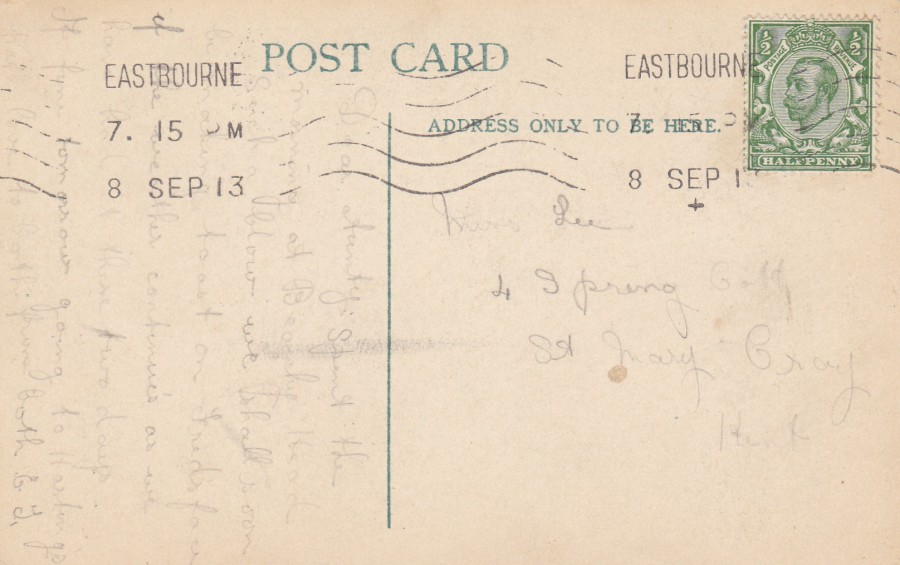
REVERSE SIDE OF ABOVE POSTCARD

11/03/2018
TO A REALLY SPECIAL MUM
‘GIRL ROBOT MUM’
By
BEVERLEY EDGE
(2012)
Published by
PAPER ROSE LTD
Ref: MTM 208PC
Here in the UK today is Mothering Sunday, otherwise better known as ‘Mother’s Day’. So, to all the mums, mothers, grand-mothers and, nan’s etc, out there, I wish you a Happy Mother’s Day.
10/03/2018
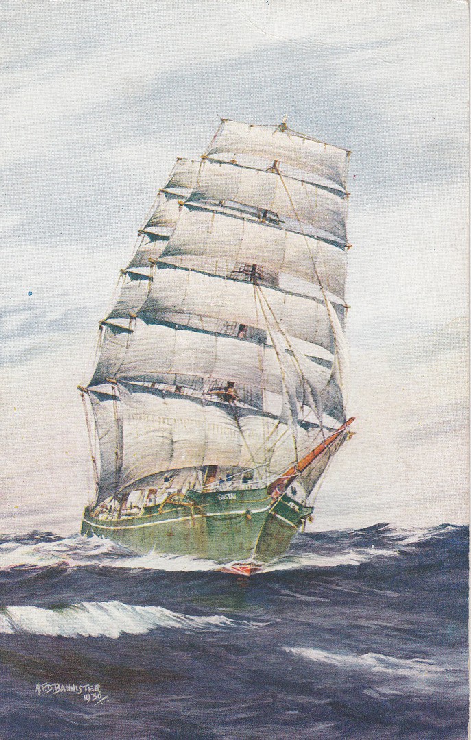
UNTITLED
(SAILING SHIP)
Artwork by
A.F.D. Bannister
Published by
J. SALMON. LTD
(Sevenoaks)
Ref: 3870
The artist A.F.D. Bannister had numerous copies of his paintings of transport themed images produced as postcards by J. Salmon. They were published through the 1940’s and 1950’s, with some into the 1960’s as well. Although this one is not titled it depicts a sailing ship, one of the tall mast ships which were once common.

10/03/2018
DON’T BE A
LITTER BUG
“Keep your postcards…
… Use me, don’t lose me”
Published by
BOOMERANG
(SCHOOLS ISSUE)
BOOMERANG MEDIA and the BOOMERNAG CINEMA postcards were all available from racks located in cinemas and some other locations. These cards were exclusive to these racks, but, there were also exclusive designs which were in racks located inside schools and universities. These were much harder for collectors to obtain, unless their kids were attending one of the schools with a rack, or one of the fewer universities. These racks were in place during the early 1990’s, when, fortunately my three kids were in a school where there was such a rack (lucky me). Over there last few years at school they brought me home some nice cards which I would otherwise only be able to obtain from dealers who could get them. This is one of those cards.

09/03/2018
NEDERLANDS
(NETHERLANDS)
CHILD WELFARE – ROAD SAFETY
“50c + 25c stamp design – Ignition Key and Framed Photograph”
(Think of Me)
Novelty Card
TRIANGLE SHAPED (FOLDED) CARD WITH CUT PERFORATIONS AROUND EDGE
I picked up this unusual item on a stand at Stampex recently. It is not a postcard, but a folded, almost ‘Greetings’ styled card, but it is interesting. It depicts a stamp from the Netherlands which was not triangular-in-shape, it was a boxed shape stamp with a triangular image on it, and which was issued in 1985 (SG 1472). The inside of this card is also interesting.
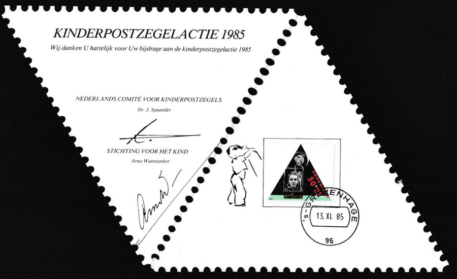
OPENED VIEW OF CARD ITEM
This is the inside of the triangular shaped folded card and, as you can see, it has one of the stamps applied inside and cancelled 13th November 1985, which was the first day of issue date for this stamp (which was part of a set of four). This would be classed as a philatelic item, a souvenir from the Netherlands postal authority. A nice and unusual addition to my collection (and it only cost me 50p).
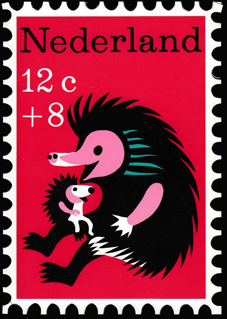
09/03/2018
NEDERLANDS
(NETHERLANDS)
CHILD WELFARE – PORCUPINE LULLABY
“12c + 8c stamp design
Novelty Card
RECTANGULAR SHAPED (FOLDED) CARD WITH CUT PERFORATIONS AROUND EDGE
I picked this up at the same time as the above item. It is very similar in design, except for the shape. This time it is a 1967 issued Nederlands Child Welfare stamp (SG 1043). The Stanley Gibbons ‘Stamps of the World’ catalogue I have (2004 edition) says that this depicts a porcupine, which is interesting because when I bought this folded card I thought it depicted a hedgehog, so you live and learn.
This is another folded ‘Greetings’ styled card, again with cut perforations around the edge. When opened-up – see below – the inside has a copy of the stamp applied and cancelled with a first day of issue hand stamp dated 7th November 1967. As with the triangular shaped card above this is clearly not a postcard, but I still think it is an attractive philatelic card and, when something like this costs just 50p, then I think it is a bargain and worth adding to a collection of card items.

09/03/2018
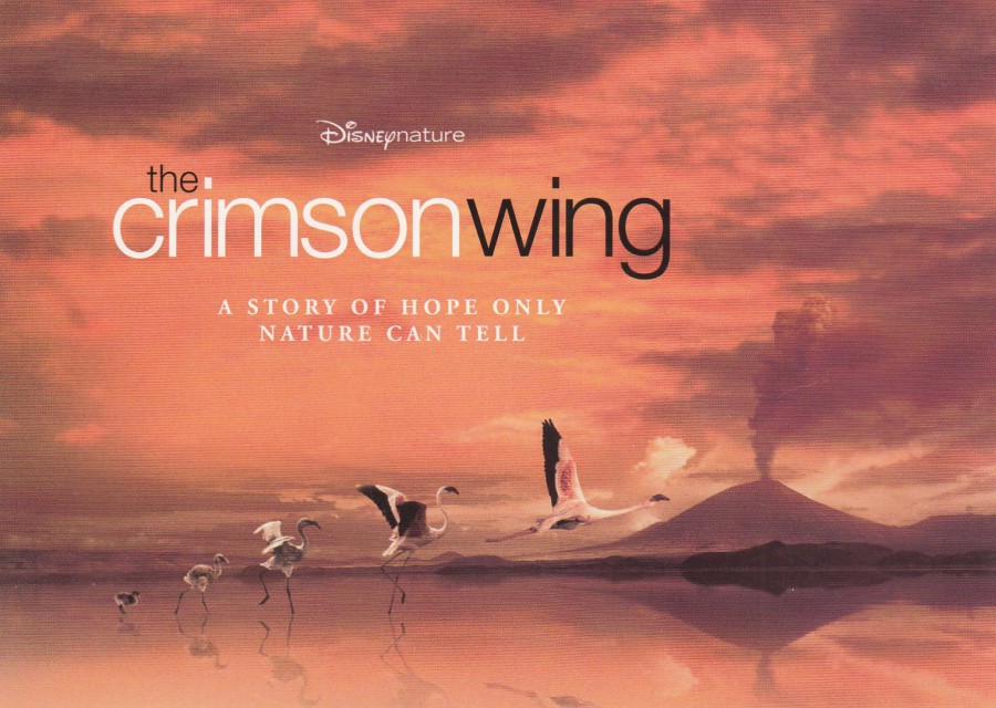
THE CRIMSON WING
‘A Story of Hope Only Nature Can Tell’
DISNEY-NATURE
IN CINEMAS SEPTEMBER 2009
Official Promotional item
No Printer named
Disney have been issuing nature films for many years, there was one about Pandas which I think came out last year. This one was about flamingos and the full title of the film was “THE CRIMSON WING: MYSTERY OF THE FLAMINGOS”. This publicity promotional free postcard was released in the UK (but there may have been versions issued in France). This film was the first to be issued under the ‘Disneynature’ label. It was premiered in France in 2008 (October 26th), but as the text above, from the reverse side of this postcard, states, it was first shown in UK cinemas in September 2009 (29th Sept). The film did not receive a cinema release in the US, it was released straight to video in 2010.
09/03/2018
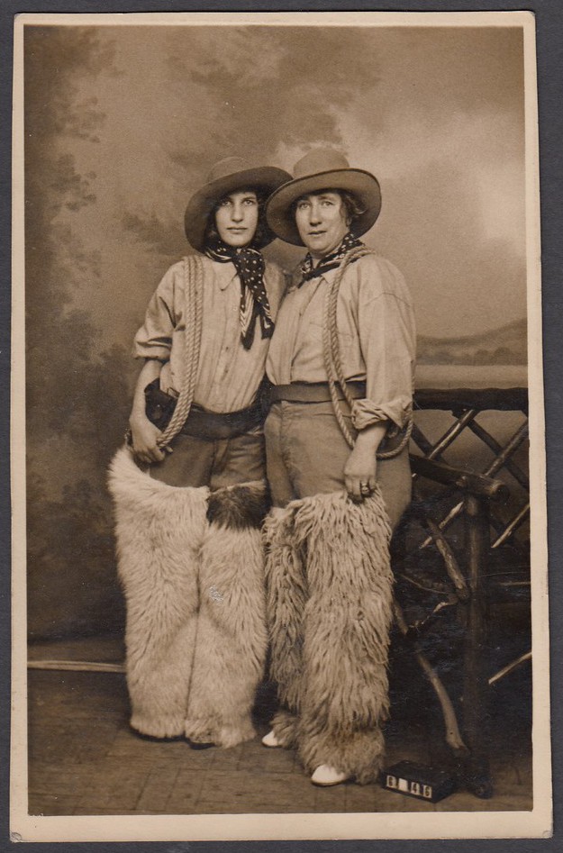
UNTITLED
Photograph taken at the
WHITAKER’S “COWBOY” FANCY DRESS STUDIOS
50 & 51 MARINE PARADE, SOUTHEND-ON-SEA
What could possibly be a better souvenir of a visit, or a holiday at the seaside town of Southend-on-Sea than a personal postcard made from a photograph taken n a special studio which seems to have specialised in staged fancy dress ‘Cowboy’ photographs. This type of fancy dress photograph is still popular to this day, although these days the photographs are often sepia toned, or ‘browned’ to appear old, although the cowboy fancy dress is still the most popular, from what I have seen.
I bought this one not for the image itself but more for the location of the studios where the photograph was taken, Southend, my home town.

REVERSE SIDE OF ABOVE POSTCARD
Here you can see the advertisement for the studios, with the address
09/03/2018
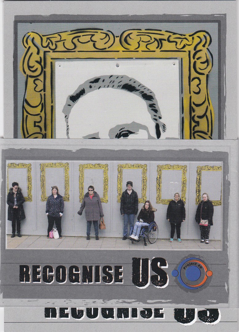
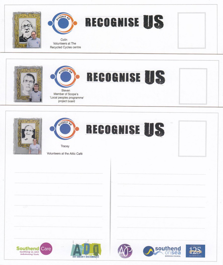
RECOGNISE US
‘PROJECT 49’
POSTCARD PACK
with the wrap-around band that held the set together
Official Postcard Set
Unknown Printer
“Recognise Us was a major art installation during the spring and summer of 2017 by Project 49 on one of Southend’s community art walls.
The aim of the project was to help breakdown stereotyping and to positively promote people with learning disabilities as well as creating wonderful street art to brighten our town.
All of us artists and models have learning disabilities and we are proud to play an active role within our community.
These postcards have been produced to celebrate diversity and inclusiveness in Southend-on-Sea.
Do you recognise us around town and do you recognise us for our contribution to our town?”
(Text from the Information Card that came with the Postcards)
On Wednesday 7th March I attended a special event where Project 49 celebrated their fantastic ‘RECOGNISE US’ project which had been held in my home town of Southend on Sea last summer. A group of artists with learning disabilities had produced portraits of local people, also with learning disabilities, who give great contribution to the community of Southend (as described in the above text which comes on the information card that is included in the pack). People who attended this event, held in the local Victoria Plaza Shopping Centre, could take a free pack of postcards which depict the individual portraits. I love this project and what it achieved, and I also love that they have celebrated it with these smashing postcards. I also got the chance, at this event, to meet the people involved, and depicted.
FAR LEFT
DAVE
Works as a domestic assistant at Viking House
NEAR LEFT
KERRY
Works for Southend Borough Council as kitchen and restaurant assistant
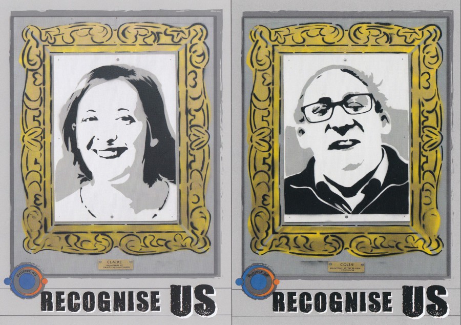
FAR LEFT
CLAIRE
Volunteers at The Trinity Centre nursery
NEAR LEFT
COLIN
Volunteers at The Recycled Cycles centre
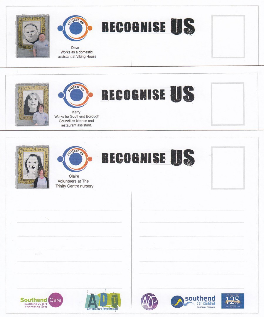
REVERSE SIDE OF FIRST THREE POSTCARDS
(Overlaid on each other to show the top section of the first two postcards and the whole of the reverse of the third card)
Even the backs of these postcards were well thought out and designed, and I applaud the use of colour, which I have mentioned before adds something special to issued postcards. Each card has a photograph of the piece of artwork, a single portrait as depicted on the front of the postcard, with the person depicted standing by it.
REVERSE SIDE OF LAST THREE POSTCARDS
(Overlaid on each other to show the top section of the fourth and fifth postcards and the whole of the reverse of the sixth card)
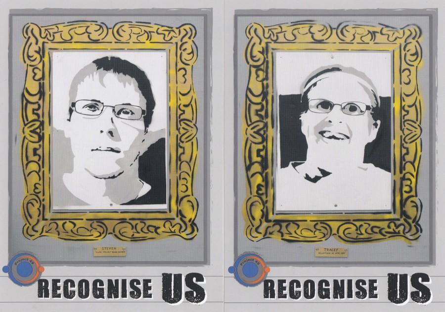
FAR LEFT
STEVEN
Member of Scope’s ‘Local peoples programme’ project board
NEAR LEFT
TRACEY
Volunteers at the Attic Café

INFORMATION CARD
FRONT
(Included with the postcards in the pack)
Depicts the artists involved in this project
Contact details for the project
prject49southend

INFORMATION CARD
REVERSE
Gives details about this project (as shown above in my introduction).
This also shows the art wall installation itself, with those depicted on the portraits standing in front of each.
PHOTOGRAPH
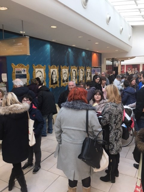
07/03/2018
This depicts People at the event where the postcards were available
PHOTOGRAPH
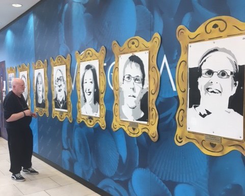
07/03/2018
This depicts the portraits which were the main aspect of this RECOGNISE US art project

PHOTOGRAPH
07/03/2018
Some ‘pre-packaged’ sets of the postcards were prepared for those involved in the project
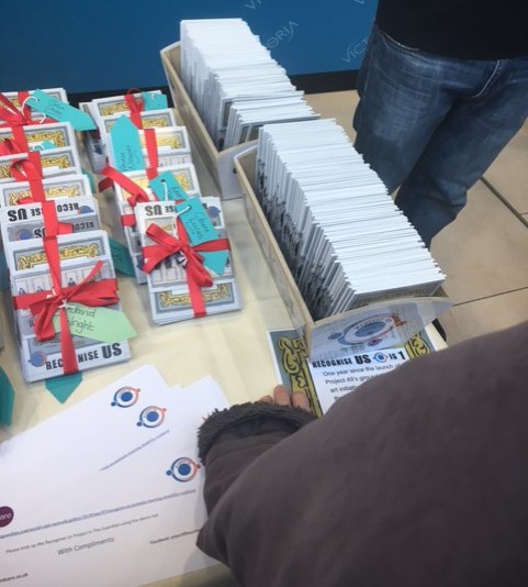
PHOTOGRAPH
07/03/2018
This is the box, far right side, containing the postcard sets which people could take a free set of postcards from.
For me this was a superb example of how people can work together for a really good cause and come together to promote and, publicise something worthwhile. For me of course, there was also the fact that this occurred in my home town, thus allowing me to add all this to my local history collection.
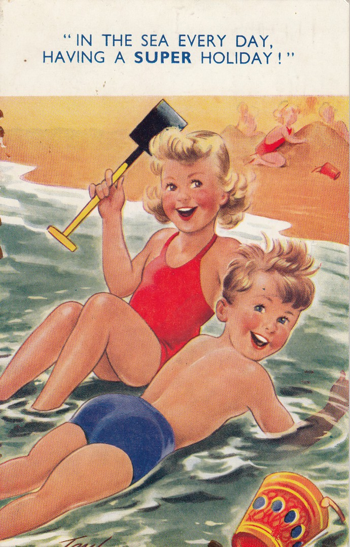
08/03/2018
IN THE SEA EVERY DAY,
HAVING A SUPER HOLIDAY!
Published by
BAMFORTH & CO., LTD
(Holmfirth, Yorkshire)
Ref: “SEASIDE KIDDY” Series No. 1374
Artwork by Arnold Taylor
(company in-house postcard artist)
Remembered much more for his more-saucy seaside postcard designs, Taylor also drew these very engaging children at the seaside designs. I have always liked these, and they have become much more of interest to collectors over the last few years as people have started being more appreciative of the cards of the 1950’s and later. I think this is because these cards, for so long still called ‘Modern’ cards by dealers and the older collectors, are now being assessed much better with the realisation that they are over sixty years old, this one here was posted in 1956, so is 62 years old now! The images are lovely as well, and they should be considered as part of our postcard heritage.

REVERSE SIDE OF ABOVE POSTCARD
Posted from Skegness (now there is a typical seaside location in the UK!) and the Queen Elizabeth ‘Wilding’ definitive 2 ½ d stamp has been cancelled with a SKEGNESS, LINCS machine wavy line cancel dated 21st July 1956.
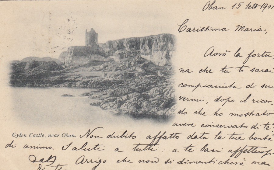
08/03/2018
GYLEN CASTLE,
NEAR OBAN
By
Anonymous Publisher
Posted 1901
This early undivided back postcard, which means that only the address could be written on the other side, and because of this law/rule publishers would leave a large area on the front for the written correspondence. The more recognised ‘Divided Back’, where you could place an address on the right side and the message on the left side, was a British invention and came out for the first time in the year after this card here was posted, 1902. So, this is an example of a late undivided back.
This postcard was posted from Oban to Italy in 1901.
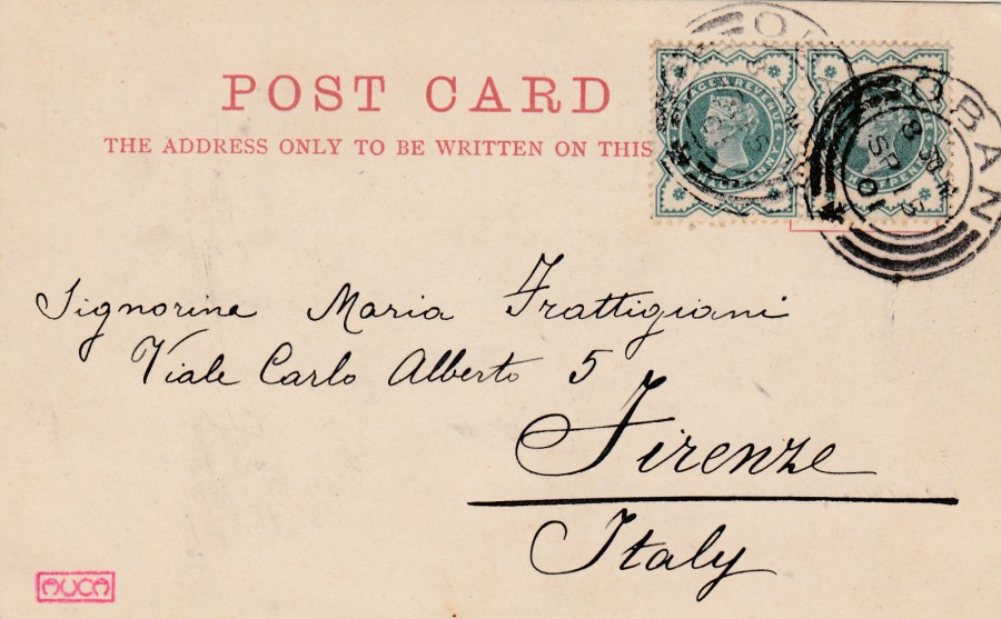
REVERSE SIDE OF ABOVE POSTCARD
The cost of posting a postcard within the UK was a ½ penny, but postage abroad was 1 penny so, two 1/2d Victorian stamps have been used here to make up the correct postage rate. These have been cancelled with a circular double bridge (two lines within boarder in lower half of the cancel) OBAN hand stamp dated 15th September 1901. The little red boxed AUCA mark bottom left has been applied to this card by either the receiver as a mark of their collection or by a later collector as a mark of the card being in their collection (which I think is much more likely). I bought a few cards from one stall at Stampex and, although they were from different publishers and locations around the UK and, they were all addressed to different people and locations in Italy, they all had this small red boxed mark.

08/03/2018
TACV - CABO VERDE AIRLINES
Printed by
BARRACUDA ART DESIGN
Ref: ATR 42
These official airline postcards can be quite useful for those who collect aeroplane postcards, especially those who want modern cards of modern planes. Although many no longer issue them, and those that do, they do so rarely these days, they maintain a dedicated band of collectors.
07/03/2018
UNTITLED ARTWORK
By
LAWRENCE MANN
Published by
BOOMERANG MEDIA
An example of an artist using the Boomerang rack cards as a form of promotion for his artwork. Boomerang offered up this free service to artists for a ‘number’ of years, and it resulted in some unusual and sometime interesting designs. To me this piece of art has a sort of ‘War & Peace’ motif.
07/03/2018
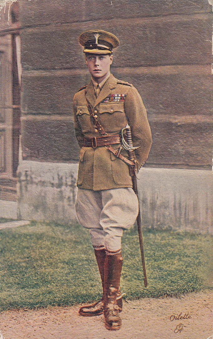
H.R.H. THE PRINCE OF WALES
(Photo Vandyk)
Published by
RAPHAEL TUCK & SONS
Ref: ‘OILETTE’ Postcard No. 3331
This is a lovely 1930’s era royalty themed postcard depicting the then H.R.H. Prince of Wales, who was still the Prince of Wales at the time this image was taken, and the postcard issued. He later of course, briefly, became King Edward VIII before abdicating in the very year this postcard was posted -1936.
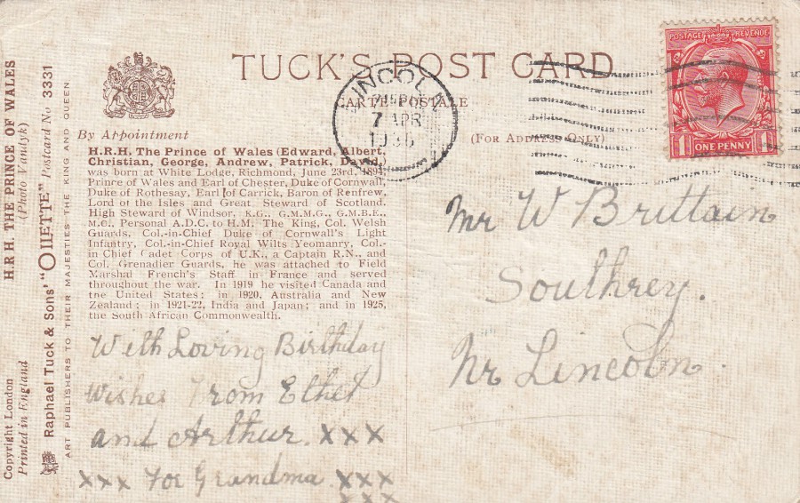
REVERSE SIDE OF ABOVE POSTCARD
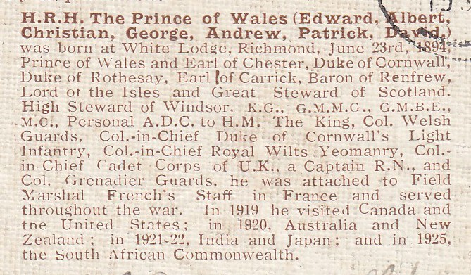
This has a fairly-detailed, up to the point of issue, biography of the prince. The card was posted on the 7th April 1936 and by this time the prince was now King Edward VIII. The postage stamp, depicting his father, has been cancelled with a LINCOLN wavy-line machine cancel. The postcard was sent as a birthday card, although I think the subject matter is an unusual one for grandparents to send for such an event.
07/03/2018
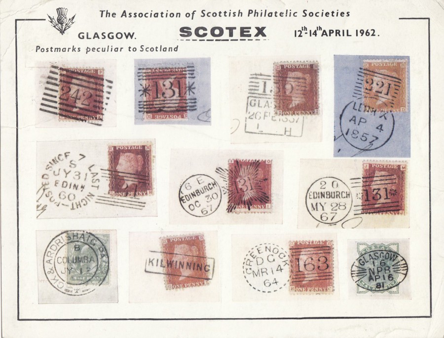
SCOTEX
THE ASSOCIATION OF SCOTTISH PHILATELIC SOCIETIES
GLASGOW
12TH – 14TH APRIL 1962
‘POSTMARKS PECULIAR TO SCOTLAND’
Official Postcard
Printed by
D. WOOD & SON PRINTERS, PERTH
This is an exceedingly large postcard, well over A5 size. I came across it on a stand at Stampex last month. I have an interest in philatelic event postcards, especially as many have special handstamps applied, and of course many depict hand stamps as well. This one depicts hand stamps from the Victorian stamp era, eleven of them. The front of this card is very attractive, but the reverse side is superb.

REVERSE SIDE OF ABOVE POSTCARD
Here you have a 3d lilac Scottish Queen Elizabeth definitive stamp (SG S7), as issued in 1958, applied top right. This stamp has been cancelled with the exhibitions special hand stamp: ‘ASSN SCOTTISH PHILATELIC SOCIETIES – SCOTEX – GLASGOW – 12 APRIL 1962’. This was at the time that almost all the philatelic events held in the UK sponsored a special hand stamp to be used on souvenir covers and postcards, often with these being specially produced for the events as well. On the left side a special exhibition cinderella label – ‘SCOTEX, GLASGOW 12th 13th 14th APRIL 1962’, has been applied. This label was probably only available at the Event. This label has had a large boxed red cachet applied to it, another exhibition item which was probably only available to be applied to items at the event itself. The red cachet reads: ‘SCOTEX 1962 – THE ASSOCIATION OF SCOTTISH PHILATELICSOCIETIES – EXHIBITION – McLELLAN GALLERIES – GLASGOW – 12, 13, 14 APRIL 1962’. The combination of hand stamp, label, cachet and stamp makes this an appealing looking item, but a very large one.
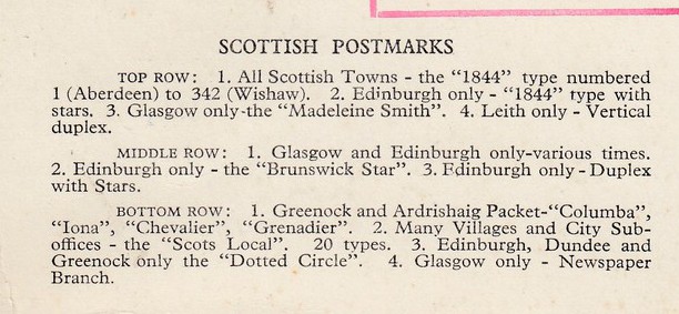
ENLARGEMENT - Details of the depicted hand stamps on the front of the card
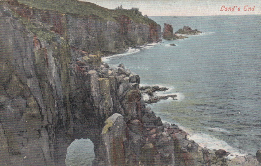
07/03/2018
LAND’S END
Published by
VALENTINE’S
(VALENTINE’S SERIES)
A nice view out from the land across and out to sea. Visitors to Land’s End have always bought postcards as souvenirs, many have of course been posted over the years and people doing so at the location would seek out one of the special cachets, now numerous, but in the past, there was only one or two, which frequently changed. This card here was not posted but does have a special cachet (which by now you should know I do like)
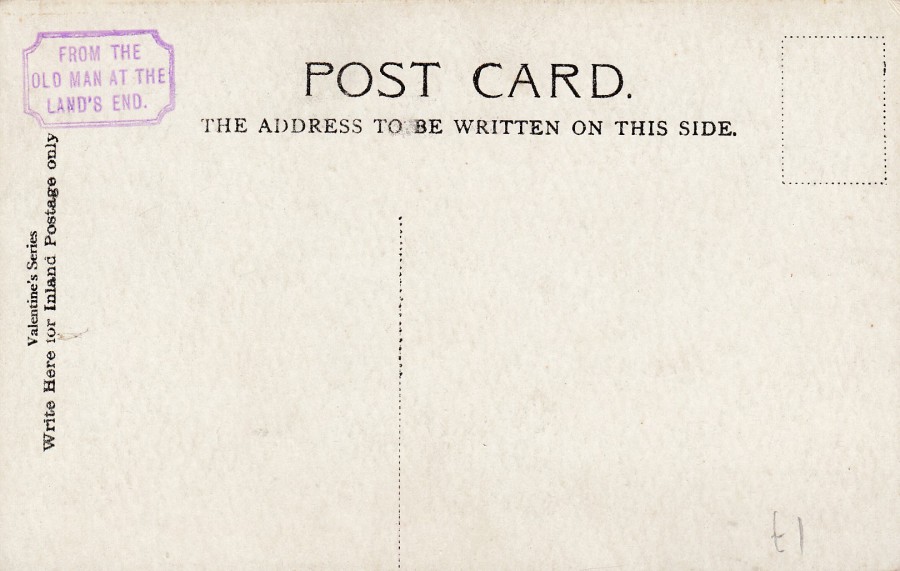
REVERSE SIDE OF ABOVE POSTCARD
With
CACHET:
“FROM THE OLD MAN AT THE LAND’S END”
Purple colour
Rectangle with indented corners
This tourist cachet was used between 1901 and 1910, and it was one of the first, in fact one of the first two, to be used. In the reference book ‘Collect British Postmarks’ published by Stanley Gibbons (8th Edition) this cachet has the reference 24/94 (page 343) – It is one of the better cachets to get and is valued at £6.
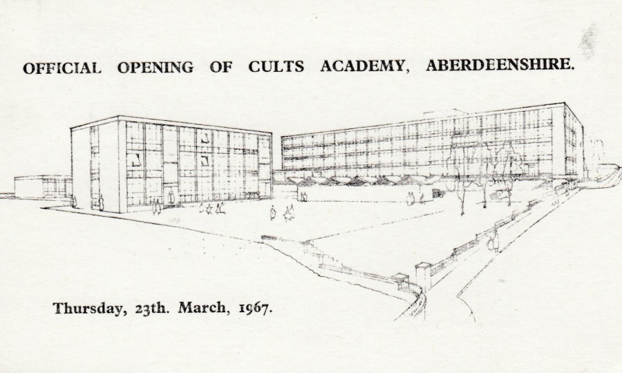
06/03/2018
OFFICIAL OPENING OF CULTS ACADEMY.
ABERDEENSHIRE
THURSDAY 23RD, MARCH 1967
Privately printed postcard
(Anonymous producer)
Postcards like this are usually only of interest to local postcard collectors, but I came across this one on a philatelic stand at Stampex, and it was the reverse side which caught my eye.
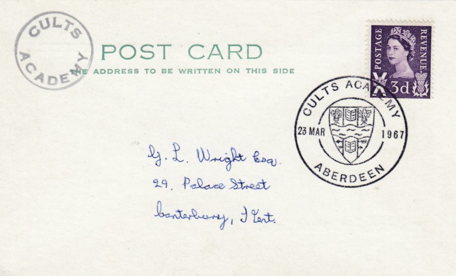
REVERSE SIDE OF ABOVE POSTCARDS
This has a superb special cancellation commissioned for the opening of this academy – CULTS ACADEMY – ABERDEEN – 23 MAR 1967. It has a small circular CULTS ACADEMY cachet top left, and you know how much I like cachets!
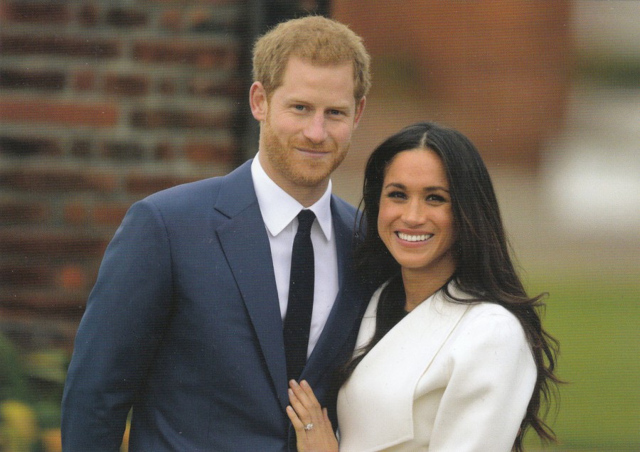
06/03/2018
HRH PRINCE HARRY AND MS MEGHAN MARKEL
ANNOUNCE THEIR ENGAGEMENT
27TH NOVEMBER 2017
Published by
PAGEANTRY POSTCARDS
Ref: JEF209
It has taken awhile, but here is the first postcard I have found which depicts Meghan Markel, the fiancé of Prince Harry, who is also depicted. This is from the official photo-shoot for the announcement of their engagement. This is an absolutely-essential addition to any modern ‘Royalty’ themed collection, but it is also one of the weirder cards from my ‘Television’ collection as well! This is because she played the character ‘Rachel Zane’ in the legal drama series called ‘Suits’ for seven seasons from 2011 to 2017. I suspect only extreme television collectors, like me, will add this to their collection, but it would be a legitimate addition. This excellent postcard, from a superb publisher of royalty themed postcards, in fact they are currently almost certainly the best in the UK, is available in many branches of W.H. SMITH – check out any spinners in stores.