04/03/2017
MARVEL
DISNEY THEME PARK MERCHANDISE
LAKE BUENA VISTA (FLORIDA)
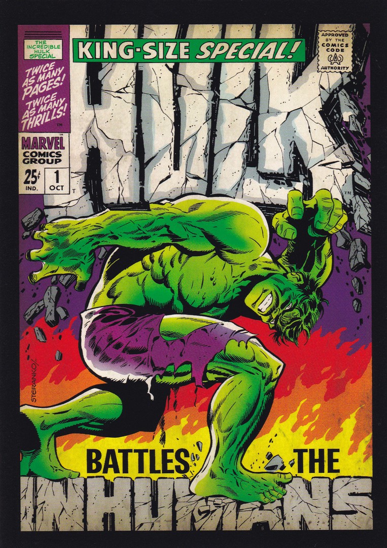
HULK
KING-SIZE SPECIAL
HULK BATTLES THE INHUMANS
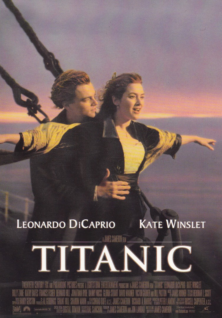
These two postcards here (see below) are the same size, thickness and printed in what appears to be similar (if not the same) quality as the DISNEY WONDERGROUND postcards, many of which I have posted here on the webpage before. I found these two postcards on sale in a special ‘MARVEL’ store located in Disney Springs (the old Downtown Disney area) in Walt Disney World, Florida. They were also the same price as the Disney ‘Wonderground’ postcards - $4.95 each. Being a super-hero collector I knew that I had to have these two postcards. But, I give a word of caution here around collecting this type of postcard in the Disney world. I saw these and, yes, they were expensive, but I bought them that first time I saw them. Each was contained in a display box which held a good 50 odd copies, or more. I returned just three days later to eat in a nearby restaurant and to kill time was again looking in the shops. When I checked this time every single copy of each card had gone. I checked with staff and they confirmed that they had all gone. So, expensive perhaps, but they still sold extremely well. My advice therefore is, if you see a postcard you like in any Disney outlet, especially in America, buy it when you first see it and do not assume it will still be there later in your holiday - because that might not be the case.
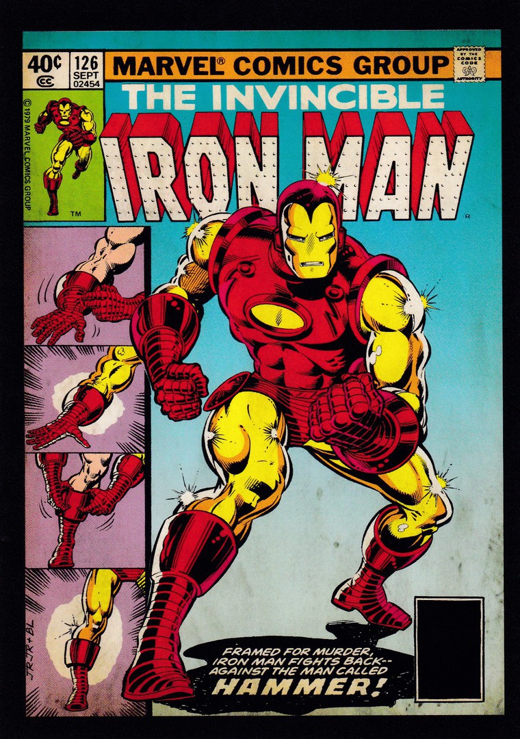
THE INVINCIBLE IRON MAN
The second postcard bought in the story mentioned above. I am a bit torn as to which I think is the best as I have always been a bit of a fan of both characters. I love the Iron Man story and think the films have brought the character to life well whilst the early Hulk films were not as good, but, after the subsequent ‘Avenger’ movies the character is back to being properly represented and portrayed (kudos to Mark Ruffalo for achieving this). And, the above comic book cover is a cracker. But I think it matters not as clearly both characters are currently very popular because, as already stated above, both postcards sold out in what I thought was an amazingly short period of time (although I did not find out if they intended to re-stock them in the future)
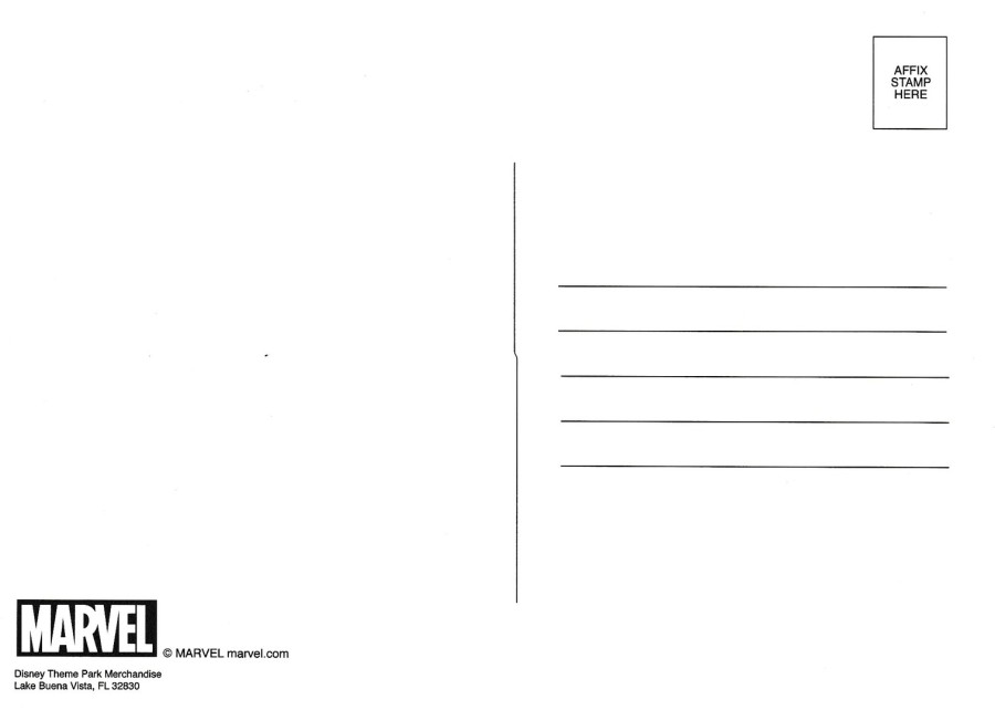
REVERSE SIDE OF ABOVE POSTCARDS
The two Super-hero postcards have the identical reverse type

04/03/2017
400e ANNIVERSAIRE DE L’INTRODUCTION DU CHOCOLATE EN FRANCE
(The 400th Anniversary of the introduction of Chocolate in France)
Published by
‘CREATION – FIRST DAY COVER – MARQUE DEPOSEE – PARIS – CARTE PHILATELIQUE
The front of this postcard depicts a cup of drinking chocolate which was once a very hot item in the early French courts. The image here is simple and has little to distinguish itself so it is perhaps a real bonus that the reverse side of this postcard has tons of interest…

REVERSE SIDE OF ABOVE POSTCARD
The 400th Anniversary of the introduction of Chocolate in France
23RD May 2009
Chocolate Scented Stamps
On the ‘23rd May 2009’ the French post office – Le Poste – issued a ten-stamp sheet which was designed to look like a chocolate bar. This postcard here has three of these stamps applied and cancelled first day of issue with a special hand stamp which depicts drinking chocolate, which, as mentioned above, was a very important introduction to the country. But, there is an extra edge to these stamps as they have also been impregnated with a real chocolate smell (not exactly ‘scratch ‘n’ sniff’ but you can ‘definitely’ smell chocolate when you handle these, but only if they have been well kept as when they were issued it was stated that the smell should last at least two years…but the ones on this card do still have a slight chocolate whiff). At the bottom, near the centre is a signature which I have been lead to believe is that of the artist that designed these stamps, but I am still to confirm this, but it is certainly someone connected with this postcard so either the stamp designer/artist, hand stamp designer or the person who took the front photograph (this last one being the least likely). All in all a cracking little oddity
04/03/2017
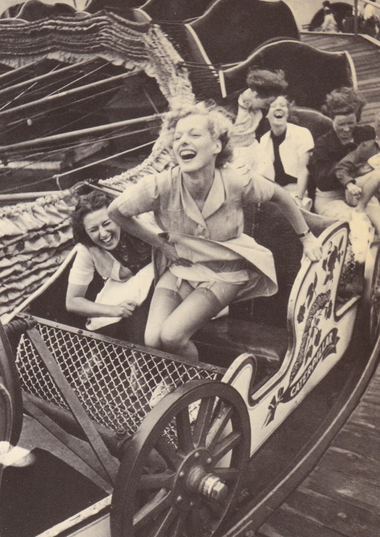
PRE-WAR JOY
Published by
CAMDEN GRAPHICS (Camden Graphics Limited, London)
Ref: PC 152
The Camden Graphics issues are so good I thought I would post another. Unlike the previous posting this one is a photograph. It is ‘actually’ quite a well-known one and has appeared on modern posters and is often used to show the amusement people had prior to the second world war. No details are recorded on this postcard as where this image was taken. But, this is not a problem as I happen to be aware that this photograph was taken at the Kursaal Amusement Park in my home town of Southend-on-Sea. So, this makes it a local history postcard for me.
04/03/2017
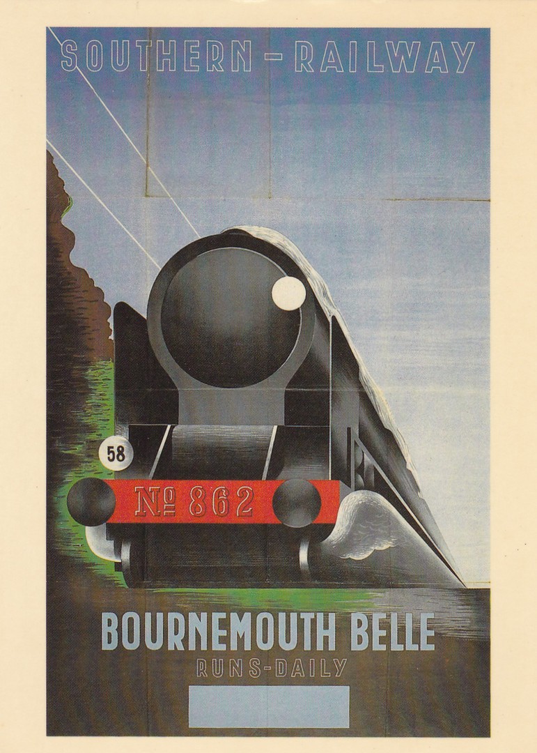
BOURNEMOUTH BELLE RAILWAY POSTER 1936
SOUTHERN – RAILWAY
BOURNEMOUTH BELLE
RUNS – DAILY
Published by
CAMDEN GRAPHICS (Camden Graphics Limited, London)
Ref: PC 160 BOURNEMOUTH BELLE
Do you know, I think this might be the first Camden Graphics postcard I have featured, which is strange as I have long been an avid collector of this companies postcards. During the eighties, at the height of their output, I was buying the new issues as I came across them. Over time I amassed quite a collection, but their output was extensive and I do not have a complete run. They issued a range of poster postcards and not just railway related ones like this one here but they are perhaps better known for their art issues, cartoon cards and modern designs. Like other companies that produced an eclectic range of images the company has its own specialised collectors. They would definitely want this one, if not already in their collections, but the many railway collectors would also desire it.
03/03/2017
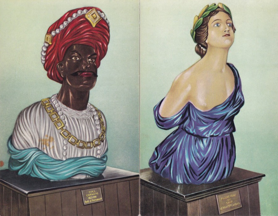
TWO POSTCARDS PUBLISHED BY
GALE & POLDEN LTD
For the Society for Nautical Research
FAR LEFT
FIGURE-HEAD OF H.M.S. CARNATIC
NEAR LEFT
FIGURE-HEAD OF SHIP OF MID-19TH CENTURY
Every so often something unusual comes along in a cheap box - which was where I found these two
03/03/2017
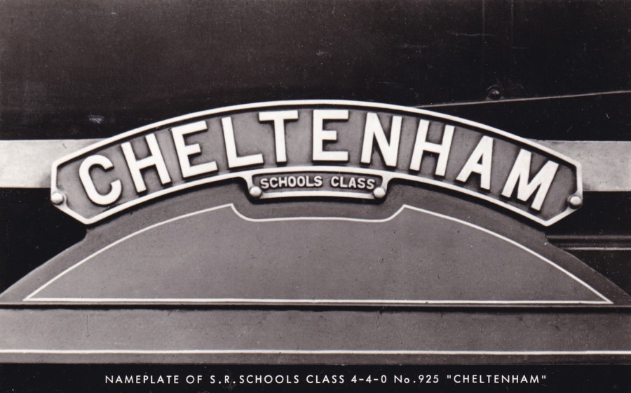
CHELTENHAM
SCHOOLS CLASS
NAMEPLATE OF S. R. SCHOOLS CLASS 4-4-0 No. 925 “CHELTENHAM”
Published by
PHOTOMATIC LTD., DELLSOME LANE, N. MYMMS, HERTS
A simple postcard image but one which a railway theme collector would like
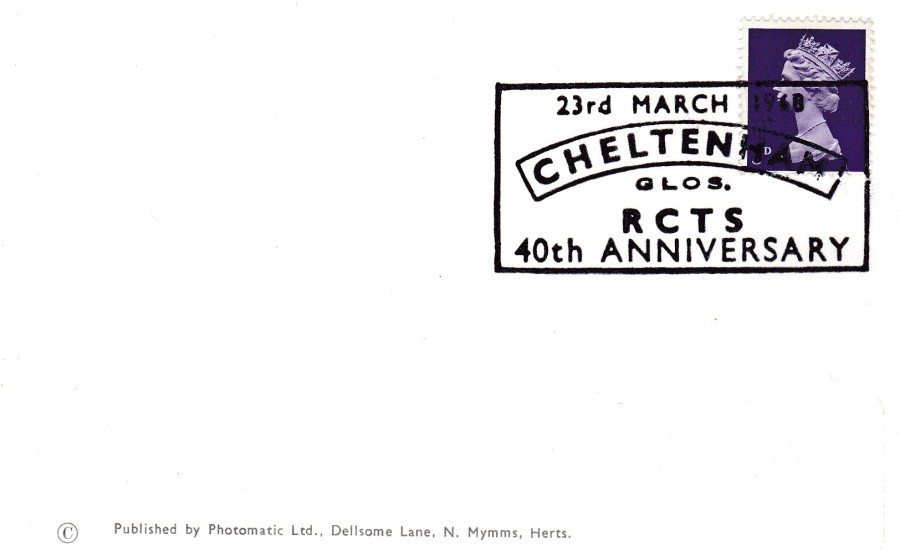
REVERSE SIDE OF ABOVE POSTCARD
This has a ‘really’ nice special hand stamp applied which directly relates to the postcards front image. The boxed hand stamp reads:
23rd MARCH 1968
CHELTENHAM
GLOS.
RCTS
40th ANNIVERSARY
I do wonder if the hand stamp was the reason for this postcards issue because it is a bit of a coincidence that this perfect hand stamp came along to be applied to the perfect matching postcard.
03/03/2017
LE MANEGE ENCHANTE
“THE MAGIC ROUNDABOUT”
RTF (French Television)
Carte Visio-relief
Published by
M. D. PARIS
VISOMATIC PARIS – 1967
3D IMAGE
This one goes ‘really’ well with the previous posting, and it is by the same company. ‘The Magic Roundabout’ is of course also well known in the UK although, as with this postcard, it originated in France. As with the below posting the background of the card is blurred because this is a 3D postcard. In France, this would cost you at least 5 euros, but do not be surprised to have to part with £5 here in the UK.

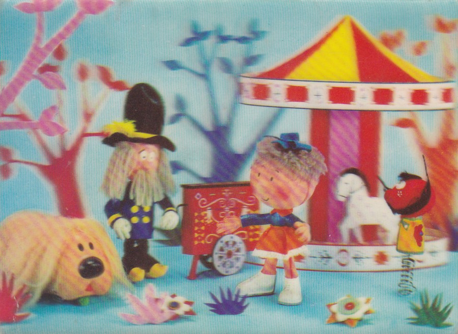
03/03/2017
BONNE NUIT LES PETITS
RTF (French Television)
Carte Visiorelief
Published by
M. D. PARIS
VISOMATIC PARIS – 1966
3D IMAGE
I have previously posted a range of photographic postcards depicting the characters from this French children’s television series – see AUG BLOG 4 for these images and information around this programme and its history – depicted here is a slightly more special postcard as this one is a 3D image (which explains why the image looks slightly blurred in the background). This card is a cracker and is the type of postcard I love finding. Postcards related to this French programme are quite hard to source in the UK but this one here proves they do turn up.
02/03/2017
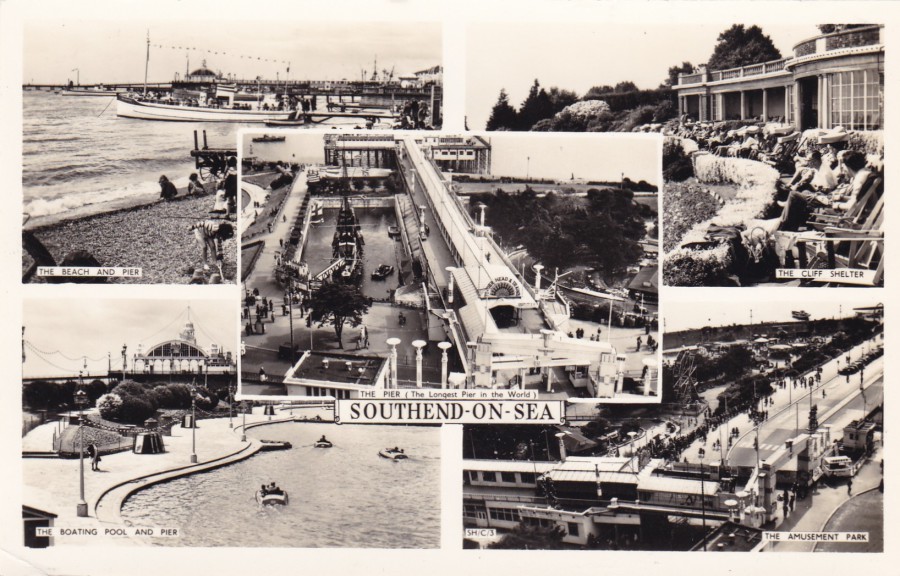
SOUTHEND ON SEA
Black and White Photograph Multi-View Postcard
Published by
MASON’S ALPHA SERIES (printed in England)
TOP LEFT – THE BEACH AND PIER
BOTTOM LEFT – THE BOATING POOL AND PIER
CENTRE – THE PIER (The longest pier in the world)
TOP RIGHT – THE CLIFF SHELTER
BOTTOM RIGHT – THE AMUSEMENT PARK
There can be a lot of history in those old multi-view postcards. The boating lake depicted bottom left has long been gone, as has the gate and walkway over the road depicted bottom right. The centre picture also depicts a pool in which was the Golden Hind ship replica. This was removed only a couple of years ago, and where this pool of water was there is now located an amusement arcade. Most of these changes have occurred in my lifetime so I do recognise these images and for me this local history from my own past. A nice postcard and one which cost me just £1.50

ENLARGEMENT OF THE LOGO AND SETTINGS AT THE TOP OF THE REVERSE SIDE OF THE ABOVE POSTCARD.
01/03/2017
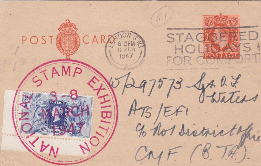
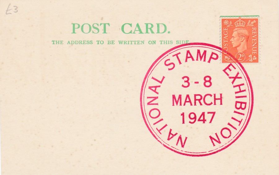
NATIONAL STAMP EXHIBITION 1947
KING GEORGE VI 2d Postal Stationery Post Card
This Postal Stationery Postcard was posted by a visitor to the last day of the National Stamp Exhibition philatelic show held in London in 1947. The exhibition ran between the 3rd and 8th March 1947 (this will be 70 years ago, in just two day’s) 1947.
The sender applied a special blue printed corner example of the NATIONAL STAMP EXHIBITION stamp like cinderella label, which has been cancelled with the large red NATIONAL STAMP EXHIBITION special cachet cancel. The sender then placed this in the post so that it was genuinely used and travelled through the postal system. The pre-printed Postal Stationery Card stamp has been cancelled with a ‘STAGGERED HOLIDAYS FOR COMFORT’ official slogan cancellation (London S.W.1) dated 8th March 1947, the last day of the National Stamp Exhibition. This is a lovely used card with lots of philatelic interest.
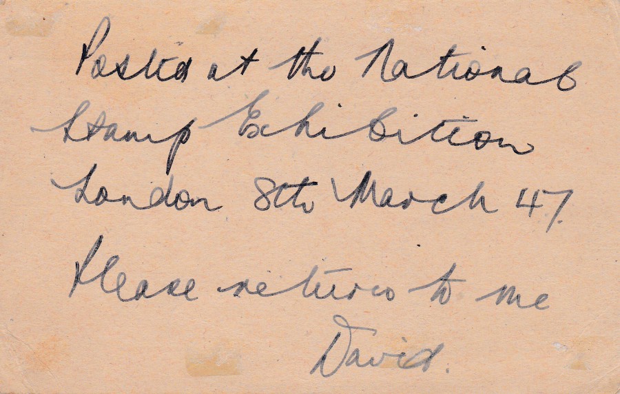
REVERSE SIDE OF ABOVE POSTCARD
The sender was clearly a collector as here he requests the card be returned to him by the person he sent it to
PLAIN POSTCARD
NATIONAL STAMP EXHIBITION
The above postcard was a recent buy at Stampex but the card here I have had for many years. It is a plain Post Card which has had a 2d George VI stamp applied which has been cancelled using the large red ‘NATIONAL STAMP EXHIBITION 1947’ red cachet (used here as a canceller but by favour rather than for actual postal validity). Having this card in my possession already meant that when I saw the used copy above I knew I had to have it. They seem to fit well together in one collection I think.
01/03/2017
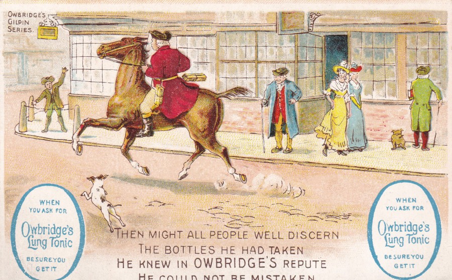
OWBRIDGE’S LUNG TONIC
FOR COUGHS & COLDS
BE SURE YOU GET IT
“THEN MIGHT ALL PEOPLE WELL DISCERN
THE BOTTLES HE HAD TAKEN
HE KNEW IN OWBRIDGE’S REPUTE
HE COULD NOT BE MISTAKEN”
This is a nice company produced advertising postcard from the turn of the last century. As postcard collecting and sending became more and more popular in the late Victorian and early Edwardian periods companies jumped on the bandwagon and issued postcards promoting their products. Some of these early advertising postcards can be quite valuable (not so much this one sadly, but it is still a nice example)
REVERSE SIDE OF ABOVE POSTCARD
01/03/2017
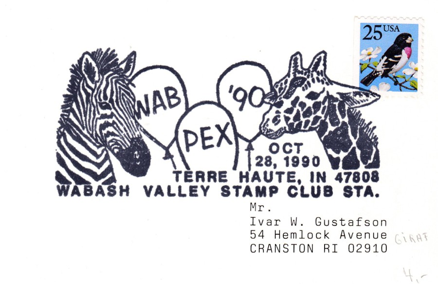
WAB PEX 90
28TH OCTOBER 1990
WABASH VALLEY STAMP CLUB STATION
Large American pictorial cancellation
Here it is most certainly the cancellation that I am collecting, as the card itself is a plain affair. This is a massive cancellation and of the type that is quite typical of these themed American issues. This one would feature nicely in any wildlife/animal collection as it clearly features a zebra and a giraffe. Depending on the theme of the cancel some of these large affairs can be very interesting and you would have to admit this does catch the eye.
27/02/2017
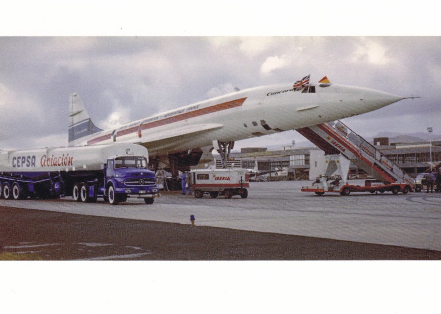
CONCORDE G-BSST (002)
At Las Palmas, Gran Canaria
Published by
HD
Ref: Issue 11
Limited run of 20 Postcards
Yes, that is correct, there really are only 20 copies of this postcard available! Concorde is still a popular theme with a dedicated core group of collectors and, thankfully, an equally small number of private publishers producing postcards in very small numbers. You must be part of the Concorde circle of collectors to be able to pick these up but if you can they are well worth obtaining. Expect to pay a little more for these new issues when they are issued in such small numbers but I consider £2 to be a fair price for a card few others can also own.
27/02/2017
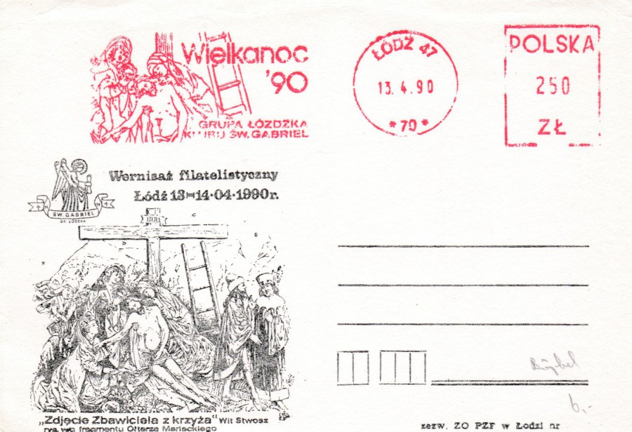
LODZ – POLAND
13 – 4 - 1990
PHILATELIC EVENT – RELIGIOUS BASED POSTCARD
(Plain Backed)
At STAMPEX I bought three very similar postcards from Poland, all of which had a religious connection. In each case the postcard depicts a printed religious based image on the left side. Above this is a red meter mark like postage paid indicator which has an image taken from that depicted on the postcard. Although religious themed postcards are extremely common and numerous they are not highly collected. But, those with a philatelic content as well, i.e. a stamp, postmark or other postage mark, are of a bit more interest and are therefore more likely to be picked up. These three appealed to me and they were in a cheap box so were also a bargain as well.

LODZ – POLAND
24 – 12 – 1993
RELIGIOUS ANNIVERSARY POSTCARD
(Plain Backed)
Although the circular date stamp section is dated from 1993 the image section on the far left has the date 1994 in it which leads me to believe this relates to what was an upcoming anniversary. The printed image on this postcard appears to be applied in a simpler process than with the other two (above and below) and the printed image is less defined. I still think it goes well with the others though.
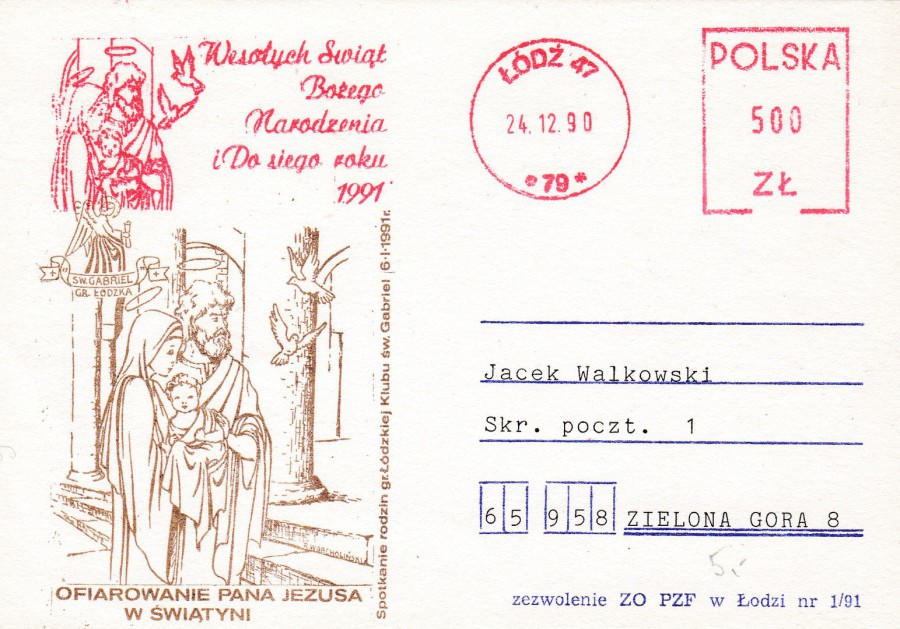
LODZ – POLAND
24 – 12 – 1990
RELIGIOUS ANNIVERSARY POSTCARD
(Plain Backed)
Here the printed image on the left side has been printed in brown. Again, the red meter mark like cancel image has a different year date in it to that in the postage paid circular section. The image has 1991 whilst the circle has 1990.
I fully admit that I do not know the full story behind these three postcards, after all a collector cannot always know everything about the items in their collection, but, as always, this never lessons the joy of having them.
Any help with details or translations would be much appreciated.

27/02/2017
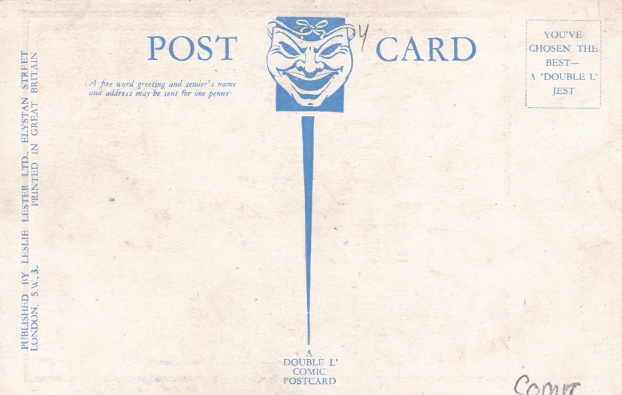
“BLIMEY, THEY’RE MORE LIKE KING KONGS”
A DOUBLE L’ COMIC POSTCARD
Published by
LESLIE LESTER LTD
ELYSTAN STREET, LONDON S.W. 3
Ref: 104
I first saw the original back and white ‘King Kong’ movie as a child, I think it was one of the early evening BBC 2 film showings. I realised it was old, and the effects were quite dated, but I was hooked and became a big fan. I have since collected all the subsequent film versions on video and DVD and have a range of books devoted to the film.
Despite the films popularity King Kong postcards are not that common. They are out there but are mainly modern film poster reproductions or are connected to either the Empire State Building or the Twin Towers (King Kong appeared on both structures, but in different versions of the film).
So, this comic postcard reference to the giant ape is an unusual addition to my collection, and a recent one as I only obtained it last week.
REVERSE SIDE OF ABOVE POSTCARD

27/02/2017
CAPTURED!!
ARRIVAL OF THE LOCH NESS MONSTER AT INVERNESS!
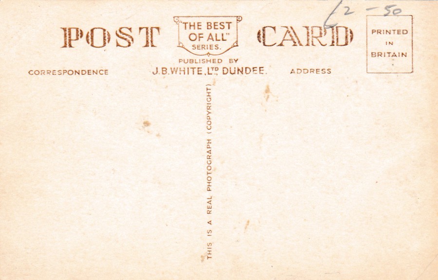
Published by
J. B. WHITE, LTD., DUNDEE
‘THE BEST OF ALL SERIES’
Ref: A.1366
I have mentioned before that I collect Loch Ness Monster postcards and here I depict yet another one, although, this one is a real cracker. It is part photograph, part artwork and part cut-n-paste, where some of the crowd scenes are cut from different photographs and applied to this photograph of Inverness. It is one of my favourite ‘Nessie’ postcards and is far better than most of them.
REVERSE SIDE OF ABOVE POSTCARD
A nice traditional but stylish reverse layout
27/02/2017
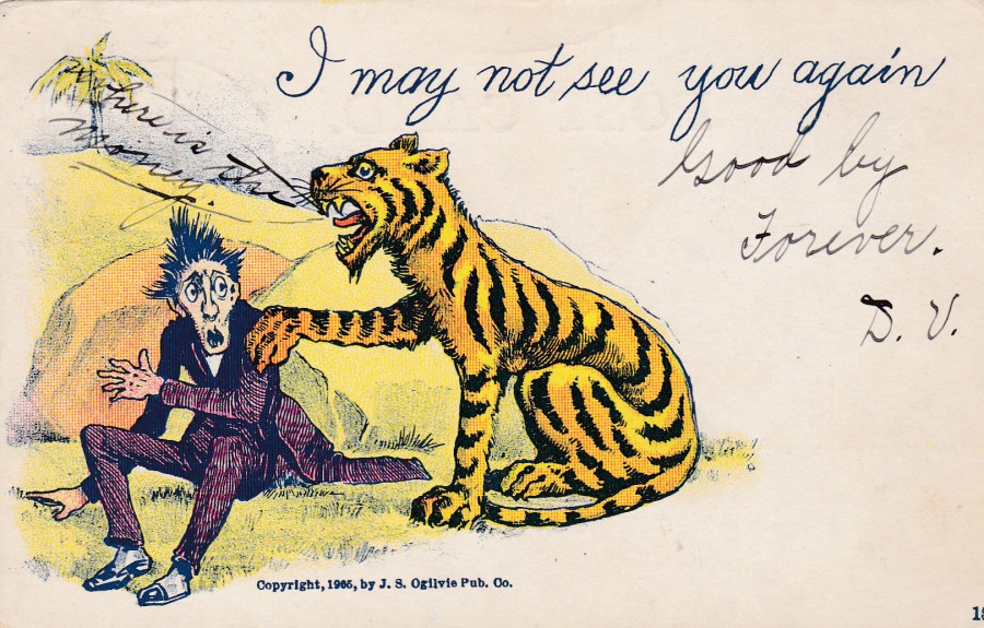
“WRITE AWAY” POSTCARD
“I MAY NOT SEE YOU AGAIN”
Published by
J. S. OGILVIE PUB. CO (Publishing Company)
TIGER DESIGN
A ‘’WRITE AWAY” postcard was, initially, a type of Victorian postcard which then ran on into the early years of the last century and consisted of a postcard with the start of a message already printed on the front, to assist those who struggled to start off their messages. The sending of postcards was at its height around this time, and this type of postcard was designed to make it easier for the sender. This one here has the message starting as “I MAY NOT SEE YOU AGAIN”. Initially for me it was the inclusion of a tiger that made me want this card, because, as you now, I collect tiger postcards. But once I had bought this I became fascinated in the additional hand written text. After the printed ‘I MAY NOT SEE YOU AGAIN’ the sender has written “GOOD BY FOREVER” which I read as ‘Goodbye Forever’ but has just been wrongly spelt. This is quite an extreme thing to write and one does wonder what the sender meant by this. And, then you have the message coming out of the tiger’s mouth. This adds another level of intrigue into the source and the meaning behind the card being sent as the tiger appears to be saying “WHERE IS THE MONEY”. I maybe reading too much into these messages but to me there seems to be either something sinister or something very sad behind the sending of this postcard. It is little, unusual messages like this one which add to the history of these early postcards.
REVERSE SIDE OF ABOVE POSTCARD
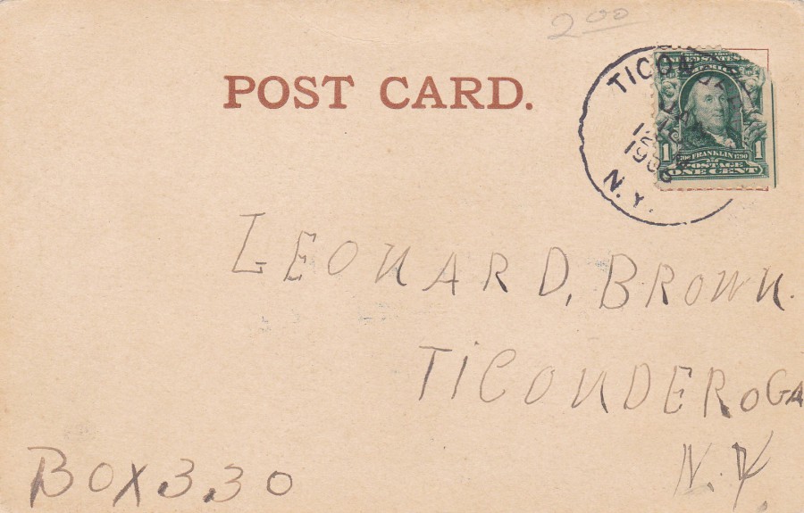
The postcard was sent from someone in Ticonderoga (New York) to another address in the same area. The American postage stamp has been cancelled with a single ring ‘TICONDEROGA N.Y.' cancel dated in January 1906. The postcard is addressed to a Leonard Brown at a Box number – 330, so not to an street address, which, for me just adds a little more intrigue to the cards source and story.
26/02/2017
BILL PAXTON ….. RIP
William Paxton
17th May 1955 – 25th February 2017
Actor and director
Very rarely the main star but still managed to appear in a number of well-known films including The Terminator (1984), Weird Science (1985), Aliens (1986), Predator 2 (1990), True Lies (1994), Apollo 13 (1995), Twister (1996 – one of the few where he was top billed) and Titanic (1997), to name but a few.
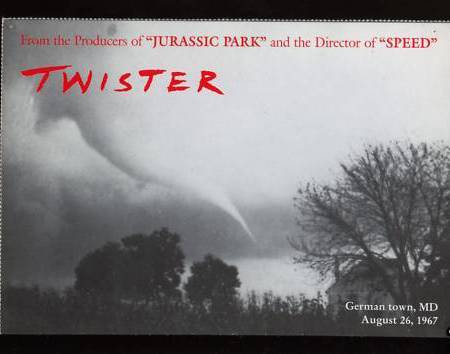
POSTCARD
TWISTER
Official film company release
Black and white publicity postcard issued for the feature film ‘Twister’. This is one of four different similar card issued at the time. They were joined together in a sheet of four so come with perforated edges.

PREDATOR 2
FILM POSTER POSTCARD
Unknown Publisher
No reference number or printer recorded
TITANIC
FILM POSTER POSTCARD
Published by
SONIS
Ref: C. 881 TITANIC

PHOTOGRAPH
BILL PAXTON
26/02/2017
STAMPEX 2017
Part Two
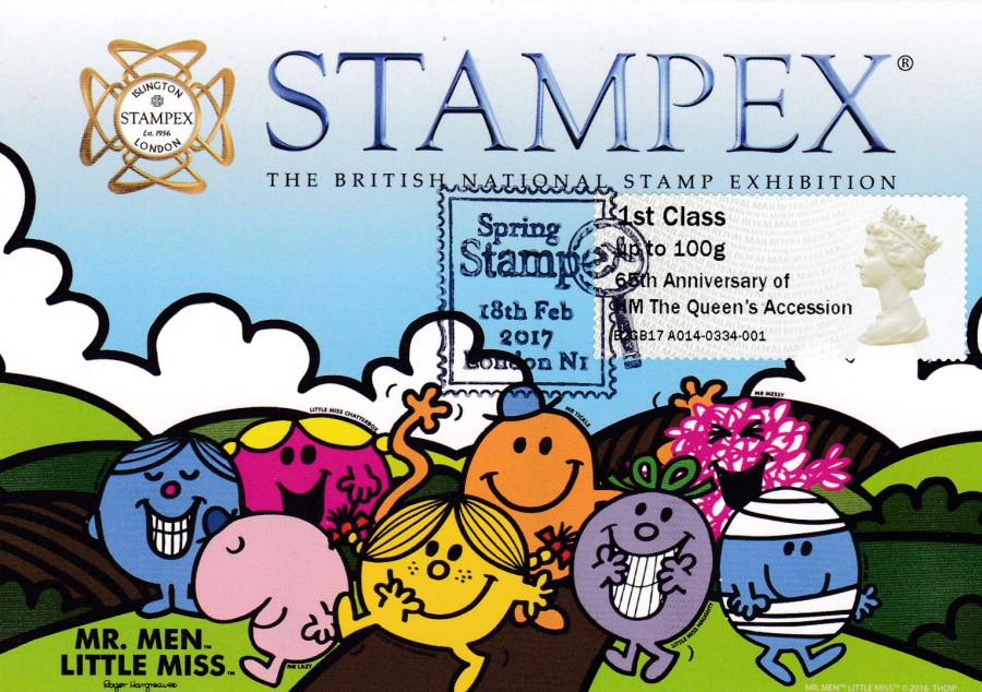
Official MR MEN & LITTLE MISS postcard
The last day of STAMPEX was the 18th February. In my first posting I showed you a copy of this postcard with a Post & Go Machin Head stamp postmarked for the first day. That stamp was overprinted with a Machin Anniversary text. Also available from the Post & Go machines were Machin Head stamps with a different overprint:
65th Anniversary of
HM The Queen’s Accession
Here you have a copy of the postcard used with one of these different overprints and cancelled with the STAMPEX magnifying glass special hand stamp dated 18th Feb 2017 (last day). This is another personally produced souvenir.

MR MEN – LITTLE MISS – UNDERGROUND
Published by
‘paperchase’
Ref: FSC C014059
Just around the corner from the location that the STAMPEX show is held is a ‘paperchase’ shop. As I had one single ‘Mr Men ‘smilers’ stamp left after producing my first day souvenirs (see previous STAMPEX posting – PART ONE) I bought this Mr Men and Little Miss Underground Train design and applied the last smilers stamp on it, as it happens it was Mr Grumpy. I then had this cancelled with the same STAMPEX cancel as applied to the postcard above.
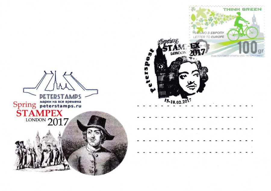
PETERSTAMPS
SPRING STAMPEX 2017
Exclusive postcard issued to commemorate the
320th ANNIVERSARY of the beginning of the Great Embassy of Peter the First in the UK
PETERSTAMPS represent a number of European and Asian areas and they had a stand at Stampex where they sold this exclusive Spring Stampex postcard. The card was available with two different applied stamps and two different special cancellations. This is the first version which has a Peterspost Russian ‘Think Green’ stamp.
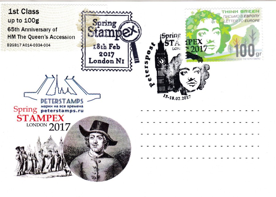
PETERSTAMPS
SPRING STAMPEX 2017
Exclusive postcard issued to commemorate the
320th ANNIVERSARY of the beginning of the Great Embassy of Peter the First in the UK
This is a second copy of the above postcard but here I have applied another of the Post & Go overprinted Machin Head stamp -
65th Anniversary of
HM The Queen’s Accession
This has been cancelled with the afore mentioned ‘Stampex’ special cancellation, for the last day of the exhibition. Another personal souvenir.
PETERSTAMPS
SPRING STAMPEX 2017
Exclusive postcard issued to commemorate the
320th ANNIVERSARY of the beginning of the Great Embassy of Peter the First in the UK
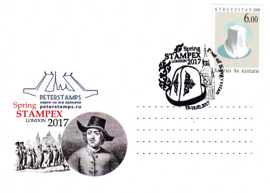
KYRGYZSTAN STAMP
This is the second version of this postcard sold. This time they have applied a stamp from KYRGYZSTAN (Officially the Kyrgyz Republic, formerly known as Kirghizia and a landlocked country in Central Asia and bordered by Kazakhstan to the north, Uzbekistan to the west and southwest, Tajikistan to the southwest and China to the east).
The stamp in question appears to be from 2008. As with the special hand stamp on the above depicted card the UK is represented by Big Ben (yes, I am aware that this is technically the name of the bell inside the tower and that the tower itself is now called the Elizabeth Tower, but everyone knows this as ‘Big Ben’).
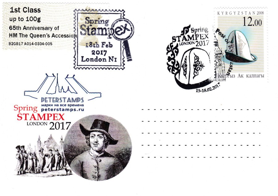
PETERSTAMPS
SPRING STAMPEX 2017
Exclusive postcard issued to commemorate the
320th ANNIVERSARY of the beginning of the Great Embassy of Peter the First in the UK
KYRGYZSTAN STAMP
This is a second copy of the above postcard but here I have applied another of the Post & Go overprinted Machin Head stamp -
65th Anniversary of
HM The Queen’s Accession
This has been cancelled with the afore mentioned ‘Stampex’ special cancellation, for the last day of the exhibition. Another personal souvenir and one which goes with the first copy depicted above. I do wonder if anyone else did this with these or if these two, with the Post & Go stamp added, are unique.
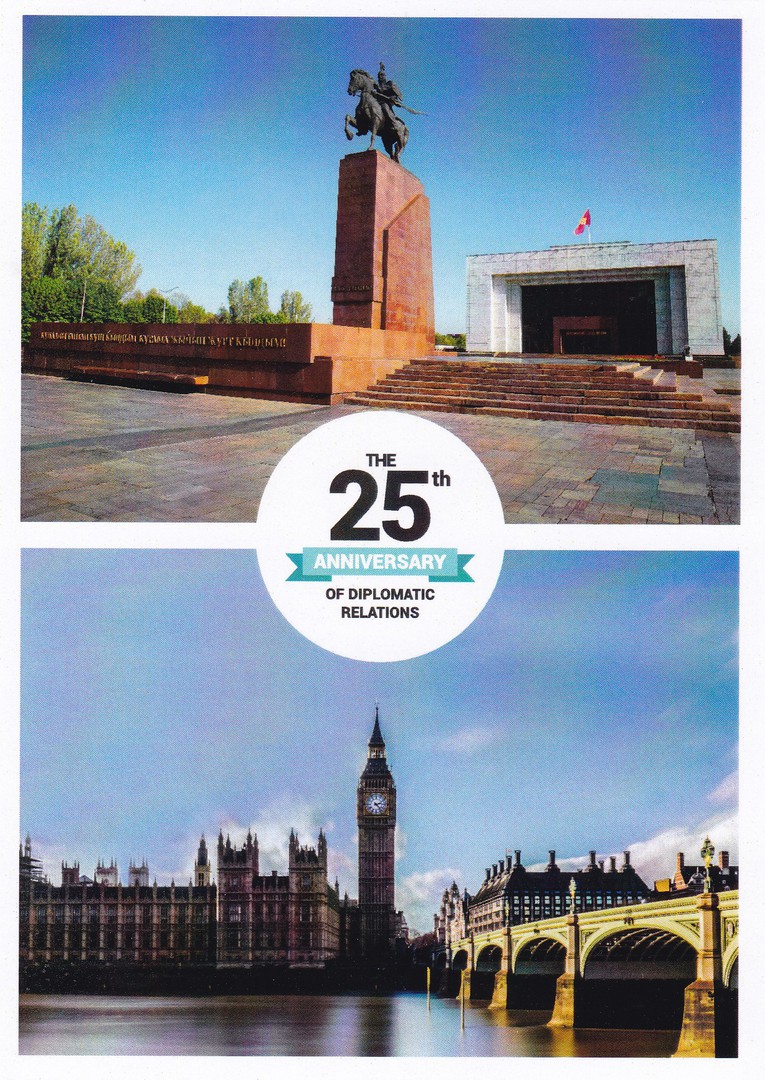
THE 25TH ANNIVERSAY OF DIPLOMATIC RELATIONS
KYRGYZSTAN
This postcard was also available from the same stand as the two previous items. This one had a front image as well, as depicted here (the two others are plain backed).
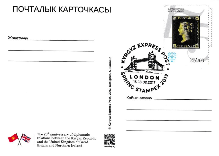
REVERSE SIDE OF ABOVE POSTCARD
Here you have a 2015 Kyrgyzstan ‘Penny Black’ 175th anniversary stamp applied to the card and cancelled with a KYRGYZ EXPRESS POST – SPRING STAMPEX 2017 – LONDON special cancellation.
This postcard, like to two above was exclusively available on the PETERSTAMPS stand.

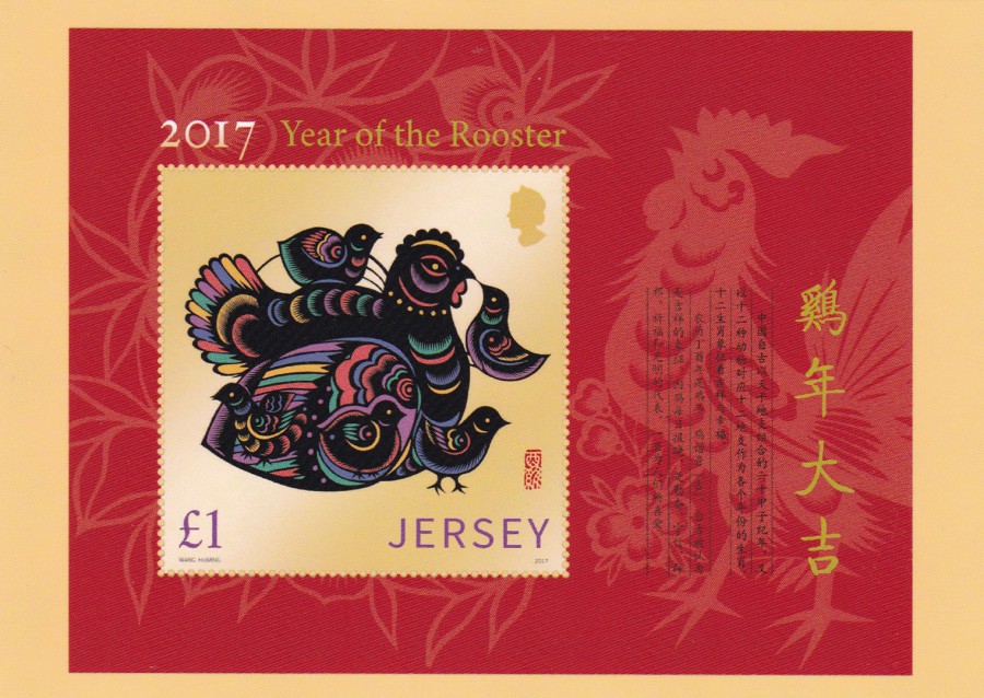
JERSEY POST
2017 LUNAR NEW YEAR – YEAR OF THE ROOSTER
(Designed by Wang Huming)
Issued by Jersey Post on 5 January 2017
Last year I depicted a Year of the Monkey stamp postcard and they issued both a mint card and one which had the actual stamp applied to the front and cancelled. This year they only seem to have issued this postcard which depicts the stamp but has no place for an actual stamp to be stuck on. But, this is still a lovely card.
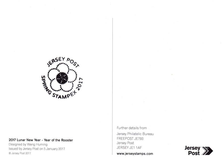
REVERSE SIDE OF ABOVE POSTCARD
For those attending Spring Stampex there was a special show cancel which, although not publicised very well, was available and if you had the knowledge that it was there it could be asked for and applied to any philatelic items. Here you can see the cachet applied to the reverse side of the above postcard.
JERSEY POST
2017 LUNAR NEW YEAR – YEAR OF THE ROOSTER
MINIATURE SHEET
(Designed by Wang Huming)
Issued by Jersey Post on 5 January 2017
Again, as with last year they have also produced a postcard which depicts the miniature stamp sheet issued for this year’s animal - the ‘Year of the Rooster’.
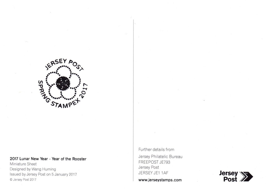
REVERSE SIDE OF ABOVE POSTCARD
Again, I had the Spring Stampex 2017 cachet applied
26/02/2017
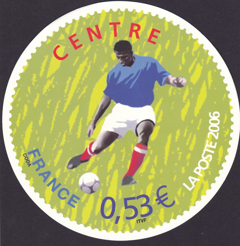
FRANCE – CENTRE – LA POSTE 2006
2006 FIFA FOOTBALL WORLD CUP
Round Shaped Official French ‘La-Poste’ postage pre-paid postcard
The French love their football and they issue postcards for most, if not all the recent Football World Cups. The 2006 event was held in Germany with Italy winning the tournament.
For me it was the unusual shape of this postcard which made it appealing, although I also like modern football themed postcards (a very popular theme).
The postcard depicts one of the stamps issued by the French Postal Authority 'La-Poste'. The stamps issued by them were round shaped, thus the shape of this postcard.
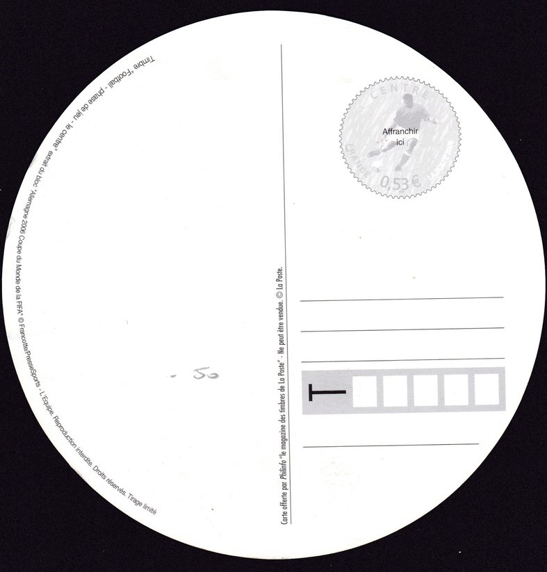
REVERSE SIDE OF ABOVE POSTCARD
26/02/2017
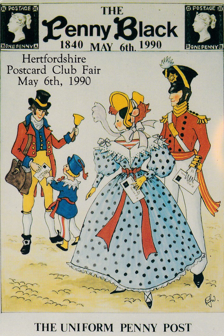
THE PENNY POST
1840 – 1990
HERTFORDSHIRE POSTCARD CLUB FAIR
MAY 6TH, 1990
‘THE UNIFORM PENNY POST’
Ref: 150th Anniversary of the Penny Black (1)
Artwork by:
Rosalind Wicks
Published by
David Shaw, The Postcard Shop, Malton 1990
In 1990 the 150th anniversary of the issue of the Penny Black stamp was celebrated by the issue of both stamps and postcards, quite a few postcards as it happens. This one here was issued for the Hertfordshire Postcard Club fair and was drawn by one of my favourite modern postcard artists, Rosalind Wicks. Rosalind had a very specific style which was ideal for the era of postcard designs throughout the 1980’s and 1990’s and there are collectors, including myself, who specialise in her issues.