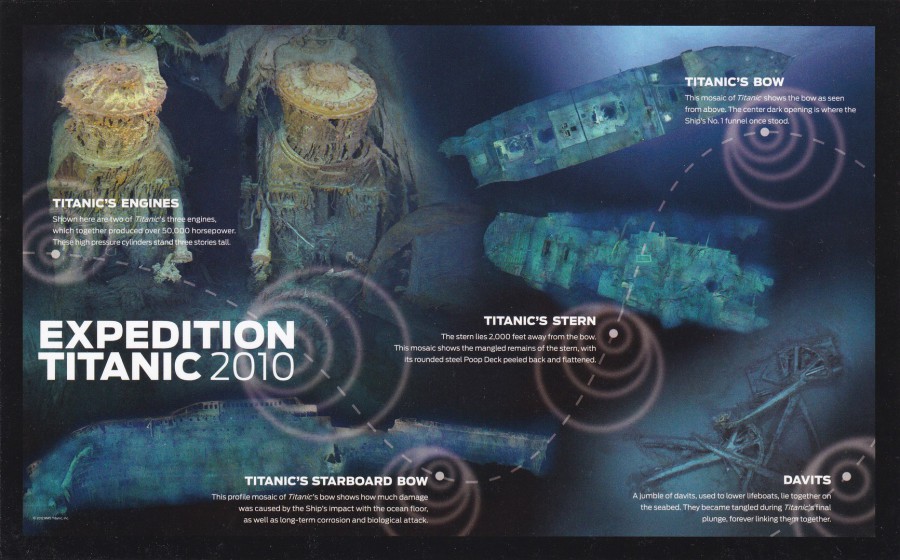
10/03/2017
EXPEDITION TITANIC 2010
Long, Large postcard published for
www. rmstitanic. Net
“State-of-the-art, never before seen mosaic images from the 2010 Expedition. A cutting edge dive back to the wreck site of RMS Titanic”
(Text from reverse side of Postcard)
Another long and large postcard also bought from the Orlando based ‘The Titanic Experience’. This one depicts specially produced images which mapped out the details of the wreck. Another nice postcard for my Titanic collection, from an unusual source.
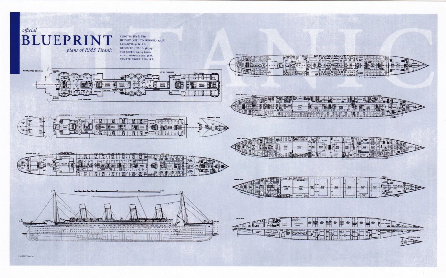
10/03/2017
BLUEPRINTS FOR THE RMS TITANIC
Long, Large postcard published for
www. rmstitanic. Net
“Inspired by the original blueprint created in 1908 by naval architects Harland & Wolff”
I bought this large postcard at The Titanic Experience on International Drive in Florida. It is one of my favourite locations outside of the worlds of Disney and Universal Studios.
Although there is little real information contained on the reverse side of this postcard, just the text shown above, I happen to know that technically there are no true representative blueprints for how the RMS Titanic was eventually constructed. Changes made towards the end of the construction were not incorporated on the blueprints. So, these ones depicted here are an early representation of how the Titanic should have looked but is not exactly how she ended up.

10/03/2017
COCA-COLA
YOU CAN’T BEAT THE FEELING (1989)
Ref: #16330
THE COCA-COLA COMPANY
Large Shaped Postcard
Another of the large shaped postcards which I bought in the Coca-Cola shop in Disney Springs, Florida at Walt Disney World. Bought in November 2016.
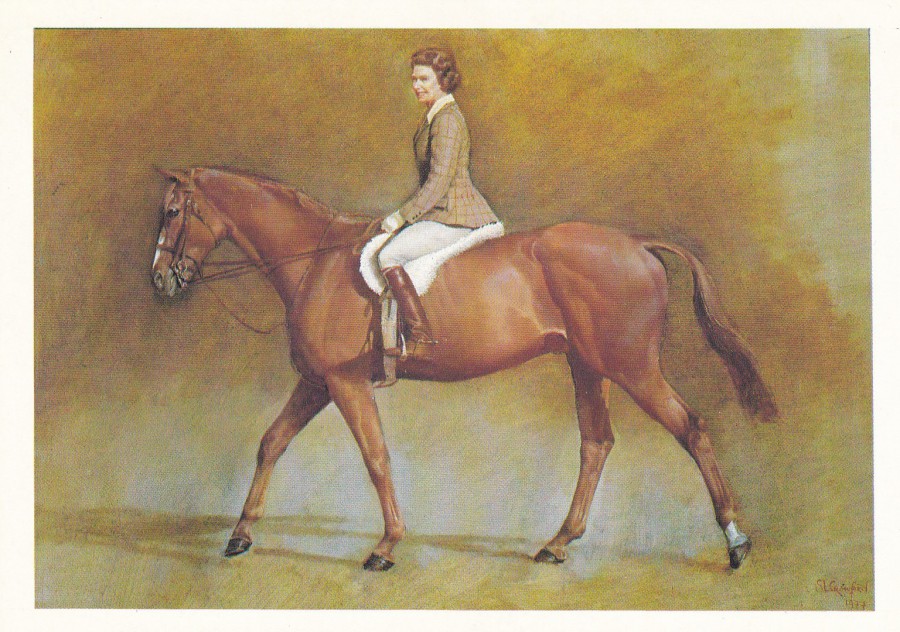
10/03/2017
THE ROYAL COLLECTION
HER MAJESTY THE QUEEN ON WORCRAN
By
SUSAN CRAWFORD
Printed by
LUND HUMPHRIES
Those who collect Royalty themed postcards are always on the look-out for something different, an image that is not often seen. This painting here is a good example of such a postcard.
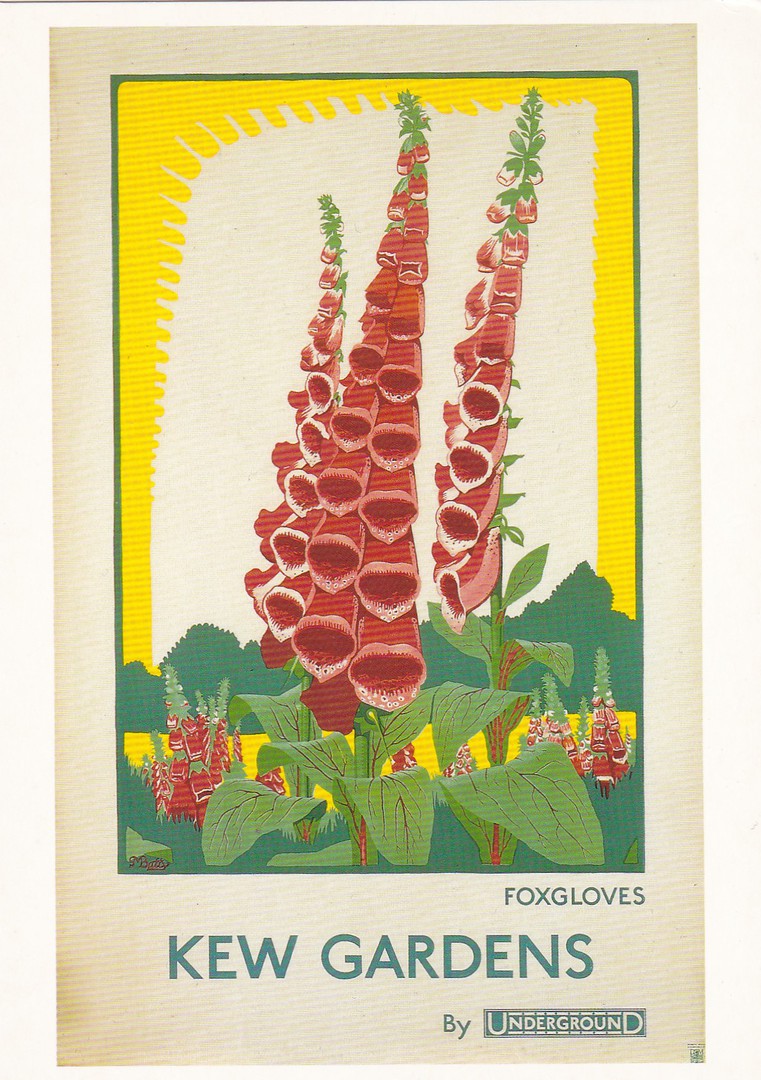
10/03/2017
KEW GARDENS
(FOXGLOVES)
BY UNDERGROUND
Published by the
LONDON TRANSPORT MUSEUM
Ref: LTM495 (1R)
(The (1R) represents the first reprint of this postcard – so it can be found originally without this additional part of the reference number, its just that my copy is from the reprint issue)
Artist: Dora M. Batty
1924
Another lovely postcard from the prodigious output from what has been a very long, and very collectible museum series, possibly one of the best museum ongoing series. The series is also one of the best sources of transport related posters. This one would also be of interest to a flower theme collector.

09/03/2017
7. CHUIGNES (Somme). –
Gros canon abandonne par le Allemands
Big Gun let loose by the Germans
World War 1
Published by a French Company based in Rue Miranmont, Amiens
This is a typical World War I postcard, one of many depicting big guns abandoned along the front. For some reason that I have never really got to the bottom of the cannons always seem to have a small child in the end of the barrel. I have several similar postcards all with a such-like small smiling child protruding out of a large battery gun.
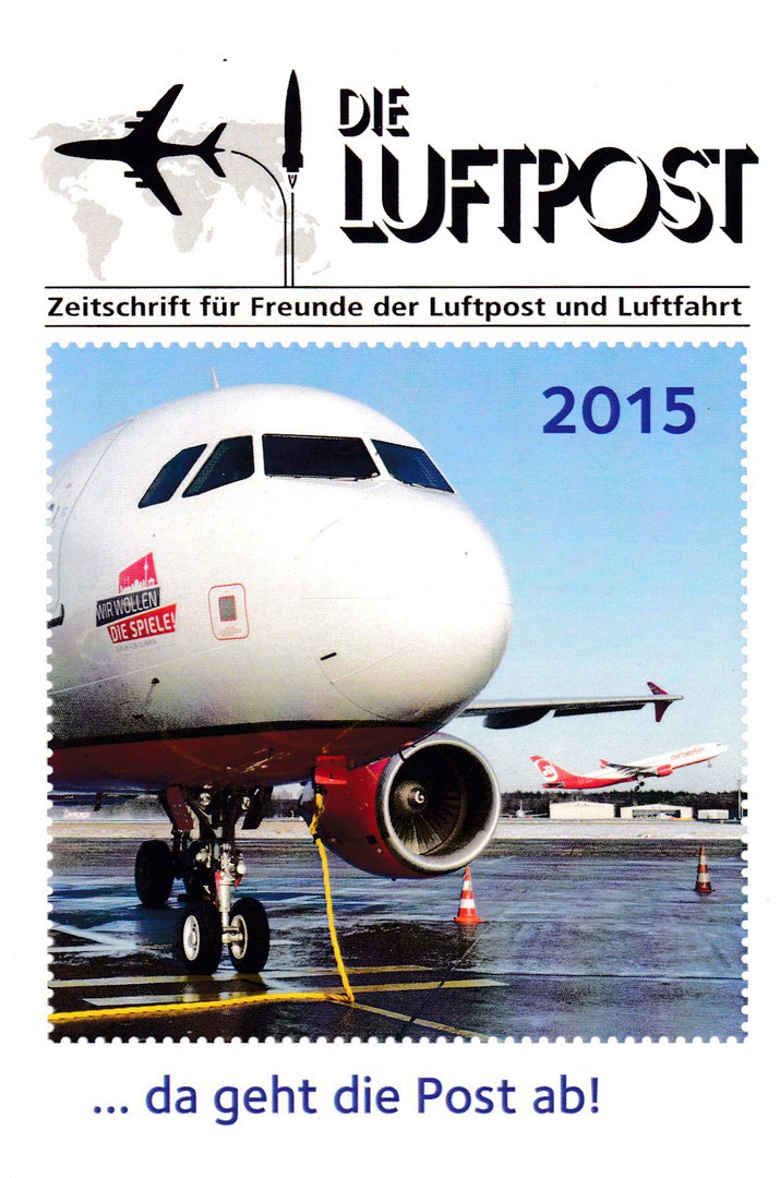
09/03/2017
DIE LUFTPOST
Magazine Subscription Promotional Postcard
A nice aviation themed postcard, copies of which were circulated free to members of the Concorde Study Circle at the last Stampex meeting. They were handed out by one of the members who had obtained a small number. Being a member, and being present, I received one of these and was delighted to add it to my collection.

09/03/2017
Large American Special Cancellation
THE ART OF DISNEY
PRINCESSES STATION
ANAHEIM, CA 92803
AUGUST 7TH, 2008
This is a plain card that someone has used to receive a very nice Walt Disney themed cancellation. This is another large cancel, much like the zebra and giraffe one which I previously posted (see previous blog page). This rather nice cancel depicts the princess ‘Snow White’ and I suspect it would be quite collectible to any Disney theme collector (and two more nice USA stamps for my collection as well, as a bonus).

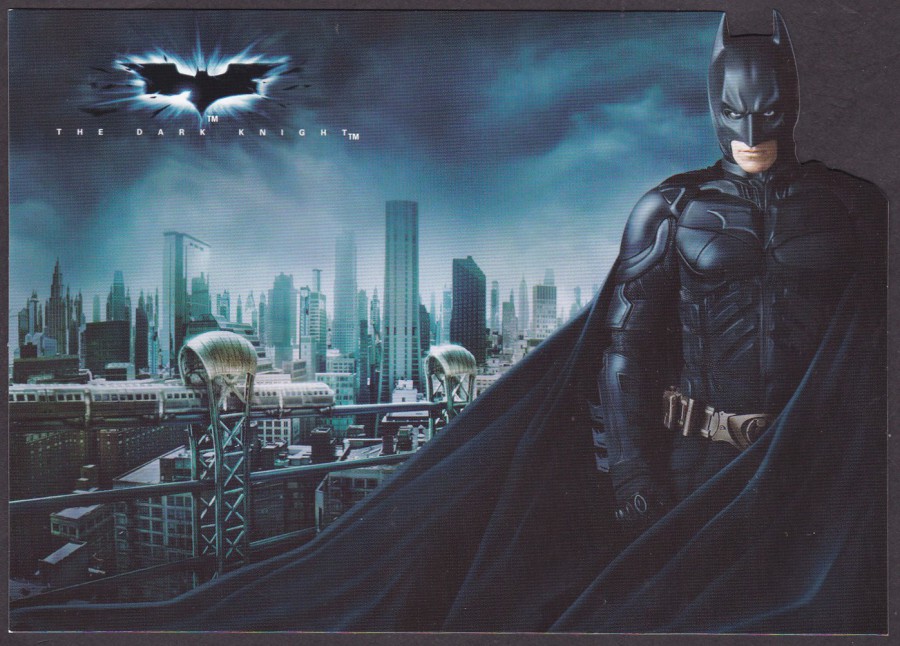
08/03/2017
THE DARK KNIGHT POSTCARDS
Publicity Postcard Set jointly issued under the companies:
LEGENDARY PICTURES – DC COMICS – WARNER BROS. PICTURES
SEALED BLACK POUCH
The four-postcard set, which is depicted below, was issued in a sealed black bag/pouch which has a Batman logo over the text:
THE DARK KNIGHT
Postcards
Depicted here is the bag that my four postcards came in.
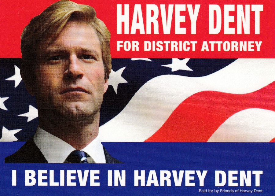
HARVEY DENT
FOR DISTRICT ATTORNEY
I BELIEVE IN HARVEY DENT
The postcards all relate to the feature film ‘The Dark Knight’, which was the second Batman film in the Christopher Nolan Batman film trilogy. The cards all have the same reverse layout but are not numbered or described outside of any front text.
This postcard here is based on a poster design for the character Harvey Dent. Like all the postcards in this set the image is unusual and an unusual addition to any Batman collection.
THE DARK KNIGHT
BATMAN
‘Shaped Postcard’
This postcard is shaped down the right side where the edge of Batman’s head, neck and shoulder is cut around. This makes for great novelty postcard, but any used copies, if any exist, would, I expect, have been damaged. These cards need looking after and need to be kept in a plastic protective sleeve to keep them undamaged. Lovely card though.

THE DARK KNIGHT
BATMAN
‘Shaped Postcard’
This image depicts Batman, with his back to us, looking out of a window down onto the skyscraper city view of Gotham. Again, this one is shaped but here you have a curved top to the postcard.

THE DARK KNIGHT
THE JOKER
‘Shaped Postcard’
This time you have the Joker with his back to us, with a knife in his hand held behind his leg and holding a ‘Joker’ playing card in his other hand. The Joker (who was played by the late Heath Ledger, who won a posthumous ‘Best Supporting Actor’ Academy Award for the role) is depicted in the middle of the street, which would indicate that this image is supposed to be set just after the large lorry has flipped over towards the end of the long chase scene (if you have seen the film you will know what I mean by this).
So, four very nice postcards, which individually would be worth having, but, when ‘combined’ as here, are extra special, and a superb ‘Batman’ themed collectible.
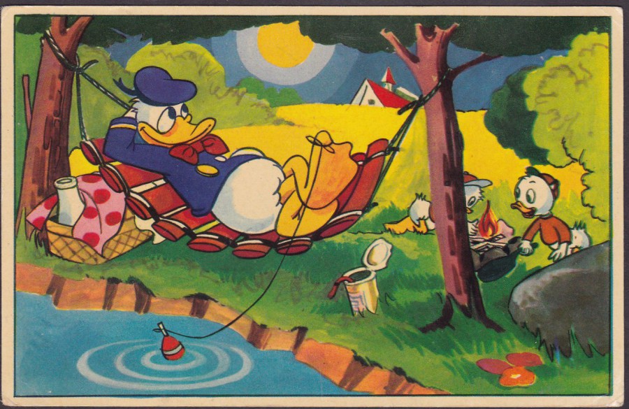
08/03/2017
DONALD DUCK
Published by
Copyright: W.D.P. MED TILLSTAND AV
MICKEY MOUSE CORPORATION A.B. STOCKHOLM
(Forlag: E. O. & Co)
Ref: Nr 40
A nice Walt Disney ‘Donald Duck’ cartoon which was published in Sweden and posted to Australia from Amsterdam, in The Netherlands, in 1958.
This is a good example of an early(ish) Disney postcard which comes untitled but with a series reference number (No 40). During this period, late 1950’s into the 1960’s there was a ‘really’ good output of interesting film, television and animation related postcards coming out of the Northern Europe countries and the Netherlands and these days these are much collected.
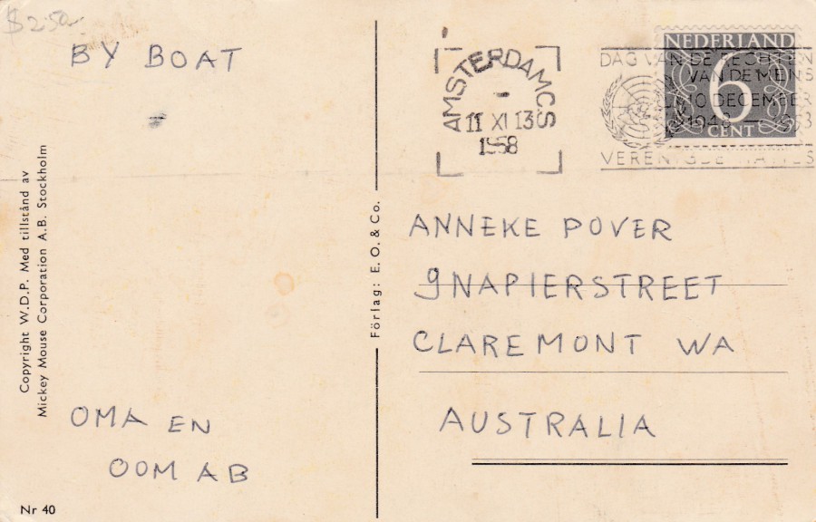
REVERSE SIDE OF ABOVE POSTCARD
As you can see here this postcard was sent to Australia, but it has a very unusual message, which I suspect is some sort of coded message (possibly). I have more than one (see below) postcard sent by this person to this address, and the other cards also have what looks like a coded message.
The stamp used here is a 6 cent grey numeral definitive stamp from the 1946 issue (SG 639c), which I assume was the postage rate from the Netherlands to Australia at that time. The stamp has a very low catalogue value but it is still nice to find it on a postcard. The stamp has been cancelled with an Amsterdam slogan cancellation:
DAG VAN DE RECHTEN
VAN DE MENS
10 DECEMBER
1948 – 1958
(the last line of text on the cancellation is partially obscured through feint printing but I have tried to reconstruct it as best I can)
VERENTGDE HAMES (But this is clearly wrong as it does not translate)
The slogan translates as:
Human Rights Day
10 December
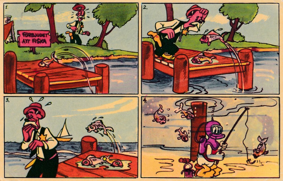
DONALD DUCK
Published by
Copyright: W.D.P. MED TILLSTAND AV
MICKEY MOUSE CORPORATION A.B. STOCKHOLM
(Forlag: E. O. & Co)
Ref: Nr 44
When I first saw this postcard, I thought it was a very unusual one as it depicts a comic strip story, which is not that common, even less so on older postcards. Also, Donald Duck does not appear until the very last box. Also, if anyone knows the name of the lawman character in the other three I would love to know as I have not been able to ascertain who this is.

REVERSE SIDE OF ABOVE POSTCARD
Straight Line, boxed ‘AMSTERDAM’ cancel
Again, you have the very simple message which appears to be coded, unless anyone knows otherwise. The sender has again used the 6c grey numeral stamp but this time it has been cancelled with an unusual straight line boxed AMSTERDAM postage mark which I have not seen before. This cancel has no date included and no clear place for this to be recorded either (but I am assuming it was sent close to the above postcard, so around 1958). All in all, both the back, and the front of this postcard is interesting and unusual.
08/03/2017
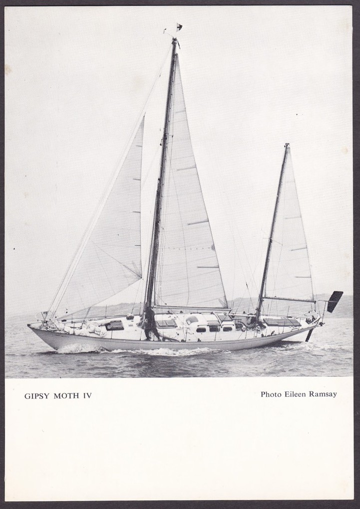
GIPSY MOTH IV
SIR FRANCIS CHICHESTER
Published by
FRANCIS CHICHESTER LIMITED, MAP PUBLISHERS, on behalf of
Sir Francis Chichester
(9 St James’s Palace, SW1)
Official black and white photograph postcard depicting the yacht ‘Gipsy Moth IV’. Sir Francis Charles Chichester KBE (17/09/1901 – 26/08/1972) was a renowned aviator and sailor and was knighted by Queen Elizabeth II after becoming the first person to sail single-handed around the world by the clipper route, and he was also the fastest circumnavigator with a time of nine months and one day, between 1966 and 1967.
Chichester left on the 27th August 1966, sailing the Gipsy Moth IV out of Plymouth (UK). He Returned on the 28th May 1967 having sailed for 226 days. He circumnavigated the world with just the one stop in Sydney, Australia. He was the first person to achieve the solo circumnavigation of the world from west to east, via the Great Capes.
06/03/2017
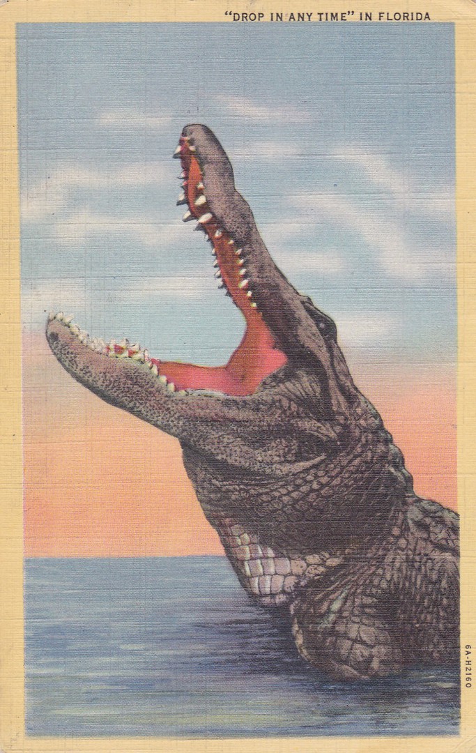
“DROP IN ANYTIME”
IN FLORIDA
Published and Printed by
GENUINE CURTEICH-CHICAGO “C. T. ART-COLORTONE” POST CARD
(REG. U.S. PAT. OFF)
Ref: 14. F – TROPICAL FLORIDA SERIES – 6A-H2160
Posted from Jacksonville, Florida 1st June 1943
In Florida, this is a well-known and extremely topical postcard which can be found in the stock of many local postcard dealers. It features an alligator in open mouth gape revealing those teeth. For me this card is a souvenir of my last visit to Florida where I attended a massive open air antiques fair where I bought this postcard from a specialist postcard dealer.
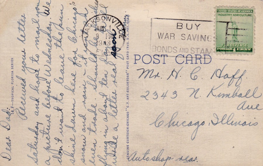
REVERSE SIDE OF ABOVE POSTCARD
1943 MILITARY SLOGAN CANCEL:
BUY
WAR SAVINGS
BONDS AND STAMPS
On
1 Cent green ‘Statue of Liberty’ INDUSTRY – AGRICULTURE – FOR DEFENSE United States of America stamp
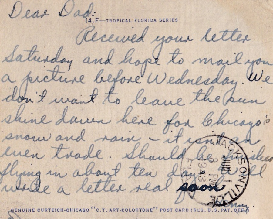
MESSAGE SECTION FROM ABOVE POSTCARD
This has an interesting message which is on first look a very basic holiday trip styled message to ‘Dad’. But I liked the fact that they make mention of Chicago, to where the card is addressed and from clearly where they came from. I found this of interest because the postcard is printed using the ‘Genuine Curteich – CHICAGO’ company process. And, that you could have sun in Florida and snow in Chicago.
06/03/2017
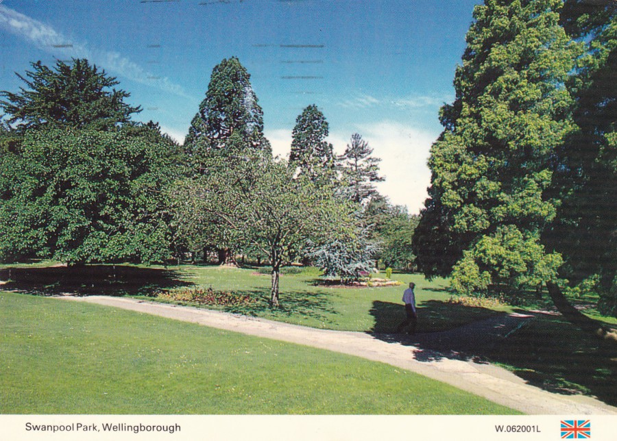
SWANPOOL PARK
WELLINGBOROUGH
A DENNIS POSTCARD
Published by
E. T. W. DENNIS & SONS LTD, SCARBOROUGH
Ref: W.062001L
A standard formatted ‘Dennis Postcard’ with the white strip across the bottom within which the details of the card are placed, along with a small Union Jack flag in the far-right corner. There is little in this image to excite many postcard collectors, unless they collect the area of Wellingborough, and perhaps not even then. But, again for me it is the reverse side that caught my eye, or, to be more precise, something applied to the reverse side.
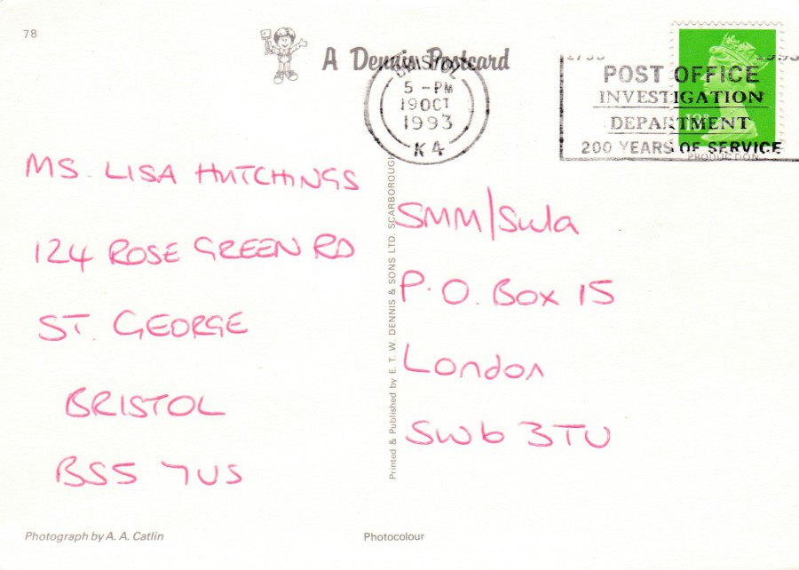
REVERSE SIDE OF ABOVE POSTCARD
SLOGAN CANCELLATION:
1793 - 1993
POST OFFICE INVESTIGATION DEPARTMENT
200 YEARS OF SERVICE
Dated – 19th October 1993
Bristol K4 Double ringed circle
This is another example of where a competition entry postcard has received a nice slogan cancellation strike (machine applied). I have previously mentioned that I collect, and like, different postmarks and cancels and have put together a collection of these items on postcards. This ‘Post Office Investigation Department’ slogan cancellation is a nice example.

06/03/2017
DRINKS DIRECT
THE SPECIAL GIFT SERVICE
NEXT TIME – YOU WANT TO SAY SORRY… I LOVE YOU… WELL DONE… THANKS FOR LAST NIGHT…
HAPPY BIRTHDAY
‘SEND A BOTTLE’
Call 0800 23 22 21 and mention this postcard for a half price standard delivery
A postcard celebrating the joys of alcohol … especially alcohol delivered to your door. This postcard was published exclusively for a drinks company called ‘Drinks Direct’.
The artwork has all the elements of the story of wine and spirits, including the original grapes, bottle shapes, ice bucket, cocktail shaker, glasses and a green woman.
My copy here was posted and has a cancellation dated for the year 1997
06/03/2017
SPRING STAMPEX 2017
PART THREE
TURKISH POSTAL AUTHORITY – Ptt
On the stand of the Turkish Postal Authority, known as ‘Ptt’, they had a range of free postcards for those visiting them. These were all old images from different areas of Istanbul Turkey (although I only assume these are all from Istanbul as some are untitled – but all the titled ones are from here). These were all printed on ‘Matt’ board/card (this is just the official way of describing cards that have not been printed on glossy coated board). Although these have some interesting images not all of them have been described, and with those that have some indication of the location depicted on the front this is not very descriptive beyond a general year and ‘Istanbul’.
There were ten postcards in all and everyone was enthusiastically pushed to take a copy of any postcard that was out on the counter, although this did mean you needed to visit the stand several times as originally not every different version was available upon just a single visit (a smart ploy I thought). I visited the stand over the two days I attended Stampex, and several times on each of these days. As stated I picked up 10 different and I believe, unless anyone knows differently, that this was a complete run. I depict them all here.
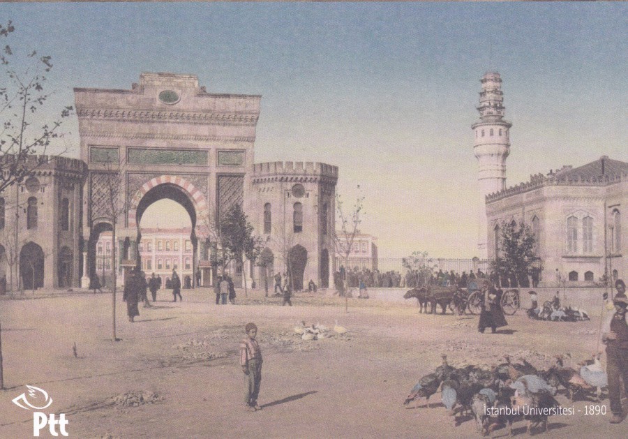
ISTANBUL UNIVERSITESI
1890
Colour Photograph
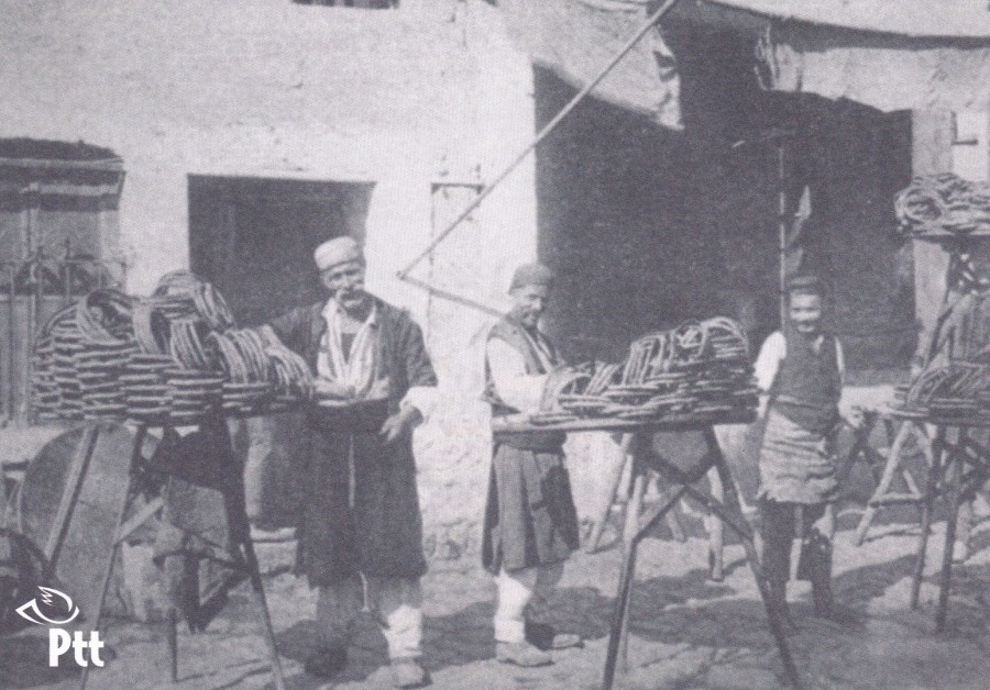
Untitled Photograph
Black and White
This image depicts some sort of merchants or tradesmen
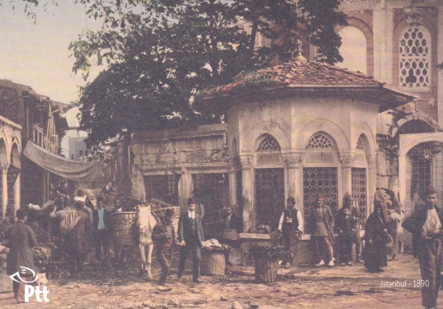
ISTANBUL
1890
This is one of my favourites from this set

Untitled Photograph
Black and White
This one depicts a cart and some bullocks although the bullocks are not attached to the cart
ISTANBUL
1890
A colour photograph of what looks to be an amazing structure – if you know where this is please do comment below and let me know
Untitled Photograph
Black and White
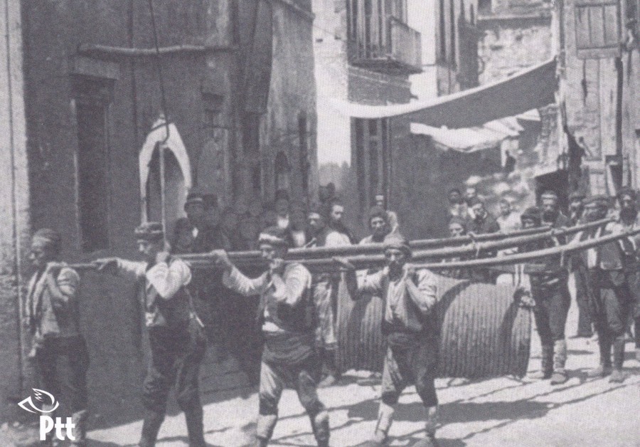
It seems that the black and white photographs are mainly untitled. This one looks to me like a group of men carrying a giant pot through the streets.
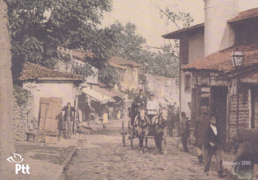
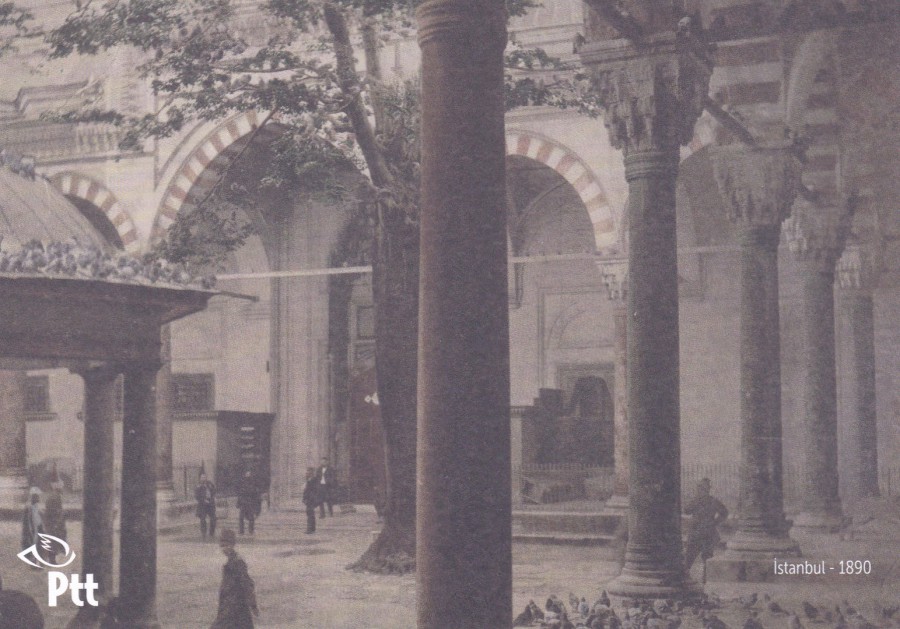
ISTANBUL
1890
A nice street scene with the ubiquitous horse and cart. This is another exceptional card
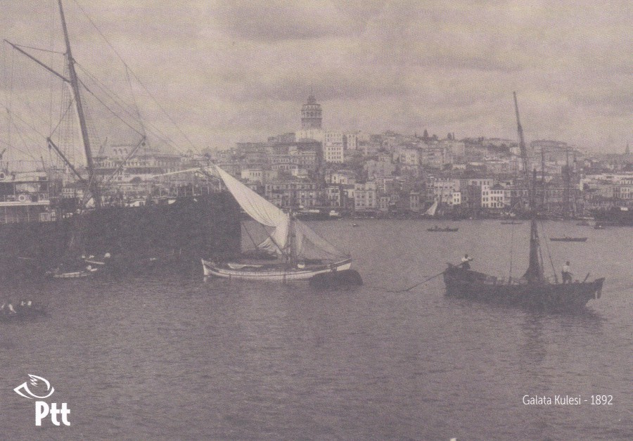
GALATA KULESI
1892
This was one of the cards I found on my second day’s visit, so I would have missed this one if I had attended only the one day. At first I was not too taken with this one, but, now, haven had time to look at it a bit more I realise that it is a smashing skyline of buildings with an added ship/boat thematic interest.
And, with a little research I now know that Galata Kulesi means ‘Galata Tower’ in Turkish and that this refers to the tower that is in the centre of this image towering above the rest of the skyline. This is a medieval stone tower in the Galata quarter of Istanbul. It is an iconic structure, a high, cone-capped cylinder structure from which you can, apparently, see panoramic views of the historic peninsula.
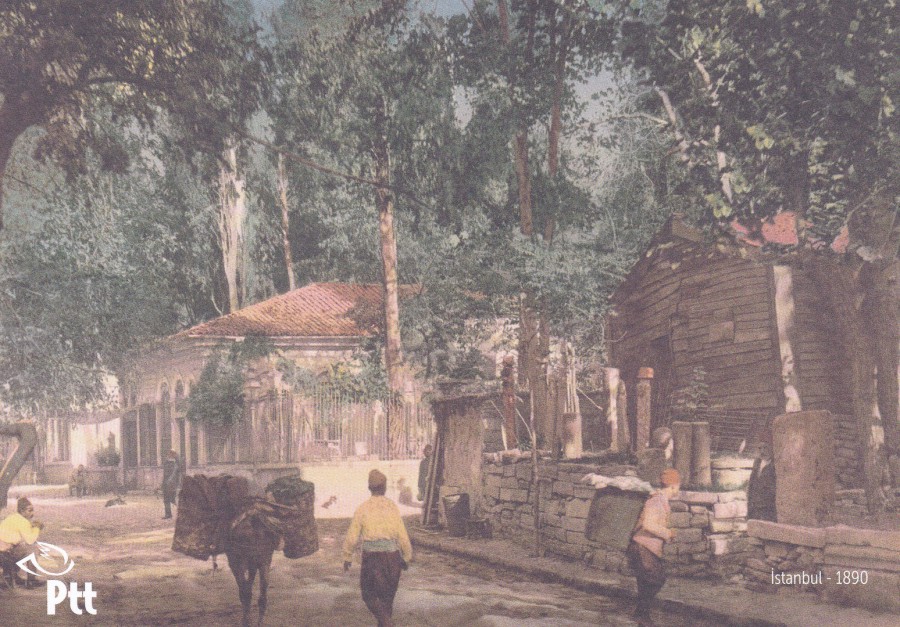
ISTANBUL
1890
This colour photograph looks like it might be a suburb area or somewhere away from the main part of the city.
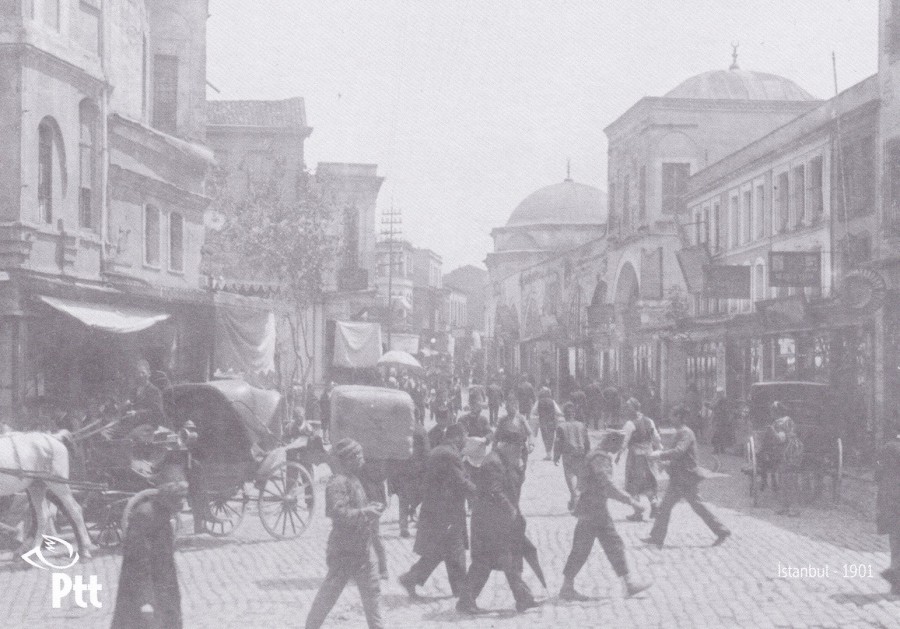
ISTANBUL
1901
A lovely, and very active street scene which is again somewhere in Istanbul. This one is the most recent image but is still 115 – 116 years old now. It is a shame that the areas, like this one depicted here, are not located or better named, but, for free postcards they were a nice addition to any Stampex visit collection.
REVERSE SIDE OF POSTCARDS
All, of the above postcards have the same reverse layout, so if you see this reverse design then it should be one of these postcards. If not, then let me know details as it could well be a postcard that I did not find on my visits.

06/03/2017
POSTA ROMANA
(Roumania)
MUZEUL MARINEI ROMANE
HIDROAVIONUL R.A.S. – 1 GETTA
CONSTRUIT IN 1925 DE RADU STOICA PENTRU FLOTILA DE HIDROAVIATIE DE LA SIUTGHIOL – MAMAIA
Romanian Navy Museum
Seaplane R.A.S. – 1. GETTA
Built in 1925 by Radu Stoica flotilla Hidroaviatie from Ovidiu – Mamaia
This is an unusual postal stationery post card, it has a plain back and is printed on plain white card in a light blue coloured print. It is, too me, quite simplistic in its look. It clearly, from the translation, commemorates a seaplane, the R.A.S. – 1. GETTA. Other than this acquired fact I know no other details about this unusual item. It cost me £1 and I bought it for my transport collection (although I think the image used for the pre-printed stamp is rather unimpressive in its execution).
(Does anyone with more expertise than me know when this card was issued?)
06/03/2017
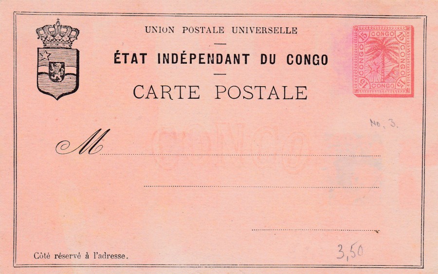
ETAT INDEPENDENT DU CONGO
15c Red on Salmon
Issued in 1888
Design of single palm (tree) and star (bottom left under palm tree) stamp
All printing other than stamp is in black
Crest in upper left corner
(Ref No 3 in Higgins & Gage World Postal Stationery Catalog Section 3)
There is a note attached to the entry in the ‘Higgins & Gage’ for this issue which reads:
“This issue is watermarked in large double outlined letters ‘CONGO’. The watermarks are found reading reversed, upside down, top to bottom, bottom to top and doubled impression”
This is lovely postal stationery postcard and was the second issue for Congo. I particularly like the watermark, which is mentioned in the above note, which on my copy can read properly across the centre of the postcard (so is not one of the versions mentioned above).
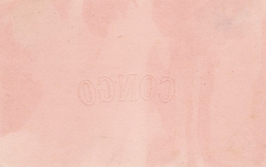
REVERSE SIDE OF ABOVE POSTAL STATIONERY POSTCARD
Here you can see the reverse side, and as the card has been reversed the watermark reads in reverse, but I wanted to show this side because the watermark can be seen clearly from this side.

05/03/2017
COLLECTION HISTORIQUE DE LA FRANCE
EXTRAITE DU CABINET DES ESTAMPES DE LA S BIBLIOTHEQUE NATIONA E
G. P. PARIS – DEPOSE
Postcards produced with rough cut edges to appear old
ROME EN 1755
TOMBEAU DE CECILIUS METELLUS, CONSUL ROMAIN, QUI SOUMIT L’IIE DE CRETE VERS I’AN 69 AVANT J.-C.
Translates as
ROME IN 1755
TOMB OF CAECILIUS METELLUS, ROMAN CONSUL, WHO SUBMITTED THE ISLAND OF CRETE TO I’ YEAR 69 BC
(Well, roughly translates as!)
This card, and the one below would ‘definitely’ fit into my ‘novelty’ themed collection. They have artificially been produced to look aged and worn. The edges have been cut to look all worn and torn, and the effect is ‘pretty impressive’. It does, though, make it a bit hard to correctly age these postcards. I am sure they were popular whenever they were released.
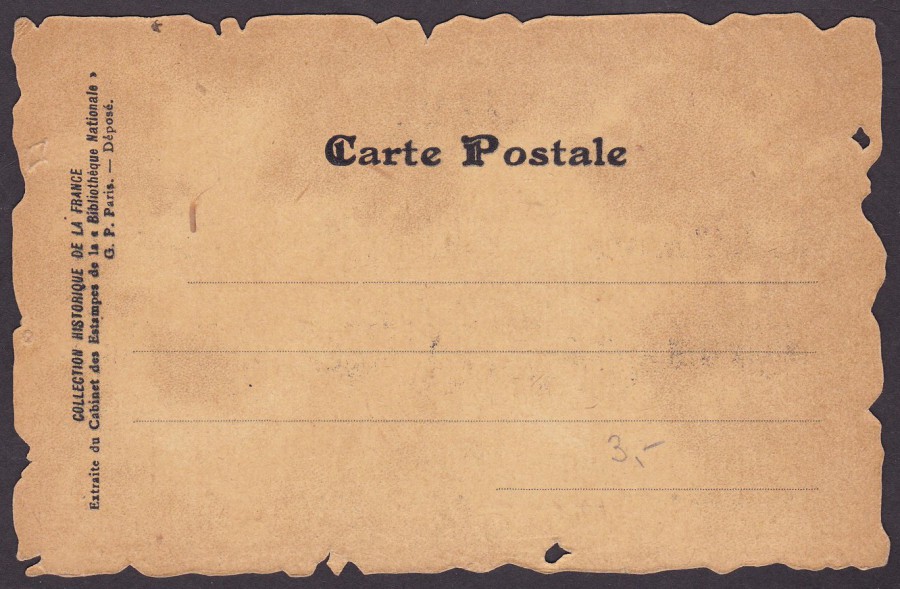
REVERSE SIDE OF POSTCARD
The text is the same on both cards
COLLECTION HISTORIQUE DE LA FRANCE
EXTRAITE DU CABINET DES ESTAMPES DE LA S BIBLIOTHEQUE NATIONA E
G. P. PARIS – DEPOSE
Postcards produced with rough cut edges to appear old
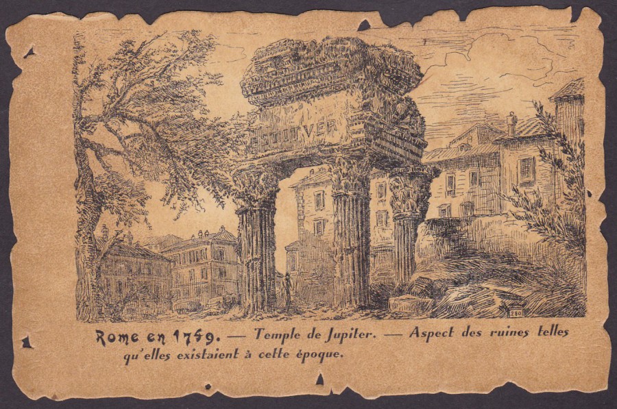
ROME EN 1769
TEMPLE DE JUPITER – ASPECT DES RUINES TELLES QU’ELLES EXISTAIENT A CETTE EPOQUE
Translates as
TEMPLE OF JUPITER – ASPECT OF THE RUINS AS THEY EXISTED AT THAT TIME
What I liked with this second postcard from the series is that the edging is cut away (or ‘worn’) in a different way to the card above. This means that there were at least two cutting edge formats (and, to be fair, they did not need to do this). I like these and think they are really unusual and worth a look.
REVERSE SIDE OF POSTCARD
The text is the same on both cards