EMAIL ADDRESS - markspostcardchat@gmail.com

01/10/2019
A DEUX
1977
By
KARIN SZEKESSY,
HAMBURG
Original Photograph
Published by
EDITION CICERO
Ref:
ART ADMIRA CARD
Bestell-Nummer 60.011

AKT MIT BRENNENDEM BAUM
1981
By
CARL-W. ROHRIG
Born 1953
Published by
EDITION CICERO
Ref:
ART ADMIRA CARD
Bestell-Nummer 21.005

AKT IN DEN WOLKEN
1981
By
CARL-W. ROHRIG
Born 1953
Published by
EDITION CICERO
Ref:
ART ADMIRA CARD
Bestell-Nummer 21.004
01/10/2019
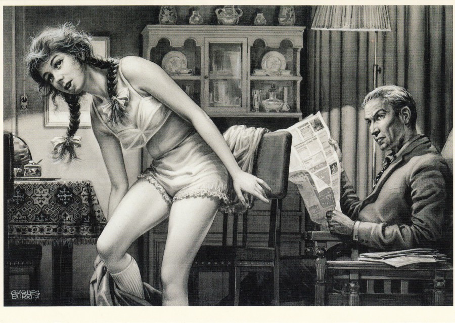
DADDY’S GIRL
1971
By
CHARLES BURKI (1909 – 1994)
Published by
ART UNLIMITED AMSTERDAM
Ref: C 7197
Printed in Holland
There is something unsettling about the image on this postcard even before you see what the images title is. This postcard was published around 1997, but I wonder if it would be considered suitable for publication in these current times. I suspect, probably quite rightly, not.

01/10/2019
TECHNO 1
1992
By
GUNTER BLUM
Published by
ART CONCEPT
Printed in Germany
Ref:
LEFT SIDE CARD: Best.-Nr. 2650-201
RIGHT SIDE CARD: Best.-Nr. 2650-202
This four-card composite was bought at the same time as the three-card design depicted below. There is no real nudity here, but there is suggested naughtiness and I think it deserves to be posted with the below set as they were obtained together and kind of belong together. This is another great novelty set.

TECHNO 1
1992
By
GUNTER BLUM
Published by
ART CONCEPT
Printed in Germany
Ref:
LEFT SIDE CARD: Best.-Nr. 2650-203
RIGHT SIDE CARD: Best.-Nr. 2650-204

01/10/2019
3 FOR YOU
COMPOSITE SET OF THREE POSTCARD
GLAMOUR POSE
Designed By
ESTHER HACCOU
Published by
FINE CARDS / DISCORDIA GMBH
Ref: Art. Nr: YP 730
This attractive series of three composite postcards were bought in Germany around ten years ago. The appeal here is the unusual issue of a composite set, something which generally is, and was not commercially appealing, but for a collector this is a different matter. The image is quite nice as well!

3 FOR YOU
COMPOSITE SET OF THREE POSTCARD
GLAMOUR POSE
Designed By
ESTHER HACCOU
Published by
FINE CARDS / DISCORDIA GMBH
Ref: Art. Nr: YP 731

3 FOR YOU
COMPOSITE SET OF THREE POSTCARD
GLAMOUR POSE
Designed By
ESTHER HACCOU
Published by
FINE CARDS / DISCORDIA GMBH
Ref: Art. Nr: YP 732
REVERSE SIDE OF ABOVE POSTCARD
You can see a complete image of the three-card composite top right with this ‘particular’ cards image shown as a darker full black and white block whilst the other two card images are shaded. Obviously, the other two cards have their own depicted section in clear print and the other two cards in shaded grey.
29/09/2019
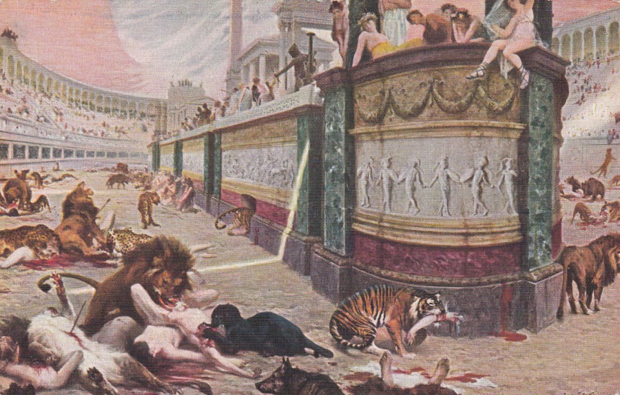
THE BLOODY ARENA
By
JAN STYKA
Published by
I. LAPINA
Printed in Paris
Ref: 437
I have posted this one under my Censored tab because it is such a gory painting. It quite graphically depicts the roman entertainment of feeding people to the lions, or as depicted here a range of vicious wild animals including leopards, panther, bear, wolves and tigers, with the tiger bottom centre depicted with a human arm in its mouth. This maybe a classic painting, but is it one which was suitable for postcard release? Possibly not, but then art is in the eye of the beholder, and art also depicts all aspects of human history, good and bad. This is another example of how postcards really do depict all sorts of images.
REVERSE SIDE OF ABOVE POSTCARD

05/09/2019
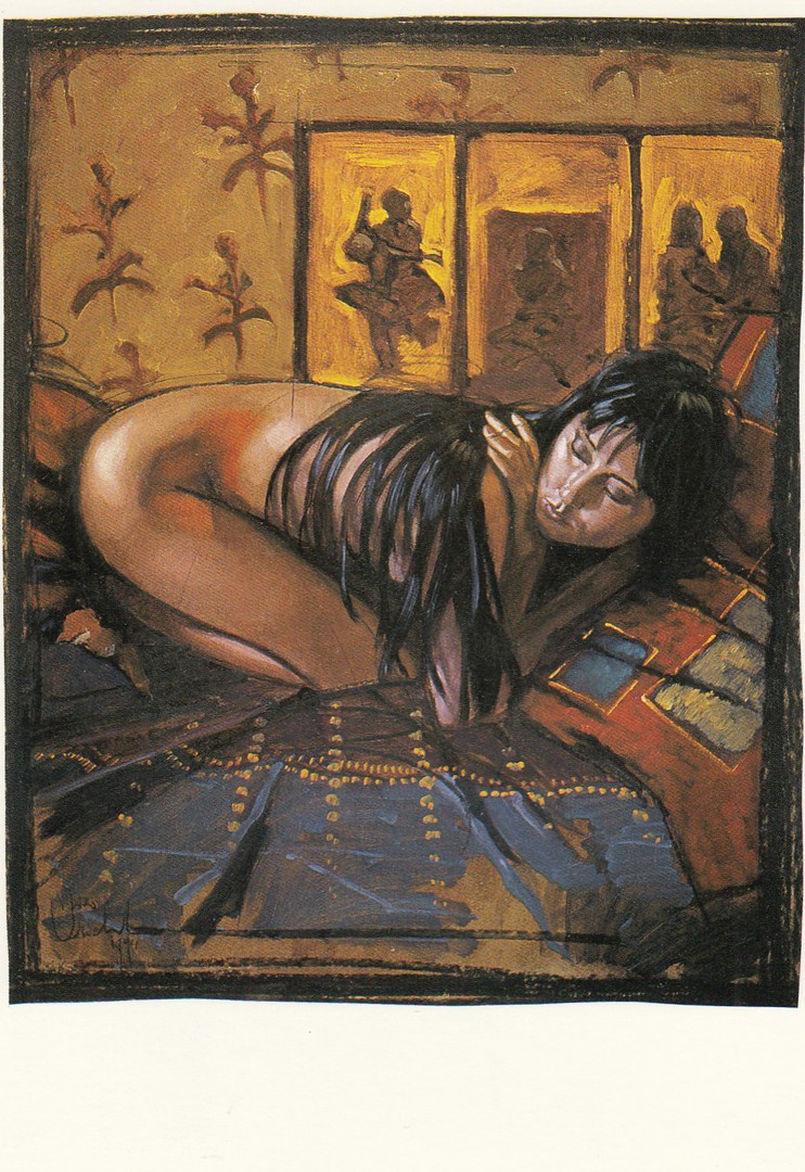
KARIN SZEKESSY, HAMBURG
JEU D’ECHEC I, 1982
Published by
AN ADMIRA CARD
EDITION CICERO
Ref: Bestell Nummer 60 006
05/09/2019
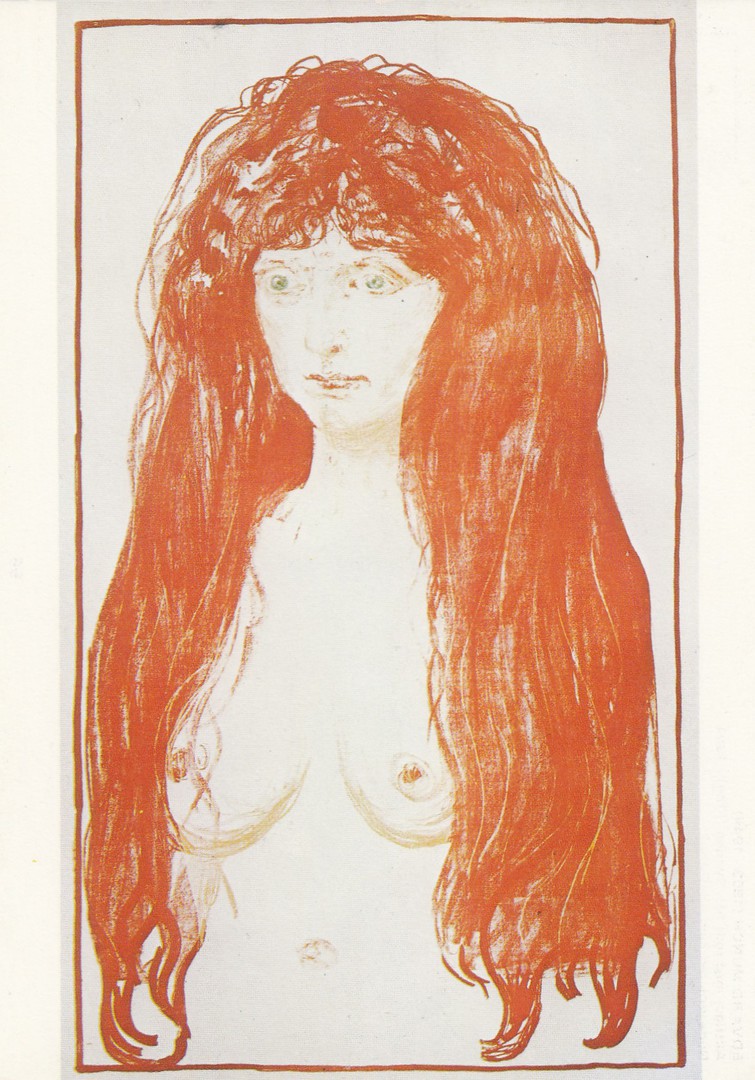
AKTFIGUR MED REDT HAR. SYNDEN (LITHO) – 1901
By
EDVARD MUNCH
(Nude with red hair)
Published by
MUNCHFORLAGET A/S OSLO
Printed in Norway
Ref: 56
Now, art is causing me some issues. Painting the naked figure has been a long-standing art form and I think some of the paintings are superb, but is it nudity which can appear on my main page, or not? To play safe I am going to put them here but remember that this painting here is 118 years old now.

05/09/2019
IM SESSEL, 1979
By
BRUNOBRUNI
Published by
AN ADMIRA CARD
EDITION CICERO
Ref: Bestell.Nr. 32 007
26/08/2019
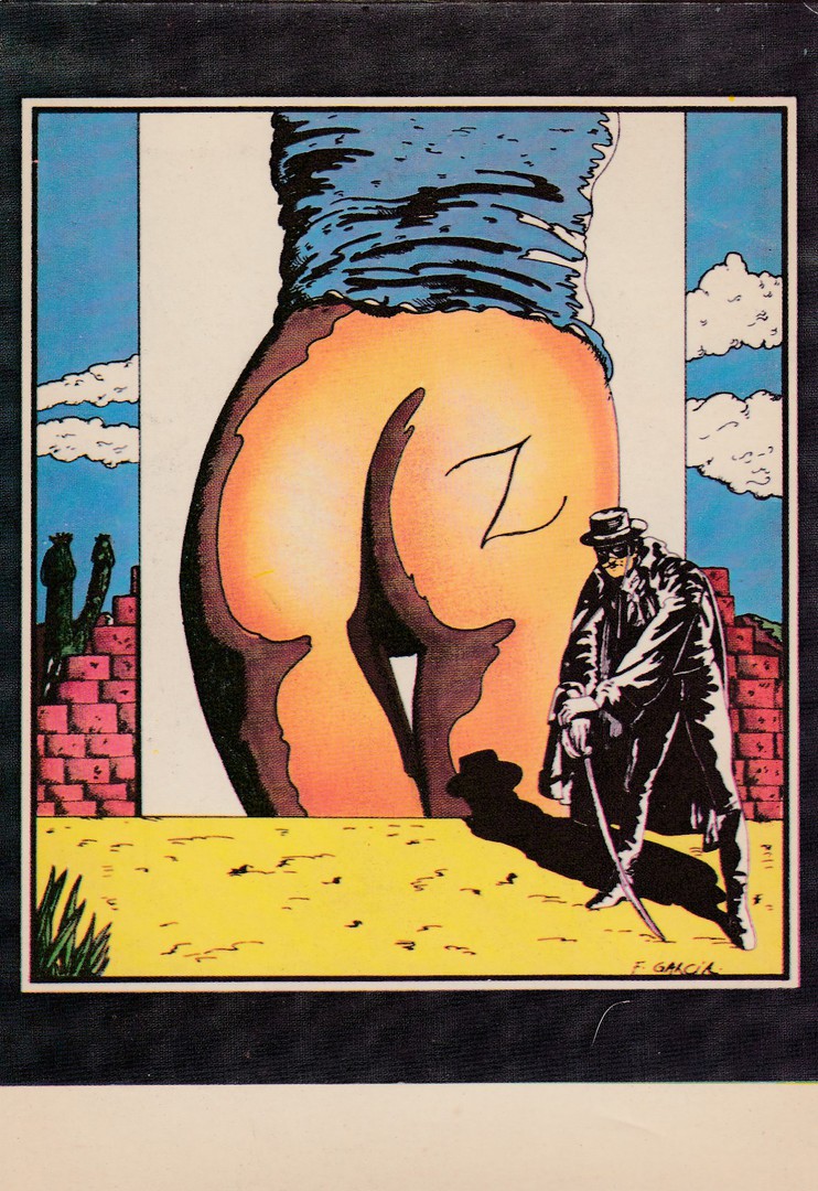
“ZORRO”
By
GARCIA PANZANI
Published by
EDITIONS F. NUGERON
Ref: H 141 – ILLUSTRATEURS
This is a strange postcard from my ‘television’ themed collection, because Zorro was a TV series. I don’t remember there being a large naked female bottom on it though!
26/08/2019
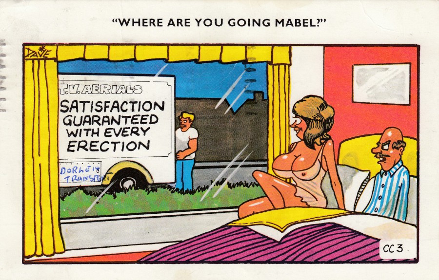
“WHERE ARE YOU GOING MABEL?”
T.V. AERIALS
SATISFACTION GUARENTEED WITH EVERY ERECTION
Published by
COASTAL COLOUR LTD
Clacton-on-Sea
Ref: CC 3
Again, I think this one could have gone on the main page, but I am playing it safe tonight and have put a few saucy seaside type cards on this page which I think I might have placed on the main page just a few years ago. But at least they are here for you to see.
REVERSE SIDE OF ABOVE POSTCARD
Posted 1975 from the seaside location of Felixstowe

26/08/2019
SORRY COULDN’T FIND YOU AN
UNCENSORED CARD!
By
A. TAYLOR
Published by
BAMFORTH & CO., LTD
Ref: “COMIC” Series No. 2320
This design probably nicely sums up this section of the webpage. It is also a nice piece of saucy seaside postcard artwork.
26/08/2019
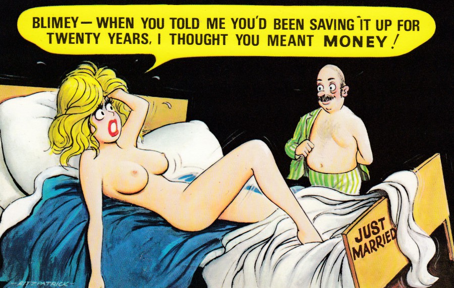
“BLIMEY – WHEN YOU TOLD ME YOU’D BEEN SAVING IT UP FOR
TWENTY YEARS, I THOUGHT YOU MEANT MONEY!”
By
FITZPATRICK
Published by
BAMFORTH & CO., LTD
Ref: “COMIC” Series No. 985
I have decided that any of the seaside saucy postcards which depict nudity will in future be depicted here in the CENSORED section of the webpage. This is a good example of such a card. Personally, I have no real issue with these, but I do accept that they are not as politically acceptable in these current times as they were.

26/08/2019
‘JUST MARRIED’
By
QUIP
Published by
SAPPHIRE
‘A SAPPHIRE CARD’
Holland-on-Sea
Ref: 48
I could probably get away with putting this on the main webpage, but its clear she thinks she is holding a certain piece of anatomy of her new husband. So, I’ve played it safe, and put he card here. It is a lot less controversial than many of Quip’s cartoons.
26/08/2019
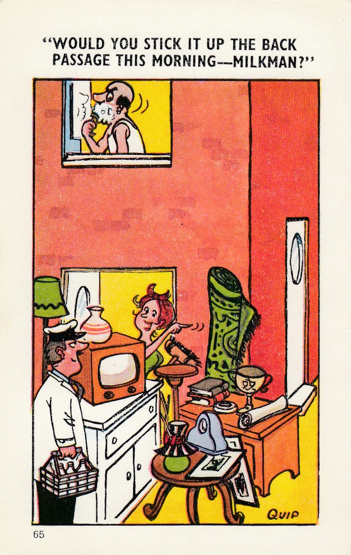
“WOULD YOU STICK IT UP THE BACK PASSAGE
THIS MORNING - MILKMAN?”
By
QUIP
Published by
SAPPHIRE
‘A SAPPHIRE CARD’
Holland-on-Sea
Ref: 65
You would not be able to get away with this piece of text today. This one pushed the boundaries of what was acceptable even when it originally came out. The implied joke, from the double-entendre, is quite extreme, and deliberately designed to be so. Because of the changes in people’s views, or to be more precise, the official views now, this could not be published today. Because of this these are becoming more and more collectible, and as a result more expensive as well.
REVERSE SIDE OF ABOVE POSTCARD

21/08/2019
THE FRONTIER “LOOSEWALA,”
OR RELIGIOUS FANATIC
SHOT NEAR WEST RIDGE BARRACKS RAWAL PINDI
PESHAWAR, INDIA
Published by
K. C. MEHRA & SONS, PESHAWAR, INDIA
Ref: No. 91
Photo Printed in Great Britain
Life was valued far less in some era’s and in some regions of the world. A postcard of a dead rebel, or ‘Loosewala’ as this man has been labelled here, would never have been issued in the United Kingdom, although I see no reason why technically this card could not have been posted from India to the UK (and indeed this may have been the case although this card here is unused).
Postcards of shot ‘religious fanatic’s’ from this period are relatively common, although often quite expensive as well for some reason, possibly the pictorial content and its unusualness in our current view of postcard releases. Many of the pictures of these corpses are from the Third Anglo-afghan War in 1919 and from around 1920. Death was not an uncommon sight in India and therefore it was not considered unusual to depict this on postcard. This is an example of how postcards have crossed every taboo and have pictured all aspects of life and death.
REVERSE SIDE OF ABOVE POSTCARD
08/08/2019
MATING SEASON, 1973
Photograph by
MICHAEL SCHULMAN
Published by
THE AMERICAN POSTCARD CO., INC
Copyright 1982
Ref: 353
This is probably just a little too ‘colourful’ for the main webpage (ironic I know, as the photo is black and white!) It never ceases to amaze me what postcard publishers placed on their postcards, as I am sure some of the images depicted here in this CENSORED section show. I am even more surprised that this is an American postcard issue. It is certainly something different.
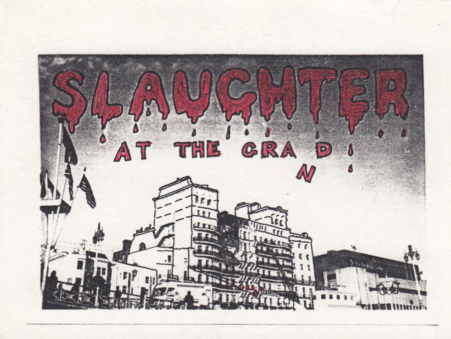
08/08/2019
SLAUGHTER AT THE GRAND
No Publisher or Printer indicated
On the 12th October 1984 the Provisional Irish Republican Army (the IRA as they were better known) detonated a bomb at the Grand Brighton Hotel in Brighton. This was an assassination attempt on the then British government, and the Prime Minister Margaret Thatcher, who were in residence at the hotel during the Conservative Party Conference. The bomb caused the death of five people connected to the Conservative party and injured another 31 people.
That outcome makes this postcard design seem to be in very bad taste, and it was. So, how did this postcard come to be published? The fact is that I am not certain, but I have some thoughts on it. I know that the IRA produced their own propaganda styled postcards, many of which were printed on secret printing presses away from the government forces. Looking at the cheap quality of this card and the simplicity of the printing process used, and with the addition of how simple and almost text free the reverse side is (i.e. no artist named and no printing details given, although perhaps the artist would not want to be known!) I suspect that this may be an underground printed IRA propaganda release.
This card, a recent acquisition at a postcard fair, requires some further research to confirm or refute my beliefs. Whatever the source, IRA or otherwise, this is a design created in bad taste, especially considering the loss of life and how soon after the event that I suspect it was issued/produced.
I show it here with a sense of its place in history without condoning in any way the message this seems to want to pass.
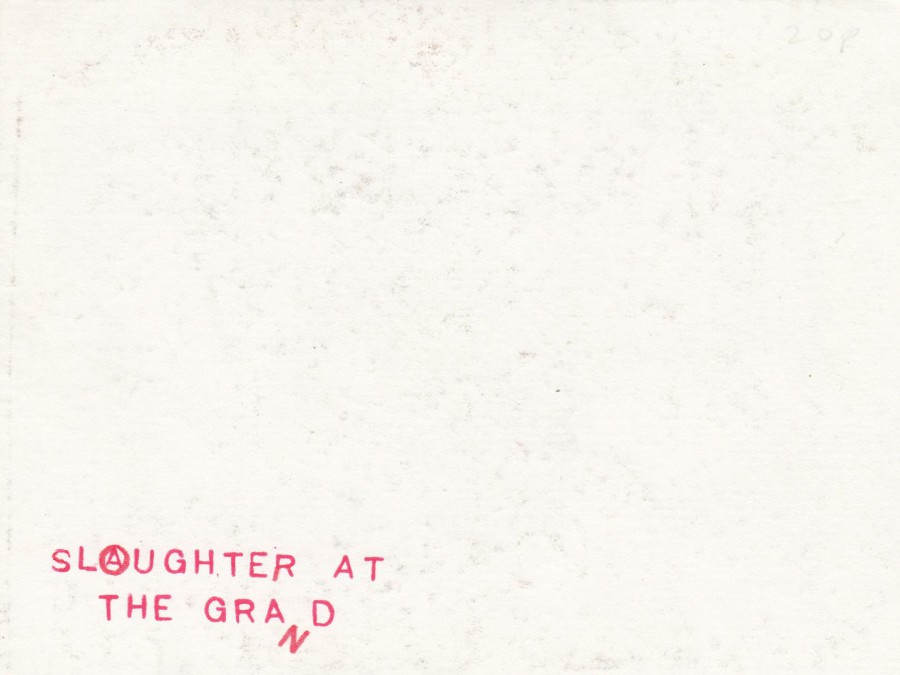
REVERSE SIDE OF ABOVE POSTCARD
The simplicity of this side is another indicator to me that this may have been an IRA produced card. There is something about the text, especially the letter ‘O’ with the letter ‘A’ inside it. Is this an IRA logo? That ‘A’ in the ‘O’ logo definitely seems to have relevancy here. As I have said above, more research is required.
31/07/2019
UNTITLED
Photograph by
ROY STUART
From the book:
ROY STUART, VOLUME II
Published by
TASCHEN GMBH. KOLN
Copyright 2000
(at this point the publishers were no longer using the BENEDIKT and the VERLAG in the centre dividing line text – as with other cards depicted here below)
Another photograph that goes to show that you really can find just about anything depicted on postcards. I have a friend who collects toilets on postcard, but I’m not sure even he would consider this one suitable for his collection!

31/07/2019
BETTY PAGE
By
BUNNY YEAGER
From the collection of Eric Kroll
Published by
BENEDIKT TASCHEN VERLAG GMBH. KOLN
Although Betty was her real name, ‘Betty Mae Page’ was better known under her professional name of Bettie Page, although this is not the name used here on this card. Bettie was an American model who was prominent in the 1950’s. She was the Playboy centrefold in January 1955 and was best known as a pin-up model. I have seen a number of images of Page, but this is the first time I have seen this one with the cheetahs.
This is another Taschen issue which almost certainly originated from a postcard book.

31/07/2019
“I’M GOING TO ENJOY MYSELF – ONE WAY OR THE OTHER!”
Cartoon by
QUIP
Published by
SAPPHIRE
A SAPPHIRE CARD
Ref: 169
The Quip cartoons published by Sapphire were always quite close to boundaries of what was acceptable, possibly even just on the other side! This one is funny, and I like the look of the woman’s face as that is a funny little old grin she has there, and it nicely indicates that she is here of her own accord and happy to be so. These postcards are becoming more and more collectible as we move further away from their era.

29/07/2019
SAMANTHA FOX
PICTURE BANK PHOTO LIBRARY
Published by
VERKERKE (COPYRIGHT & LICENSING GMBH KUSSNACHT AM RIGI SWITZERLAND)
Ref: # 34937
TOP TEN CARD
I did say that there would be more Sam Fox related postcards, and here is another one. Remembered as one of the most popular of the UK page 3 girls (for those who are from outside of the UK, the phrase ‘Page 3 Girl’ comes from the topless photographs that appeared on page 3 of the daily newspaper called The Sun - although this is no longer the case, but it was for many, many, years). There were a number of well-known Page 3 Girls, but I think Sam Fox is the one most people now remember.

REVERSE SIDE OF ABOVE POSTCARD
This was the standard VERKERKE – TOP TEN reverse layout

29/07/2019
ANTOINETTE AS ART
By
ERIC KROLL (SAN FRANCISCO)
Published by
BENEDIKT TASCHEN VERLAG GMBH, KOLN (Cologne)
Published 1997
One of the photographic postcards published by this company, again almost certainly from a postcard book. There has always been a view towards the naked body as being a form of art and photographers have used the naked model, both female and male, and have produced images of nudity which they designate as art. Some of these can be very beautifully shot and can be images which do attract the eye. This one is a simple image, but one well crafted, as perhaps the photographer intended. Pornography? Or Art? I suppose it depends on the person looking at the image.

29/07/2019
ERIC STANTON ILLUSTRATION
FROM
BONDAGE ALBUM
UNDATED
Published by
BENEDIKT TASCHEN VERLAG GMBH, KOLN (Cologne)
Published 1997
Bondage themed illustrations on postcard are far more common than one might think. This is because the theme can pictorially show more dressed individuals than naked, although clearly to many the latex styled costumes appear unusual. Bondage also comes with the theme of sexual pain, or, as with this rather unusual image spanking and the visualisation of this. This postcard was probably from the same postcard book as the below depicted image.
29/07/2019
ERIC STANTON ILLUSTRATION
FOR
HUSTLER
1990’s
Published by
BENEDIKT TASCHEN VERLAG GMBH, KOLN (Cologne)
Published 1997
We have mentioned before that the act of oral sex is something else which rarely gets depicted on postcard, and as with the male genitalia postcard depicted below it is again understandable why this should be so. Taschen are a company that have a reputation of producing books of sexual artwork by both artists and photographers including images of all types of sexual persuasion. This is a very provocative cartoon, if you can call it a cartoon. Although I have not direct information to confirm this, I believe strongly that this is a card removed from a postcard book, especially as Taschen publish a wide range of postcard books.
29/07/2019
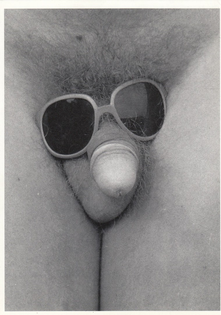
KISS ME
By
GIERSCH/VOLLER ERNST
Published by
HUMOUR A LA CARTE
(PARIS)
Ref: P 790
Postcards depicting the male genitalia are scarce, which I am sure will come as no surprise. A touch of double standards really considering how much female nudity there was on postcards during many of the eras of postcard publishing. This one is from the 1980’s and is from France, where they seemed to enjoy pushing the boundaries of what was acceptable. I don’t think the title helps much here either! I don’t believe this postcard image would have been an easy sell here in the UK. It may even have constituted a criminal offence.
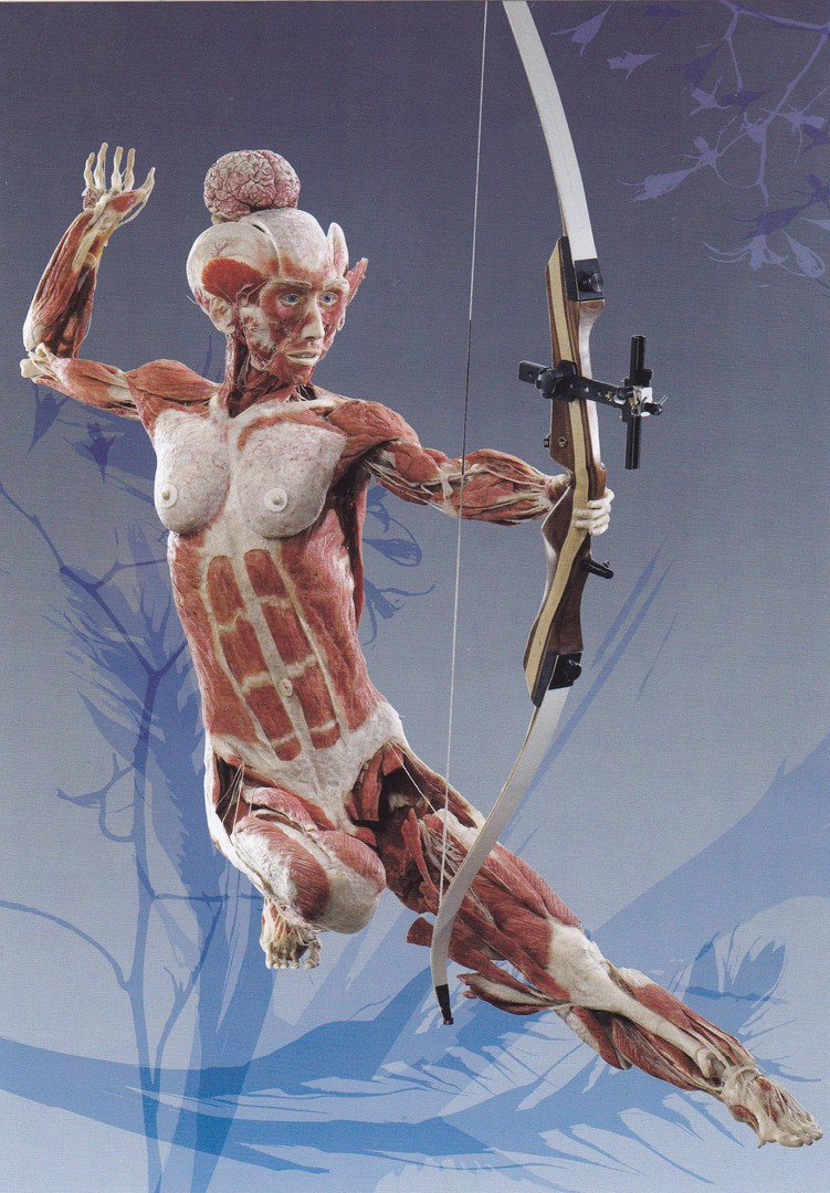
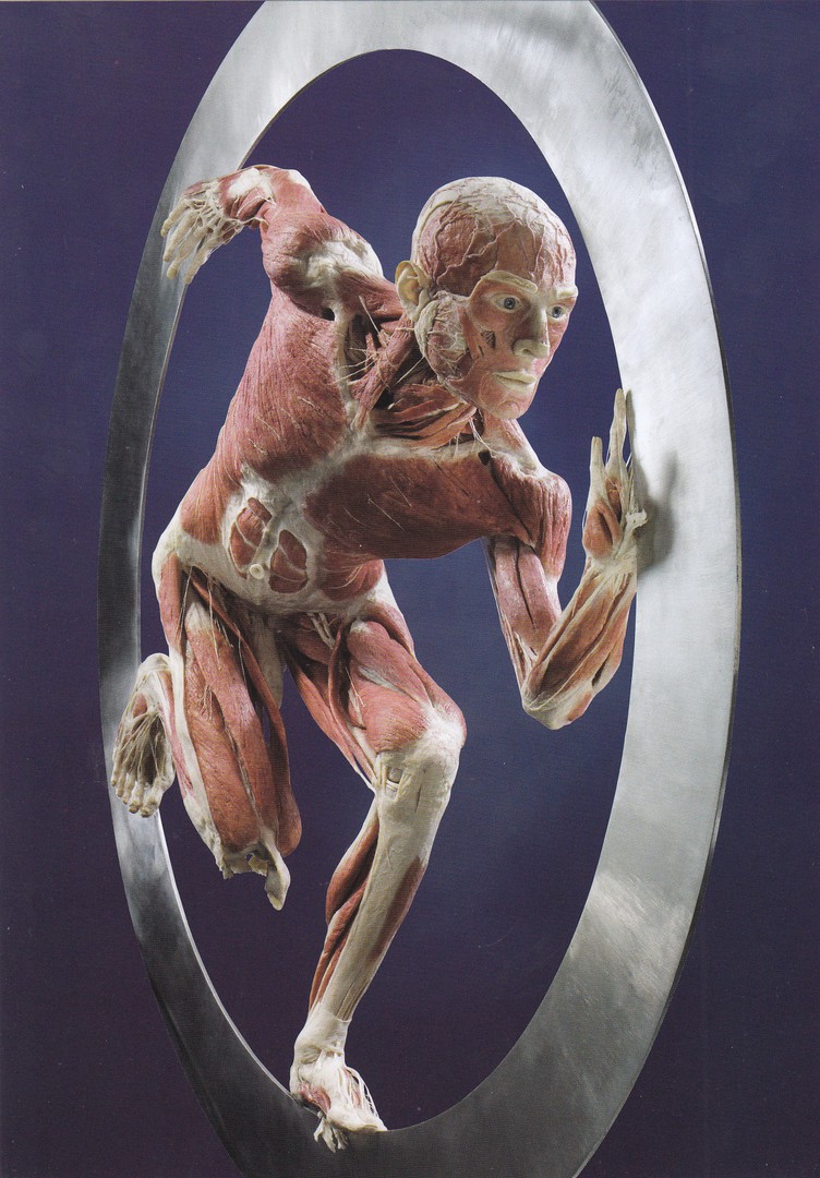
28/06/2018
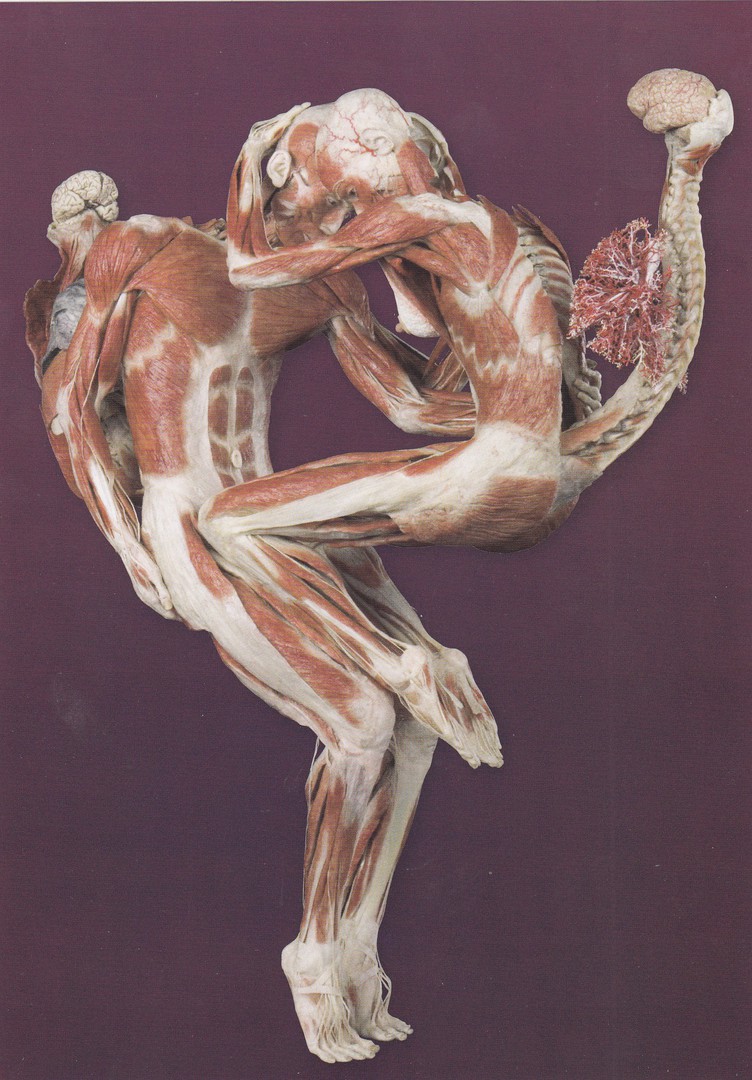
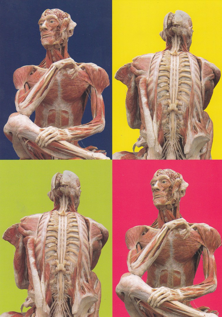
BODYWORKS
Gunther von Hagen’s original exhibition of real human bodies
LONDON
Official Bodyworks Exhibition postcards
I have recently posted some postcards I bought in Berlin featuring animal bodies from the exhibition located there. On Wednesday I was in London and came across the exhibition at Piccadilly Circus. They had a pack of postcards for £4. These were all large, slightly larger than A5 sized cards and the pack contained six different.
Now, when I posted the previous selection on the main webpage, I caused some consternation with readers as some people did not like these at all. To avoid this happening again, especially as some of these are even more graphic than the ones I have previously posted, I have decided to place these here under the CENSORED tab to avoid any issues.
The cards are not titled or numbered so I will just depict them here for you to see. I like these but can understand how they might not be to everyone’s taste (they could be described as a bit unusual!)
.

.
.

.
.

REVERSE SIDE OF ABOVE POSTCARDS
All the cards have the same reverse layout (which is different to those I picked up in Germany)

18/06/2019
SPAIN IS DIFFERENT
ESPANA
Image by
CAP CUADRAT
Published by
EL CAP CUADRAT
Ref: No 025
I found this on an antiques stall at a collector’s fair. Initially you could be fooled into thinking that this is some sort of strange nudity image. Fortunately for my sanity I recognised that this is a photograph from a scene from the Arnold Schwarzenegger 1990 film ‘Total Recall’. The card itself makes no mention of the film so I suspect the image was used without any proper copyright. I did think that this was a weird postcard image.
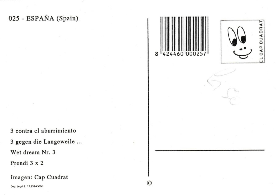
REVERSE SIDE OF ABOVE POSTCARD
18/06/2019
“CHATS – TOI – ET – MOI”
Design by
PATRICK HAMM
Published by
Jean Claude SIZLER
Ref: COLLECTION DE SIZI L’ESCARGOT – 2e SERIE No. 500
LIMITED EDITION OF 500 NUMBERED ISSUES - This card is No. 364
This limited-edition French postcard is by the well-known modern postcard artist Patrick Hamm. This card has been printed on a gold effect card which makes the background reflective and shiny.

REVERSE SIDE OF ABOVE POSTCARD
08/05/2019
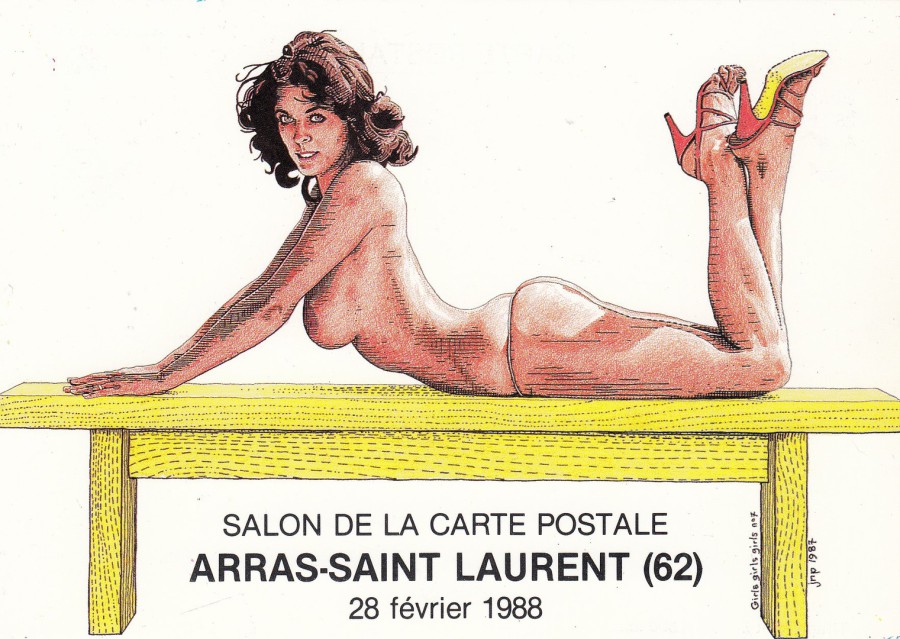
SALON DE LA CARTE POSTALE
ARRAS-SAINT LAURENT (62)
28 FEVRIER 1988
GIRLS GIRLS GIRLS No7
(artwork dated 1987)
Illustration by
J. N. POTTE
Published by
EDITION DES ESCARGOPHILES
Ref: COLLECTION 1988
No 30
Limited hand numbered edition of 300
(This postcard is hand numbered No 197)
A ‘Pirate’ postcard fair postcard published under the SIZI ‘Edition des Escargophiles’ postcard label.

08/05/2019
SABRINA
Published by
UNDERGROUND
Ref: U506
Although this postcard was published here in the UK it would be fair to say that the model Sabrina was far better know on the European continent mainland, Spain particularly I believe. Having said all that she did, I believe, appear in certain magazines here.
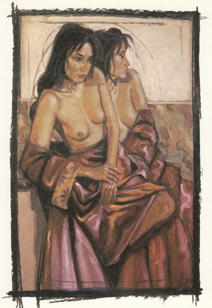
08/05/2019
“NUDO” (1981)
Painted by
AMLETO DALLA COSTA
Published by
GALLERIA “BRERA 3”
VIA BRERA, 3 MILANO (ITALY)
Ref: D. C. 56
It has been a while since I have placed anything here, so I thought this nice art design could be posted today. I have always quite liked this one. It is from Italy.

12/02/2019
GOIN’ NATIVE
At Club Med, guests discovered that watches and
cash weren’t the only things they had to leave behind.
Published by
VINTAGE IMAGES
Ref: PC1602
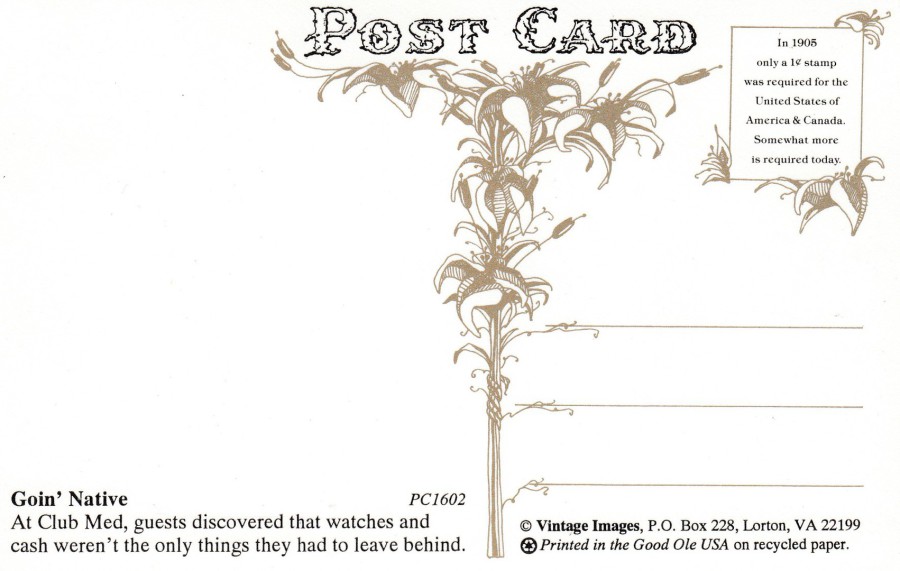
REVERSE SIDE OF ABOVE POSTCARD
I like the rather amusing comment made in the stamp box top right.
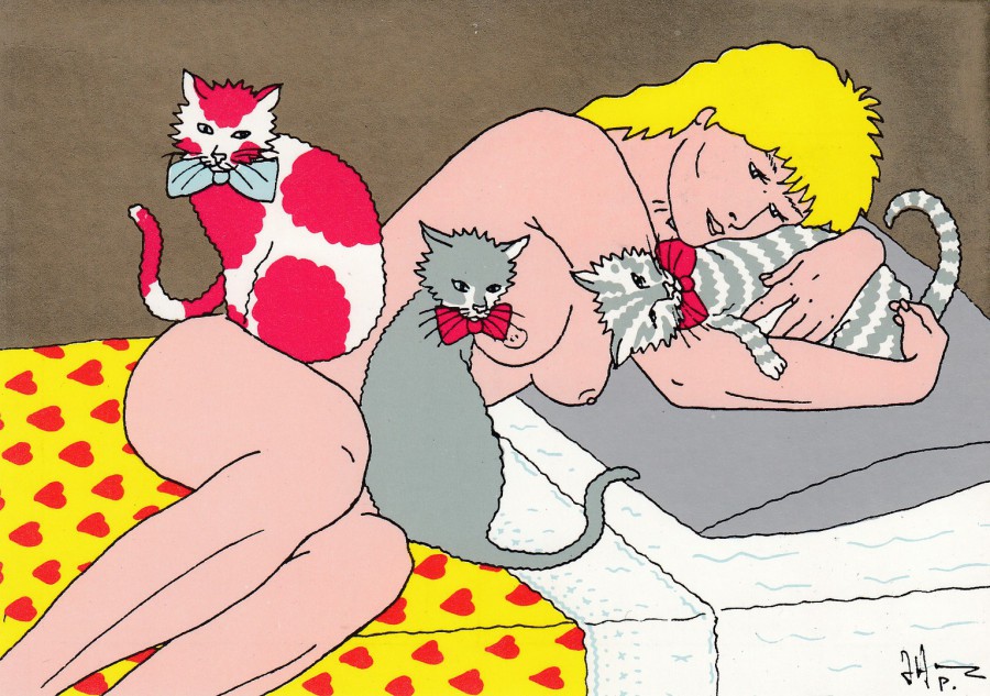
12/02/2019
GEMINI
By
Nico Vrielink
(1995)
(mixed media)
Published by
ART UNLIMITED (AMSTERDAM)
Ref: C 6341
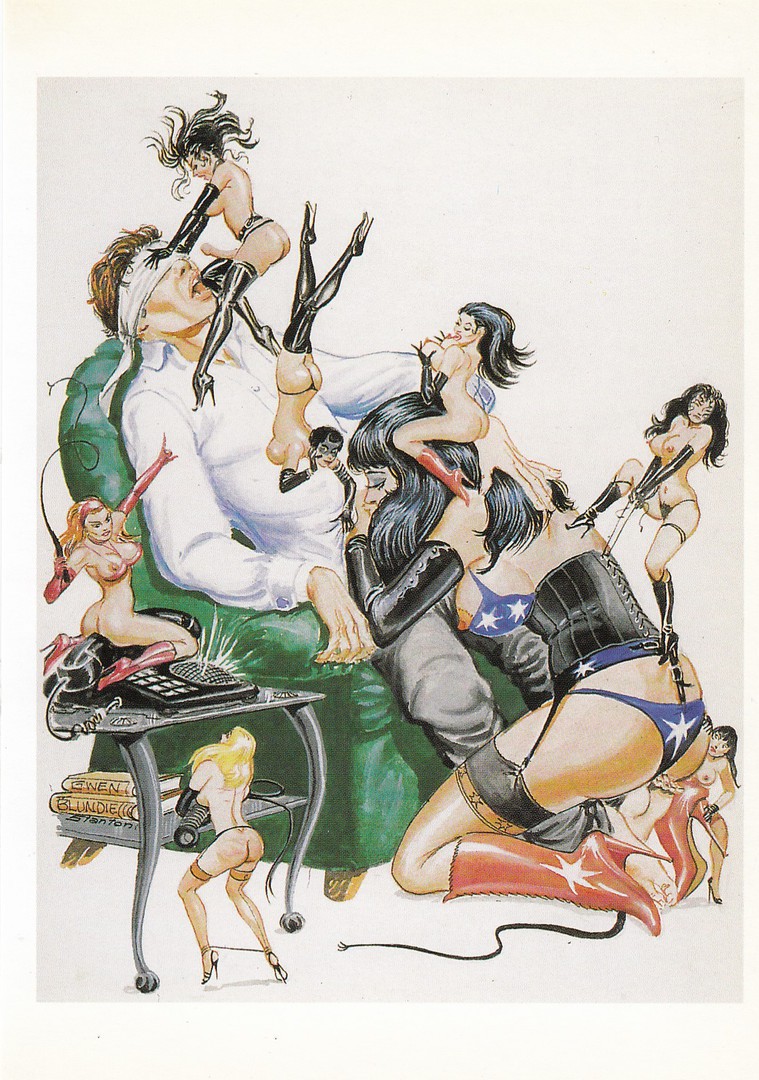
Art Unlimited, based in Holland, issued a large range of postcards depicting the artwork of Nico Vrielink whose designs are immediately recognisable. I do not have them all, but I do have a very large collection of them because the style of this artwork appeals to me. I am still not sure if these artwork postcards should be here under the censored category or if they could still be depicted on the main webpage page, but I am going to play safe and stick them here.
UNTITLED
By
Nico Vrielink
(1995)
(mixed media)
Published by
ART UNLIMITED (AMSTERDAM)
Ref: C 5751
Another design by Nico Vrielink from the same publisher. You can immediately see how the design has the same style as the postcard posted above.
07/01/2019
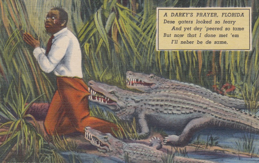
A DARKY’S PRAYER
Published by
GULF STREAM CARD & DISTRIBUTING CO., MIAMI, FLORIDA
GENUINE CURTEICH -CHICAGO “C. T. ART COLORTONE” POSTCARD
Ref: D. C. 179
Racism was rife on postcards in older periods, although it can be surprising to people who live outside of the area known as Southern America just how long these cards were still being published and used.
In many areas of Southern America, the theme of ‘Black History’ is extremely popular and I have found this as a listed theme on a range of stalls at events I have attended in Florida. The theme is so popular that cards can be, and are, extremely expensive in comparison to other cards of a similar age and production. This one here was posted in 1956, so its post WWII, so hardly classed as an old postcard in the postcard world (and to me, with my background, this seems like such a late date for such a themed card to have been on sale, but then when I watch history programmes for this period of US history it does not surprise me so much). But having said that it was priced at $20, which after a bit of bartering I managed to get down to $12. Not cheap, but despite my abhorrence of the theme, I wanted an example for my eclectic collection.

REVERSE SIDE OF ABOVE POSTCARD
Postmarked ‘HOMESTEAD FLA [Florida] – 5pm 11TH MARCH 1956’ with a wavy line machine cancellation