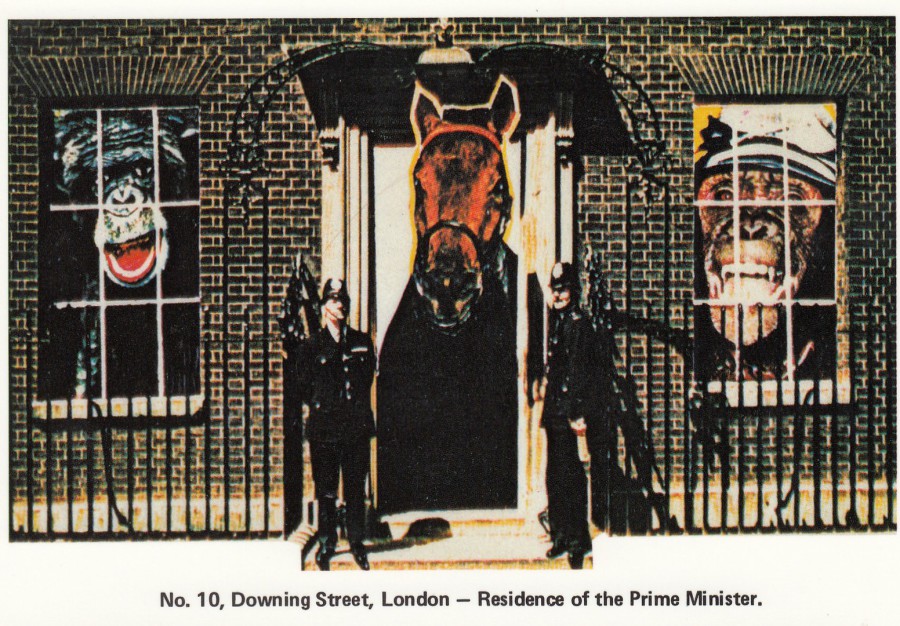
20/06/2018
No. 10, DOWNING STREET, LONDON –
RESIDENCE OF THE PRIME MINISTER
Published by
BUNCH OF ARTISTS
This company issued some ‘really’ unusual postcard designs during the 1980’s and I believe into the 1990’s. Their designs were never dull, often topical and irreverent, but never dull. When I come across cards by ‘Bunch of Artists’ I normally buy them. Also, as I am not a fan of the current incumbent of this address, this design also currently gives me a smile when I look at it.
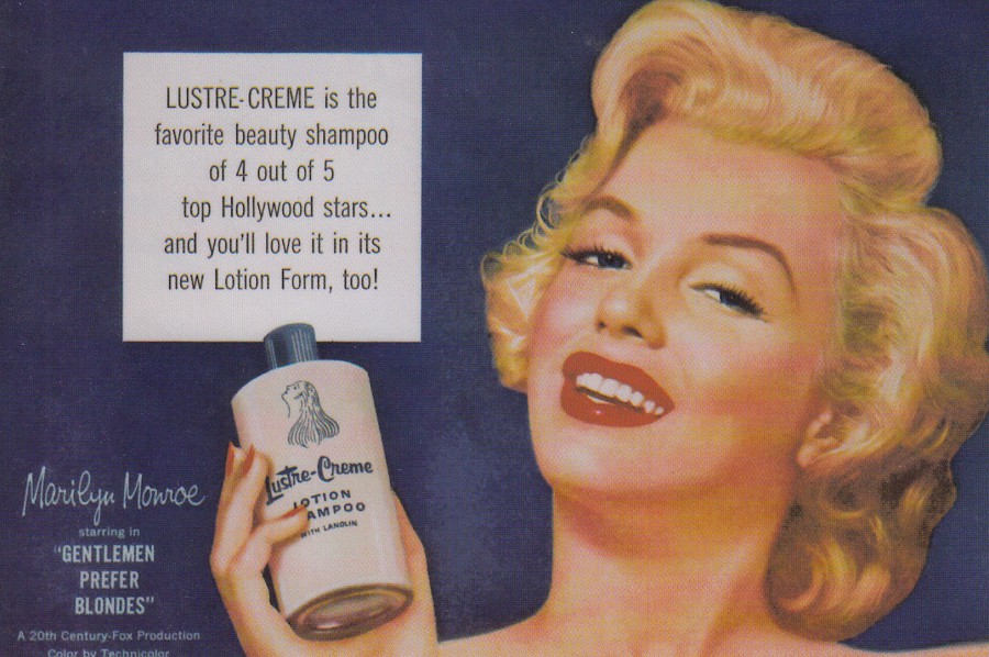
20/06/2018
LUSTRE-CRÈME SHAMPOO
‘MARILYN MONROE’
Advert
Published by
THE CHORLTON CARD COMPANY
Edition Limited to 1000 cards
Ref: C307
This postcard was issued in 1994 and text on the reverse side makes mention of the ‘100 YEARS OF BRITISH PICTURE POSTCARDS CENTENARY EXHIBITION – 30 AUG to 3 SEPT 1994 – ROYAL HORTICULTURAL HALLS, WESTMINSTER, LONDON W1’. I had the pleasure of visiting this centenary show in London for four of the five days it was on. During the centenary year there were a large range of specific centenary postcards issued and even more that made mention of it in text on the reverse side. I collected these cards and have a near complete collection (there are two cards that I am aware of that I need to have all the cards that I am aware of). Some of the cards released were more unusual than others and this is a nice example of one of those.
REVERSE SIDE OF ABOVE POSTCARD

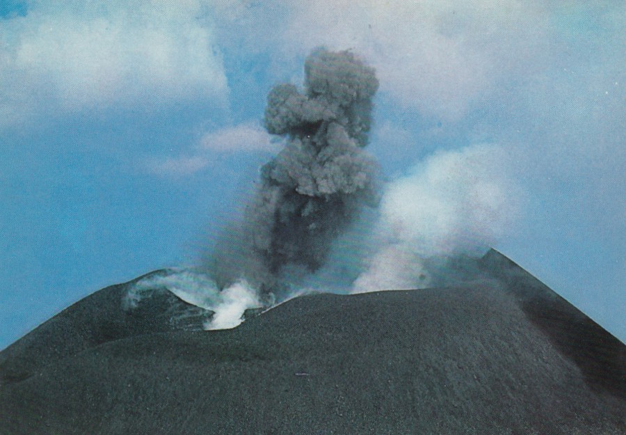
20/06/2018
ETNA
EXPLOSIONS IN THE CRATER
1981
Published by
PLURIGRAF TERNI
(da fotocolor Kodak Ektachrome)
Ref: 524
Volcano’s have always fascinated me, and the depiction of eruptions and lava flows from volcanos were the first non-wildlife subject that I bought on postcard.
At the time this 1981 eruption was considered Etna’s most dramatic and destructive of the 20th century. The eruptions in March of 1981 caused lava flows which came very near to the town of Randazzo with one flow, which was heading directly for the town, stopping just 2.5 km from the outskirts of Randazzo. The eruptions occurred between the 17th and 23rd of March of that year, 1981, on the north - north-western flank of the volcano. The eruptions were so dramatic that a number of the images depicting them were published as postcards.

ETNA
1983 ERUPTION
Published by
PLURIGRAF TERNI
(da fotocolor Kodak Ektachrome)
Ref: 527
This dramatic photograph shows lava flows encircling a building which has already caught fire at the back.
The 1983 eruption started on the 28th March and followed a couple of days of earthquake activity. This time a fissure opened-up on the south flank and this produced a lava flow which, as depicted here, destroyed several restaurants, chalets and other small buildings. On the 3rd April this lava flow had reached a distance of 2 miles from its source.
ETNA m. 3263
NORTH-EAST CRATER: EXPLOSION
Published by
RIPRODUZIONE VIETATA
(da fotocolor Kodak Ektachrome)
Ref: 150
The year this photograph was taken is not given on the postcard, but I believe this could be another image from the 1981 eruption, although this is not confirmed.
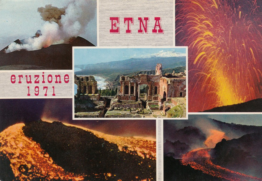
ETNA
ERUZIONE
1971
(ERUPTION 1971)
Published by
RIPRODUZIONE VIETATA
(da fotocolor Kodak Ektachrome)
Ref: 85
This postcard was posted in 1978 and it depicts a number of photographs from the 1971 eruption which occurred on 5th April of that year. On this occasion two fissures opened-up and lava again flowed. By the time that further eruptions took place on 21 – 22nd April the lave had reached and breached the buildings of the Volcanological Observatory located on an area called the Piano del Lago.
It seems that the various eruptions have supplied many images which have graced various postcards and that many tourists visiting the area buy these and post them
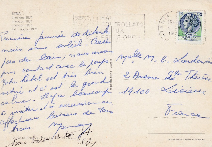
REVERSE SIDE OF ABOVE POSTCARD
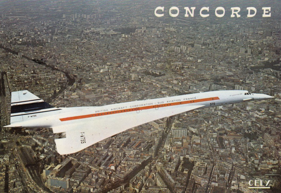
20/06/2018
CONCORDE
Published by
EDITIONS CELY
Michael Pendaries
TOULOUSE
Ref: 2055
One of the many Concorde postcards in my collection, a range of which have appeared previously on this webpage. This is a lovely early aerial photograph published in France.

REVERSE SIDE OF ABOVE POSTCARD
Some technical details are given here
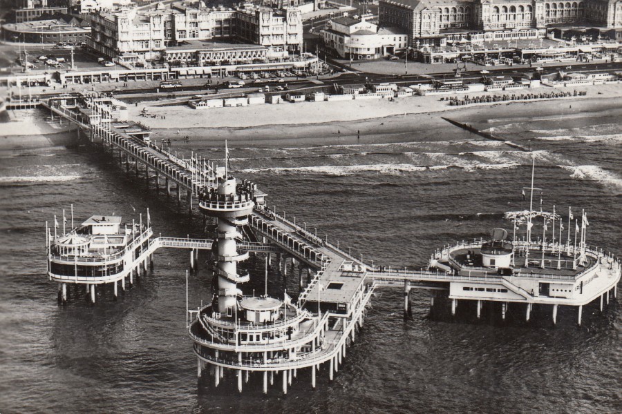
20/06/2018
SCHEVENINGEN
PIER
LUCHTOPNAME
Published by
UITGAVE: STICHING “HAAGSE JEUGDVERBLIJVEN”
Ref: 663
According to ‘Google Translate’ ‘LUCHTOPNAME’ means ‘Air Intake’, but what this means in relation to this pier that is depicted on this photograph I am not sure. The pier at Scheveningen is a pleasure pier and it was opened in 1959 (it is the second pier in the town as the first was lost during World War II – the first pier opened in 1901). The pier is unusual because it has two levels, an enclosed one on the lower level and an upper level open to the elements.
This postcard was posted in 1965 whilst the pier was still in the height of its early years, but decay soon set in which lead to the pier being purchased in 1991 for just one Dutch guilder by the Van der Valk group. Twenty million euros was then invested in the pier which included the construction of a restaurant and a casino. In 2011 a fire caused damage and lead to another period where the pier fell into decay. Then in 2013 (October) the pier structure was entirely closed off and described as unsafe. In 2015 another sale lead to further work and some of the pier has been re-opened.
This cracking black and white photograph shows the pier when it was probably at its best, in its early years. Again, you have a piece of history saved on a postcard.
20/06/2018
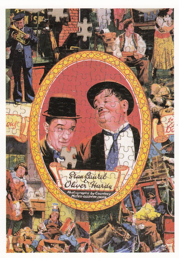
STAN LAUREL
&
OLIVER HARDY
TWO OF THE WORLD’S GREATEST CLOWNS,
CAPTURED ON AN EARLY EXAMPLE
OF MOVIE MEMORABILIA
(LAUREL & HARDY JIGSAW PUZZLE)
Published by
MUSEUM OF THE MOVING IMAGE
(SOUTHBANK, LONDON)
Printed by
EXPRESSION PRINTERS, LONDON
Ref: 4
The specialist museums, from all over the world, are often the source of some amazing postcard images. This cracking early jigsaw puzzle is in the collection of the Museum of the Moving Image. I know that Laurel & Hardy are extremely popular with collectors and there is even a specialist collectors club entirely related to the two actors. This would be a great postcard for anyone interested in these two. I wonder if this is the only time this puzzle has appeared on a postcard.

20/06/2018
ALEXANDRA TUGS ATTENDING THE
QUEEN ELIZABETH 2
ON HER FIRST VISIT TO LIVERPOOL,
IN CELEBRATION OF CUNARD’S
150TH ANNIVERSARY
24TH JULY 1990
Photograph by
B. S. CLARKE
Published by
ALEXANDRA TUGS
(Tug Owners since 1833)
This is a superb photograph of the QEII from 1990 when she visited Liverpool on her first visit. Although the front image is worth placing in a collection on its own right, someone has taken this postcard and applied some cachets to the reverse side which make it even better.
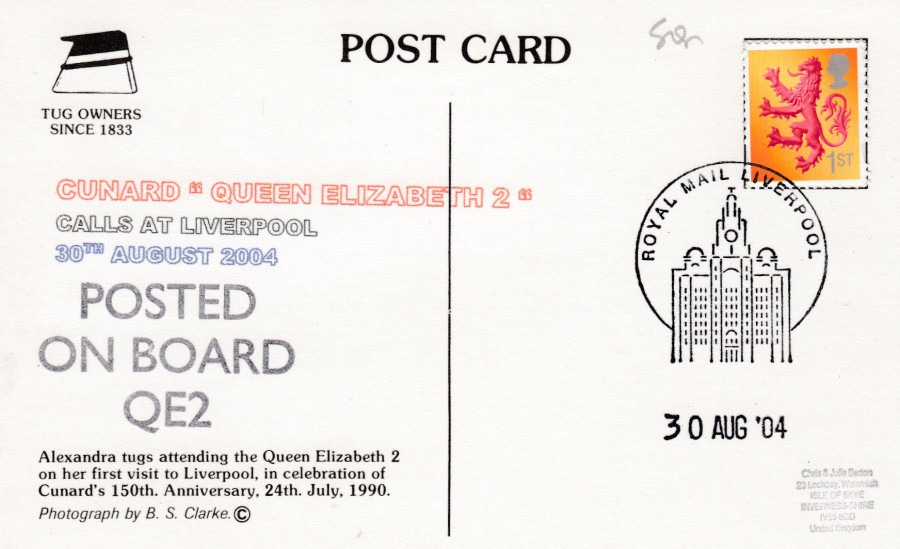
REVERSE SIDE OF ABOVE POSTCARD
This side has two special applied cachets. One is worded:
CUNARD “QUEEN ELIZABETH 2”
CALLS AT LIVERPOOL
30TH AUGUST 2004
I believe this is a cachet which the person who has created this usage has designed and applied themselves. It is a nice three coloured cachet which is date specific.
Then you have a second cachet which reads:
POSTED
ON BOARD
QE2
This looks very much like an official cachet applied by the ship’s crew and which was available for use by anyone who was onboard the ship. I know that they changed this cachet often and I have three different versions in my collection.
Then you have the 1st class UK ‘Lion’ definitive stamp which has been cancelled with the ‘ROYAL MAIL LIVERPOOL’ philatelic counter special hand stamp dated 30th August 2004, which was the date of the QEII’s visit here. A great card with superb usage.
20/06/2018
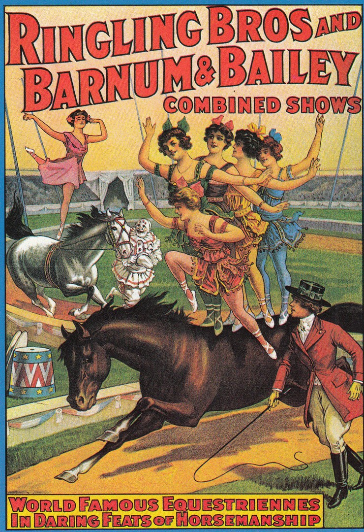
RINGLING BROS
And
BARNUM & BAILEY
COMBINED SHOWS
WORLD FAMOUS EQUESTRIENNES
IN DARING FEATS OF HORSEMANSHIP
Published by
KRUGER
Ref: 491194
(Printed in Venezuela)
Superb circus themed poster. The artwork used on these early posters was fantastic and I fully understand their appeal. This postcard was published by the company ‘Kruger’. Their cards were sold across Europe and I have seen them in Belgium, Germany and France, although I suspect they were (are?) sold elsewhere as well as the language used on the reverse side around the company logo is in Spanish.
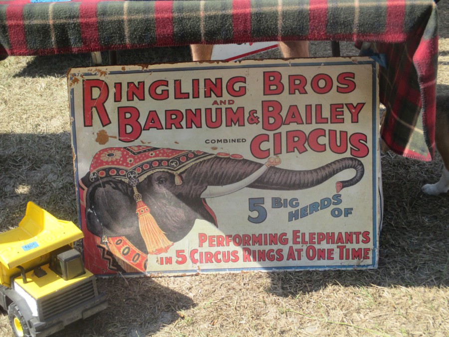
PHOTOGRAPH
Taken in 2016
Mount Dora, Orlando
Open air Antiques and Flea Market
When I was in America a couple of years ago I spent a fantastic day at a massive open-air antiques and collectors fair event. I managed to pick up some postcards here, but I was also amazed at what else was present to be bought. If Jo had not dragged me away and, quite correctly, stated that we would not get it into our luggage I suspect I might have been very tempted to buy this superb metal circus sign, Jo would have killed me though! I thought this was great.
19/06/2018
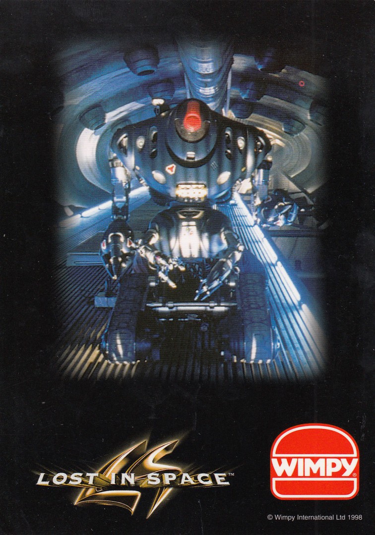
LOST IN SPACE
BLUE ROBOT
WIMPEY Restaurant
Official ‘Wimpey’ Postcard
(Possibly a free issue – or given away with the children’s meals which they used to give out)
This robot was in the 1998 feature film version of the television science-fiction series ‘Lost in Space’. I have been a regular eater at the Wimpey beef-burger chain of restaurants since being a kid, but despite this postcard being twenty years old now I was totally unaware of its existence until I came across it on a stall at this years Woking postcard fair. Because of the films connection to the original TV series I picked up every card I could find when they came out, but I did not see or hear about this one. This is what I love about postcards, the fact that even supposed big collectors like myself cannot know everything, or, be even close to knowing most of the postcards issued. So, the next question is are there anymore postcards like this for other characters from this film.
REVERSE SIDE OF ABOVE POSTCARD
19/06/2018
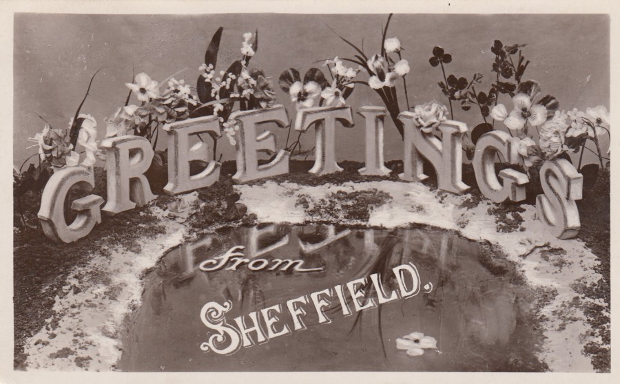
GREETINGS
FROM
SHEFFIELD
Anonymous Publisher
Posted from Sheffield in 1909
As a simple local postcard design, you probably could not find a better example. This design could have been used for any location in the UK with the simple addition of that locations name printed where SHEFFIELD appears here on this one. I like these simple designs, they are not popular with many collectors, but they tell a very important part of the postcard story.
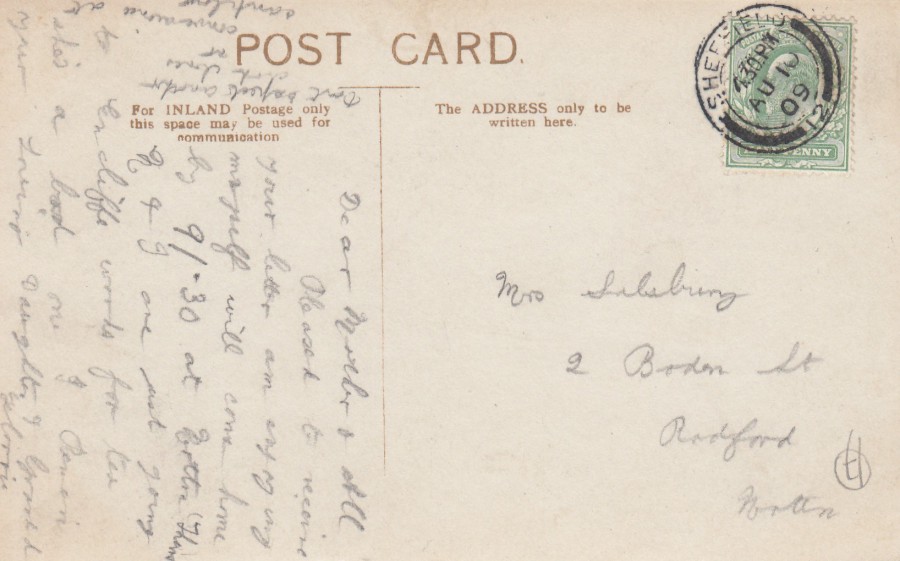
REVERSE SIDE OF ABOVE POSTCARD
This has been used locally and the stamp has received a nice clear SHEFFIELD cancel dated 10th August 1909. This usage adds to the local interest of this postcard.
19/06/2018
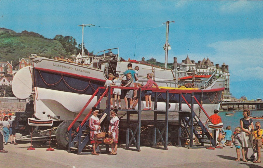
LLANDUDNO, CAERNARVON, WALES
LLANDUDNO LIFEBOAT
The
“LILLY WAINWRIGHT”
37 ft long Oakley type.
Published by
N. P. O. Ltd, Belfast
(npo fotocolor)
I have a small collection of ‘Lifeboat’ themed postcards and I have always bought them when I have come across them from lifeboat shops and stalls, this is partially because I like these, but mostly I like that they raise money for this excellent organisation, the R.N.L.I. (Royal National Lifeboat Institution).
I am not sure this postcard did raise money for the RNLI, but it is such a nice photograph that I am happy to add it to my collection anyway. I also liked that there are two women wearing Welsh national costume included in this picture.

REVERSE SIDE OF ABOVE POSTCARD
19/06/2018
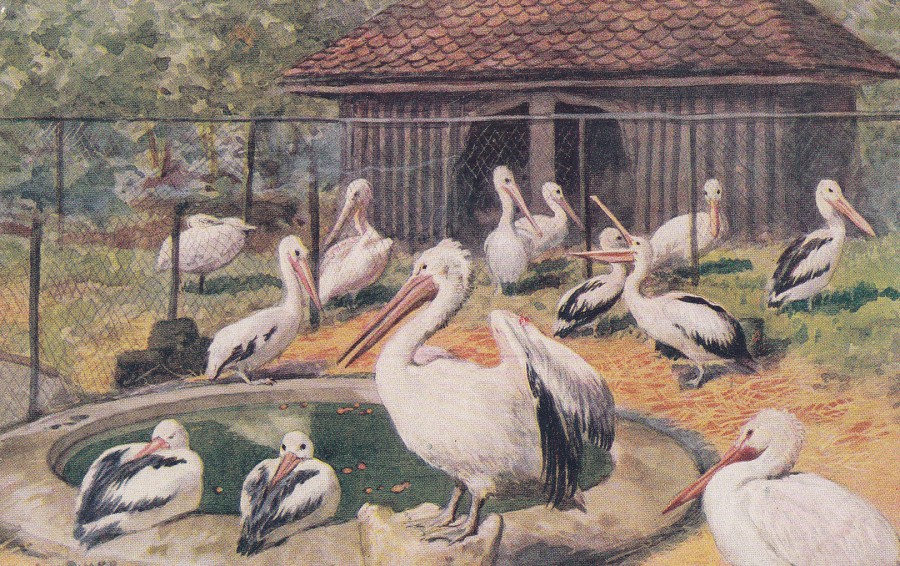
PELICANS
AT THE ZOOLOGICAL GARDENS,
LONDON
Published by
J. SALMON (SEVENOAKS)
Ref: 3068
I have collected all sorts of different postcards related to London Zoo, but it is the early painting issues which I like the most.

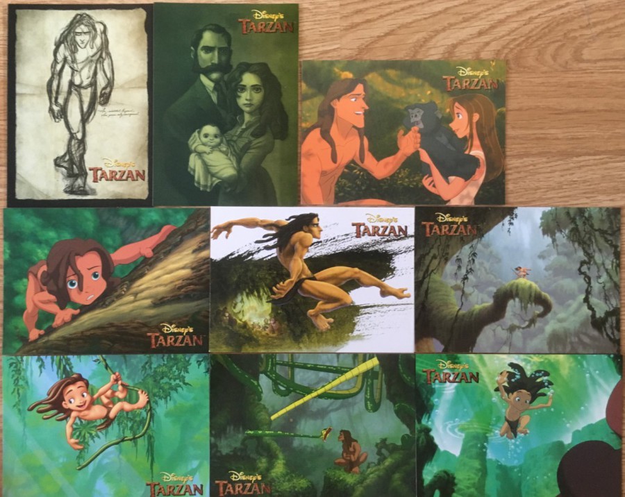
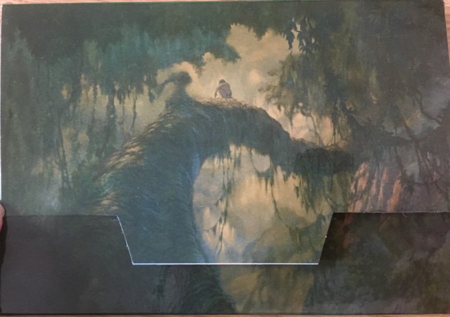
19/06/2018
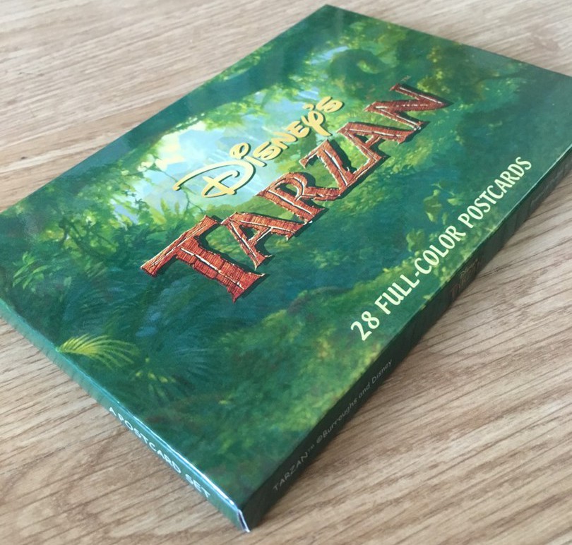
TARZAN
POSTCARD PACK
28 Postcards
(Walt Disney ‘TARZAN’ animated feature film)
Published and Printed
In Thailand by
STARPICS/SUWAN STUDIOS
PHOTOGRAPH
PACK COVER
This is a pack of 28 postcards all featuring scenes and poster styled artwork from the 1999 Disney animated feature film ‘Tarzan’. Over the past few years there have been some extremely well crafted and professionally produced postcard sets coming out of Thailand, this is one of these sets. They have the added-bonus of also being reasonably priced. This set cost me £10, which I think is very reasonable.
PHOTOGRAPH
Image of the complete package from the side

<< New image with text >>
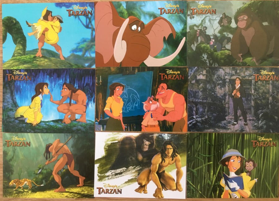
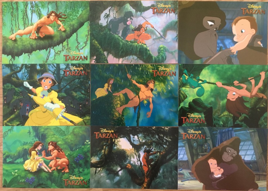
PHOTOGRAPHS
Selection of postcards from collection
PHOTOGRAPH
REVERSE SIDE OF PACKAGE
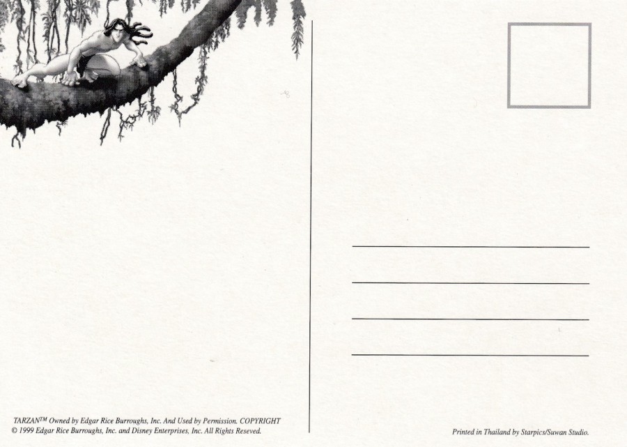
REVERSE SIDE OF POSTCARD
All the postcards contained within this package have the exact same reverse layout, without any differences.
18/06/2018
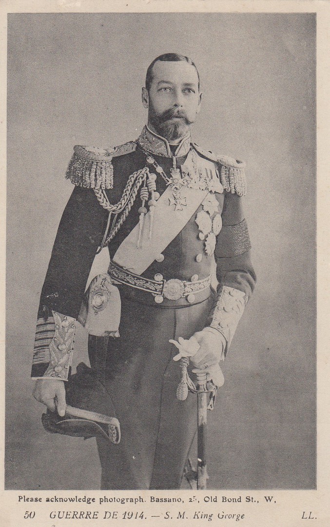
GUERRRE DE 1914
(War of 1914)
S. M. KING GEORGE
(King George V)
Published by
LL
Ref: 50
A postcard of the King issued in France during the first year of World War 1. This one would appeal to any early royalty collector and, also to anyone collecting first world war related postcards. This is a nice official portrait photograph of King George V.
REVERSE SIDE OF ABOVE POSTCARD
Very basic early WW1 French postcard reverse layout
18/06/2018
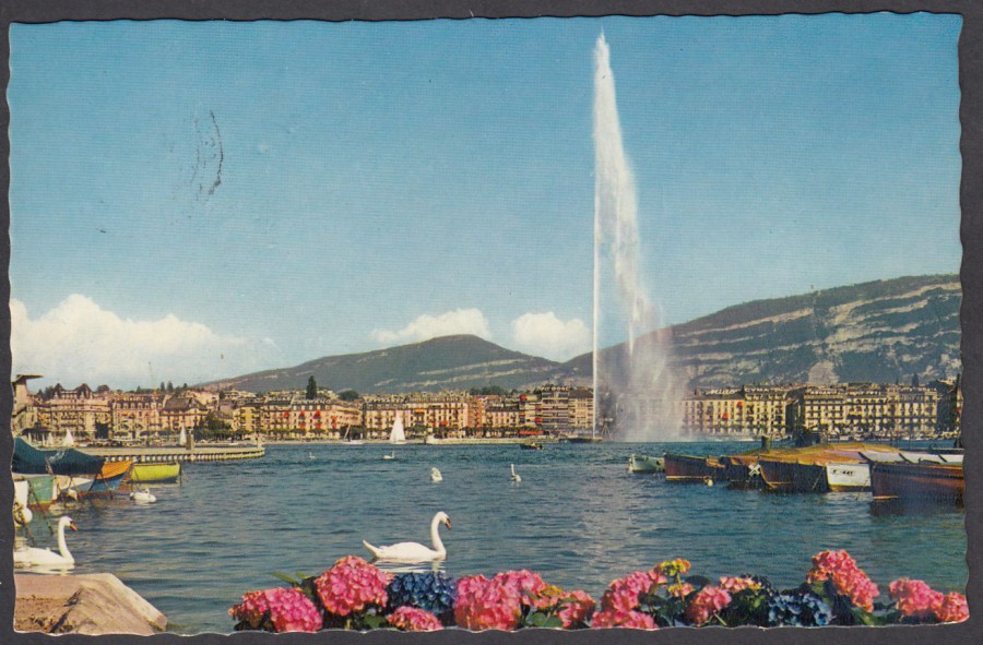
GENEVE
LA RADE ET LE JET D’EAU (130 m)
Geneva
The Rade and the Water Jet
Published by
EDITIONS JAEGER & CIE
(J &Cie)
Printed in
IRIS MEXICHROME
Ref: 113
The Rade is the waterfront area of Geneva City and the development of this area has been the subject of a design competition. I like postcards that depict swans, something which harks back to my original wildlife postcard collecting, but it was something else related to this scene which made me buy it. This is one of the most unusual additions to my television themed collection. The reason why this water jet lakeside scene is so well known to me is that I saw it many times during the opening credits of one of my favourite television series of the late 1960’s, ‘The Champions’ (the original release dates for the only series of this programme was the 25th September 1968 – 30th April 1969 – In all 30 episodes were made). As each of the three main actors (Stuart Damon, Alexandra Bastedo and William Gaunt) playing the main three characters were introduced during these opening credits the water jet you can see here on the postcard was seen in the background behind them. I watched re-runs of this series and I also had a Gum Card set which shows images from the first opening episode of the series, so I was a fan. Seeing this postcards image reminded me of the fun I had watching The Champions as a young boy.
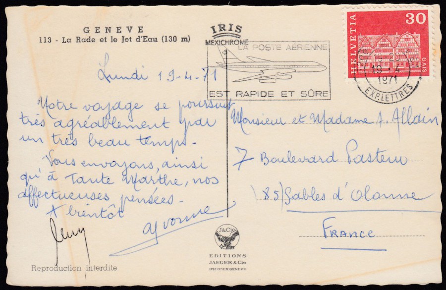
REVERSE SIDE OF ABOVE POSTCARD
Geneva is in Switzerland so naturally enough this postcard was posted using a Swiss postage stamp which has been cancelled with a nice collectible aeroplane slogan cancellation dated 1971. The slogan reads as:
LA POSTE AERIENNE
EST RAPIDE ET SURE
THE AIR POST
IS FAST AND SAFE
There is a nice outline of a commercial passenger jet plane incorporated within the slogan cancel. It is this which makes this so interesting, in my mind anyway.
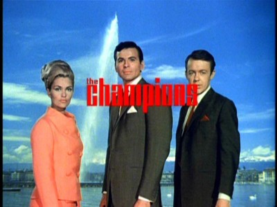
PHOTOGRAPH
Picture taken from the opening credits of ‘The Champions’ television series showing the water jet depicted on the postcard above...Ah, memories
18/06/2018
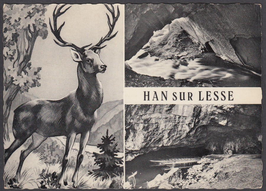
HAN SUR LESSE
Published by
Ern. Thrill, Bruxelles No 3
(Ref: No. 3 – possibly?)
Han sur Lesse is a village in Belgium (in the Rochefort, Namur Province) which is apparently famous for its caves, which are described as ‘exceptional’. These caves have been carved out by the passage of the river Lesse as it passes under a hill by the river.
This postcard, posted in 1962, has two photographs of these caves on a multi-view postcard which includes an artwork piece depicting a deer. I would not be surprised to find that this deer picture appears on other postcards as well, possibly even from other areas as this was a common practice both here in Europe and the UK.
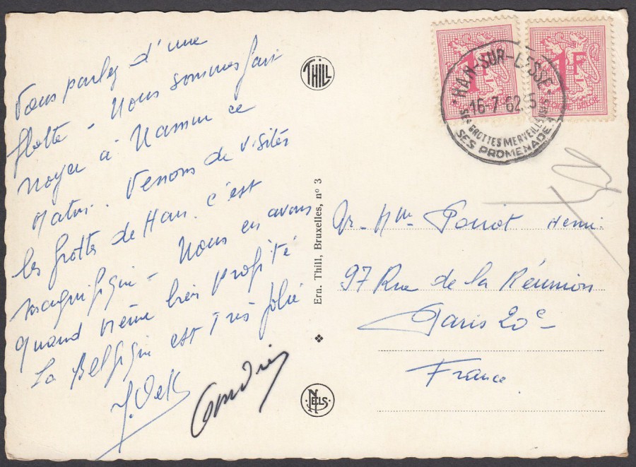
REVERSE SIDE OF ABOVE POSTCARD
I love the cancellation used here which reads:
HAN-SUR LESSE
16-7-62
SEE GROTTES MERVEILLEUSE
[See Wonderful Caves]
SES PROMENADE (? Possibly there is a number here – 1?)
This is a nice local cancellation which advertises the caves which the village is famous for. For me the cancellation adds extra interest to this postcard.
18/06/2018
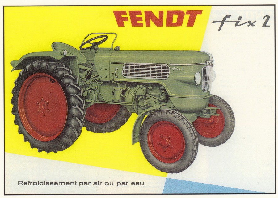
TRACTEUR FENDT Fix 2
PROSPECTTUS D’EPOQUE
(1961)
“Tractor FENDT Fix 2 [Mark 2?]
Time Prospectus”
Published by
CENTENAIRE EDITIONS
13, rue Rabelais – 1700 SAINTE – FRANCE
Ref: 114 – MATERIEL AGRICOLE [Agricultural Equipment]
(This is the series of postcards which I discovered in the town of Sainte, which is located close to where my In-Laws house is located, in Venerand, France. The cards depict old adverts from all periods, but I particularly like the ones from the 1950’s, 1960’s and 1970’s, and those depicting farm equipment & vehicles, Cars, Vans, Motorcycles and other forms of transport – many of which I have not seen on postcard before. I also like the fact that these postcards were locally published in Saintes. I like this series a lot and I have previously posted some examples)
I think I like the tractor advert material issued by this company the best. It is quite rare to find this sort of advertising material on postcard as mainly publishers seem to issue postcards related to the early horse drawn ploughing era of farming. Modern farming images are much harder to source, but this French company have produced a nice range of images.
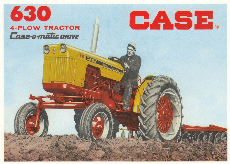
CASE 630
4-PLOW TRACTOR
CASE-O-MATIC DRIVE
Published by
CENTENAIRE EDITIONS
13, rue Rabelais – 1700 SAINTE – FRANCE
Ref: 124 – MATERIEL AGRICOLE [Agricultural Equipment]
This appears to be an American Tractor advert, so it is nice to see that this company did not only source French adverts

TRACTEURS RENAULT
D35
Publicity from 1956
Published by
CENTENAIRE EDITIONS
13, rue Rabelais – 1700 SAINTE – FRANCE
Ref: 111 – MATERIEL AGRICOLE [Agricultural Equipment] Series 3
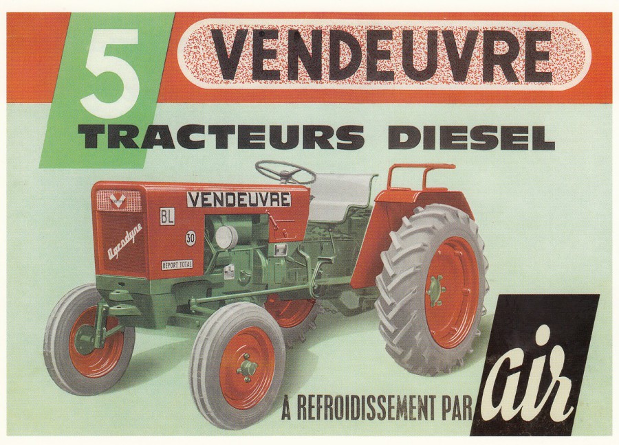
VENDEUVRE
5
TRACTEURS DIESEL
Published by
CENTENAIRE EDITIONS
13, rue Rabelais – 1700 SAINTE – FRANCE
Ref: 35 – MATERIEL AGRICOLE [Agricultural Equipment]
This is another superb piece of advertising material which the company have sourced in France and placed on this postcard. The company seem to have made-contact with a range of collectors of this type of material as the people from whose collection the images have come from are named on the back of the cards. This one is a bit different though as the source is shown as Collection de l’Editeur, which means this material here was from their own collection.
17/06/2018
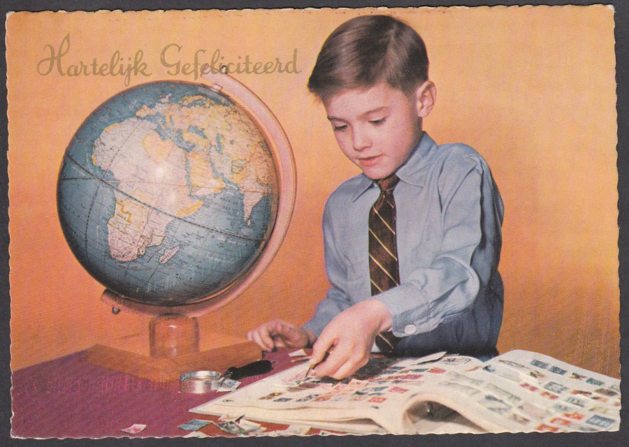
HARTELYK GEFELICITEERD
‘Congratulations’
Published by
Gebr. Spanjersberg N.V. Rotterdam
Dutch Postcard
Honestly, this could be me at that age. I, like many kids at the time, collected stamps at a young age. I was started out on this journey by my Mum who gave me her own childhood stamp album (which I still have). Me and a friend of mine at school approached one of the teachers and created an after-school stamp club, so my collecting streak started at a young age. I do like this cards image as it reminds me of how stamp collecting used to be. I may concentrate on postcards these days, but I have never lost my love of stamps.
17/06/2018
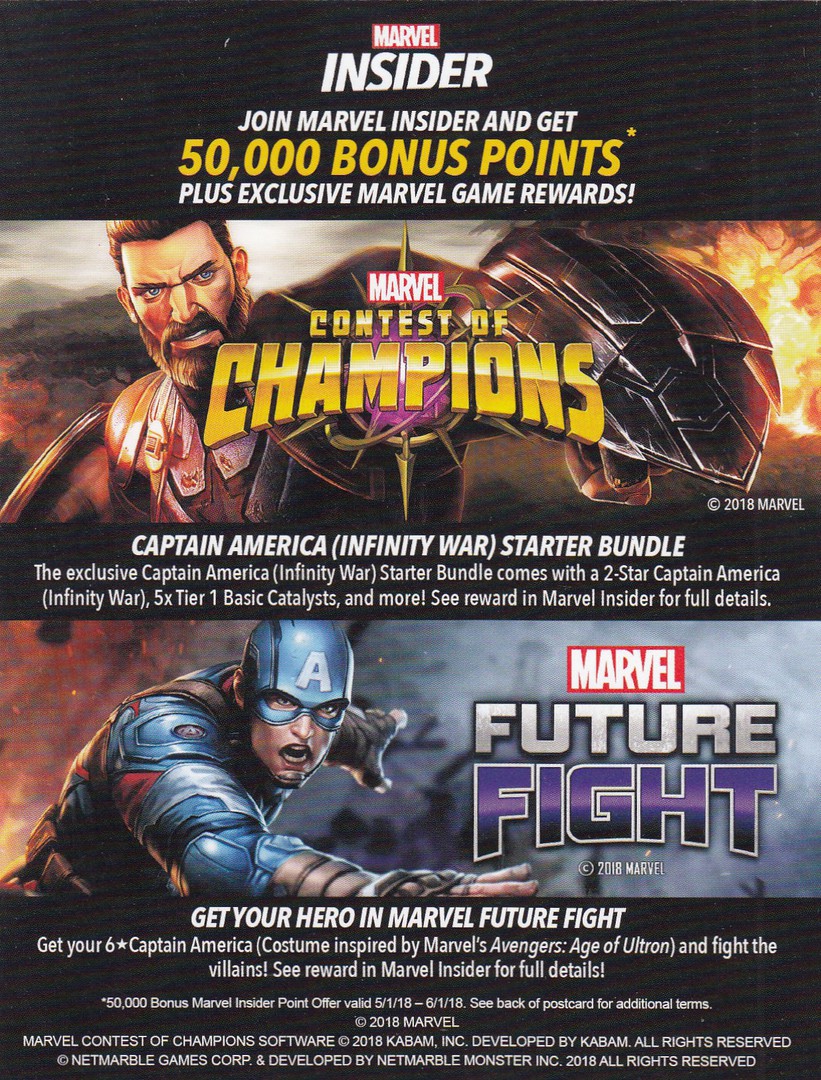
NON-POSTCARD ITEM
(ADVERT FLYER CARD)
MARVEL
INSIDER
CONTEST OF CHAMPIONS
FUTURE FIGHT
I picked up a couple of copies of this ‘Flyer’ card advert because I collect anything card like which features superheroes, especially Marvel and DC Comics. This is clearly from Marvel and relates to what I believe is a computer game? All I know for certain is that it depicts two different versions of Captain America and references the ‘Infinity War’. These unusual advert cards are much collected by those who are interested in the world of modern comic-book characters. These were free on the counter of a comic shop in London.
19/06/2018
Update
I noticed that 'Avengers Assemble' was on the TV today so decided to watch it again for upteenth time - it might just be one of my top 10 favourite movies, and by far the best 'Superheroes' movie so far made.

REVERSE SIDES OF TWO COPIES OF THE ABOVE
ADVERT FLYER CARD
These each have a separate unique reference code which can be used to unlock bonus material connected to the game. Feel free to use either of the two numbers displayed here as I will not be using them 9this is why I have displayed the back of each of the two copies I have).

different code - feel free to use this one
17/06/2018
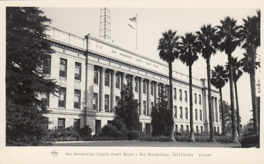
SAN BERNARDINO
COUNTY COURT HOUSE,
SNA BERNARDINO, CALIFORNIA
Published by
FRASHERS, INC. POMONA,
CALIFORNIA
Ref: F-7600
A FRASHER FOTO CARD
This postcard fits squarely in my ‘Law & Order’ collection. The Courthouse depicted here was built in 1927 and it was designed by a local San Bernardino architect called Howard E. Jones, and apparently it is the only surviving Classical Revival building in San Bernardino. It is now on the U.S. National Register of Historic Places (added in 1998). If you ever visit here, and I have not had that privilege, then you will find this building located at 351 N. Arrowhead Avenue, San Bernardino.
REVERSE SIDE OF ABOVE POSTCARD
To me this has a late, post war 1940’s or early 1950’s style and look to it. It is not dissimilar to the Kodak style of printing back which was widely used across the U.S. at this time.

17/06/2018
MARILYN
(Marilyn Monroe)
REINHARD COLLECTION
Published by
WIZARD & GENIUS
(W&G)
Switzerland - 1987
Ref: 5269
I think this is one of the best official photographs of Marilyn Monroe. When I saw this on this postcard I knew it was one I wanted in my collection. I know there is a soft lighting effect to this photograph, but I think you can see here why she was considered such a beautiful woman.
17/06/2018
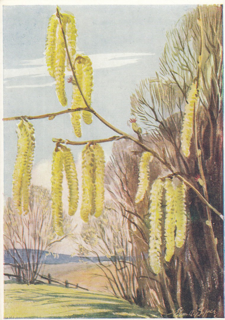
HAZEL
By
EILEEN A. SOPER
Published by
THE MEDICI SOCIETY LTD,
LONDON
Ref: P.C. 1044
In their:
MEDICI BRITISH TREE SERIES
This is the second of these Eileen A. Soper illustrated Medici postcards that I have posted on the webpage, the other being a flower if I remember correctly. These are delightful cards which are very early Medici issues, but which, despite their age, are not that expensive to pick up.
17/06/2018
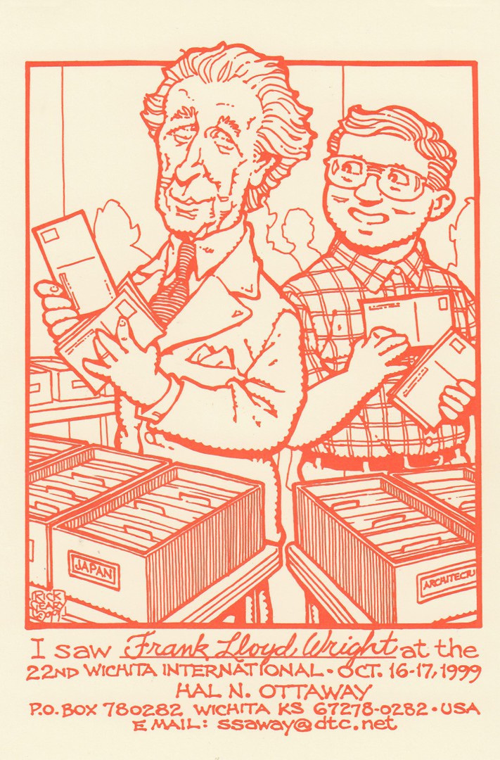
I SAW FRANK LLOYD WRIGHT
AT THE 22ND WICHITA INTERNATIONAL
16 – 17th October 1999
Artwork by
Rick Geary
Published by
HAL OTTAWAY
Issued in a Limited edition of 300
Individually numbered postcards
Hal Ottaway issued a number of these ‘I Saw’ postcard designs, all by Rick Geary, and which all depict and name different famous people. Some of these people have been obvious to me, but by no means all of them as I had not heard of Frank Lloyd Wright. I now know, thanks to a bit of research, that he was an American architect, interior designer and writer. I also know that Hal was unlikely to meet him in 1999 as he passed away on 9th April 1959, but that was part of the fun of this series as it features people from both the past and the present.
REVERSE SIDE OF ABOVE POSTCARD
This is a standard reverse layout for these postcards which has again been drawn by Rick Geary

17/06/2018
LES CHIENS
DOGS
Published by
NOUVELLES IMAGES
Ref: PHC 1850
This is one card in a series of these on which a ‘large-number’ of small images of one type of ‘thing’ are depicted. I have cards in this series covering Birds, Insects, Fire-engines and tree’s (amongst others). These are sold in France (source country for the issuing company) and here in the UK, although it was in France many years ago that I first came across them. I love these and buy them whenever I come across them.
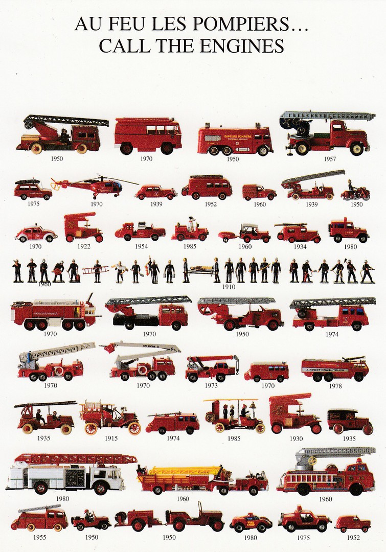
AU FEU LESS POMPIERS…
CALL THE ENGINES
Published by
NOUVELLES IMAGES
Ref: PHC 1702
This is the fire-engine one mentioned above – I decided to show it here as well. These are toys with the year of issue placed underneath them. A superb thematic card this one.
17/06/2018
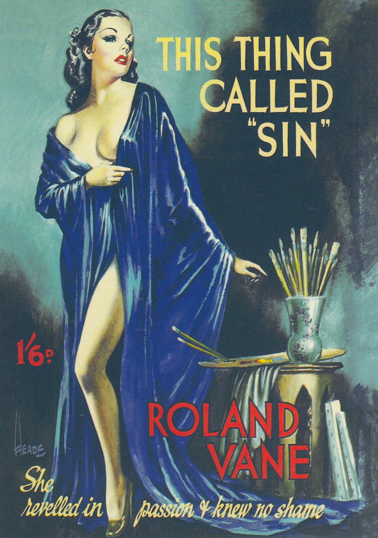
THIS THING CALLED SIN
BY
ROLAND VANE
“She revelled in passion & knew no shame”
Book Cover circa 1950
Published by
ROBERT OPIE
(ROBERT OPIE COLLECTION)
Another postcard in the massive output by this producer – these can be found in most museums, tourist sites and specialist shops all over the UK – Robert has all but cornered the ‘Modern’ postcard sales market, something Robert will, and should be remembered for
Ref: 01CR02
CRIME & PASSION SERIES
There is an added bit of text on the reverse side of this card which reads ‘Action, adventure and spicy romance are the three main ingredients in pulp fiction which flourished in America between the wars’, although, obviously, if this piece here is from the 1950’s then it came after WWII.
This image is just an inch or two away from making into my CENSORED category postings, but it manages, just, to be depictable here. I wonder if the story was ‘actually’ any good!

RICKY DRAYTON
SAYS
STIFFS DON’T SQUEAL
“It’s a Milestone”
Book Cover circa 1940’s
Published by
ROBERT OPIE
(ROBERT OPIE COLLECTION)
Another postcard in the massive output by this producer – these can be found in most museums, tourist sites and specialist shops all over the UK – Robert has all but cornered the ‘Modern’ postcard sales market, something Robert will, and should be remembered for
Ref: 01AP04
AMERICAN PAPERBACK SERIES
There is an added bit of text on the reverse side of this card as well, although this reads as ‘Once considered throwaway items, pulp fiction novels are now collectors’ items, especially when they feature amusing titles’. I assume, probably correctly, that they feel this one does have an amusing title.
17/06/2018
If you are checking the webpage today – Sunday 17th June – then also please check back on the previous page – June 2018 Blog 4 – for some postcards posted earlier this morning before commencing this new Current Blog Page.