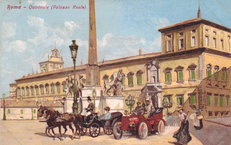
31/07/2016
ROMA – QUIRINALE (PALAZZO REALE)
Made in Italy
Unknown Publisher
(But there is a logo for a publisher but no letters or name – the logo is a white logo within a circle)
This is a lovely postcard from the period around the turn of the century (between the 19th and 20th Century) and nicely shows the onwards advance in technology with the depiction of a, then, modern motor car alongside a then traditional horse and carriage.
From marks which appear across each corner it is clear this was once kept in an early postcard/photograph album (I suspect a postcard album as they traditionally had the slotted cut corners in which postcards were fitted – I have a couple of albums, and if you go back through the postings I have depicted images of one of these and you can see how the cards were held in).

31/07/2016
ANDRE RIEU
CHRISTMAS WITH ANDRE
In Cinemas
Saturday 19th November, 5pm
“Christmas with Andre, a festive celebration, featuring a brand new 90 minute recorded Christmas concert, packed with Christmas favourites including Hallelujah, Jingle Bells, White Christmas, Amazing Grace and many more!
Exclusively for cinemas, Andre invites his fans to his hometown with an intimate live tour of Maastrichts magical Christmas highlights, as well as participating in an interactive Q&A hosted by Charlotte Hawkins.
Tickets are on sale now – Book online or at the box office!”
(Text from reverse side of Postcard)
I found this free postcard in my local Odeon Cinema yesterday – Is it too early to be advertising something with a Christmas theme? Nice well produced postcard though.
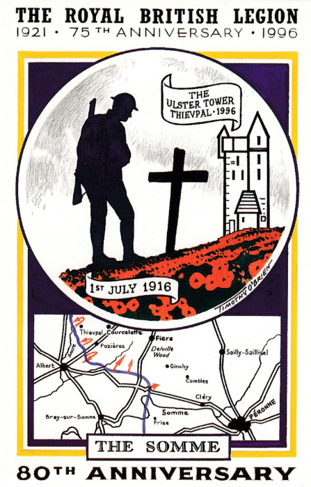
31/07/2016
THE ROYAL BRITISH LEGION
1921 – 75TH ANNIVERSARY – 1996
THE SOMME
80TH ANNIVERSARY
1ST JULY 1916
Published by
DUNLUCE COLLECTIONS
Ref: DUN 3/96
Limited Edition
Artwork by Timothy O’Brien
Is this the first Timothy O’Brien artwork postcard I have posted? I think it is, which is a surprise as he is one of my favourite modern postcard artists. I have met Tim several times and have also commissioned him twice to produce postcards for me. And, more interestingly I have four of his original paintings, artwork which was used on postcards, framed and hanging up in my home. There is also a signed RMS Titanic print as well, hung in my living room.
So, as you can see I do like Tim’s work and this design here, despite being twenty years old now (this surprised me, 20 years? I remember when this card came out), is still very topical, especially this month. I think Tim caught the feel of remembrance really well.
The design includes the Ulster Tower and if you check back to an earlier July posting I depicted an early photographic postcard showing this Tower (which I have visited and which is well worth a visit if you find yourself in this area).
I will definitely be posting more of Tim’s work in the future.
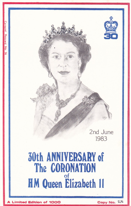
31/07/2016
30TH ANNIVERSARY of THE CORONATION of HM QUEEN ELIZABETH II
2nd JUNE 1983
LIMITED EDITION OF 1000
(This copy here is hand numbered – Copy No. 576)
CAROUSEL POSTCARD No. 36
Published by
CAROUSEL
Carousel produced a wide range of commemorative and event postcards during the 1980s and some of the designs are very nice, although sometimes simple in concept. Because they are limited in number (all be it that 1000 is a reasonable number for most collectors that want a copy to be able to obtain one). This one is a little more special than most and has a touch of novelty as the Queens tiara crown is made up of applied glitter dots which sparkle when turned into the light. This does mean though, that the card has to be looked after carefully as this glitter does come off, so it needs keeping in either a plastic sleeve or in an album pocket to prevent its total loss (which could potentially occur if people kept touching the glitter). My copy here cost me £1, but I have seen priced at £3+
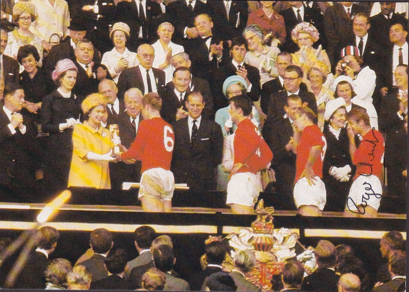
30/07/2016
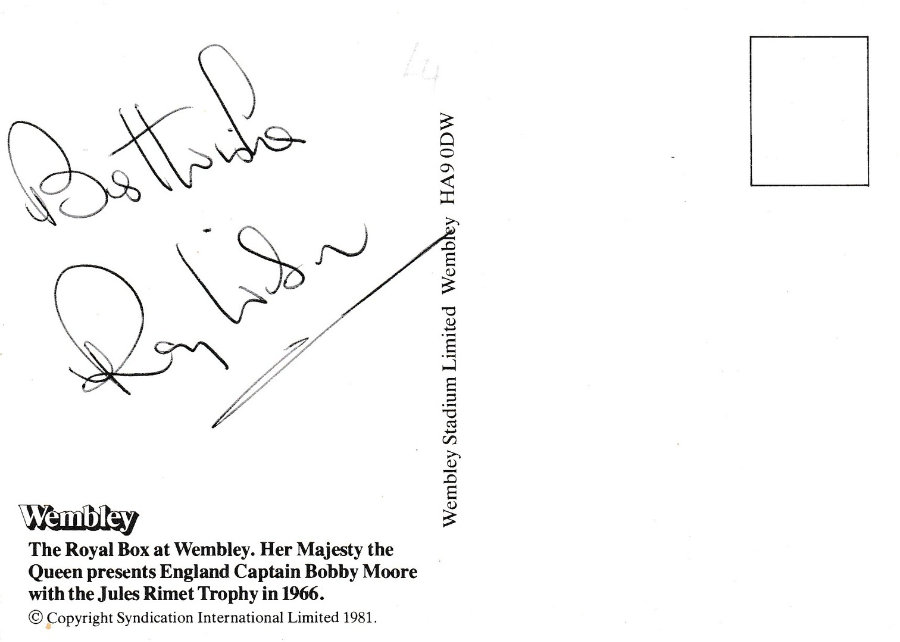
WORLD CUP 1966
50TH Anniversary of the Football World Cup Final
ENGLAND 4 – 2 WEST GERMANY
Fifty years ago on this day England faced West Germany in the final of the 1966 World Cup at Wembley Stadium. England went on to win and become the World Cup winners. Bobby Moore went on to be handed the Jules Rimet Trophy by her Majesty the Queen.
In honour of this anniversary I post the following five autographed postcards.
WEMBLEY STADIUM
Published by
WEMBLEY STADIUM LIMITED
“The Royal Box at Wembley. Her Majesty the Queen presents England Captain Bobby Moore with the Jules Rimet Trophy in 1966”
(Text from reverse side of Postcard)
This image of the England Captain receiving the trophy has been signed on the front by ROGER HUNT, who has signed over his own image on the card.
The photograph has Bobby Moore at the front, then Geoff Hurst, Bobby Charlton and Roger Hunt.
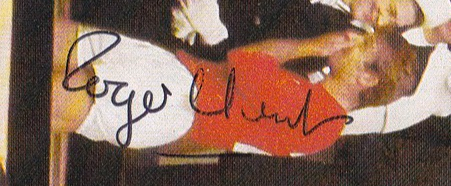
CLOSE UP OF THE SIGNED AREA
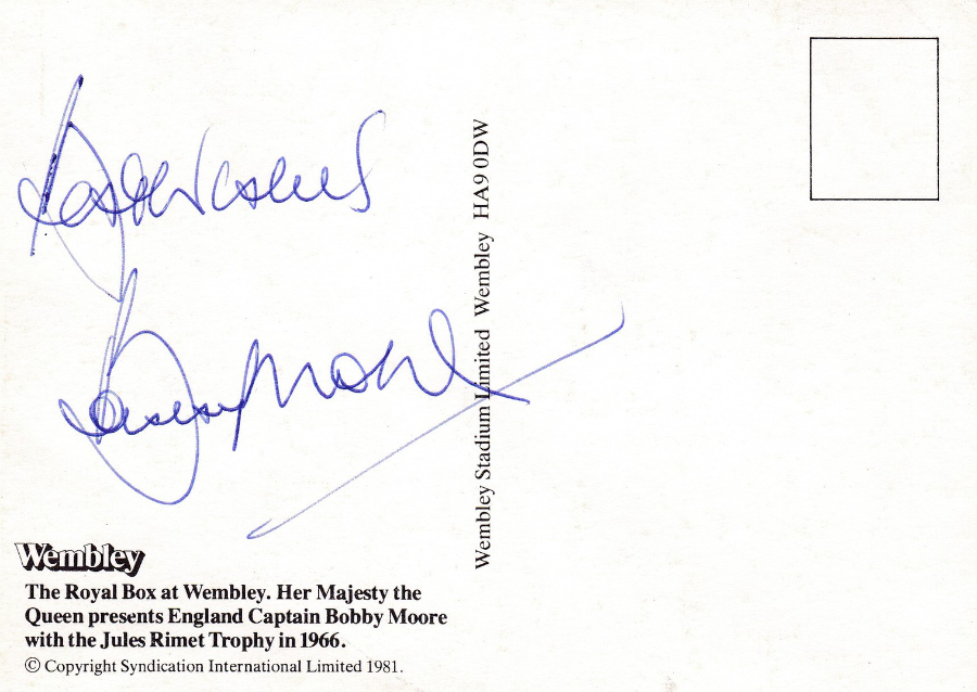
WEMBLEY STADIUM
Published by
WEMBLEY STADIUM LIMITED
This is the same postcard issue as illustrated above, but a different copy, this time signed on the reverse side by the England Captain BOBBY MOORE (Bobby Moore’s autograph is highly collected and carries some value these days)

WEMBLEY STADIUM
Published by
WEMBLEY STADIUM LIMITED
This is the same postcard issue as illustrated above, but a different copy, this time signed on the front by GEOFF HURST – still the only football player to score a hat trick in a World Cup final. He has signed over his own image on the card.
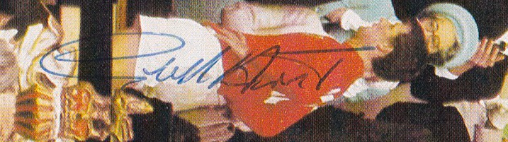
CLOSE UP OF THE SIGNED AREA
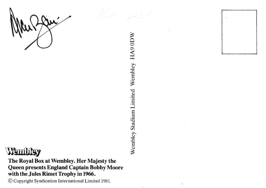
WEMBLEY STADIUM
Published by
WEMBLEY STADIUM LIMITED
This is the same postcard issue as illustrated above, but a different copy, this time signed on the reverse side by ALAN BALL, another member of the winning England team.

Enlarged depiction of Autograph
WEMBLEY STADIUM
Published by
WEMBLEY STADIUM LIMITED
Yet another copy of the same postcard but this time signed on the reverse side by another member of the England team – RAY WILSON.
30/07/2016
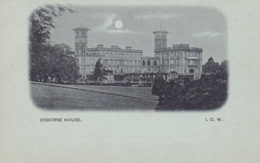
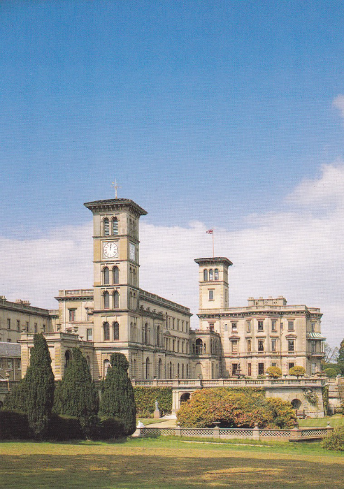
OSBORNE HOUSE
ISLE OF WIGHT
Last month I promised that I was going to give you a large postcard look at Osborne House, and here it is. The postcard, of course, was an invention of the Victorian Age so it should come as no surprise that Queen Victoria herself was the subject of much interest. After her death her home on the Isle of Wight, Osborne House, eventually, became a tourist site.
POST CARD – GREAT BRITAIN & IRELAND
Very early undivided back postcard showing a photograph if Osborne House. Because of its age this postcard could even be from before Queen Victoria died, at the very latest it is from the year, or within a year or two, of her death. The postcard is unused (it cost me just £2 when I bought it some years ago)

REVERSE SIDE OF ABOVE POSTCARD
A nice example of an undivided back – printed on blueish card (which has previously mentioned in a post – is a type of card commonly used on the continent in the very early days of picture postcards, just before and just after 1900)
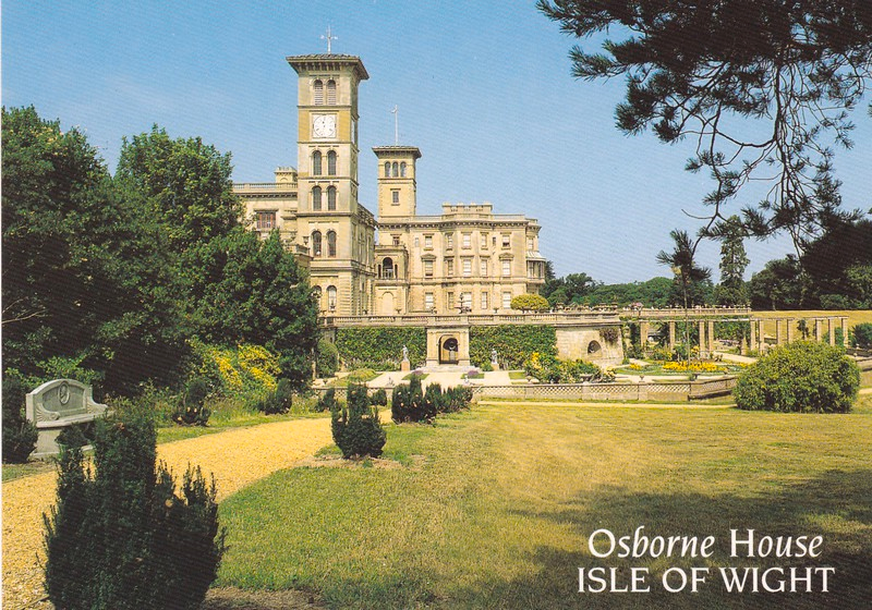
OSBORNE HOUSE – ISLE OF WIGHT
Published by
SALMON (Cameracolour Post Card)
Ref: 2 – 59 – 10 – 19
A modern postcard (well, ten years old) which I bought on my visit to Osborne House.
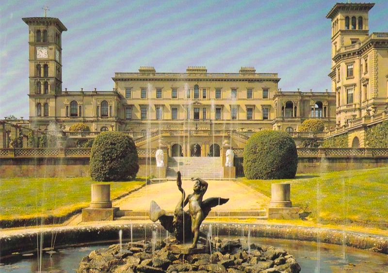
As stated Osborne House was the residence of the Royal Family. It was built between 1845 and 1851 for Queen Victoria and Prince Albert as a summer home. Queen Victoria had spent two holidays on the Isle of Wight as a young girl and had clearly liked it here.
There was a house already here, which they bought from Isabella Blachford in October 1845, which was soon deemed to be too small. They decided to replace the old house with a new one.
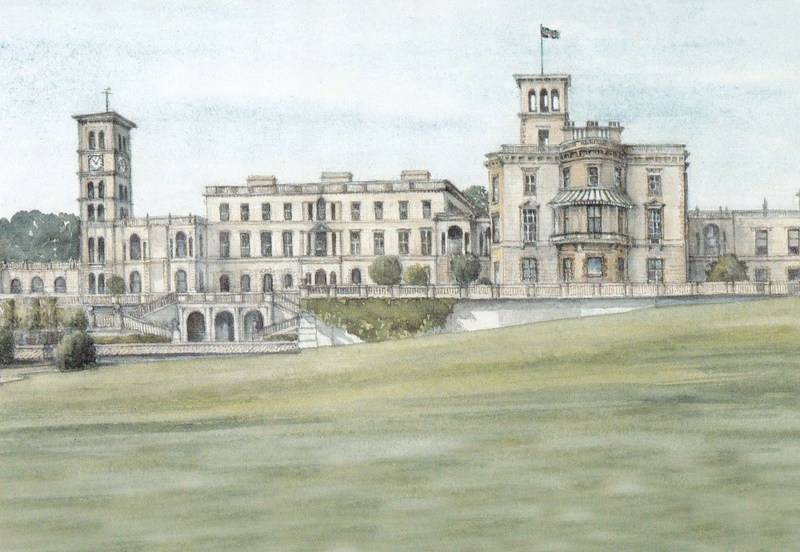
OSBORNE HOUSE I.W.
Printed and Published by
ISLE OF WIGHT COUNTY PRESS
From a watercolour by
MURIEL OWEN, S.W.A.
The house was designed by Prince Albert and was based on the style of an Italian Renaissance palazzo. The architect, and builder, Thomas Cubitt was used to construct Osborne House (his London company had been used to build the façade of Buckingham Palace for Victoria and Albert in 1847). Albert and Cubitt worked together on the houses design.
OSBORNE HOUSE
ISLE OF WIGHT
Published for
ENGLISH HERITAGE
Ref: KA9880
This is a postcard that was sold at Osborne House itself (it still may be of course). Here you can see quite clearly the two belvedere towers which were incorporated into the design.
Apparently Queen Victoria and Prince Albert paid for much of the furnishings for Osborne House through the sale of the Royal Pavilion in Brighton.
OSBORNE HOUSE
ISLE OF WIGHT
Published for
ENGLISH HERITAGE
Ref: KA3820
A nice view of the back of the premises from the garden area. The two belvedere towers can be seen standing at either end. This is another postcard which was sold by English Heritage at the house itself.

OSBORNE HOUSE
ISLE OF WIGHT
Published for
ENGLISH HERITAGE
Ref: KA4467
Another postcard available exclusively at the English Heritage gift shop attached to the house. Looking at this image in particular you can clearly see the Italian influence in the design. This is one of my favourites of the modern postcard selection.

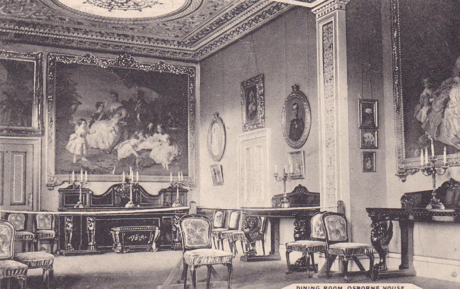
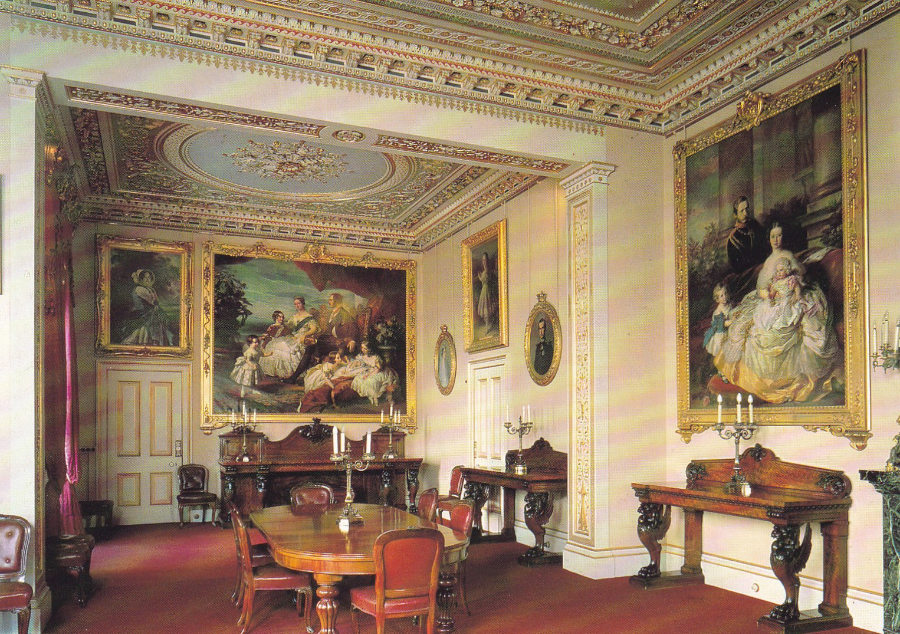
OSBORNE HOUSE (Isle of Wight) – THE DINING ROOM
Published by
LL
Ref: 13
TOP – Colour version
BOTTOM – Black & White version
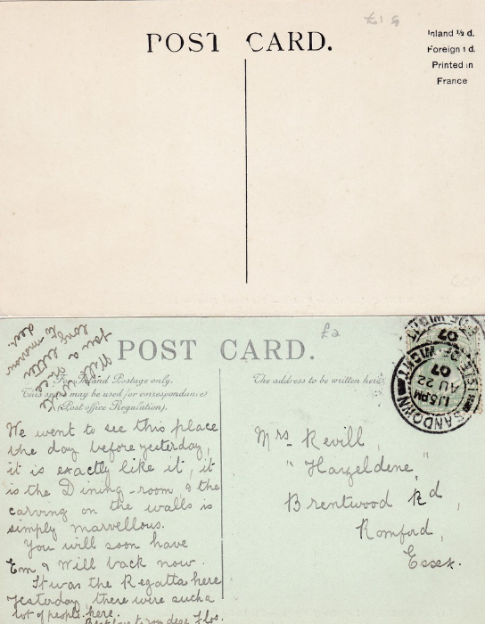
Here you have an internal photograph of the dining room within Osborne House. It was published both as a black and white postcard (bottom) and as a full colour image (top). The top colour version is mint, unused, so I do not know its correct period of usage. The black & white version was posted from Sandon (on the Isle of Wight) on 22nd August 1907. The message can be seen below. These are obviously much older postcards from the period within 5 to 10 years of the death of Queen Victoria.
Queen Victoria actually died whilst at Osborne House, in January 1901. Following her death, the house was considered as being no longer required by the remaining Royal Family members (some of whom I think were not that fond of the house anyway). So, despite Queen Victoria’s wish that the residence was to remain in the hands of the royal family, her siblings handed it over to the state. But, a few rooms were retained as a private museum to Queen Victoria.
REVERSE SIDES OF ABOVE POSTCARDS
TOP
Mint colour version
BOTTOM
Black & White version
The message is quite a nice one:-
“We went to see this place the day before yesterday, it is the Dining room, & the carving on the walls is simply marvelous. You will soon have Ern & Will back now. It was the Regatta here yesterday, there were such a lot of people here”
DINING ROOM, OSBORNE HOUSE
Published by
W. H. SMALL, YORK AVENUE, EAST-COWES
Copyright
Wm. U. Kirk & Sons, Cowes, I. W.
Ref: 11 13352
Another image of the Dining Room, this time published by a local Isle of Wight company. This is just one of two rooms which frequently seem to appear on postcards from Osborne House. I wonder if these were the two room (for the second room see further below) that people could access on a visit. Gathering from the message on one of the cards above someone had paid a visit in 1907 and had seen this dining room.
OSBORNE HOUSE
ISLE OF WIGHT
THE DINING ROOM
Published for
ENGLISH HERITAGE
Ref: KA9874
Postcard bought on my visit. This modern one is around 100 years older than the ones illustrated above that depict this room – not that it has changed very much (the addition of a table seems to be the main change). It is nice when you can obtain postcard images that are many years apart, it allows you to see what, if any, changes have occurred.
For your information Osborne House areas were used from 1903 to 1921 as a junior training college for the Royal Navy, and was known as the Royal Naval College, Osbourne.
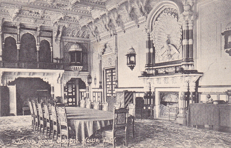
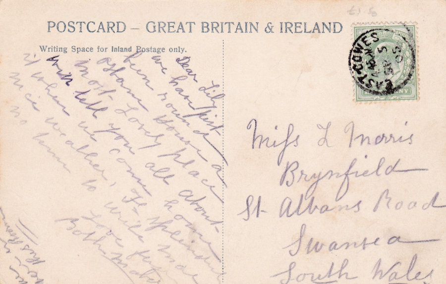
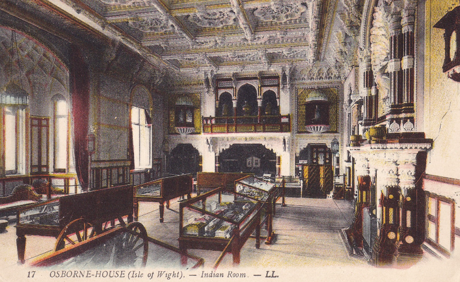
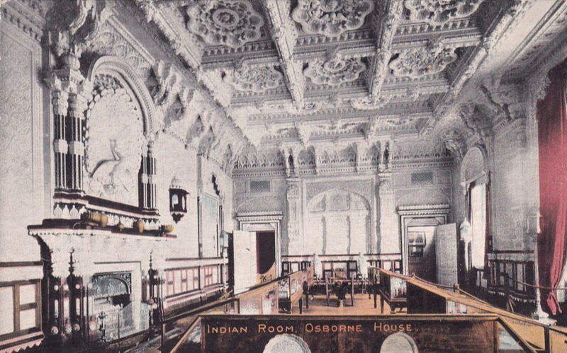
INDIAN ROOM, OSBORNE HOUSE I.W.
Published by
Wm. U., Kirk & Sons, Photographers, Cowes, I. W.
Rref: No 28
This is actually the DURBAR ROOM, but some postcards refer to it as the INDIAN ROOM, perhaps for obvious reasons given its architectural style.
This is the second room I referenced above, the other room which seems to appear on more postcards than any others. In-fact, there are more postcards for this Durbar Room than there are for the Dining Room. But, I think this is no surprise as this Durbar room is truly astounding, and on my visit it was the most outstanding aspect of the trip.
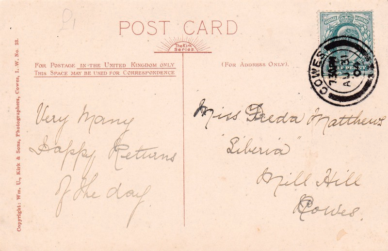
REVERSE SIDE OF ABOVE POSTCARD
This old postcard was posted from COWES on 31st August 1904, just three and half years after Queen Victoria’s death. The COWES cancellation is a lovely double circle type with single arc, broken with a cross pattee (reference 9/26 on page 147 of the Stanley Gibbons ‘Collect British Postmarks – 8th Edition’ catalogue).
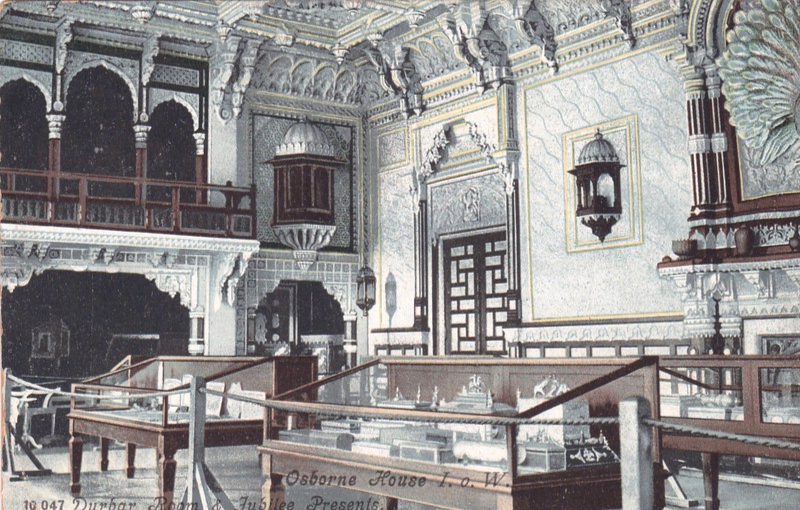
OSBORNE HOUSE I. o. W.
DURBAR ROOM & JUBILEE PRESENTS
Unknown Publisher
Ref: 10 047
The postcard above has a table down the centre of the room, whilst here, you have display cabinets containing presents received by Queen Victoria during her Jubilee. Also, here the room is correctly named as the DURBAR ROOM. To all intense and purpose this appears as a black and white photograph, but, the wooden sections are brown in colour on this card. This is quite a nice filled out image.
REVERSE SIDE OF ABOVE POSTCARD
Posted from EAST COWES on 5th September 1905, with the stamp cancelled with a small single ring cancellation.
The message reads as –
“Dear Lily. We have just been round Osborne House a most lovely place. Will tell you all about it when we come home. Nice weather H [Hotel ?] splendid. No room to write more”
OSBORNE HOUSE
ISLE OF WIGHT
Published for
ENGLISH HERITAGE
Ref: KA9877
This modern postcard (another from my own visit) quite correctly calls this the Durbar Room and the reverse side text reads as:
“Osborne House was Queen Victoria’s seaside residence and her favourite home. The exotic Durbar Room was constructed in 1890-91 and elaborately decorated in Indian style, to provide a state banqueting hall”
This postcard image is taken from almost the same position as the one two up, and not far off the one immediately above either, although here you have no display cabinets anymore.
OSBORNE HOUSE
ISLE OF WIGHT
Published for
ENGLISH HERITAGE
Ref: KA4930
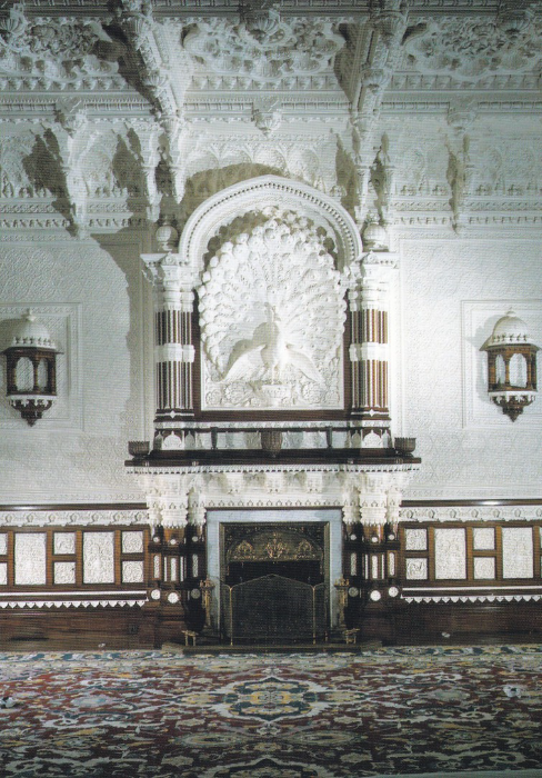
This superb modern postcard (yes, yet another from my visit) shows more clearly my favourite aspect of the room – the massive carved peacock which stands above the fireplace. You can see this on all the other postcards above, that show this room, but here you get the front on view, the best view in my opinion.
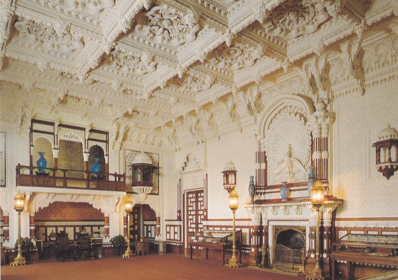
The Durbar Room was actually placed in the ground floor of what was the final addition to the house and which was called the ‘Main Wing’. The word Durbar in Hindi means, in an anglicized way, ‘Court’. The room was decorated by Bhai Ram Singh in a very intricate, and I have to say both elaborate and astounding way. When you stand in this room you can see why it is one of the favourite rooms in the house.
OSBORNE HOUSE (Isle of Wight) –
INDIAN ROOM
Published by
LL
Ref: 17
Here again the room is called the ‘Indian Room’ but, for an older postcard (my copy is unused but would be of a similar age to those older ones above, say 1904 – 1909). Again, here you have the cabinets displaying the Queens jubilee gifts. This image is from a slightly different angle to those above, but shows the same end of the room as the above images. The large peacock on the wall can be seen top right (just).
INDIAN ROOM
OSBORNE HOUSE
Published by
M. JONES, COWES and EAST COWES
Another old postcard view, but again unused, but again of a similar age to the above older postcards. When I saw this one I had to have it because, to date, it is the only image I have seen which shows the other end of the room. This time the peacock is on the left side. You also get more of the ceiling decoration (very impressive). This is another postcard which titles the room as the INDIAN ROOM. I like this image quite a lot as the display cabinets don’t take over from the rooms designs.
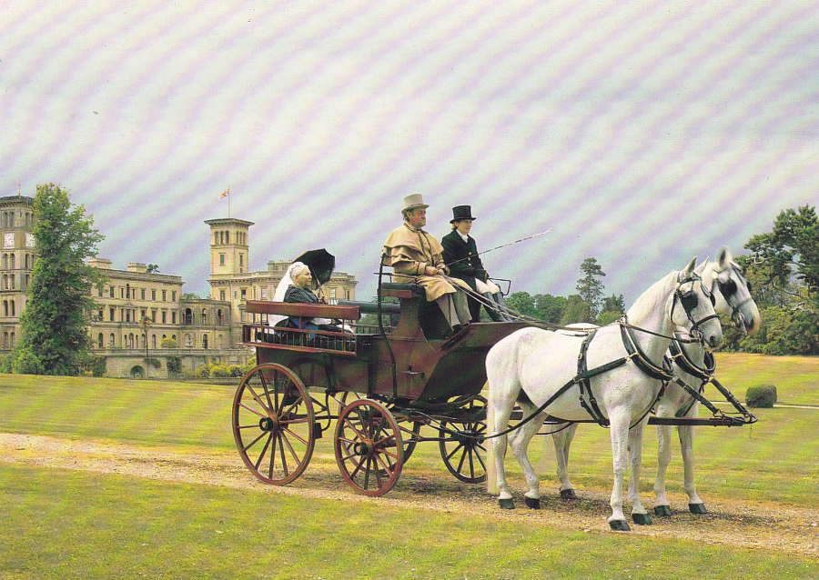
OSBORNE HOUSE
ISLE OF WIGHT
Published for
ENGLISH HERITAGE
Ref: KA1712
And lastly an image with Osborne House in the background, but with someone representing Queen Victoria in a carriage in the grounds of the house. This is another exclusive to the Osborne House gift shop – and a very good one (would grace any royalty collection as something unusual)
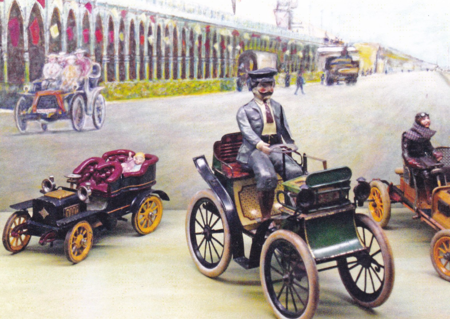
29/07/2016
BRIGHTON TOY AND MODEL MUSEUM
“Photography by Anthony Capo-Bianco”
A lovely card, but, one with no descriptive text on it, either on the front or the back. So, although I can clearly say that these are toy cars, and from appearances very old ones, I can-not tell you who made them or from where they originated from. If you know the answers then please let us know.
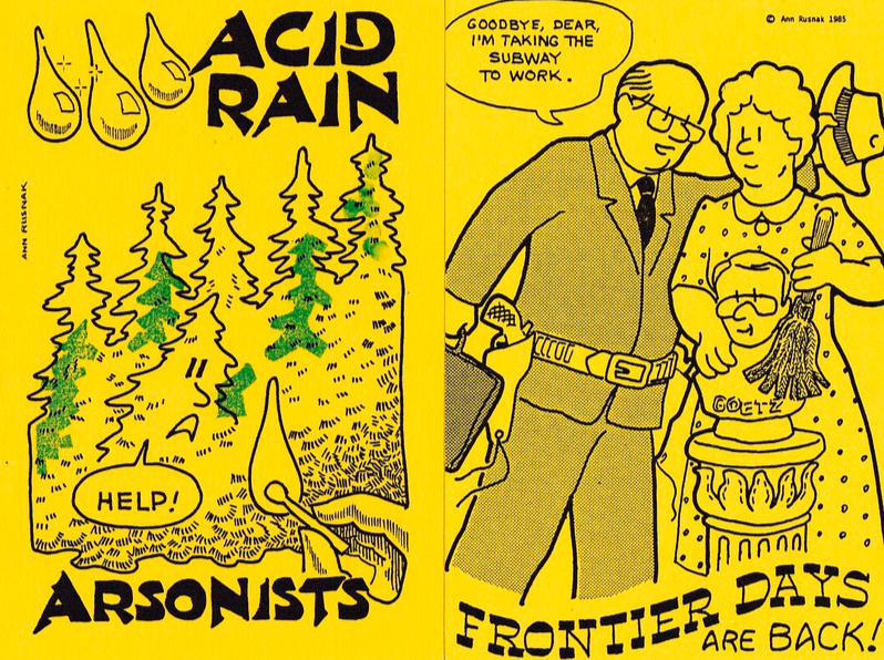
29/07/2016
ANN RUSNAK
Postcard Designs
FAR LEFT –
TIMELY TOPICS #8
ACID RAIN – ARSONISTS
“Forests of Canada and the United States are under siege during the 1980’s: firewood poachers, acid rain, and now deliberate arson in California and the South”
(Text from Reverse Side of Postcard)
NEAR LEFT –
TIMELY TOPICS #2
FRONTIER DAYS ARE BACK
“Bernard Goetz shot four young hoodlums on the New York subway in January 1985. The Grand Jury refused to indict Goetz for attempted manslaughter”
(Text from Reverse Side of Postcard)
I love Ann Rusnak’s designs (which you have probably worked out by now). They are simple, but, within the American modern postcard collecting fraternity she is a bit of a postcard hero.

29/07/2016
EURO DISNEY
FRONTIERLAND
“PHANTOM MANOR”
Another of the initial ‘Euro Disney’ concept artwork postcards. I really like these and they are nice collectible early items. Having been here a few times I think the actual mansion is slightly facing a different angle as the boat you can see is too far away in the distance for this to be a correct image. But who cares? It’s a cracker anyway.
29/07/2016
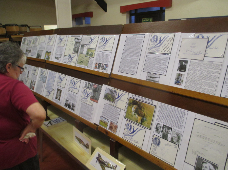
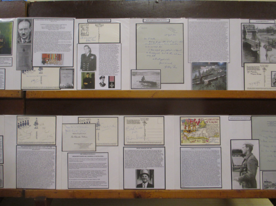
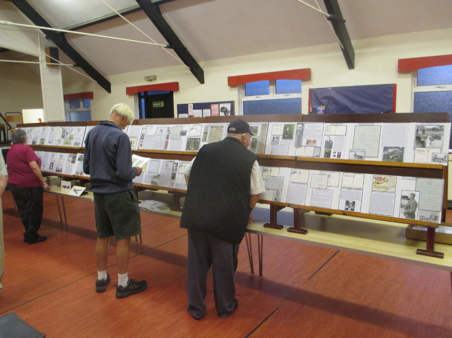
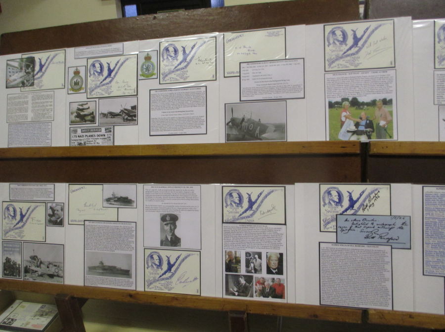
No posting yesterday, but that did not mean my night was not still postcard related. Last night I gave a display of autographed postcards (large selections of Battle of Britain pilots and other WW2 pilots, Victoria Cross holders from WW2, those involved in the raid at Dieppe, the D-Day landings assault on Pegasus Bridge and the Arnhem airdrop). The display was given to the Shoebury Philatelic Society (just down the road from me and where I am also a member).
Here are some pictures of part of the display.
27/07/2016
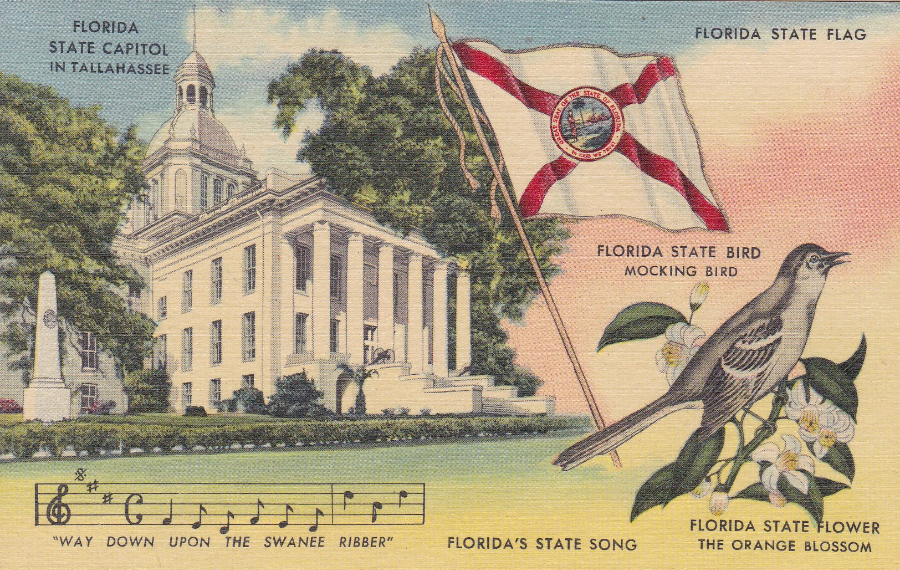
FLORIDA STATE CAPITOL IN TALLAHASSE
FLORIDA STATE FLAG
FLORIDA STATE BIRD – MOCKING BIRD
FLORIDA STATE FLOWER – THE ORANGE BLOSSOM
FLORIDA’S STATE SONG – “WAY DOWN UPON THE SWANEE RIBBER”
Published by
GENUINE CURTEICH-CHICARGO “C.Y. ART COLORTONE” POST CARD (Reg. U.S. PAT OFF)
Ref: F171
TROPICAL FLORIDA SERIES
As I have had so many holidays in Florida it is perhaps no surprise I have a number of postcards from this American state. This is one bought at an American Antique Fair and it shows several of the Florida State symbols. Cards like this can be found many different American states and they can be attractive in their design. Being a bird watcher myself I am well aware of the Mocking Bird, and have seen many of them.
27/07/2016
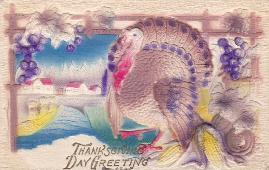
THANKSGIVING DAY GREETINGS
NOVELTY EMBOSSED POSTCARD
TURKEY
Unknown Printer / Publisher
As previously mentioned on other postings, I am very interested in ‘Novelty’ postcard items. This one here is an American postcard (naturally – given the subject matter) with all of the design raised up in relief on the front of the postcard. All of the little leaves, grapes, houses and trees are raised, as is the main turkey and all the articles to the right side of the turkey (I very much like the corn on the cob, where every little corn is individually embossed – fantastic to run your fingers over).
Although not posted the sender has kindly written the date on the reverse side – 11-29-1911 (written in the American date format with the month first, then the day of the month – so this is actually the 29th November 1911). The colouring is a bit crude, but the design superb. It cost me $4 (would have been a bit cheaper in the UK as the theme is less collected – but, as a souvenir of America it is delightful).
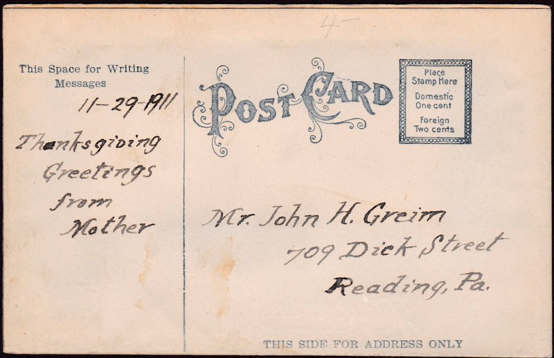
REVERSE SIDE OF ABOVE POSTCARD

27/07/2016
NATIONAL AIRLINES DC-7 STAR
Ref: 886-415
“Fastest and finest of all U.S. airlines – modern Turbo-Compound giants that cruise 365 mph. Finest luxury travel. Choice filet mignon…seats just 2 abreast…Starlight Cocktail Lounge…two charming stewardesses…popular music in flight”
(Text from reverse side of postcard)
FLY NATIONAL BETWEEN NEW YORK. WASHINGTON. FLORIDA. CUBA
This is a smashing airline advertising postcard with a really nice piece of artwork on the front. These type of postcards are collected both in America and over here in Europe and the UK. Any postcard related to airlines or any plane image will be snapped up by the large group of collectors who have aviation as their theme.
26/07/2016
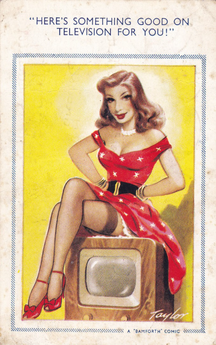
“HERE’S SOMETHING GOOD ON TELEVISION FOR YOU!”
A ‘BAMFORTH’ COMIC
Published by BAMFORTH & CO., Holmfirth, Yorkshire
“COMIC” Series
No. 966
My copy of this postcard, depicted here, is a little rough around the edges, but, I could not resist it as it is nicely television related (I had also seen a copy of this card, in a display in 2010, at the ‘Festival of Stamps’ exhibition in London – I had wanted a copy as a result).
This is a ‘Taylor’ comic card and is nicely drawn, just look at that cracking television set, you can almost touch the smooth wooden edges (yes, I know, you were not actually looking at the television set!).
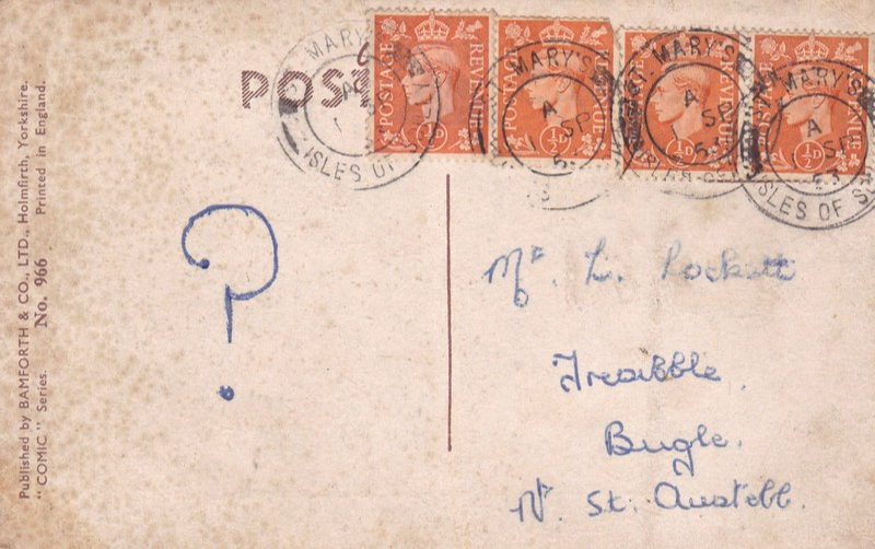
REVERSE SIDE OF ABOVE POSTCARD
Despite the obvious TV connection, and the fact that I wanted a copy of this card, it was actually the rather unusual usage on the reverse side that caught my interest. The card has been posted with what I think is a very unusual message, ‘?’ All there is, is a simple question mark. Makes the card a little more interesting and unusual I think. I wonder if the receiver did actually know who the sender was?
The postcard was posted from St Mary’s on the Isles of Scilly, and the four stamps used have been cancelled with four nice strikes of the ST MARY’S – ISLES OF SCILLY double ring cancellation dated 1st September 1953. The stamps are 1/2d pale orange King George VI definitive stamps from the 1950-1951 issue (SG 503)

26/07/2016
NATIONAL POSTCARD WEEK 1986
4th – 10th May 1986
JOAN CRAIG, ST PETERSBURG FL (Florida)
Artwork by
ANN RUSNAK
Hand Numbered limited edition of 300
(This copy is No 11)
Another Ann Rusnak designed postcard, produced in her traditional simple, but delightful style. Here you have a poodle looking at a unicorn (a nice card for ‘Fantasy’ and ‘Mythology’ collectors). This is a nice card which has some value due to the low issue run of just 300 copies.
26/07/2016
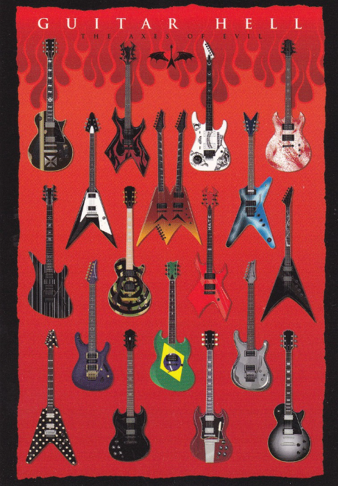
GUITAR HELL
THE AXES OF EVIL
Published by
PYRAMID INTERNATIONAL
Ref: PC9872
Copyright 2011
A nice collection of images of actual guitars. A smashing postcard for any music collector. The details of each guitar are listed on the reverse side (in very small text). The details are listed below and the numbering starts top left and across, then down and across through the five lines of guitars. Each guitar is described as “AS PLAYED BY…”
-
JAMES HETFIELD – METALLICA
-
KERRY KING – SLAYER
-
KIRK HAMMETT – METALLICA
-
SCOTT IAN – ANTHRAX
-
ROBB FLYNN – MACHINE HEAD
-
DAVE MUSTAINE – MEGADETH
-
DIMEBAG DARRELL – PANTERA
-
SYNYSTER GATES – AVENGED SEVENFOLD
-
ZAKK WYLDE – BLACK LABEL SOCIETY
-
MICK THOMSON – SLIPKNOT
-
MICHAEL PAGET – BULLET FOR MY VALENTINE
-
HERMAN LI – DRAGONFORCE
-
MAX CAVALERA – SOULFLY
-
JOE SATRIANI
-
RANDY RHOADS – OZZY OSBOURNE
-
TOMMY IOMMI – BLACK SABBATH
-
ANGUS YOUNG – AC-DC
-
ADAM JONES - TOOL
25/07/2016
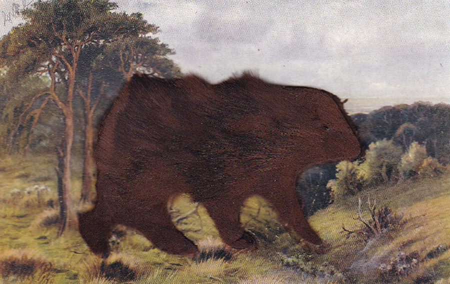
REAL FUR BEARS
TOP
BROWN BEAR
(Real fur material attached to postcard)
Published by
OSBORNE LTD, NEW YORK
SERIES No. 599C
(Printed in England)
On one of my Florida trips I had the pleasure of visiting a large open air (and it was hot!!) antiques fair. Here I was lucky enough to find a couple of postcard stalls and these two postcards here were bought from one dealer on one of these stalls.
This brown bear postcard was posted in America in 1907 and was printed in England for a New York based postcard company.
This is a wonderful novelty postcard and the fur is quite thick, my grandchildren like running their fingers through it, although, to be honest, I am not sure how healthy that is!
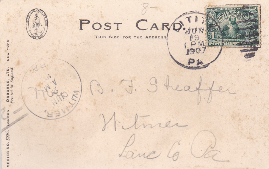
REVERSE SIDE OF ABOVE POSTCARD
This postcard was posted from a small town in Pennsylvania called Lititz (In 2013 Lititz was voted ‘America’s Coolest Little Town’) and the stamp has been cancelled with a single ring LITITZ PA cancel dated ‘19 JUN – 1pm – 1907’.
The postcard was addressed to another town in Pennsylvania called Witmer, and upon arrival received a WITMER PA. single ring cancel date 20 JUN 1907 (the time has been partially obscured but it was AM and looks to be 10.??).
The stamp used is a 1907 1c (green) Jamestown Exposition, featuring an image of Capt. John Smith (SG 335)

BOTTOM
WHITE BEAR – POLAR BEAR(?)
(Real fur material attached to postcard)
Unknown Publisher
Ref: 207
Although not by the same company as the above Brown Bear card, the basic design idea and format used here is almost identical to the above card. My copy of this card is mint (unused). I actually think this one is better than the Brown Bear one but with much less known about its source.
REVERSE SIDE OF ABOVE POSTCARD
25/07/2016
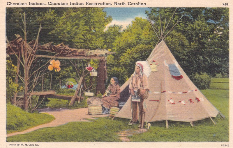
CHEROKEE INDIANS
CHEROKEE INDIAN RESERVATION, NORTH CAROLINA
Published by
STANDARD SOUVENIRS & NOVELTIES, INC, KNOXVILLE, TENN
Ref: 246 (top right) 69945 (bottom right)
Photo by W.M. Cline Co.
“TICHNOR QUALITY VIEWS”
(Made only by Tichnor Bros, Inc, Boston Mass)
“The Cherokees today number 3000 on the reservation here. They are descendents of those who hid in the Smokies when the Cherokee removal to Oklahoma began in 1838”
(Text from reverse side of Postcard)
Another postcard bought at the Florida Antiques Fair I attended (and from the same dealer as the two ‘Fur’ Bear cards depicted above.
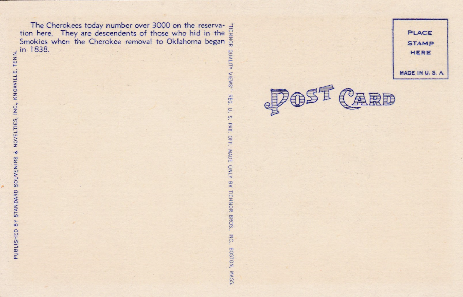
REVERSE SIDE OF ABOVE POSTCARD
If ever anyone asks what a typical mid-century American postcard reverse looks like, then this one is a true typical example. The coloured, blocked POST CARD letters are very synonymous with the American style of fancy postcard layout.

25/07/2016
GREETINGS FROM LONDON TRANSPORT
On the occasion of the Visit to the U.S.A. of three London Transport Buses,
March – July, 1952
“The photograph (see over) shows the Houses of Parliament in the centre, Westminster Bridge with Big Ben at one end and the London County Hall at the other, and Westminster Abbey in the left foreground”
(Image descriptive text from reverse side)
I bought this in America (at an Antiques Fair in Mount Dora, Florida). I believe it was given away free to people visiting the display of three London Buses (I assume bright red ones) which had travelled to America in 1952 on a publicity drive for holidays to London/England. I thought it was an unusual item, not quite a true postcard, but the same size as one and with the ‘feel’ of one. It is an interesting piece of London Transport memorabilia.
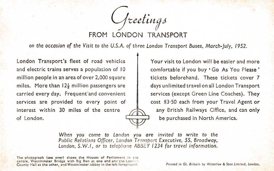
REVERSE SIDE OF ABOVE POSTCARD
With even more text viewable
Printed in Gt Britain by Waterlow & Sons Limited, London
(so these were prepared in advance and possibly went out with the buses to the USA – this one has now come back to England with me)